Home
Home

 Artists
 Search
 Recent
 Random
 Posts
Posts
 DMs
DMs
 Tags
Tags
 Random
 Importer
 Import
 FAQ
FAQ
 Account
 Register
 Favorites
 Login
Login

Modeling, Texturing, Lighting the Library (Patreon)
Content
I really enjoy modeling rooms for Murder. It’s a fun exercise in form vs function. I like to think game design is baked into every decision, and that includes artistic decisions. Plus I just really like the old-timey style. I documented my process for making the library specifically for this blog post, and I think I’ll do it again in the future for some of the other rooms.
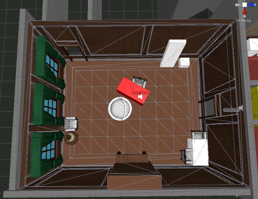
Step 0, already have a greyboxed floor plan of your world, playtested so you know the overall dimensions of the rooms are ok.
Step 0.5 put on some fun music to listen to because that helps me stay focused when doing artsy stuff.
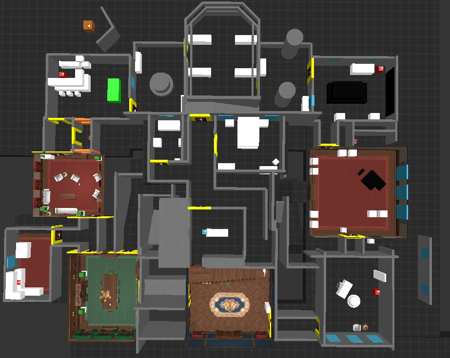
Step 1, choose a room. Making rooms one at a time works fine for murder because of the hallways connecting each room. One the generic floor plan exists, it’s way easier to move rooms around relative to each other by stretching and squishing hallways versus having rooms share walls with each other. The general size and door connections should already be established, making changes to the major architecture of the room later after it’s already modeled is annoying.
Pro tip: work on a grid when possible for “interior” type models such as this. One grid unit in Unity is 1 meter and basing objects off 1 meter, 1.5 meter, 2 meters, etc works nicely for me. For the entire murder 4 map I try to stick to a consistent sized door threshold width (1 meter is not 100% realistic, but close enough) and pad corners with about 0.5m so the door can swing open and not hit the wall. Anything tighter than 1 meter isn’t really comfortable to squeeze through-- for door frames, floor space, etc. In this example, the library is 9m by 7m.
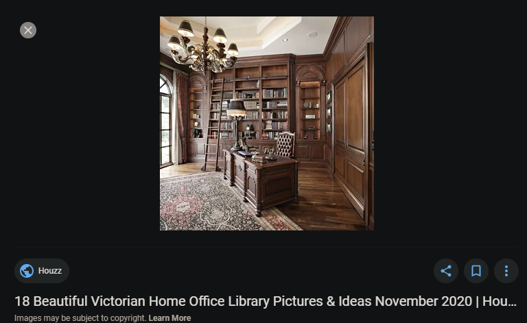
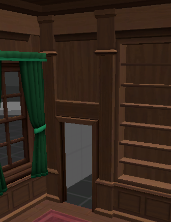
Step 2: Decide on major details for the room: Walls, ceiling, floor/carpet, windows and doorways, fireplaces. This is separate from the furniture, but definitely keep furniture in mind. For example, for this library room, I want to have shelves set into the wall, and one of the walls has three windows. The library is also a little special because I want it to be a mirror-image of the dining room on the other side of the house, so that when I model an exterior for the house, it looks nice and symmetrical. I won’t care about this for the back/sides of the house.
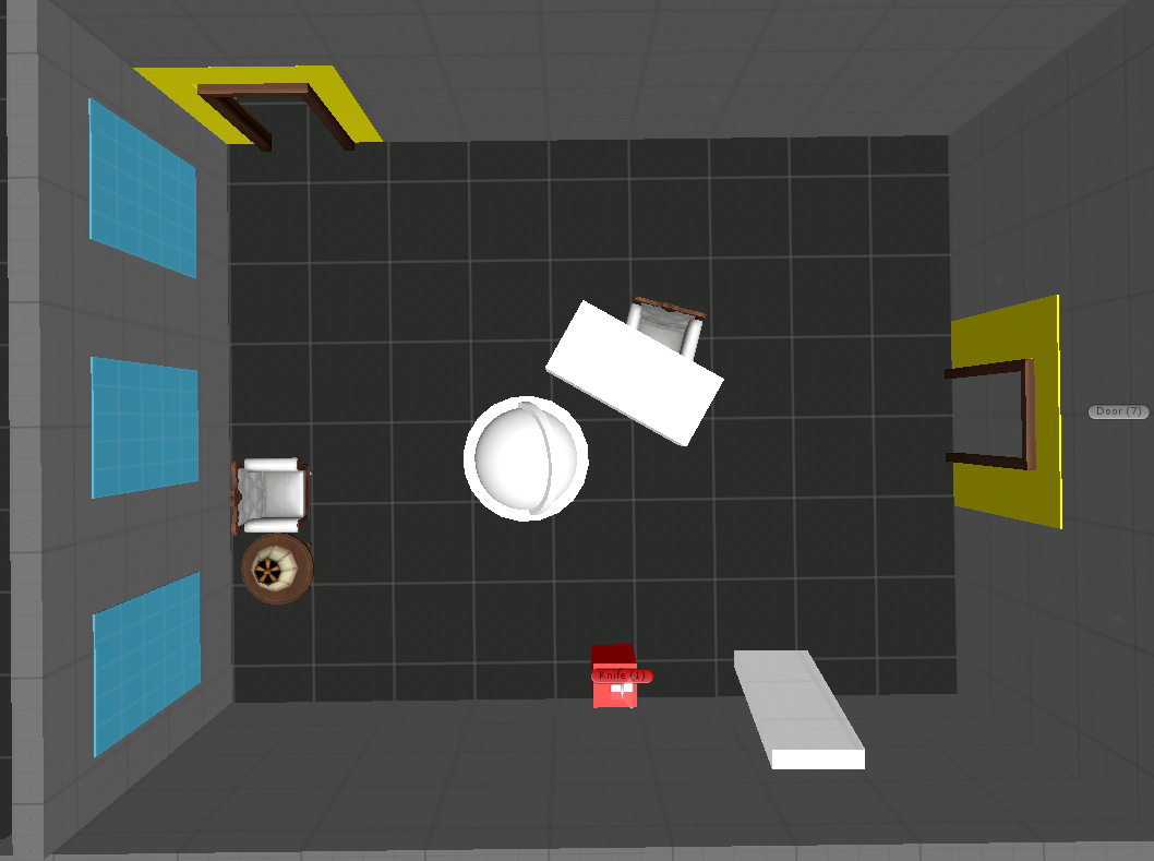
A note about furniture: I have some white boxes to represent furniture, but in my experience these tend to change and also not matter as much. In murder a room is typically either totally open space or obstructed by a single major feature like a table, piano, or car. That fits into how the game works, you want some open spaces for discussion but also some cat-and-mouse rooms where you can play knife-vs-gun “chicken.” All rooms will have some kind of furniture around the border to hide clues in the corners, sometimes I just don’t greybox those because they don’t really get a lot of foot traffic and other than the clue spawn points, are more aesthetic than functional.
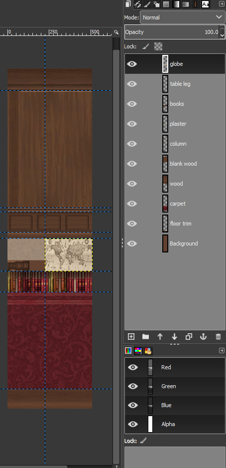
Step 3: Set up a texture atlas. Think of an atlas as one mega-texture made up of several smaller textures, and different models pick and choose different areas of the texture map.
Why do this? Because you can apply this map to a single material and apply that material to many objects. For example, let’s say the upper half of your atlas texture is for a couch, but the lower half of the texture is for a rug. You can put this texture on both the couch and rug models. In Unity, an important optimization consideration is having as few materials as possible in order to save graphical processing power-- even if your textures are really big, it’s better than having a ton of materials with tiny textures.
It makes sense to plan your atlases before starting on your models, but there are automated programs you can use to atlas after you model (like the CATS plugin/material combiner for avatars). So how do I choose which textures get combined into an atlas? In Murder 4 and Among Us, I started using a separate texture atlas for each room. In the case of murder, this room-architecture atlas often doesn’t even include furniture. I decided to give furniture its own atlas to save space in each “room” atlas, and because furniture is shared between so many different rooms.
There’s another good reason to combine textures based on their model’s location- if you need to change the color of a texture (for example, the exact shade of brown you want for your walls), it’s easier to change the texture atlas for the entire room instead of individual textures for the panels, trim, ceiling, etc. It’s faster and more consistent to use an atlas for that. The furniture is another good example of a wood color that I want to match throughout the entire house.
Anyway, let’s get started on the actual texture. I use an image manipulation program with a “layer” feature so that it’s easy to work with multiple textures on the same canvas, and export png files whenever I need to check my work. Exporting to png “flattens” the layers, so I keep the layered “project” in the same folder so I can go back and move things around easily if I want to.
For all the rooms so far, I’ve used a tall, skinny texture with dimensions 512 by 2048 pixels. The dimensions are important for a few reasons. “Power of two” numbers are preferred. That means numbers that are 2 to the exponent power of… something. They are 2, 4, 8, 16, 32, 64, 128, 256, 512, 1024, and 2048. I think you can also get away with 768, which is technically not a power of two but is still a common size when combined images sized 512 and 256. Unity lets you import textures of any size or ratio, but under the hood, it rounds/stretches them to images with “power of two” number dimensions anyway. It’s basically to be proper and save you time when importing or converting textures in Unity.
Why not double the size and use 1024 by 4096? Because 4096 is a ludicrously large size compared to 2048, and you can’t even really see the difference between the two in VR. In my experiences, 512 pixels of detail wide is a good amount of detail for something like 1 meter in 3D space, at least for stuff like walls and floors. Less than that, and the texture is pretty obviously too blurry, and more than that isn’t necessary.
The reason the texture is rectangular shaped is because I want to make the texture repeat over and over horizontally for stuff like wallpaper, panels, and wood trim. Then I can put all the other stuff underneath, like ceiling tiles and carpet… which just happen to be square shaped and fit perfectly in the space below.
I start by measuring the wall height and figuring out how much vertical space to use on the atlas for the repeating-walls part. If the wall is extra tall, it’s okay to squish it vertically a bit to save space, because some minor distortion isn’t a big deal. I’m also re-using some of the upper and lower trim from other rooms to keep some consistent style cues. If I keep the texture scaled to either 1 or 2 meters wide on the model, I can cut slices and move walls around using a grid-based guide, and the texture will always blend seamlessly when stitched back together again. I also make a small vertical bevel in the corners of the walls to make them just a bit less sharp-- totally unnecessary but I like it. My first goal is to get the walls up and textured, without door or window holes.
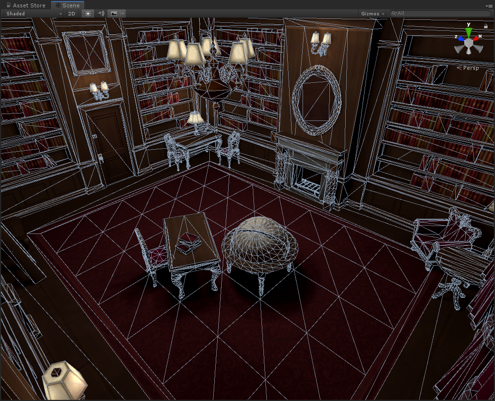
Step 4: Model the walls. Using the wall texture as a projected guide for how thick the upper and lower trim should be, I make very low poly extrusions and bevels to add a bit of detail to the wall’s edges. The library walls are a little more detailed than just tiled wallpaper texture. I want to have shelves set into holes in the walls themselves. I also chose to make these shelves at least 0.75 meters off the ground, with a huge wooden panel strip below the bottom shelf, so that players don’t have to bend over to reach the bottom shelves anymore. Using beams is an easy way to add structure and character to a room using only 8 triangles. In this library, I use beams as columns separating the inset shelves, plus a few horizontal ones across the top of the door frames. For the many bookshelves lining the walls, I start with creating one shelf, then copy it vertically to make an evenly-spaced stack of shelves, then copy that stack to all of the other walls. I quickly re-use parts of the trim texture to add some shading and character to the beams and inset bookshelves because why not, before finally cutting holes for the doors and windows. The door frames are part of the door “prefab” I have already set up, so I don’t need to include a door frame, just a rectangular hole. I use a block with specific dimensions (1m x 1.8m) as a reference for cutting door holes to make sure they match throughout the house.
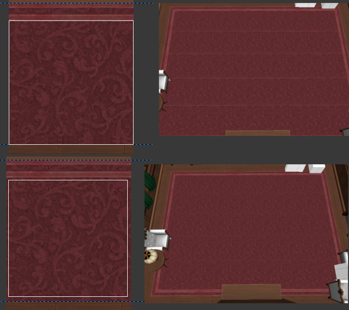
Step 5: Make the floor. I like to make a really thick wood trim around the perimeter of the room out of standard wood floorboards, then fill the center with some kind of large, repeating texture like marble tile, carpet, or parquet wood. For a basic wood floor, a large rug might work well too. For the library, I was initially just going to re-use the dining room floor geometry, but there is a section of wall (with the fireplace) that sticks out onto where the carpet would be. To prevent the fireplace from touching the carpet (ew), I had to either redo the floor with a thicker border, or change the shape of the trim perimeter to include the fireplace sticking out. I went with the first option because I thought it would look nicer.
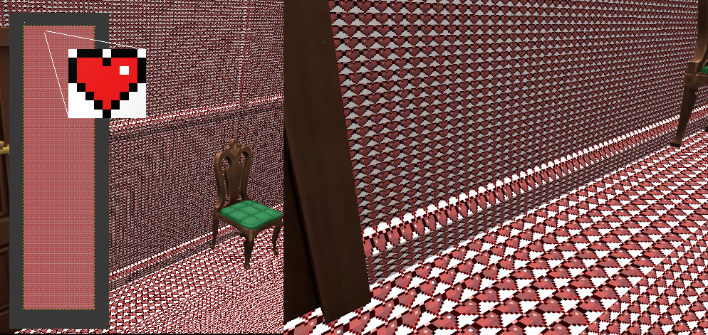
For the repeating texture that fills most of the floor, I can’t use the same type of tiling effect that I used to make the walls repeat horizontally, because the floor tile repeats in two dimensions. Just a downside of using a texture atlas. This can be fixed by making the floor out of connected squares. This has a slightly higher poly count, but not by much. Also, there’s a weird thing called “bleeding” that I have to be careful about. I need to pad the tiling square floor texture with a thick border of pixels that are relatively the same color. Otherwise, when you are looking at the floor from far away, Unity will blur the texture and reveal the edges of these individual floor squares as the carpet texture blends into the brown wood texture surrounding it in the atlas.
Step 5.5: Go back and add details to the wall columns, at the sake of more polygons, because I think the walls look too boring right now. These vertical supports with a bit of trim are nice for splitting up repeating wallpaper textures in other rooms, and you can even mount wall sconces to them.
Step 6: Fix up some of the trim textures that are too bright or dark in different places.
Step 7: Make the ceiling. I put way less effort into the ceilings than I do for the floor, but I do try to make it slightly interesting for if you happen to look up. Usually it’s some light color (reflects light well) like beige plaster, but solid wood if fine too. I like putting wood beams across the ceiling, too. This is an easy way to add a little depth in a way that hardly costs and polygons. Beams are also nice for hanging chandeliers on. For the library, I put a small square of beige plaster texture in the atlas to use on the ceiling. This doesn’t need to be properly tiled since the beams already split the ceiling into several rectangles and cover up the seams.
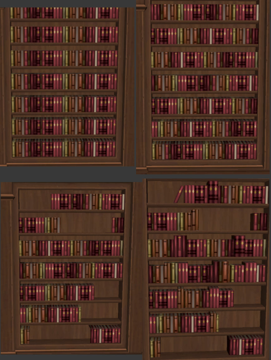
Step 8: Books. Most of the books on these shelves are going to be static props, and since they are so low poly and I have tons of space left in my atlas, I decided to model them into the walls of the room. Making the rows of books is mostly clever copying and pasting. The main row of books is only two polygons. I used the same horizontally-repeating texture trick in the atlas to make the sides and top of the books appear to loop forever. I added some variation to the books texture to include some repeating books, different shades of red, and some yellow details. To make the repeating texture less obvious, I randomly shifted this texture horizontally for each shelf, and sometimes flip the texture horizontally. Since the texture loops seamlessly, you can’t tell where it truly starts and ends. But the repetition is still obvious to the human eye. Luckily, adding more geometry detail helped hide this in two ways: I wanted to have some empty space on the shelves to hide clues in, so not every shelf is completely full of books and therefore does not show a lot of texture. I also add some extra low poly blocks for some height variation- these are just taller, thinner copies of the existing row of books. Add some slanted books here and there, and each shelf can look pretty unique with minimal work beyond copying and pasting. The final step is to copy this stack of shelves to all the other empty shelves in the room, but to make THAT copy and paste job less obvious, I shuffled each shelf vertically by simply dragging each individual row of books. Also, some of the unique geometry like the slanted books and taller segments are either horizontally flipped or simply removed.
Step 9: Recolor some props. I’m working on furniture in general separately from the actual rooms, but there are some variations on already-modeled pieces of furniture that I can make for the library specifically before moving onto the next room. First, the curtains and armchair can be recolored reddish-pink to match the room’s color scheme. To save texture space and material count, I re-use the same material with a white fabric and brown wood texture. Then, I make duplicates of the mesh with different “vertex colors” painted onto the white fabric parts. If you didn’t know, you can bake color data into the vertices of a model, and if your shader has a vertex color feature (like the VRChat shaders in the SDK), this color data is multiplied with your texture color and blended over the mesh surface based on vertex distance. Really useful stuff!
Step 10: Make some unique props like the ladder and globe. I had some room left on the atlas, but only in thin horizontal strips for trim, not a large rectangular part for the glove texture and the legs of the globe stand. That’s not a problem- I can just re-arrange the books and plaster to make a little more space. The rest of these objects are just wood strips, so I repurposed the trim texture from the rest of the room. Always recycle!
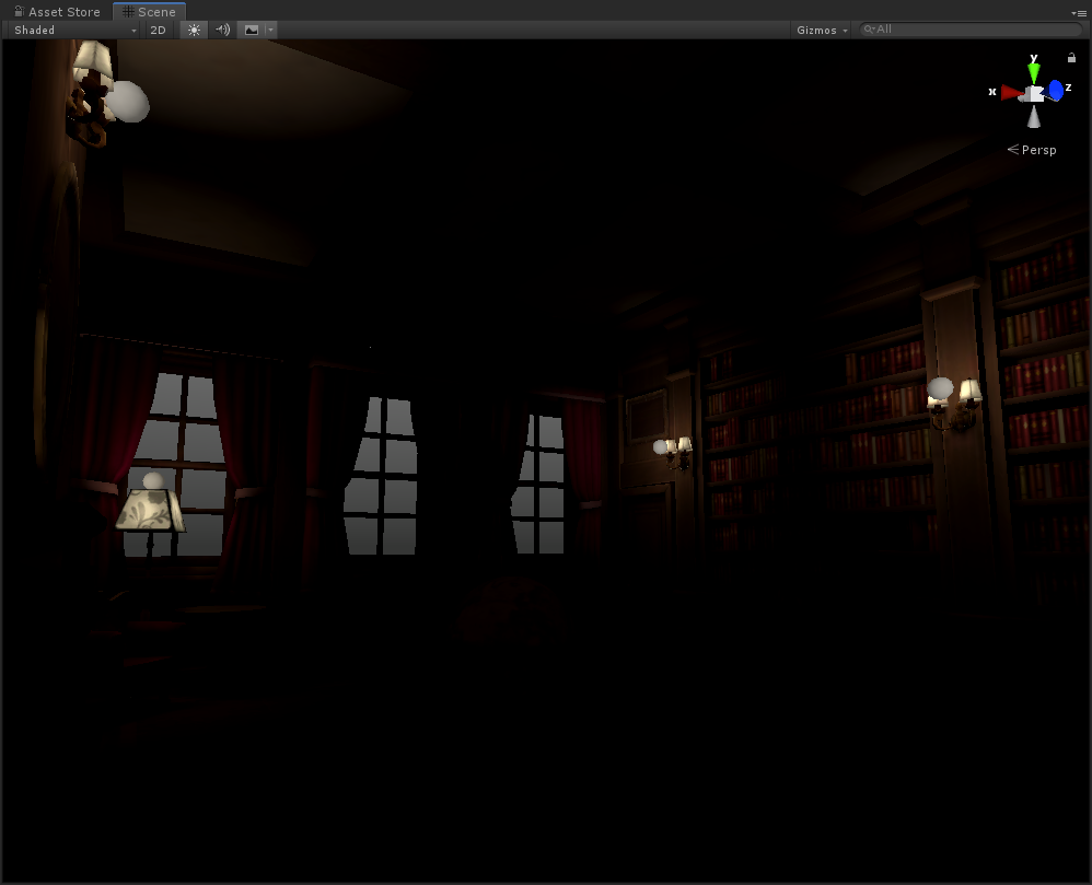
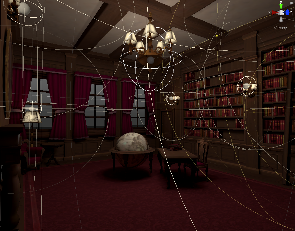
Step 11 Lighting. Lighting is super interesting and could even be its own post, but for now I just want to see what the library looks like with proper lighting. The important thing to know here is that I do what’s called “baking.” Basically, I can place lights in the scene, then run a program that “paints” lighting and shadows onto surfaces. The downside to this is that light sources can’t move. The plus side is that I can do really nice looking, complex lighting with zero realtime lights, which is great for performance. Normally, the process of baking lights takes a while depending on how fast your CPU is, but I bought a third-party plugin on the Unity Asset Store called Bakery which renders higher quality lights much faster using the power of your GPU. For one room, it only takes about 10 seconds to bake the lights. For a whole world, it might take 2 minutes. So I just go wild and experiment with what works well.
I’m making a conscious effort to make the lighting in Murder 4 way brighter than Murder 2 and 3. I was fine with the gloomy feel and game difficulty that the darkness added when you were actually playing in VR, but screenshots/video/livestreams of the game looked really bad. Murder 4 will be overall more colorful, but I will also try my best to make it seem myserious in other ways, like interesting shadows and monotonous color palettes per room. I placed wall sconces, a chandelier, a floor lamp, and a table lamp around the room to provide some light in the corners, making sure to set the fixtures themselves to “don’t cast shadows” so that the chandelier geometry itself doesn’t interfere with its own light being cast from its lamps. I also made an emission map for the material which all lights share. Then I can set the color to a dark tan to make all lampshades in the world glow in the dark. The emission on the texture actually emits light during the baking process and it even casts shadows onto the environment, but it’s pretty weak. I have to boost this dim texture-based emission by manually placing some point light sources. I might combine the light source components and the lamp geometries into prefabs to make my life easier later, if I want to change the brightness and range of light sources across the board-- making adjustments to the range on a room-by-room basis if necessary. I did this for the sconces in Murder 2, and it was very useful.
Notice that I didn’t go with candle flames this time around. This is for a few reasons. I think candlesticks were just a bit too old-fashioned for the time period and visual themes I’m trying to express for Murder 4, and they were also additive particles which isn’t great for performance.
I’ll have to come back to revisit lighting for this room because I don’t like how dark it is under the table, it’s pitch black. I also want to optimize the higher-poly models like the sconces and chandelier. But otherwise, I like how it’s coming out so far.
I’m excited to move on to the ballroom next! That room will definitely have a unique floor, and hopefully a unique ceiling, too, if I can manage to do something interesting with curves and arches.
Files