Home
Home

 Artists
 Search
 Recent
 Random
 Posts
Posts
 DMs
DMs
 Tags
Tags
 Random
 Importer
 Import
 FAQ
FAQ
 Account
 Register
 Favorites
 Login
Login

Monthly Painting INKS - WIP (Patreon)
Content
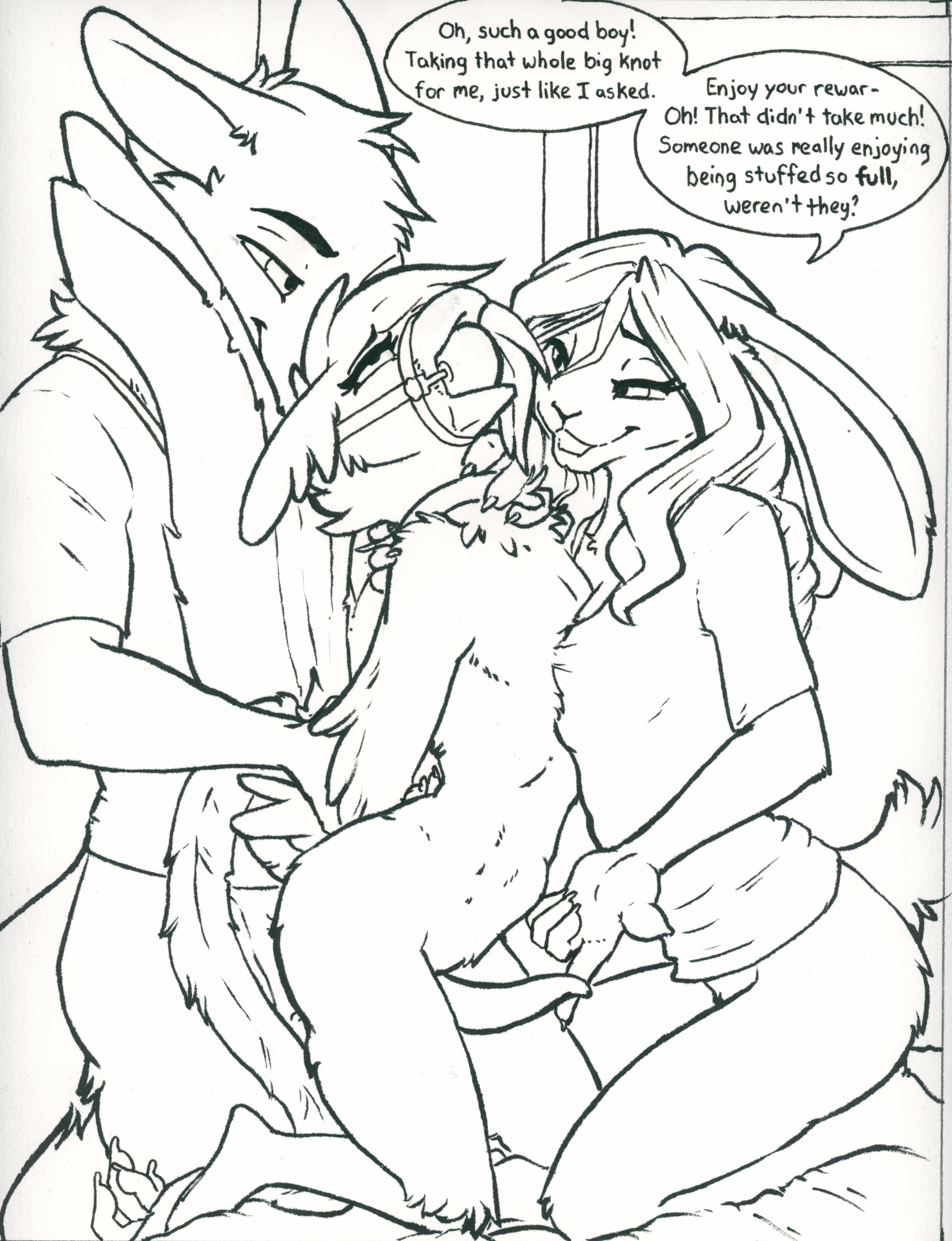
Not sure there's a ton of point posting the inks since they're pretty similar looking to the digital sketch, but eh. If nothing else you can see what I ended up doing with the text. I didn't exactly use any specific suggestion, but took the flavor from a few of them and mixed them together in my own way. I think I got something that fits the tone I want- I hope y'all like it!
I've noticed lately that the inked version of my pictures have been looking a little disappointing compared to the digital sketch, and I think part of the reason comes down to much bolder lines in the digital sketch. A lot of my pens were too fine. I thought I'd experiment and see how thicker lines look in a painting so I busted out the brush pen for the first time in a while. The brush pen causes some feathering, but I don't think that'll be too noticeable in the finished version, and I do think I'm liking the thicker lines so far.
Anyway, we'll see how it works in the finished thing. I'm off to start painting!
Files