Home Artists Posts Import Register

Content

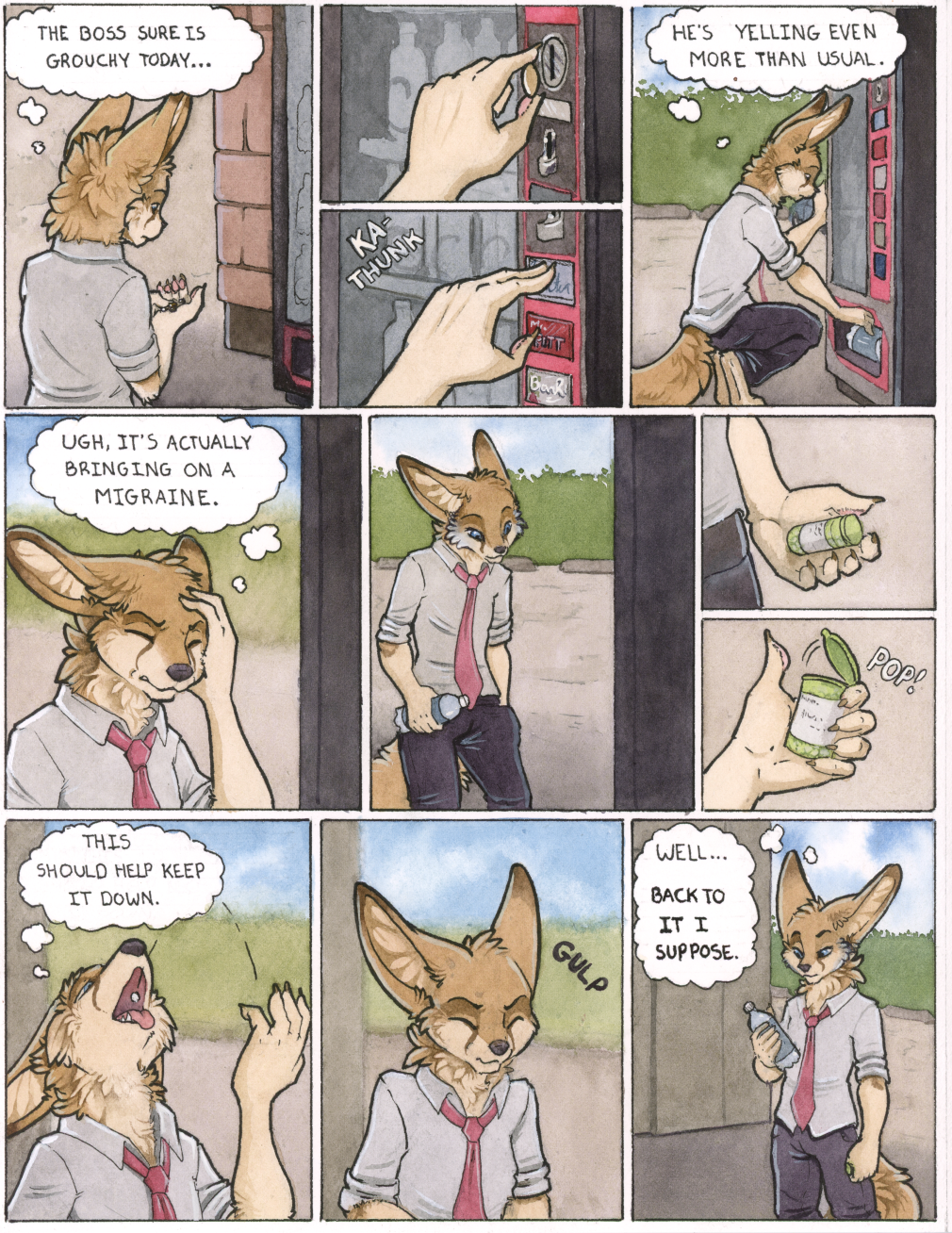
In which our hero continues to go get a bottle of water. 

I promise we're getting to the point (and the porn) fairly soon, but you'll just have to bear with me as I set things up just a little longer. I'm still too shitty a writer to make the excuses for my smut very interesting just yet, I think. x3

Still, if you happen to have any thoughts on this page, as always I'd love to hear 'em. 

Files

Comments

Bloudin Ruo

I hope you know at this point that I love your art, and I love seeing you improve. In the pursuit of that I may negatively critique things, and as an artist I hope you see it as points to improve rather than qualities you lack. So, with that out of the way, here are my thoughts. Kyle's head in panels #6 (center) and #11 (final panel) feel off. #11 feels less off than #6, but I think they both have some proportion issues that you don't have in the other panels (or any panels up until now, on previous pages). Kyle's head seems too small for his shoulders in #6, and then while the effect is lessened in #11, it still feels that way, probably because of the stout way he's holding his shoulders, making them appear wider than if looking from the front. Both panels are almost a reflection of the pose on the other, a quartering towards/45 degree shot on Kyle, so maybe the perspective plays with the proportions. I understand that your medium is tedious and that these panels are very small to begin with, and doing wide shots on tiny panels with watercolor is immensely difficult. Taking all that into consideration I think you did tremendously well with the poses and perspectives you tacked on this page. But, as I said before, in the pursuit of improvement I felt you needed to hear what could be improved. Either way, incredible work and I'm looking forward to seeing where that little pill takes him! :)

ruaidri

Hrm, you're right, I see it now that you mention it. I was hoping to touch it up traditionally as I was kind of hoping to do something with all these comic pages once I was finished, but I had to tweak it digitally to make it look decent. Ah well. Number 11 still doesn't look too bad to me though. I've tweaked it a touch but that one doesn't bother me. :P Anyway, I've updated the page if you wanna check the fix out, see if it looks any better.

Ztpia

Never rush the setup!

Bloudin Ruo

Yeah I think you tweaked the proportions in the right direction! #6 looks like an unusually hard perspective, what with Kyle looking down and to the side with that kind of expression. #11 doesn't feel like there are any issues with it anymore. Improvement is always difficult, because you have to accept that there is room for improvement in the first place :)