Home
Home

 Artists
 Search
 Recent
 Random
 Posts
Posts
 DMs
DMs
 Tags
Tags
 Random
 Importer
 Import
 FAQ
FAQ
 Account
 Register
 Favorites
 Login
Login

Hotel Inks: 01-04 (Patreon)
Content
I'll be posting the inks of each page moving forward, too.
The as-of-yet-unnamed-but-really-obvious-if-you-look-at-the-décor cabin has populated itself almost entirely with Le Corbusier furniture. A relatively safe design decision if you've got a couple dozen thousand dollars-worth of cash and little imagination in 2016, but back in the interwar period, furniture designers who would ultimately come to be called Modernists were coming to realize the potential of new manufacturing methods. Thus the emphasis on bent-steel tubing.

Hotel 01 is the first page I drew after moving to Poland for a few months. I'm getting kind of used to having to pack up all of my supplies and move to a new country, but it does mean that all of the A-E pages are in a storage shed in England, and F-G are trapped back in California. Makes it a little inconvenient to go back and check for continuity stuff in the drawings.

In Hotel 02 I was super insistent that everything the Diver is wearing and consuming is part of the cabin, so I made Renee go back and make it more visually explicit that his sweatpants and the blue drink are very solidly blue. (Sorry Renee!)

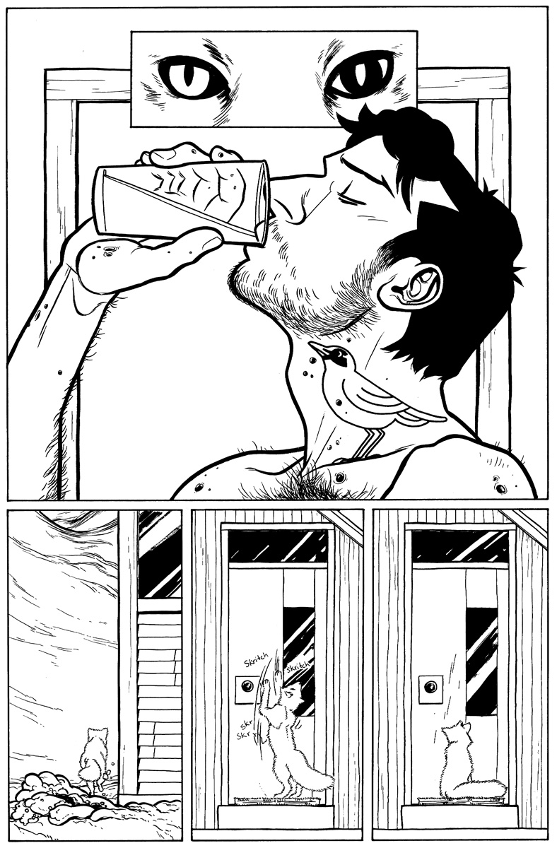
In Hotel 03 I'm still struggling to figure out how to draw an arctic fox. These aren't my favorite, but perfect is the enemy of good (or rather, the enemy of posted).

I really felt like I nailed a few of the foxes in Hotel 04. Especially the one in the second panel. I also fudged the perspective in the last panel to make more guiding lines point towards the fox off in the distance. The planks that make up the deck are parallel to the mantle that the guys are resting on, so they should really meet at the same vanishing point as that bold fireplace line (which meets the horizon behind Charlie's shoulder), but if you imagine that, you can see how the deck would be pretty useless as a design element, so instead it breaks the "rules" and has a vanishing point directly on the little fox. One of the perks of working in comics instead of something filmic is that it's trivially easy to manipulate the reality of your image for the sake of design--specifically, conveying your intention with the panel. Clarity of message sits at the top of a panel's hierarchy of needs.
Files