Home
Home

 Artists
 Search
 Recent
 Random
 Posts
Posts
 DMs
DMs
 Tags
Tags
 Random
 Importer
 Import
 FAQ
FAQ
 Account
 Register
 Favorites
 Login
Login

Making Enamel Pins - Ogre (Patreon)
Content
So back in January, in my optimism, I thought it would be a great time to finally make some enamel pins again. Between a pandemic, economic downturns, and some highly justified civil unrest, it's been quite a journey to getting these things on my desk.
That said, I wanted to give an in depth description of the process to share with you, as well as a soft opening of the store to sell them to you all at a discount, if they're something you're interested in. These'll be shipping out as soon as I have the last of the shipping materials in hand.
($) Ogre Pin - 20% Patreon Discount USD
(£) Ogre Pin - 20% Patreon Discount GBP
This is going to be a long, image heavy post describing the process of having these made from top to bottom. Hopefully this is the kind of information some of you find interesting--if you're thinking about making some enamel pins of your own, this post includes a lot of things I learned and encountered having these ogres made.
The last time I made enamel pins was for Alpha Flag in 2012, and those were pretty simple, but the process of designing, negotiate with manufacturers and finally holding them in my hands was really rewarding. Since then, a whole swath of middlemen companies have sprung up to act as intermediaries between artists/designers and manufacturers (largely) in China.
So early in the year I'd been sketching some ogres for myself in downtime. Like this:

Just doing some collaborative world building for the sake of with a friend, when I started really getting into oysters--books, news articles, wikis. Just super suddenly and unexpectedly falling down that random interest hole. It worked its way into the world building, and how someone would go about becoming an ogre in this setting. It really got under my skin, and I had to let some of the obsessive energy out in some way, so, since it's the way I find best to express that sort of thing, I figured I'd make some thing.

Here's an alternative take that didn't make it too far ghosted on top of the design I ultimately went with for comparison. I knew I wanted to incorporate some kind of pearl into the design (at this stage it could've been just an an enamel element) so I was thinking about how the pearl would've worked as a sort of pillow. It started becoming too difficult to work the limbs into a silhouette that would read well on a tiny pin, so I scrapped this direction. I did incorporate bits of the back musculature into the finished design, though.

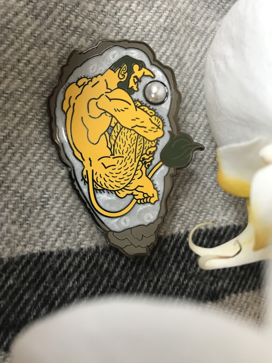
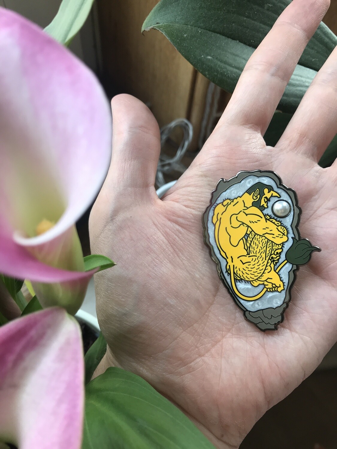
Then I remembered I'd basically drawn a perfect pose for the little guy in 2018 for Inktober--the way it nailed that dramatic super 90s anime fetal position pose was really what I was looking for. I had really wanted to make this particular drawing into a sticker, patch or pin or something, but I couldn't quite get over the hump of committing to the work it would take to make it fit one of those mediums. So when the ogre energy bubbled up, I realized it would be the perfect shape to nestle into an oyster shell, I went to work redrawing it, and reimagining it as an ogre.

Using mostly a single width brush in Photoshop, I traced (never repeat work you've already done if you can avoid it) bits of the inktober drawing that I wanted to borrow, changed the proportions to convey the scale of the little guy's body a bit better, and redrew other parts wholesale. I wanted to get a nice mix of lumpy muscularity, sexiness and cartoony appeal and I felt this struck that balance.
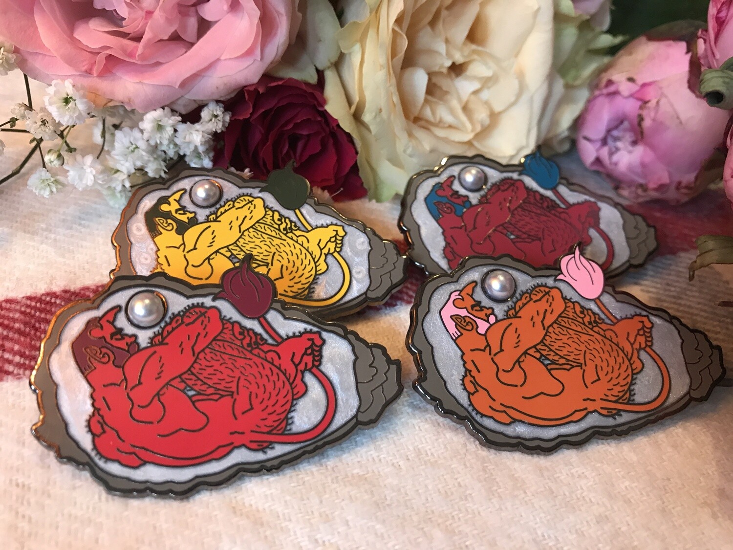
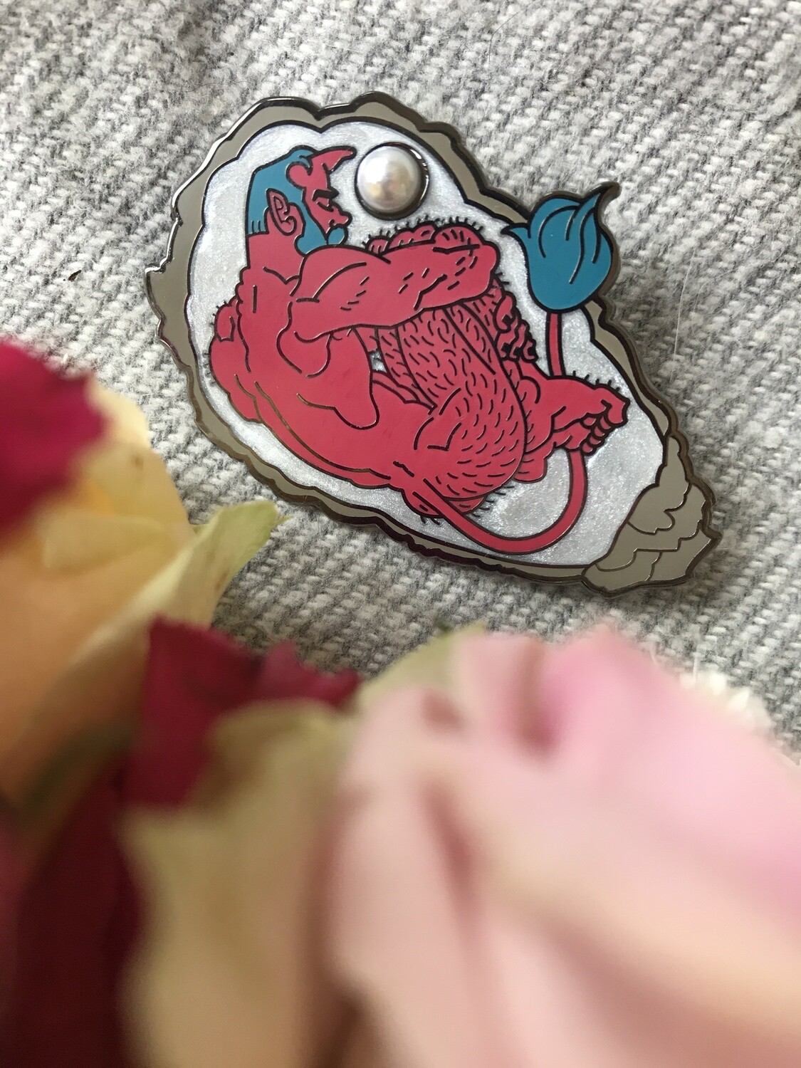
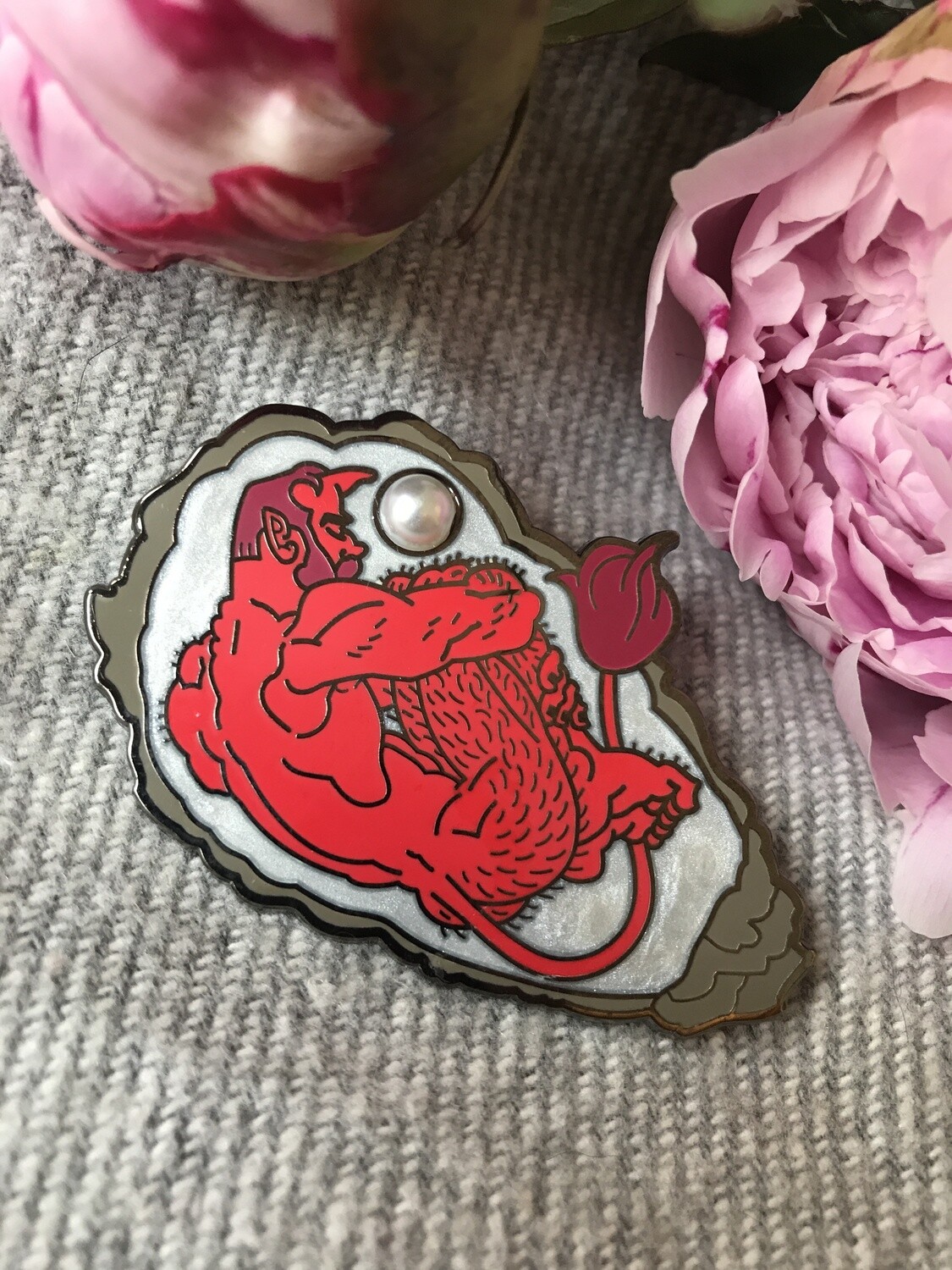
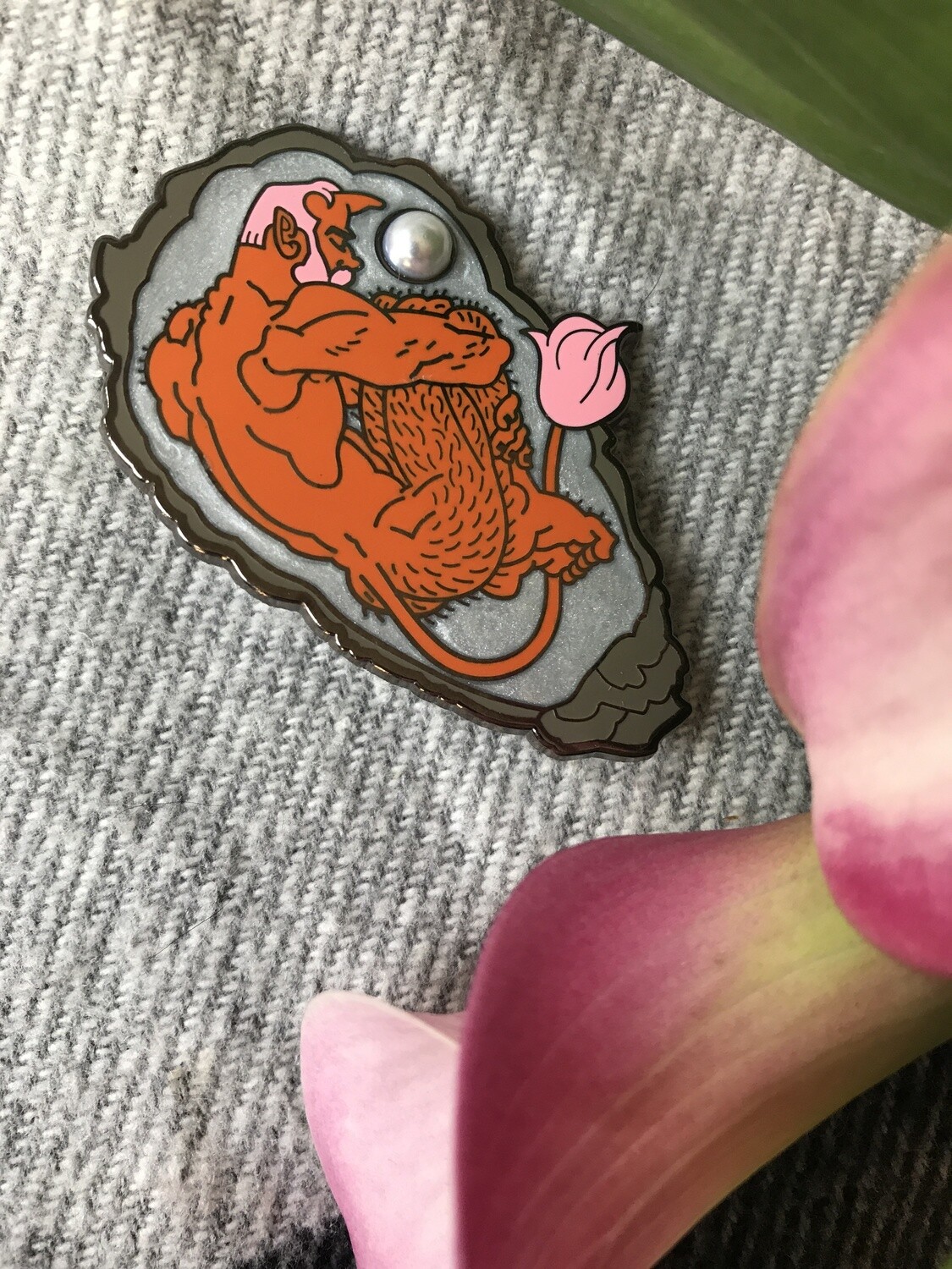
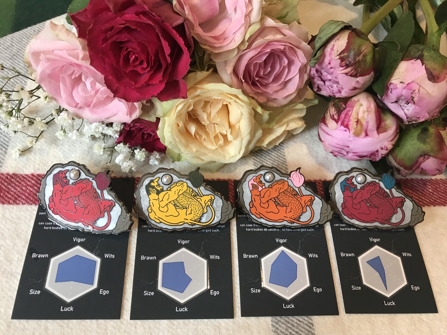
Next up was deciding the colors the pin would be. When world building, I envisioned this as the range of what the ogres skin tones would be:

So with that, I went about picking the colors for the pin. After messing around with various skin and hair color combinations, I’d landed on four separate colorways that I really liked that would be representative of the guys as I saw them in my mind. When you’re producing a pin, the lines you draw are pressed into a die that they use to cut the pins out of sheets of metal. Because the pins have to then be colored, it’s possible to have the factory do different color variations—usually for a fee. You can’t flip the design without pressing a new die, but you can make a red one and a yellow one, for example.

Now that I had nailed down all of the specifics of the project, it was time to start looking for manufacturers. The specifics being: the design, the quantity, the size, the colors, any extras that might be harder to source and very importantly, a strong eye towards a specific budget.
With that last point in mind, a good friend and fantastic pin maker offered to let me go to his sources for a quote—which because of the parameters I’d designed, ended up being unfeasible. The added expense of a middleman made the unit cost of each pin prohibitively expensive. My options were to simplify the design (one or two colorways, no pearl, smaller scale) or deal straight with a factory.
Since I’d already made pins directly with a factory before, I didn’t feel too apprehensive about the prospect of making a more complicated pin that way this time. One of the big risks of going straight to a factory is if you don’t explain your design well enough to them, and your product comes out wrong, you’ll be responsible for the mistake. They’ll largely offer you a small discount on your next order with them, but it might deter you from trying again.
Accepting that risk, I found a bunch of prospective manufacturers through Alibaba (a business-to-business e-commerce portal that allows you to contact factory representatives in China directly) to ask for quotes based on my design specs. The good thing is that if they’re not willing to try something different or complicated, they’ll just tell you no straight away, and the inset pearl really gave me a lot of NOs.
After finding a company representative who really seemed to understand my project and who I managed to negotiate a good unit price with, it was up to me to produce a finished design. You can hand them your rough drawing or sketched out idea and they’ll finish the design for you, but this is very much like throwing a dart at a really distant board. No two people will interpret your design the same way, so doing it yourself is the best way to ensure you get the lines and look that you want. And that requires a vector file!
I’m not super proficient in Illustrator, but I needed to turn my digital drawing into a finished, clean eps vector file. So I tried to think of it as a way to force some education about the brush and pen tools. There are lots of really helpful videos on YouTube these days that really accelerate getting over the learning curve.

This was what I sent the factory after redrawing the design in Illustrator. I had to make some compromises here and there, because you need to have lines that are at least 0.2mm wide, and areas of color that are at least 0.3mm across. Most of the application of color to the pins is done by hand via liquid enamel in a little syringe, so you’re constrained by the physical dimensions of the needle in how narrow spaces can get, and the fineness of the die cut lines by the properties of the various metal stamps.
Within those constraints, I had a lot of trouble filling out the leg hair, but I think what I ended up with her is an okay compromise.
At this juncture I really want to talk about color, though.
When you’re in a painting app, your screen has access to a lot of really nice, vibrant colors that are, unfortunately, impossible to reproduce in print or in pigments mixed into enamels. You’re never going to be able to get that super bold neon green to look as good on a page as you can on the screen. Sometimes it’s just absolutely impossible to reproduce light shooting into your eyes straight from the source.
The array of colors that can be reproduced by something is its color gamut. The mixing of Red, Green and Blue light at varying levels of brightness gives you a really wide spectrum of colors on a screen but with pigments, you’re constrained by the literal colors of things in the world, mixed together in novel ways to approximate various colors. There are lots of colors we can imagine that just don’t have tangible manifestations in reality—as far as we have discovered so far! That’s why your internet colors can be in the RGB color mode, but in print you need to do CMYK. The CMYK color gamut excludes a lot of those bright colors, but a printer can’t print them anyway, so it’s just saving you the pain of being disappointed later.
So to avoid all of these layers of abstraction in communicating what colors you want your pins to be, manufacturers use Pantone colors. The Pantone Matching System is basically a set of standardized colors overseen by a company that makes incredibly expensive swatch booklets that all share the same colors. You can look at your swatch to find a color code you want, and give that color code to your manufacturer who looks at their book, finds the same color, and mixes your enamel directly to that color.
It’s fantastic if you have someone to buy a $200 color swatch booklet for you, and it might be worth buying a used on on eBay if you’re looking to make dozens and dozens of pins… but I just don’t have swatch booklet money, so I used colors from pantone’s website to get them 90% correct, and the result is pretty good. I hear a lot of libraries stock the books too, so definitely look there first too.
If you don’t give them specific Pantone colors, they’ll approximate or guess, and you run the risk of your colors coming out really dull, drab or dark, which might completely ruin your design.
Which, as you can see on the left here:

The left column is what they sent back after receiving my design. Their interpretation of what I had given them. The blue haired ogre looks perfect! Just like what I asked for. But the other three? Not so much.
I had sent a single eps file with all four colorways set to different layers, with the blue haired ogre as the active layer. I guess they were working fast and assumed the file was only for him and had hastily color picked the colors of the other three ogres. Which as you can see turned out really ugly. They also had the pearl area down as “pearl color”. I clearly hadn’t communicated my idea as clearly as was necessary, and you can see how leaving your design up to interpretation can lead your project astray.
Thankfully, they’re always really invested in getting it right, and after explaining the issues, and turning in individual eps files for each color, we landed on the designs on the right.
With that, I felt fairly confident about okaying the manufacturing—which meant paying for the goods outright so they could begin (which, sidebar, I did through PayPal because of their strong buyer protections).
And then…! The pandemic largely closed down production for about three months. Nobody’s pins are worth anybody getting sick making them, and since I’d been saving money to pay for this project out of pocket I had no preorders or backers to answer to, there was no real rush.
So while waiting, I started working on the backing card that the finished pins would sit on. I had zero clue what I wanted here, so I looked up a bunch of pins to see what other people were doing with backing cards and researching lots of potential printers to see what was out there being offered.
I saw that a specific printer was offering the ability to do business cards (the perfect size for my extra large pin) with raised spot gloss on two sides, and the ability to make every back of each card different. So I figured it was the perfect opportunity to create some super tedious busy work for the sake of making the project cooler.

So I decided that every pin would have unique stats, and each card would reflect that in an individualized graph. I pulled down a list of a hundred sets of 6 numbers from 1-10, and edited my radar graph template in illustrator to output a hundred little radar graphs that I could thrown into the backing card file in photoshop and save individually. If it sounds tedious, that’s because it was incredibly tedious. Thankfully I set up a lot of guides at the beginning of the process to make illustrator and photoshop do a lot of the work, but sometimes this stuff is just what it is.
But the effect is great, especially combined with the raised spot gloss like a little dome over the graph. And hopefully it’ll connect with somebody’s imagination out there somewhere. I know that it’s the product that I would want, so that kept me going. I just dread having to produce the second set of backing cards if these all sell out--but that's a problem for Future Jon.
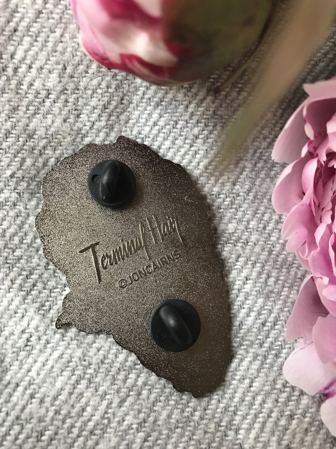
The next step was typography. I really wanted some fancy cursive lettering on this thing like I always seem to do, so I took out a bunch of pens and got to work trying all lots of different lettering paradigms. I always like to let this process happen organically, since when emerges tends to be more interesting or beautiful than what I would envision on my own. The TERMINAL HAIR back stamp lettering on the back of pin is an example of letters that I’d created this way, and I think that turned out neat. Always happy to reuse good lettering on a future project, too.


I’ve written about my typography process in other posts, but here’s how I went about it for this project. Lots of variations of the letters that I can then scan and mash together, editing for clarity and flow. You’ll often be surprised by how far you can abstract letters and they’ll remain legible. After winnowing the selection for the best looking, and best looking together letters, I ended up with this.

Which I think looks pretty neat!

I put gloss over the letters to give it some pizazz, and then added some water droplets to make it look like the marble was wet from a fresh oyster being placed there.
Since the backing card was really the only place I’d get to demonstrate the world the ogre comes from in any immediate capacity, I wanted to fill the back of the card with lots of evocative information.

I made up some non-traditional stat categories that would really evoke an image of what each person’s pin would be like as an actual ogre, both physically and personality-wise. It was satisfying looking at the random numbers line up with the ogres that they generated while I working on all of the little graphs.
I also thought it would be interesting to try to convey a sense of the backstory world building in a concise four line poem. I was honestly not prepared for the amount of editing and thinking it would take to write such a short poem, but trying to encapsulate all of my thoughts in 34 words was a humbling experience. I wanted to stick to a very strict iambic pentameter structure to echo the number of stats I’d arbitrarily chosen. A good challenge, though.
But anyway, it the cards came out super cute:


By this time, a couple of months had elapsed and the factory was back to producing, and after a couple more weeks, they were done! And then caught up in customs for another two weeks… but then they finally did arrive! Once again feeling happy I didn’t take preorders so I could avoid the anxiety of explain why they were late. But hey, check this out!

The lads arrived! In my hands. All that remained was checking them all for defects and separating them by grade, pulling together appropriate shipping materials and setting up a storefront (or in this case, two) to sell them. I’ll be opening sales up to the general public (hopefully) within a week, but I wanted to set up the storefronts to give you guys secret access to a 20% discounted version for Patrons if you wanted an ogre of your own. I’ll be shipping out those first once the fancy tissue paper I ordered comes in to ship them with.
($) Ogre Pin - 20% Patreon Discount USD
(£) Ogre Pin - 20% Patreon Discount GBP
If you're thinking about making enamel pins yourself and have any questions, feel free to comment or email me.
Files