Home
Home

 Artists
 Search
 Recent
 Random
 Posts
Posts
 DMs
DMs
 Tags
Tags
 Random
 Importer
 Import
 FAQ
FAQ
 Account
 Register
 Favorites
 Login
Login

Typography - Terminal Hair + Paleolithic (Patreon)
Content
A few people have complimented the font choice of these two title treatments without knowing that people can and still do draw calligraphic titles in the 21st century. Crazy, I know! But I figured I'd delve a little into how I go about it in case it's helpful for you, the reader. I personally love hand-drawn titles. Nothing beats letters dripping with character featuring repeated letters with their own satisfyingly different quirks!
So here we have the mock file of how I was envisioning the Terminal Hair front and back covers. This was my first time having anything printed on a RISO printer-duplicator, so I tried simulating red and green inks best as I figured they'd end up (sidebar: RISO printers are just fancy japanese copiers that do single color passes instead of black. Its appeal is that, since each color is its own pass through the machine, you get slightly off registration, interesting overlap transparency effects, and on textured paper, mottled areas that didn't receive ink. Basically, much like a silkscreen, each print is unique), on top of a low-res, simulated version of kraft paper.
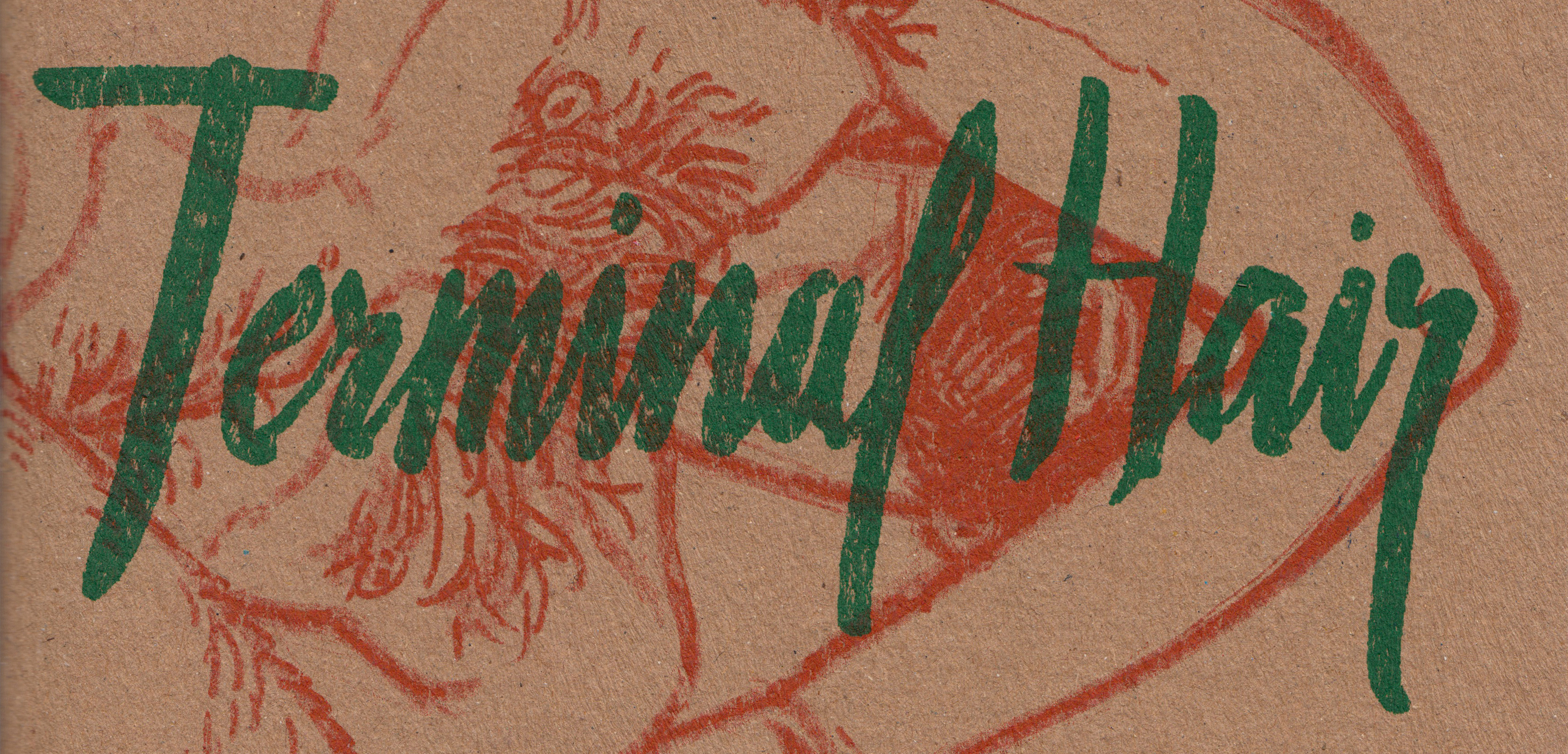
For the cover image, I did a big hero shot in pencil, and then wanted to cover his face and torso with the title of the book. He'd extend to the back cover so when you put two books next to each other, you'd see the whole image. I had two separate ideas for the cover--a huge, thick title that would lead to a lot of green-on-red overlap, and the narrower one that I ultimately chose. Let's start there!

Here's my finished title. It looks pretty solid, I think! Each letter has individual character, and they all flow neatly together. But really, it's a digitally-composited Frankenstein's monster of various passes.

As you can see here, I drew as many takes as I thought it took to get a nice version of each letter, based on the concept I had in my mind. I was looking for a sort of masculine, aggressive handwriting that was classy enough to contrast with the drawings of minotaur penises you'd find in the book.
I played around a lot with the first and last letters of each word, playing with just how loud I wanted the character of the descenders and ascenders to be. Terminal came together really quickly, but Hair eluded me. I couldn't quite get the right leg for the H out of my pen. In the end, I constructed my own H digitally out of the single lines down at the bottom, and incorporated what I considered a successful air from the earlier passes.
To make these I used a single pen: Kuretake Disposable Pocket Brush Pen - Extra Fine
I ordered the pen after seeing another comic artist using it to great effect in inking his pages… and then I absolutely hated it for inking! Fortunately for me, it makes fantastic letters!

The second title treatment idea I had wouldn't die, however. Big, fat letters taking up the bulk of the page. Bold, wet, aggressive. I ended up lettering the concept anyway and made it the inside front cover. You open the book up and on the right it's a full-page pencil drawing of a foreshortened naked dude, and on the left, this:

It has a really nice life to its lines. I wanted an English-language version of the aggressive, one-take look of East Asian calligraphy. I thought the spontaneous look would match the pencil interiors thematically. So the idea was to, as Ms. Frizzle says, "take chances, make mistakes, get messy!"
I've retained some of the hideous takes for honesty's sake. You can see I had similar struggles with the H, once again. I didn't end up using any of the numbers or my name. I ended up using a font for various elements of the book design (page numbers, URLs, bylines and such). I think the real reason there is an attractive cursive J still eludes me.
For these, I used a Pentel Pocket Brush Pen
Back before I started working on Alpha Flag, I used the Pocket Brush's trashy cousin Pentel Color Brush (now known as Pentel Art Brush, apparently) to ink literally everything to ween myself off of microns. The Pocket Brush is a more durable version with shorter bristles. It gives great chunky lines that I find hideous for the type of controlled lineart I like to produce, but once again, great for super expressive letters!

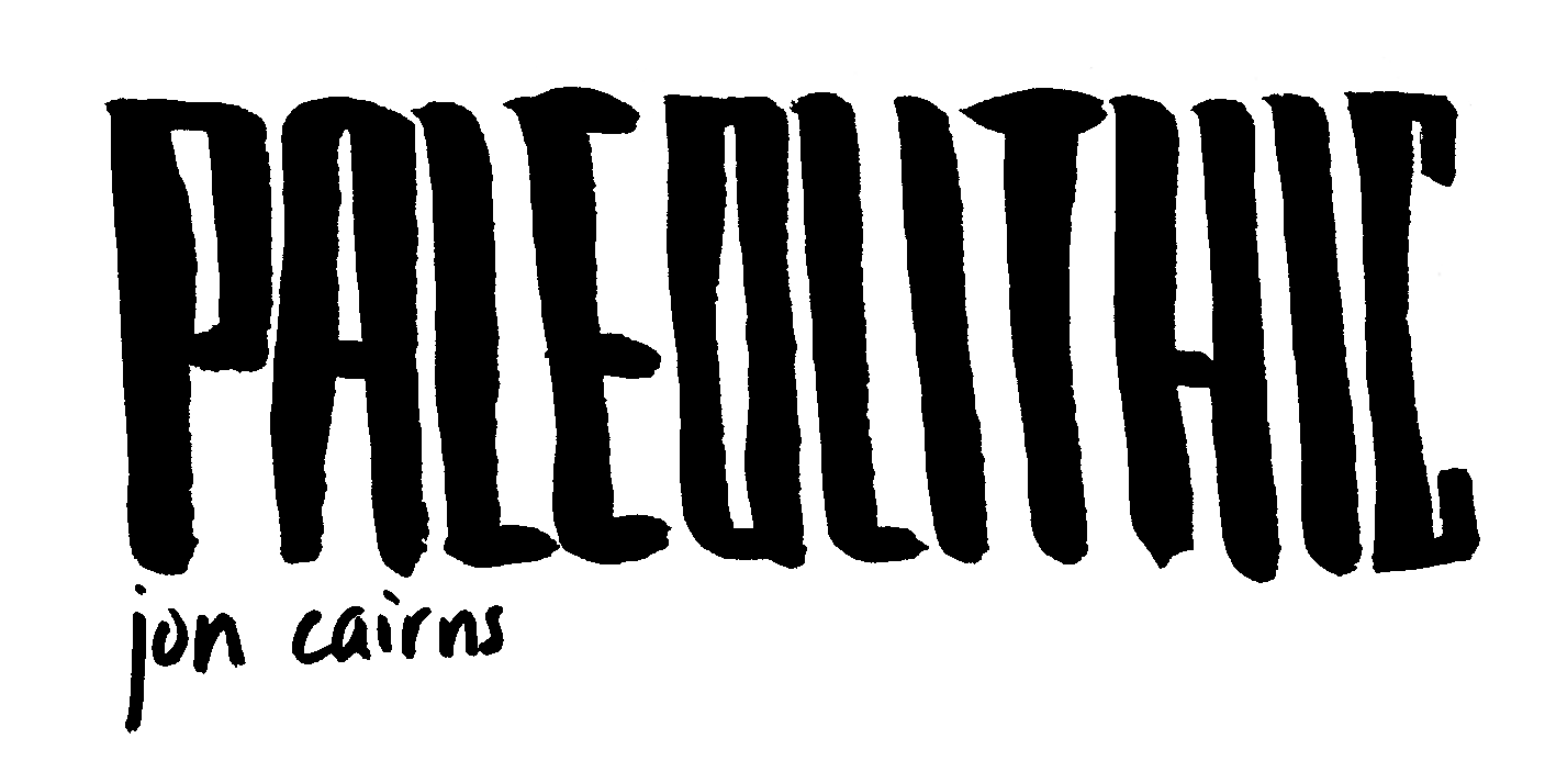
A few months later, it was time to create a cover for my 8 page porn minicomic, Paleolithic. If the concept of the Terminal Hair zine's title treatments was supposed straddle the classy/trashy divide, the concept of the Paleolithic book was quite obvious: caveman art.
I imitated some Paleolithic-era cave drawings (charcoal or ochre on stone) in simple black crayon, and set them above the title.

I wanted an unrefined, simple look for the letters. Here, I used the same two pens: Pentel for the title, Kuretake for my name. For the title letters, I kept a stiff arm and made all perpendicular lines made holding the brush pen in an unchanging orientation. All vertical strokes would end up being thicker than horizontal ones.

Pretty simple! As you can see it came together pretty quickly (also, bless that THIC C C " ' at the end there). The first two passes were a little more wild before I reined it in on the second and so forth lines.
You can see after the first abortive PA attempt, I tried making the title with the Kuretake, thinking I could blow it up and threshold it neat. I decided against that, thinking it was giving up, and went back to the Pentel and eventually got some passes I liked.
Not pictured here is the lighter, colored lines I ruled onto the paper at the top and the bottom of each letter to keep the heights consistent. That's why they're so even and straight. It's definitely not me doing that naturally.

Some final tips!
• Knowing what mood/feeling/statement you want your title (and the individual letters that make it up) to convey goes a long way towards decisively choosing the right shapes and tools to render them.
• Experiment with different pens, and different scales of letters with each pen. A pen that you hate to draw small letters with might be your absolute favorite pen to draw HUGE letters with. In the end it doesn't matter what size they are since you'll resize them on the screen to fit your purpose anyway. Don't be afraid to draw a title huge on an entire sheet of paper.
• Even if you work digitally, all of the rules still apply! Don't be afraid to experiment with different brushes and programs. All that matters in the end is what you end up pulling together from all of your effort. Digital, traditional, a letter from here and there. Hitting your goals with that final treatment is all that matters.
Files