Home
Home

 Artists
 Search
 Recent
 Random
 Posts
Posts
 DMs
DMs
 Tags
Tags
 Random
 Importer
 Import
 FAQ
FAQ
 Account
 Register
 Favorites
 Login
Login

Bernard's Halloween Obesity (Patreon)
Downloads
Content
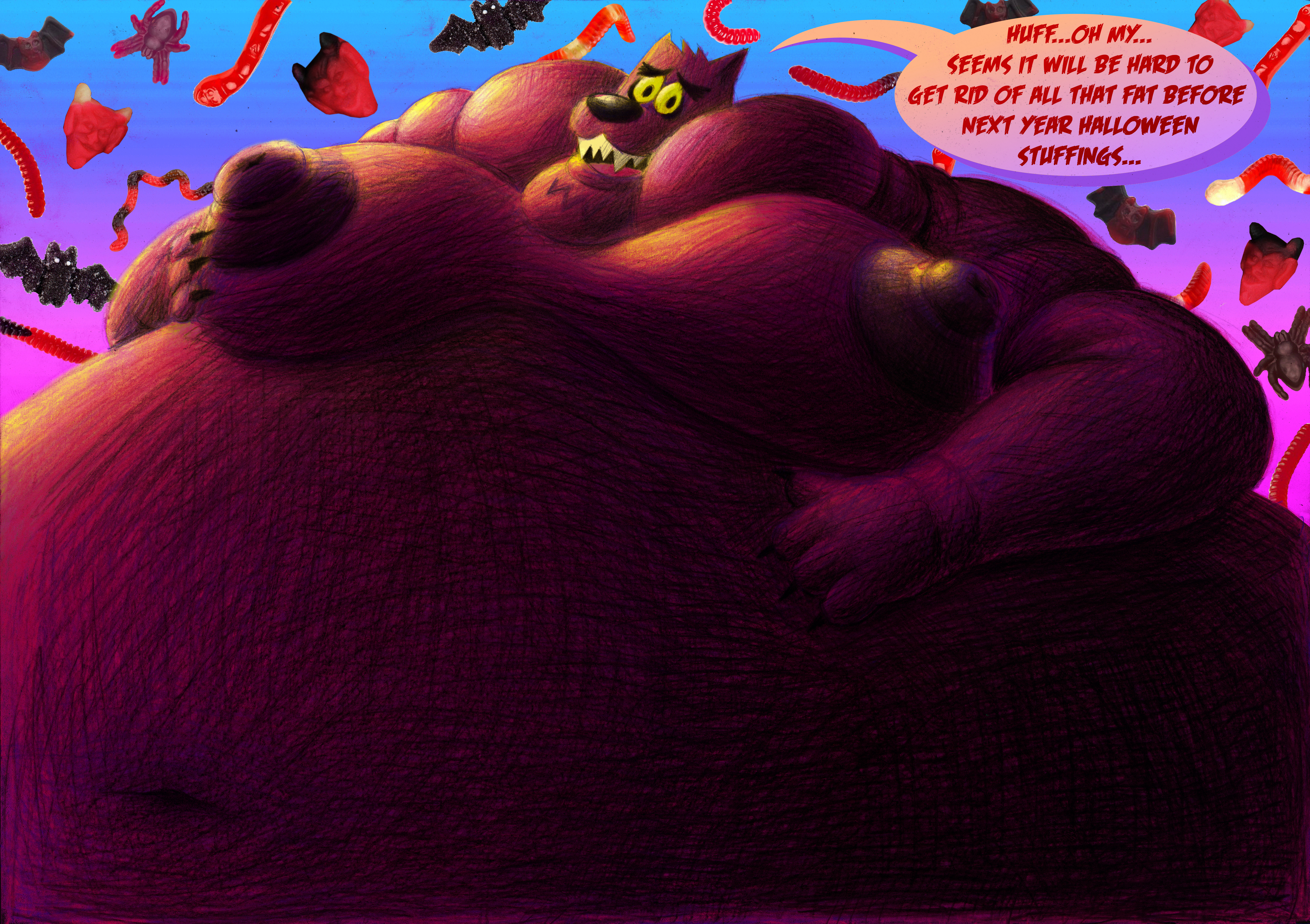
Finally, my 4th and last drawing for my fat Bernard sequence. I'm glad to finish it at last, surely it was a really good one and quite nice attempt to combine horny stuff with photo collage and retro aesthetics. Of course, last two parts can seem repulsive for someone but what can I do? I'm into multiple things and I'm glad that every each part of that sequence has it's own audience to love it.
To be honest, I'm not 100% happy about how that one went out. First ones were extremely good and realistic because I used photo references for them but there are no real refs for such bodies and also I have got some problems with lighting. I choosed very difficult angle for light, rather speaking it so happened by itself when I started to put first shading on Bernard's cheeks. As a result, upper part of drawing looks maybe not bad but the belly looks just like shapeless wall of lines, it can be called a really round shape. That's actually why I even decided to not upload original scan anywhere, it's not enough appealing for me. At least it's my own opinion, some people still liked it a lot.
Anyway, it was my first try to draw extreme stuff with obesity and I'm glad to make it, hope next time it will came out better.
I also faced a hard choice between two types of light. Really liked blue light, it looked like a moon shine but I wanted to use different gradient for background with the same blue color. Such color scheme didn't look bright enough and so I decided to use yellow type. Anyway, I saved that blue light version with dark background as alternate image.
Files