 Home
Home

 Artists
 Search
 Recent
 Random
 Posts
Posts
 DMs
DMs
 Tags
Tags
 Random
 Importer
 Import
 FAQ
FAQ
 Account
 Register
 Favorites
 Login
Login

The Young Protectors - Coda, Page 13 (Patreon)
Content
—
Are you a reader of color? I need your help.
This is long but please be patient with me, it’s important.
So, a few years back a reader wrote to me with a concern about the coloring of our characters who have dark skin (i.e. Tsunami and Fluke). They pointed out that humans, all humans, have significantly less melanin in their palms and the soles of their feet. (And, as it turns out, thicker skin that blocks sunlight and less sun exposure in that location, as well.) And so, for folks with dark skin, this means that their palms and soles will typically be less dark than the rest of their bodies.
In traditional comics coloring, this difference has been ignored, with the palms and soles of people of color rendered just as dark as the rest of their body. In fact, I’ve had difficulty finding any example of this difference being reflected in the coloring of published comics, even independent comics (although there is, at least, one exception from a creator I admire.)
As you know, the whole reason I chose to get into making comics was because I wanted to depict folks who have traditionally been poorly represented in mainstream comics—LGBT folks, people of color, people with differently-sized bodies, etc.—as heroes. I wanted to create representation that was positive and felt real.
So when this reader approached me with this concern—which they felt very strongly about—it seemed like a no-brainer. I was prepared to unilaterally ask our artists for this change.
I happened to be at a convention when I heard from this reader and, as it turned out, wound up seated at a table for lunch with a bunch of comics coloring professionals and other artists, some of whom were people of color. I casually mentioned what I intended to do, and was surprised by their reaction: they strongly discouraged me from asking for this change.
Here’s the counter-argument:
When the reader reached out to me originally, one of the reasons they believed I should make this change is because they felt our art style is “realistic.” This reader might, for example, give The Simpsons a pass on this detail but, because of the “realism” of our art, it felt to them like a glaring and offensive oversight.
That this reader feels this way about our comic is, of course, a compliment to Adam’s and Vero’s tremendously strong art. But the truth is, our art is not photo-realistic. It certainly is more naturalistic than The Simpsons, but it’s a stylizednaturalism. Just like in manga, this is not how people would look in a photograph. So that means any choices we make will 1) not look 100% real and 2) can be an indication that we are highlighting something “important.”
The argument that these colorists made to me was that, by insisting on this change, I could be highlighting racial differences (they used the example of “blackface”) and could make folks feel less well represented, not more. They argued, strongly, that I could be hurting and offending the very folks I was trying to represent fairly.
Obviously, that would be the last thing I would want to do. So it gave me pause. And when I checked in with other artists of color (and readers of color) at other conventions and elsewhere, I got either shrugs or similar warnings not to do it.
But I still find the original reader’s argument compelling. And now we have a second voice, new commenter Clinton O. (Hi, Clinton!) who expressed the same concern on the last page, as that first reader did all those years ago. As a white person, making this change still seems like a good idea to me. But my primary rule when it comes to depicting people who are different than I am is to listen, listen, listen to the folks I’m hoping to represent accurately before making my choices.
So, I’ve asked Vero to give her best efforts to show what the difference would look like. And I’d like to hear what you think in the comments.
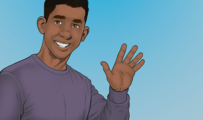
Here is the original panel from page 12 of this Coda:
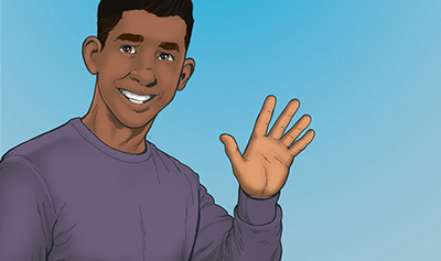
And here is Vero’s rendering of that same panel, based on my desire to address this concern:
So, now I want to hear from you, our readers of color.
Should we make this change for our dark-skinned characters? Or should we just keep doing what we’ve been doing? How would either choice make you feel?
For this one issue, for obvious reasons, I’d like to just hear from our readers of color on this. (And by “reader,” I’d ideally like you to have commented at least once before on this site—I really want to hear from folks who actually are our awesome readers and not strangers from the Internet on this.)
Please let me know your thoughts. I still haven’t printed Volumes 2 or 3 of The Young Protectors. Once we go to print, I won’t be able to make a different choice. And if the choice I make is offensive to folks who have already been treated badly in comics, then I will have made a decision that goes against pretty much everything I’m trying to do. So now is the time to resolve this, once and for all, because I trust y’all and, ultimately, I want to make sure our readers are cool with the choices we make about these sorts of things.
Thank you all for sticking with this long explanation and for being such superheroes. You all totally rock. Please let me know your thoughts.
So! Looks like Kyle is on a first date! And it’s going to begin with some jazz music in the park! What will Kyle think of the music? Is Sameer really a “very nice boy”? And is that a plus or minus for our firebending hero?
Tune in this Wednesday to find out! Hope to see you there! :D
Files
