Home
Home

 Artists
 Search
 Recent
 Random
 Posts
Posts
 DMs
DMs
 Tags
Tags
 Random
 Importer
 Import
 FAQ
FAQ
 Account
 Register
 Favorites
 Login
Login

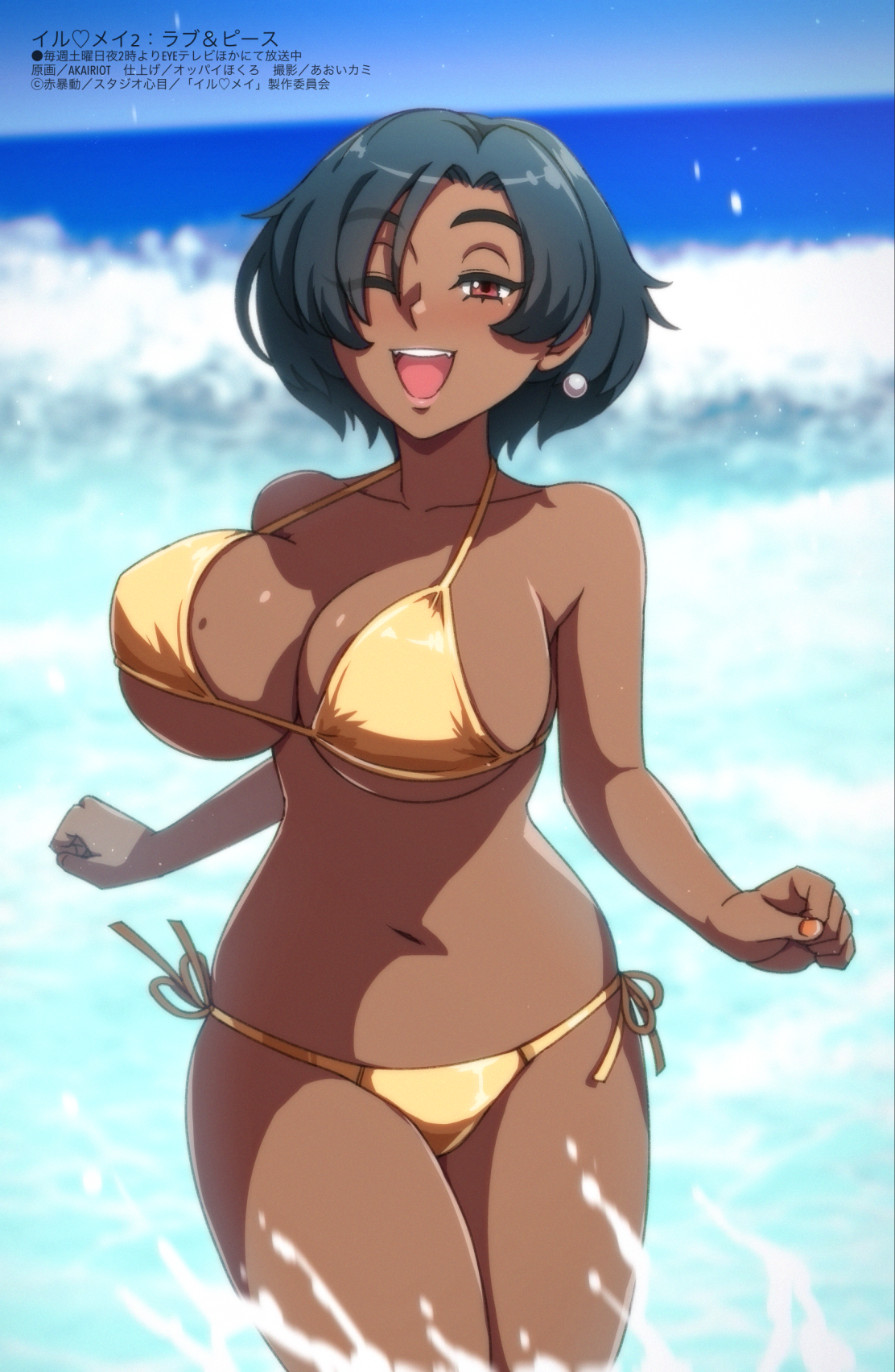
Love and Peace (Paz, Original) (Patreon)
Content
I tried everything I learned while studying the clean/crisp anime style that I love, and I think what I came up with really sells that feel! Or maybe it could be an old pinup from Megami Magazine -- in fact, I spent an hour studying the corner credits on actual Megami Magazine pinups and tried to replicate it for an alternate version. Maybe nobody will appreciate that but me, but it feels really cool to see one of my characters looking like they're on a real show, lol.
I did all the line art for this on a vector layer, which I'm not really used to using -- it allowed me to get some really crisp lines, though! It's different from my usual style, but I hope you'll still enjoy it.
(I'll start working on the Paz bonus art tonight and hopefully have it done tomorrow!)
Files