 Home
Home

 Artists
 Search
 Recent
 Random
 Posts
Posts
 DMs
DMs
 Tags
Tags
 Random
 Importer
 Import
 FAQ
FAQ
 Account
 Register
 Favorites
 Login
Login

LESSON - Composition Basics (Patreon)
Content
This lesson covers the basics of composition, specifically to be applied in gay NSFW art.
A quick explanation on the subject: Composition is a big part of what makes your art look appealing, eye-catching, and well-put-together. It’s how you compose a piece, arranging the different aspects and elements together, to create something aesthetically pleasing.
Elements of Composition
There’s many different ways of listing the elements of composition, but for our purposes, it comes down to these 4: Positioning, Lines and Angles, Contrast, and Balance.
1. Positioning
Where is your character positioned in the canvas; where is his head, or his pecs, or his dick located? Where are the background elements positioned?
All of this determines which part of the drawing becomes a natural focal point.

Example 1: The tree demands more focus than the actual characters in the shot.

Example 2: The meeting of characters is the focus, but it’s way off to the right side of the canvas. Looking at it is awkward, making you want to look further to the right of the canvas.

Example 3: This vaguely symmetrical arrangement works in some situations, but not all. The tree still ends up being the major focal point, while the characters are secondary. This composition is heavily used in the movie The Grand Budapest Hotel, among other experimental media

Example 4: Probably the best choice for this shot. The tree is out of the way enough that it sinks away into the background. Both characters become the focus of the shot, with a little contrast between the two (one’s silhouette is partially consumed by the tree, the other is fully against the sky).
This also brings up a common rule of thumb when it comes to positioning: the Rule of Thirds.
Essentially, our eyes naturally gravitate towards the 1/3 and 2/3 lines of the canvas.
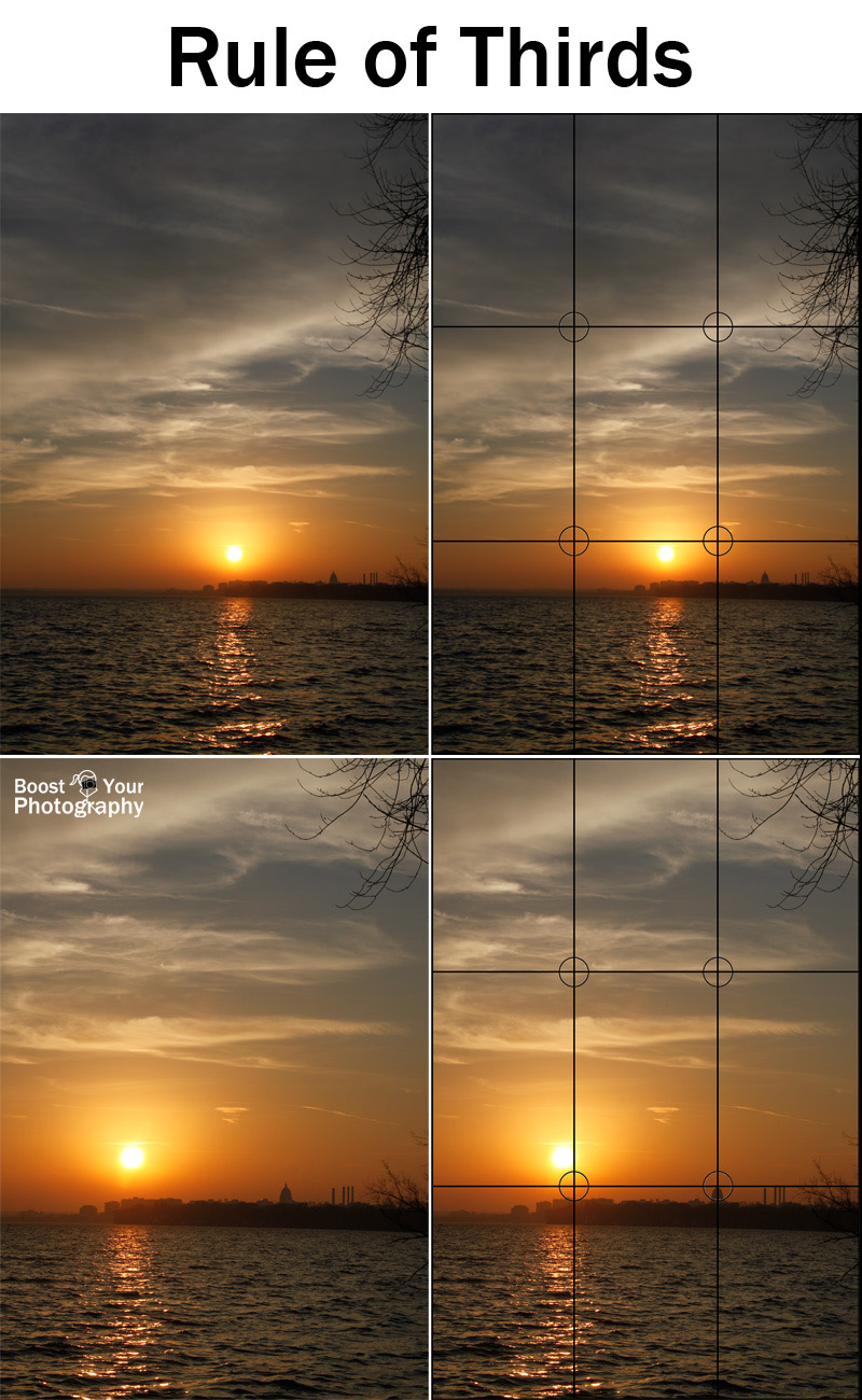
Placing the focal points of an image where these lines intersect often makes an appealing picture, giving it a sense of depth and direction.
2. Lines and Angles
You’ve probably seen a lot of muscle guys taking a selfie from a low angle. Why is that? Because it makes them look bigger, and highlights the shape of their bodies.
Lines and Angles governs dynamism, excitement, and tension. It’s the difference between this:

And this:

Now the topic of Lines and Angles is *Vast*. There’s so many different ways you can manipulate it to achieve different results. However, here are a few rules of thumb:
- Low angles give a sense of grandiose, makes the subject look bigger, more dominant, more imposing, i.e. you’re looking up at someone big.
- Slightly high angles give a sense of diminution, makes the subject looks smaller, more submissive, but also works well with making them look rebellious, i.e. you’re looking down at someone.
- Very high angles or a bird’s eye view gives a sense of detachment, like you’re looking down on a scene as an observer.
- Tilted angles give a sense of dynamism. It makes it seem like the scene is alive and moving, as if your view isn’t steady, adapting to the changing circumstances.
- Straight angles give a sense of blandness, but can also give a sense of tension. This is probably the hardest to take advantage of, coz you need the other elements to supply the things that this angle lacks.
- Lines lead the eye, place focal points along existing lines in the composition

3. Contrast
In short, Contrast makes different objects discernible from each other.
At its core, you want your subject to pop out from the background, and you don’t want random things popping out to steal attention from your main subject.
There’s several main ways you can apply contrast:
- Value contrast: Differentiate foreground and background by using similar values.
In this example, the background is very light and pale, the foreground is darker.
- Hue contrast: Use warm/cool colours to separate BG from the focal point
In this example, the subject is primarily warm, while the BG is almost entirely cool. Note how the red condom packets are more like dark magenta, and the bronze lamp base is almost a gray-brown. - Saturation contrast: Exactly as it says. Even if everything is around the same hue, having the subject be decidedly more saturated than the BG will help it pop.
Here the subject is almost bright orange compared to the brownish background.
- Size/Proportion contrast: Using angles, you can make one thing take up more space than another thing, in proportion with the canvas. This works even though they might be the same size, or maybe even one thing is smaller than the other. (I don't have a good example for this one unfortunately)
- Patterns and pattern-breaking: Simply put, when something deviates from an established pattern, it creates contrast and catches attention.
Basically like this

4. Balance
Lastly, balance is probably the hardest to describe. It kind of comes down to these two things: Focal point(s) and Flow.
First, Focal point(s): You want one or two things to be the focal point. If everything is too contrasted and tries to pull your attention at the same time, it just ends up looking flat. For example, a picture with 4+ characters each doing their own thing is gonna look less aesthetically pleasing than a character with 1 or 2 characters doing One thing together.
This pic looks unfocused, with 4 different characters trying to grab your attention, compared to:

Another example, an artwork with too many different colours is gonna look less impactful compared to one with a distinct and well-balanced colour scheme.

This piece, for example, looks unfocused. The subject stands out enough, but the background feels messy.
Compare that to this, where the background melds together into one platform for the subject to stand on and bask in the attention.
Secondly, Flow: You want the elements that exist in your drawing to guide the eye through the canvas, and importantly towards the focal point. You don’t want the elements to lead the eye to stagnate and just stare and one place, or worse, be led off away from the focus of the picture.

This example doesn’t have a very good flow. Everything just sort of exists there, without really leading the eye towards any particular part of the canvas.

This example also doesn’t have the best flow. The left character brings the eye away to the top left corner of the screen, while the trail of blue serum leads the eye away to the right; all in all pulling the view away from the main event in the middle of the canvas.

Meanwhile, this piece has an excellent flow (special thanks to my friend OG-San who helped me with this piece). Using text bubbles along with sight lines and natural curves of the body, it leads the eye not only towards the focal points of the piece, but also guides it temporally to read the story in order.

Others
There’s many other intricate elements that make up Composition, which may or may not be related to the 4 points explained above. I definitely recommend getting other resources to have a better grasp of this concept.
---
As always, if you have any questions, feel free to hit me up in the Art Labs channels in the AA Labs discord!
Files
