Home
Home

 Artists
 Search
 Recent
 Random
 Posts
Posts
 DMs
DMs
 Tags
Tags
 Random
 Importer
 Import
 FAQ
FAQ
 Account
 Register
 Favorites
 Login
Login

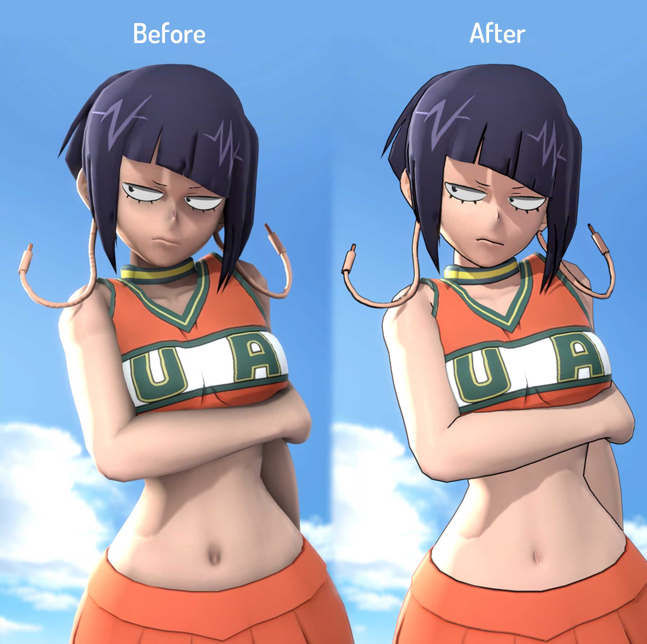
Help me by voting on what looks better please and thank you (Patreon)
Published:
2020-08-06 20:10:45
Imported:
2020-08
Content
So I've been using the style on the left for the last fucking however long and I'm really annoyed with myself for not experimenting more now, because I think the answer is incredibly obvious as to what looks better
Please lemme know below which style you like more, though I think it's pretty obvious
Files