Home
Home

 Artists
 Search
 Recent
 Random
 Posts
Posts
 DMs
DMs
 Tags
Tags
 Random
 Importer
 Import
 FAQ
FAQ
 Account
 Register
 Favorites
 Login
Login

Behind the Screens: What's in a name? (Patreon)
Content
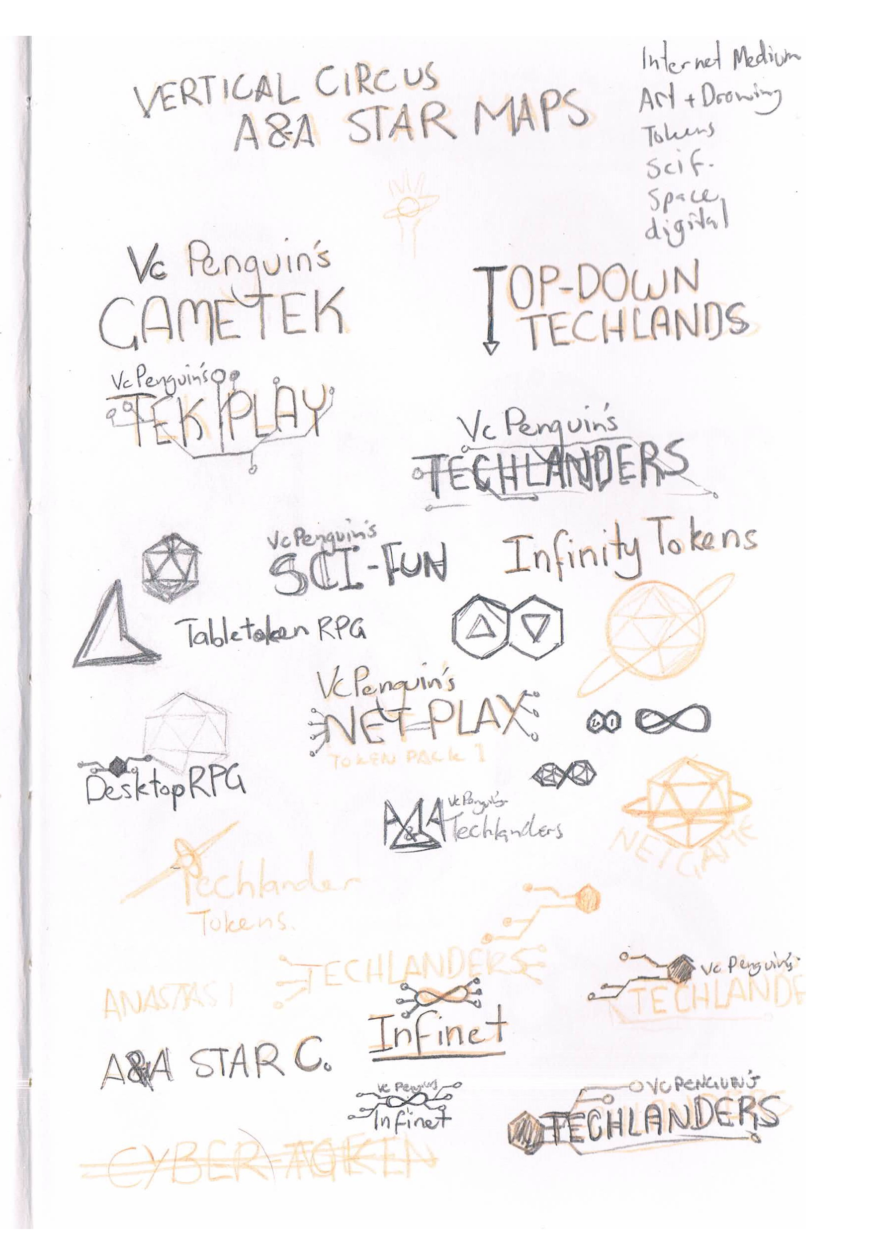
What's in a name? A lot of testing, apparently.
Hello All. I promised behind the scenes stuff and I hope some of it is interesting or even useful to some of you. I'm glad I have an outlet for some of the work that didn't make the final cut but I'm still quite proud of. This Post is the development that went into making the Techlanders title image and logo design.
The name "Techlanders" comes from my method of referring to fantasy settings as "Magic land" or "Fantasy land" to define the allowance for why a situation may arise. The project being centered on dystopian, cyberpunk, futuristic science-fiction, the name was explored and I liked the way it sounded. Now I use it to affectionately refer to the character tokens made for the series.
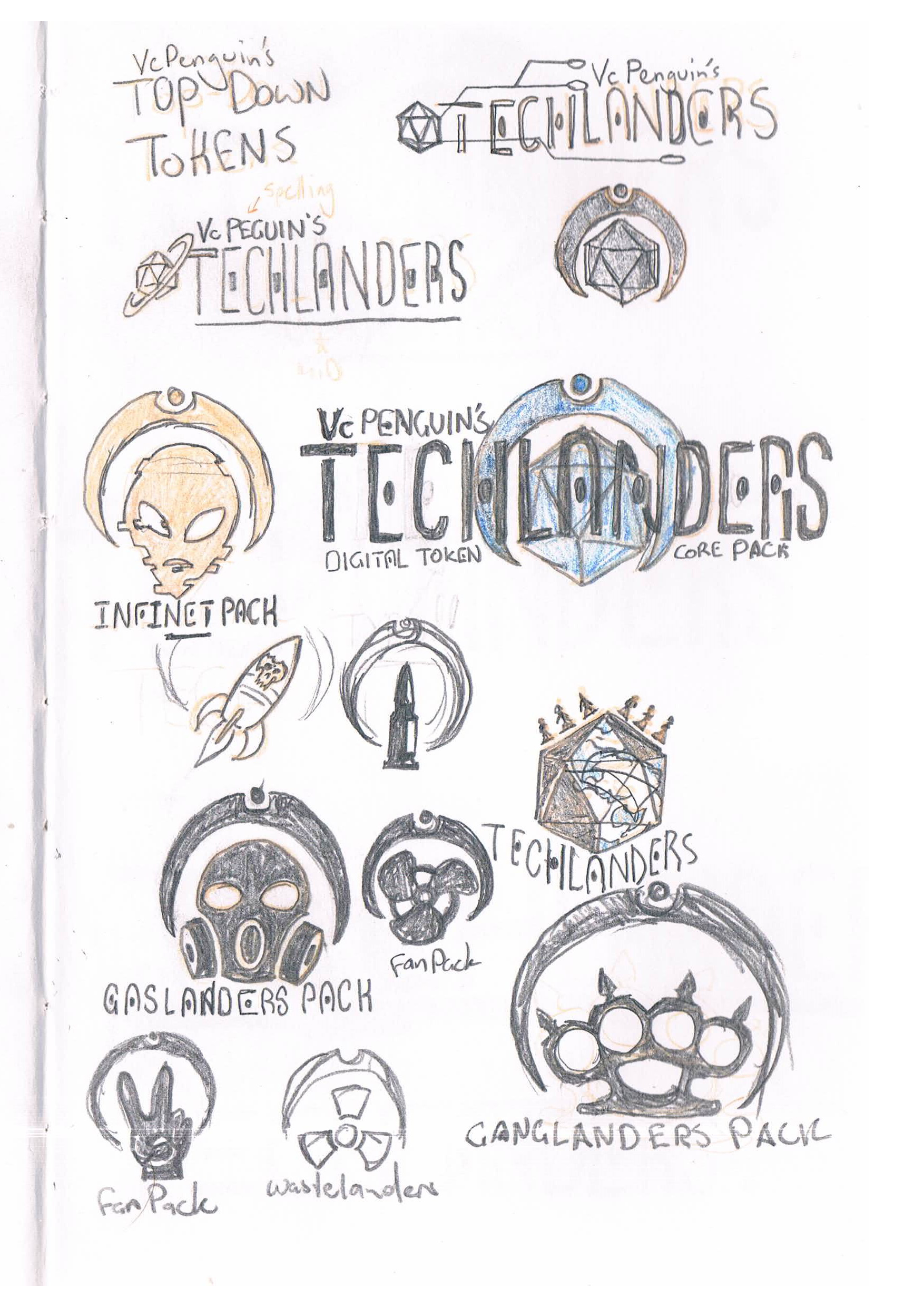
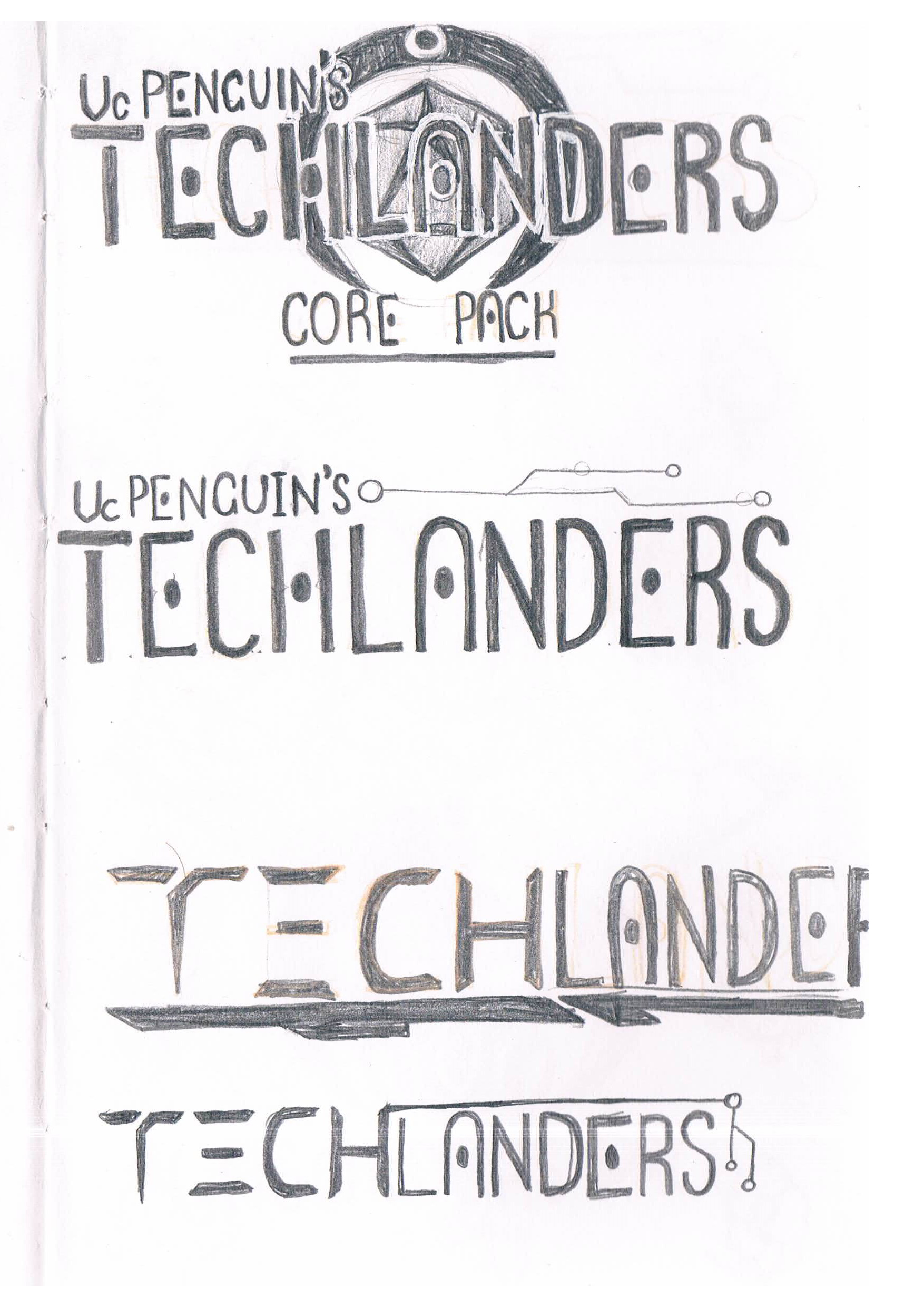
The final design required making a new font that I intend to refine and even release as a downloadable font some time.
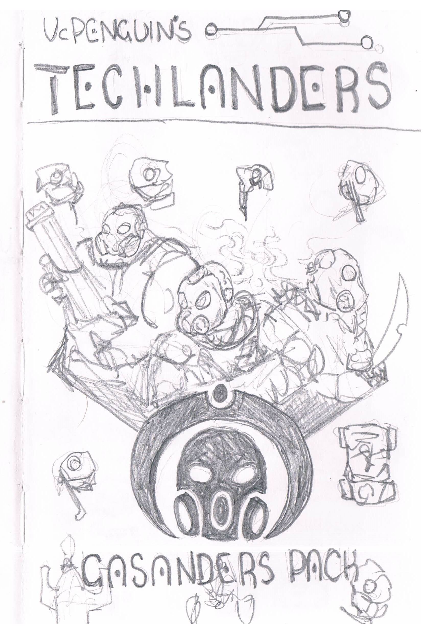
The logo design was developed with consideration to wanting to release packs of Techlanders via online stores like DriveThruRPG and the Roll20 marketplace, so I wanted to give clear reference to the style of each pack but to make sure there was a cohesive sense of branding that would allow it to look neat when lined up together. This is why I included the crescent design and kept the theme logos black and white.
If themed packs end up being released I will create cover page illustrations (as with the Starter Pack) for each as I like the implication of having the characters illustrated in scene.
I hope this little article provided some insight and I'd love to see comments if you got any special use or interest out of it, or if you'd like longer articles in the future.
Thanks for reading,
VcPenguin.
Files