Home Artists Posts Import Register

Content

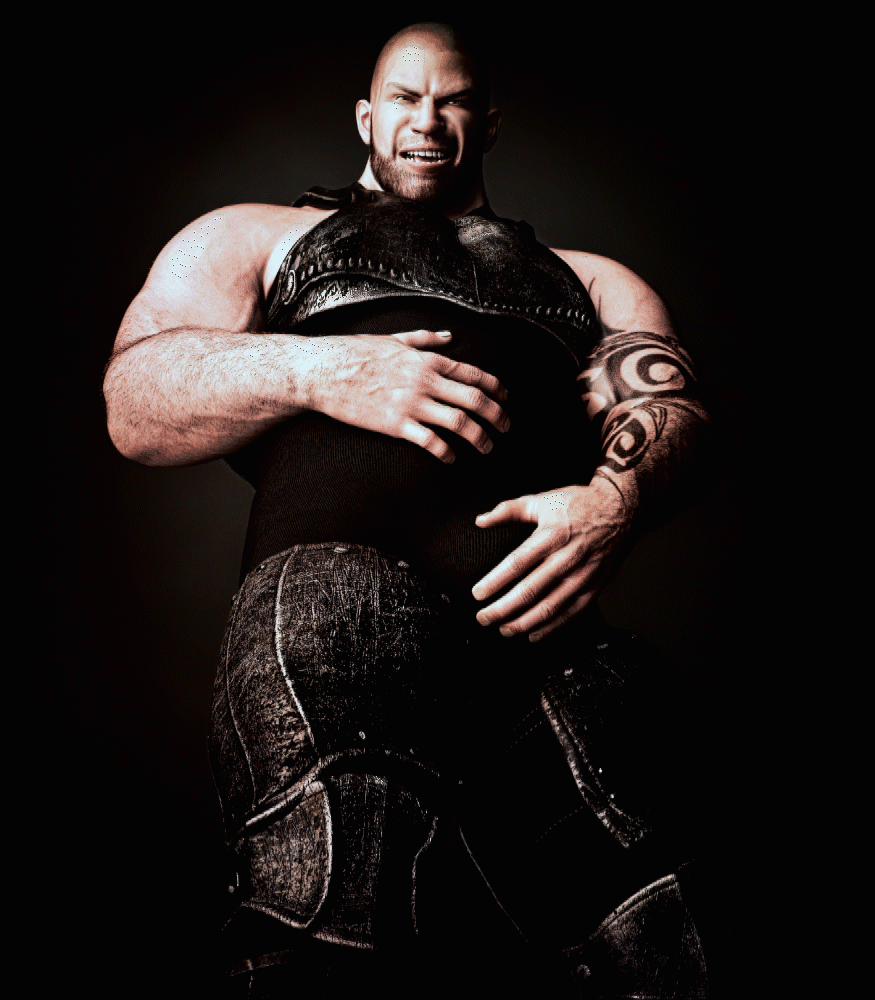
The dark style or the light style?

These are two different artistic styles. The first graphic style is dark and gives a realistic appearance to Tobias. I find that the palette of color is very well associated with the story of Tobias who is a hunter of Demon.

The second graphic style is a warmer dominant color and brings out the details. Artistically speaking, it is the better.

I ask you this in order to know which version I should publish for this series of three images or you will see Tobias dressed and ... without his armor!

In comments, mark 1 for dark or 2 for light style.

I will take into account the majority choice (of Patreon/Tumblr and FA).

you have until September 7 to give your choice.

Files

Comments

Tobymanic

going with 2 for light.

Wolfie Randolf

2 for the tone, but.... 3rd option is to find a happy medium where it does both bring out the flesh tones, but also dark enough to bring out the dark atmosphere (Hollywood does that allll the time, look at underworld for an idea... though they have a strong blue-white filter going on lol.) If you didn't know about it, look up a concept called "color timing" (If I don't have my terms mixed up, this is what is used to mess with the colors and balance of any given part of any given picture/frame at any given time, a lot of the time one can fool around with just the flesh of a person/character and then given their armor a completely different thing so that the flesh, or the armor/wardrobe is the focus or has a darker/lighter thing about it... but you probably already knew this stuff , just putting it out there jfyi if you didn't. And forgive me if my nomenclature is wrong.

Anonymous

Going with #2 myself

Karew

#2 light

ADGames

I did not know the term "color timing", usually I work with instinct. However the procedure seems similar to what I already do: Selecting a colors don the spectrum is between dark tint and light tint. In this case on the choice 2 (dark) I realized something different in order to use the shadows as a dominant element. Thank you for your suggestion ;)

ADGames

here is a sample of a less saturated version. <a href="https://i.imgur.com/RVbmfOv.jpg" rel="nofollow noopener" target="_blank">https://i.imgur.com/RVbmfOv.jpg</a>

Anonymous

2, light