Home
Home

 Artists
 Search
 Recent
 Random
 Posts
Posts
 DMs
DMs
 Tags
Tags
 Random
 Importer
 Import
 FAQ
FAQ
 Account
 Register
 Favorites
 Login
Login

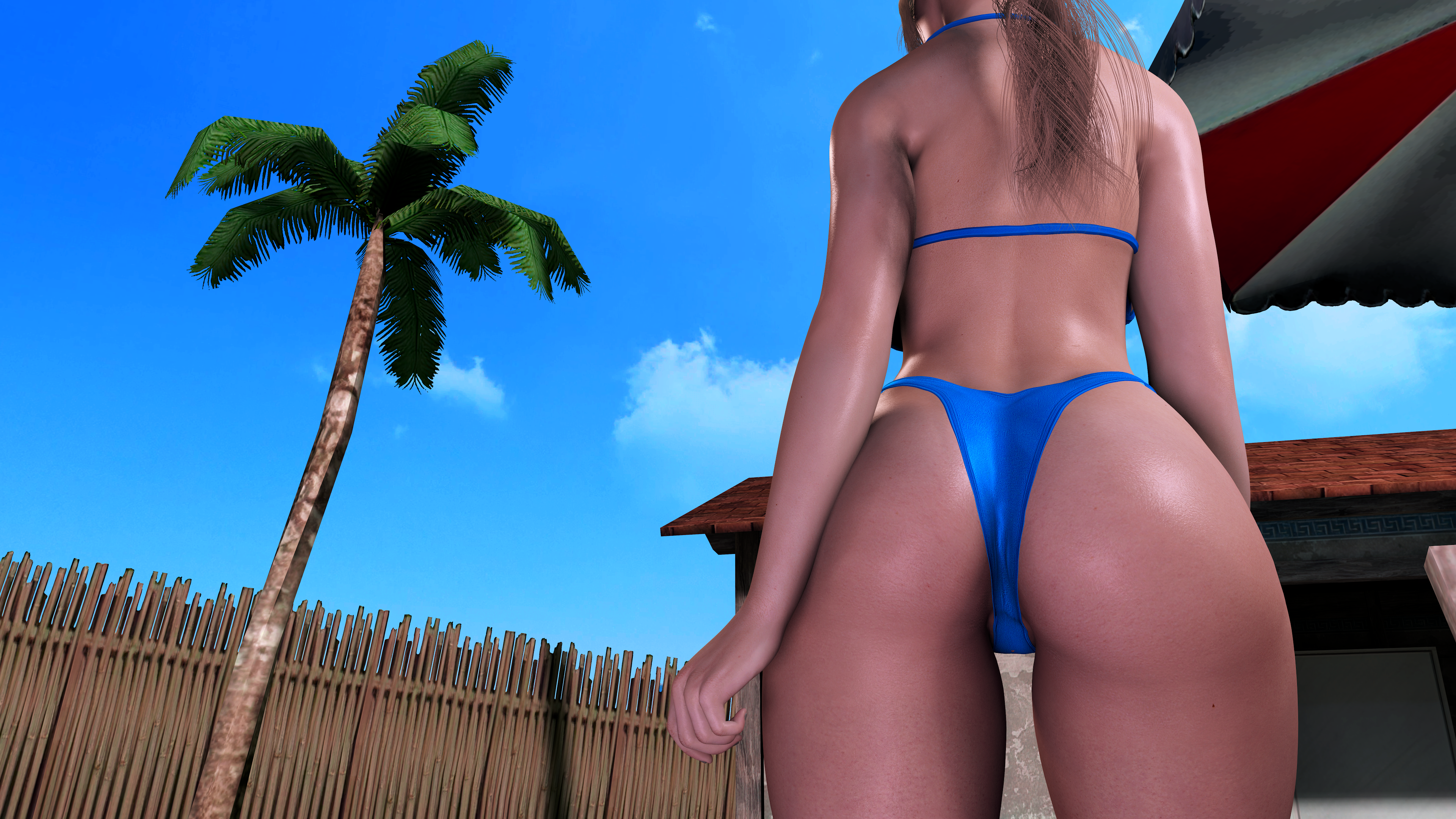
Which Do You Prefer? (Patreon)
Content
First picture is edited, second picture is not edited, lemme know which you prefer in the comments!
I only ask because the way I take the photos they are in UHD but I use post processing that only shows up in HD pictures. I take these two photos and mix them together in Photoshop to create the first image that is supposed to be in UHD.
I personally see a very large dip in quality between the two however I really prefer the edited version that has DOF and color correction. But I'd rather get y'alls opinion and see if maybe more people preferred the unedited just because it's cleaner.
So yeup lemme know!
Edit: Thank you guys! Y'all basically confirmed what I had a feeling about. Keep the skin from the right, keep the background from the left. Woop woop teamwork make the dream work!
Files