Home
Home

 Artists
 Search
 Recent
 Random
 Posts
Posts
 DMs
DMs
 Tags
Tags
 Random
 Importer
 Import
 FAQ
FAQ
 Account
 Register
 Favorites
 Login
Login

Newest art with Commentary. Enjoy the pierogies! (Patreon)
Content
Hello everyone, I hope you are staying safe and doing well. I’ll drop a few colorful drawings on you and attempt to brighten your day with my newest collection of work.
For the past few months, I’ve been primarily doing cover design and commercial art rather than my traditional black and white sci-fi stuff. Though somewhat out of my element, I’ve experimented with bolder colors and more kid-friendly designs, as well as a lot of 19th-century inspired pieces for covers and interior print layout work.
Attached to this post is a look at some of my favorite recent pieces destined for shirt and product designs. I thought that a little commentary about them might be fun for patrons. These are in my Seatropica and Turbo Volcano lines of clothes.
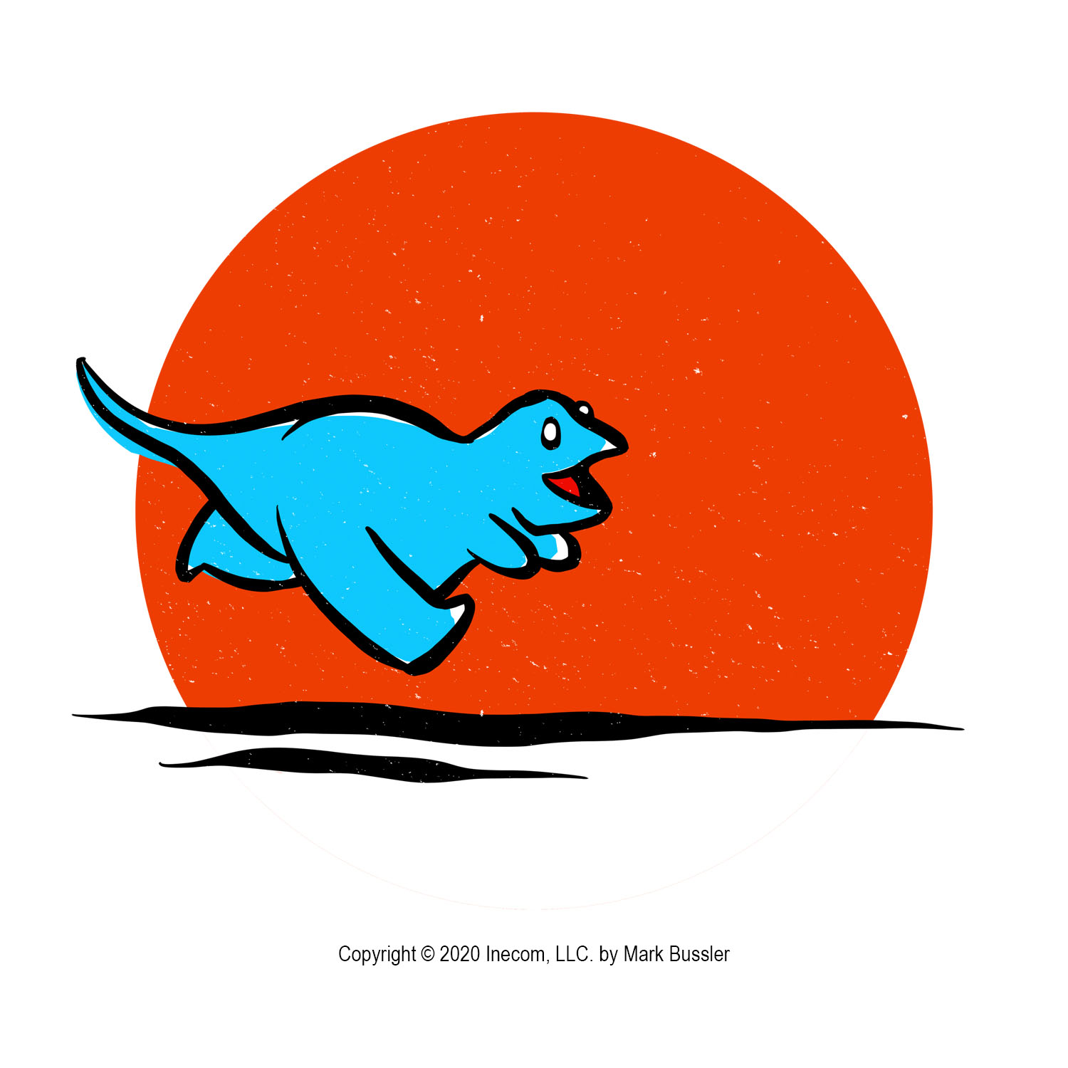
1. The dinosaur running is based on a sketch that I made for my drawing dinosaurs book a few months ago. I’m working to break animals down into the fewest shapes possible for “cute” style drawings, and I think that particular sketch turned into a fun and colorful t-shirt. The legs were tough to get right. I like the look on its face.
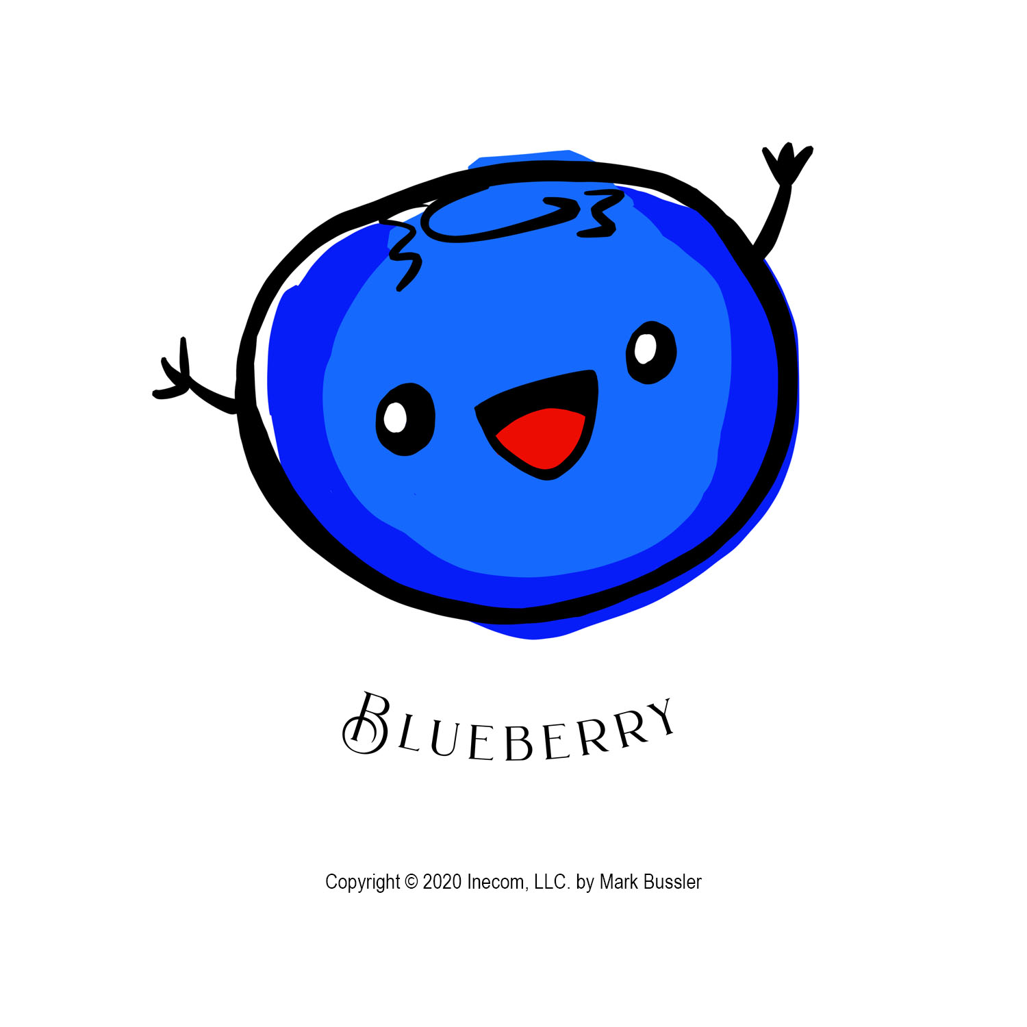
2. You might think that blueberries are just blue circles, but actually they’re like deformed ovals with many shades of blue. I based this cute blueberry drawing on a photograph of a real blueberry (that I ate afterward.)
3. The mermaid design is for my Turbo Volcano line of clothes, which is basically stuff that I would wear. Who doesn’t want mermaids to be real? That’s done with vector graphics and, though simple, it’s the phrase that really makes it.
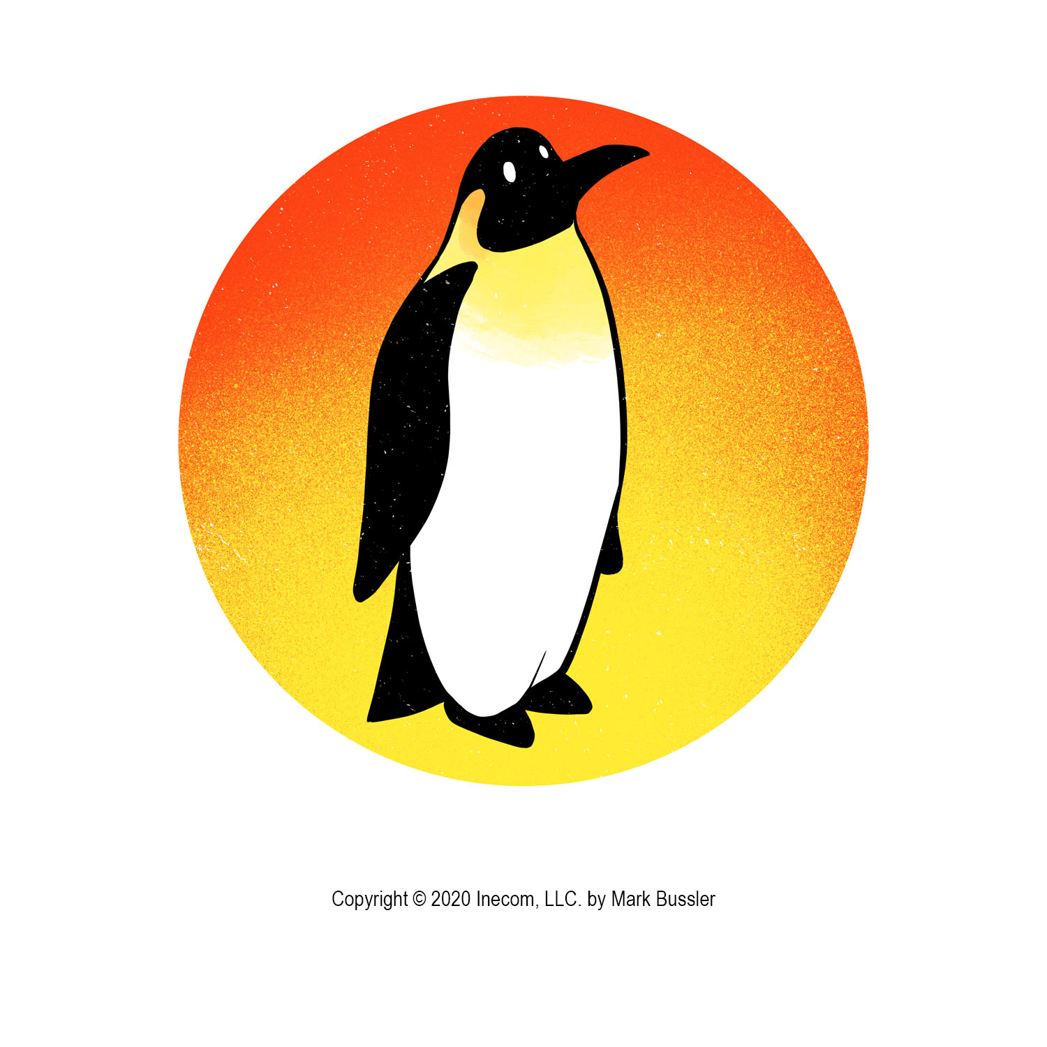
4. I’m not totally satisfied with this penguin drawing, but it makes a nice shirt. It’s based on a pencil sketch that I’m going to break down into even fewer components for another design soon. I do like the look on its face and the background.
5. I love my jalapeno drawing, maybe because it’s modeled on top of a photograph of a jalapeno that we grew (and ate not too long ago.) I’m working more with fast stroke colors that don’t need to fit into the lines, I think it works well for cute drawings and loosens them up. I don’t really care for the vector graphic, perfect line, super-cute style out there. I prefer something a little more hand-drawn.
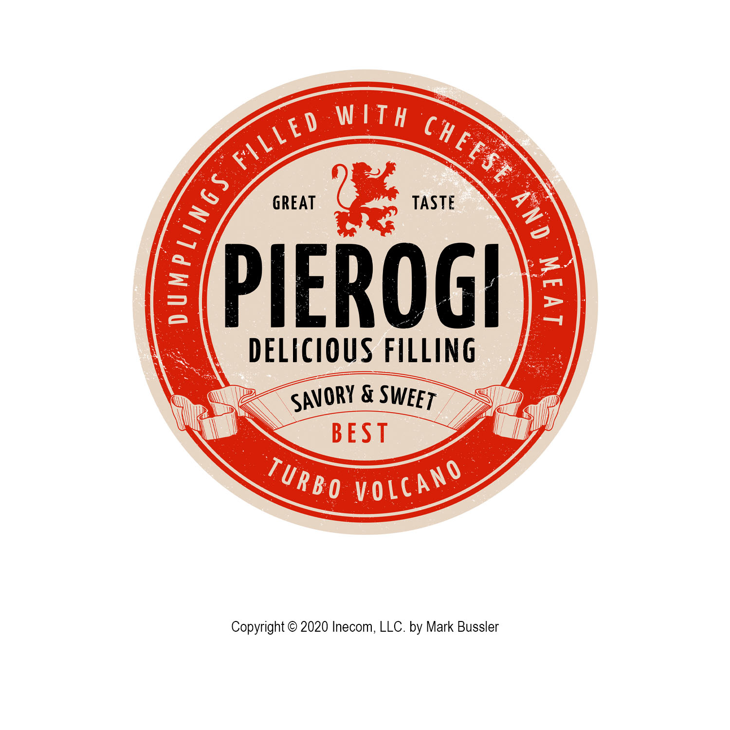
6. The pierogi design is a template that I converted from beer into a pierogi because why not? I’m pretty happy about that. I like beer and pierogies.
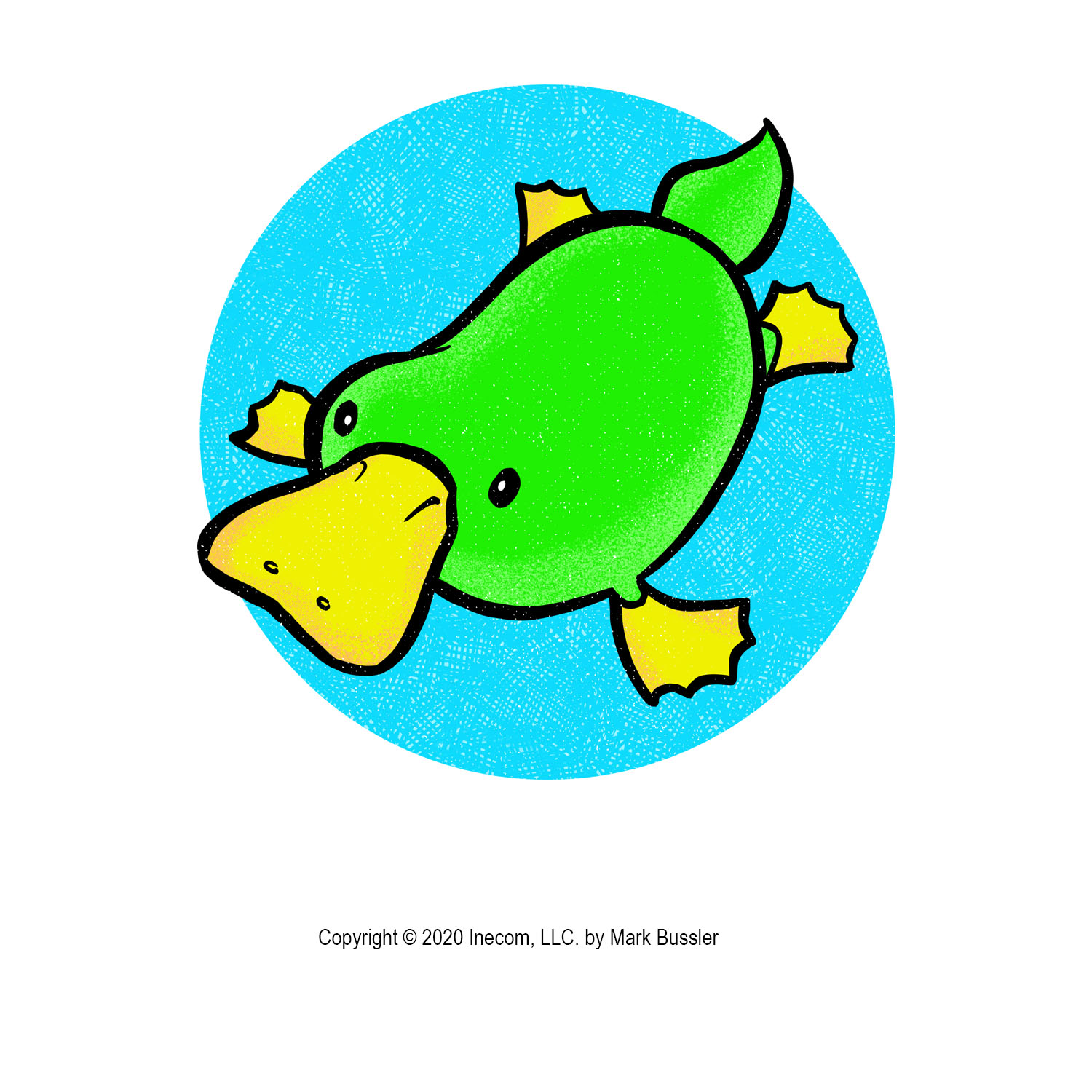
7. Like the penguin drawing, I started this platypus design with a pencil sketch of a real platypus that I deformed into that silly shape. It’s like a bag of water with a beak. Can’t go wrong with a green platypus.
That’s all for today. I’m working on hundreds of these things right now, in between everything else going on. Most of the work was done in Procreate on iPad with some Photoshop touchups afterward. I’ll bring some pencil sketches in an upcoming post as I continue working with various foods and animals – I’m also doing some “how to draw” books for kids.
Take care, and stay sane!
Mark
Files