Home
Home

 Artists
 Search
 Recent
 Random
 Posts
Posts
 DMs
DMs
 Tags
Tags
 Random
 Importer
 Import
 FAQ
FAQ
 Account
 Register
 Favorites
 Login
Login

Andromeda news (Patreon)
Content
I hope you all had a wonderful Christmas ! Personnally I was looking (and feeling) like a zombie because of the christmas rush at work ; but now finally getting better and recovering from my lack of sleep :)
Anyway, I have finished scripting and storyboarding the 3rd chapter, and I'm starting to draw the roughts. I will add them in the dropbox every nce or two days and hopefully all the chapter 3 rought pages toward january's end. As I may have mentionned before, I want to rought all the pages before inking them because it's much more convenient in my workflow.
You can check it in the dropbox tier 3 folder/Ch3 roughts
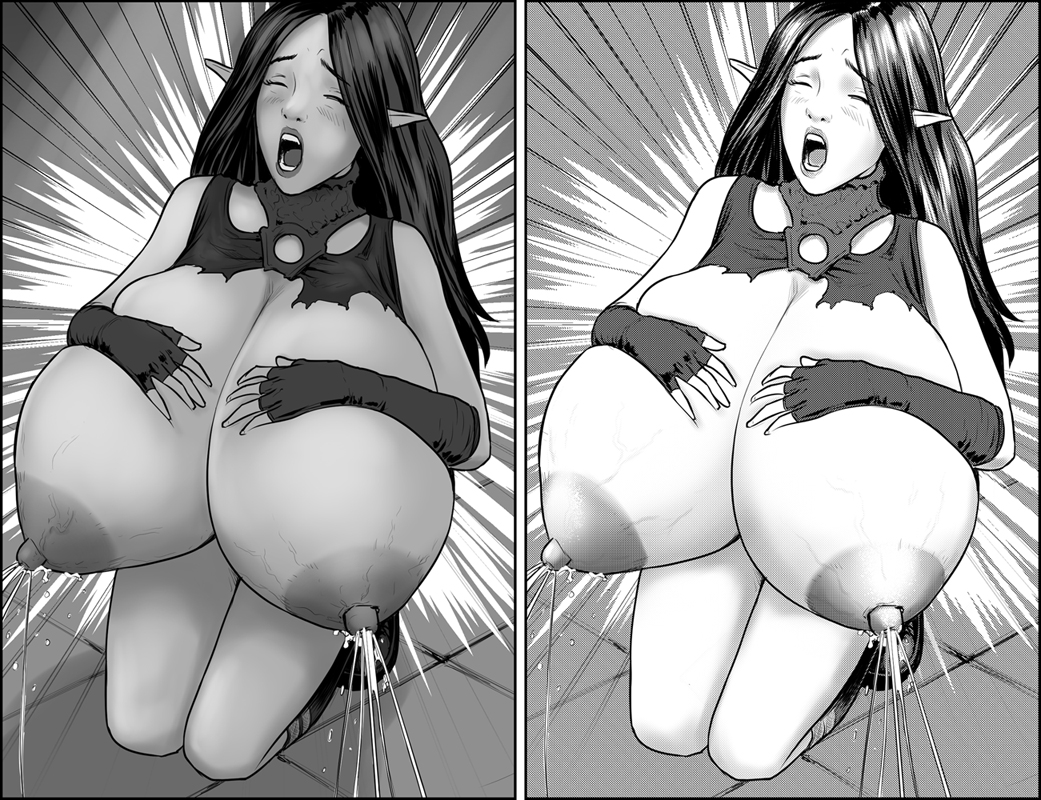
Concerning the article image, it's just some rendering test I did, to see if a manga version would look nicer, but I'm not really convined. It looks too "messy", I don't really like how the sceen tones look. I'm like more the left version, eventhough it's poorly shaded, with a little more work I think it can be much nicer. It's just for style really, because the screen tones are originally for printing purposes, so on digital screen it's not quite useful...
Which one do you prefer ?
Files