Home
Home

 Artists
 Search
 Recent
 Random
 Posts
Posts
 DMs
DMs
 Tags
Tags
 Random
 Importer
 Import
 FAQ
FAQ
 Account
 Register
 Favorites
 Login
Login

Orange Variations (Patreon)
Content
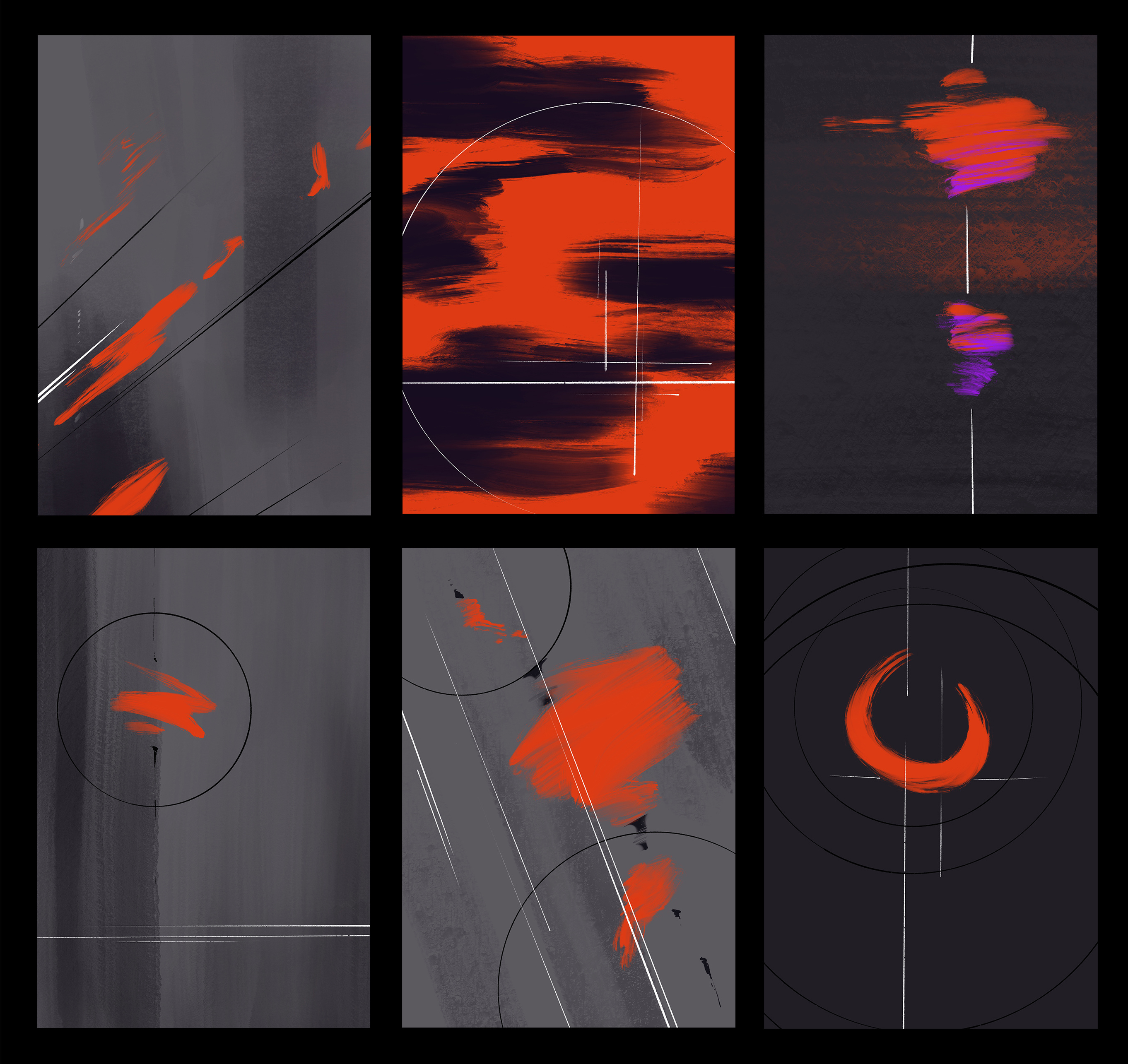
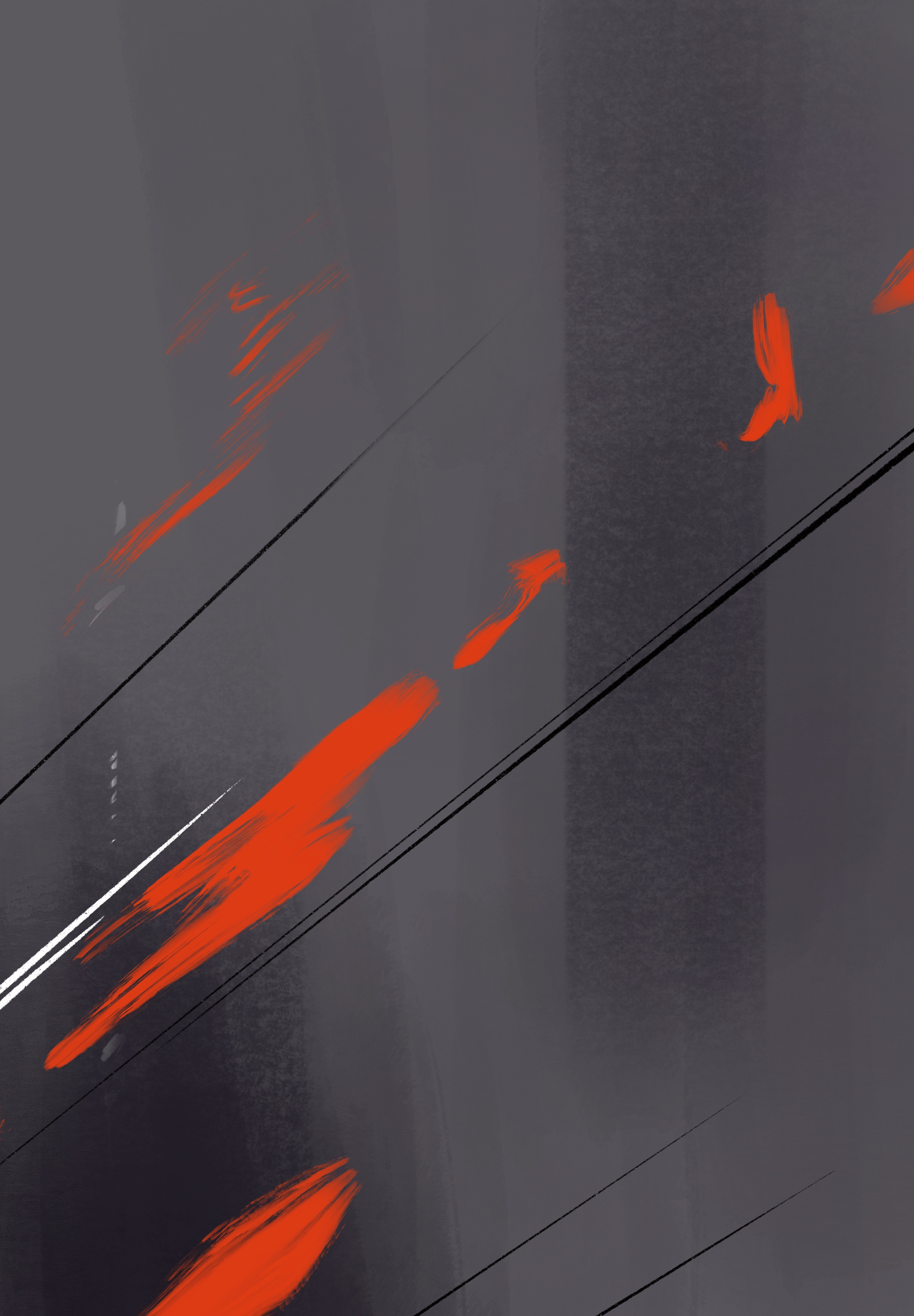
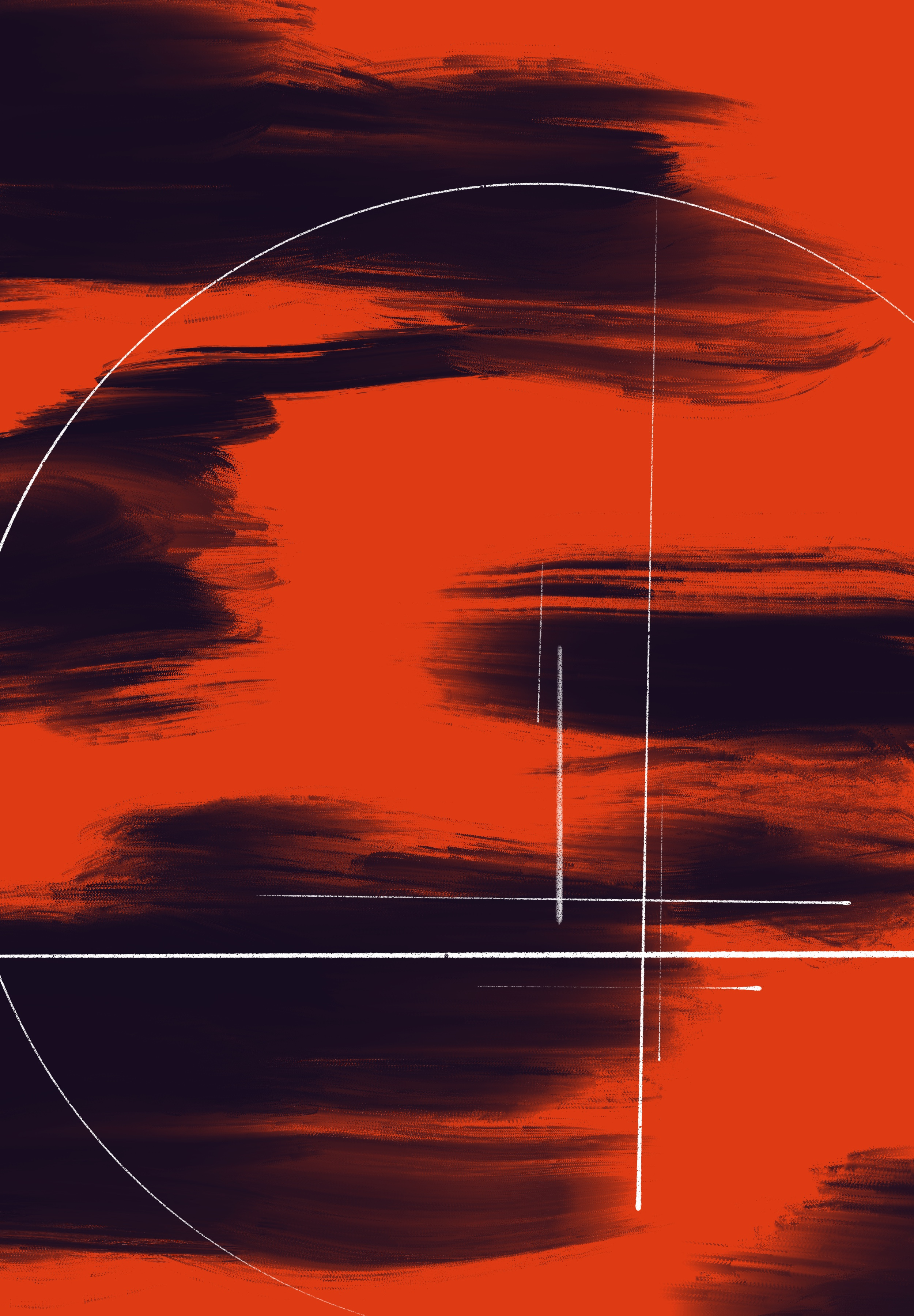
Another series of design sketches, this time based on the orange and grey sketch from the last set.
When I was an art student, one of my teachers talked about how it's a good idea to spread your work out and compare a bunch of pieces all together. You end up seeing a lot of parallel and similarities you'd never have noticed otherwise. These were all drawn together, so it makes sense that they'd share some similarities. Still, it's interesting to see the common elements. It's not hard to see how much I like thirds, for example. Using the rule of thirds is always a good bet, but sometimes you can rely on something like that too much. All of these have a focal point at (or near enough) one of the intersecting thirds, except for the upper left piece where I made a specific effort to put the focal point right on the edge of the composition. That breaks a lot of rules. But sometimes when you know the rules really well and follow them too closely, breaking a rule is what you need to do.
Full res sizes are attached.
Files