Home
Home

 Artists
 Search
 Recent
 Random
 Posts
Posts
 DMs
DMs
 Tags
Tags
 Random
 Importer
 Import
 FAQ
FAQ
 Account
 Register
 Favorites
 Login
Login

Pulsar Font Update (Patreon)
Content
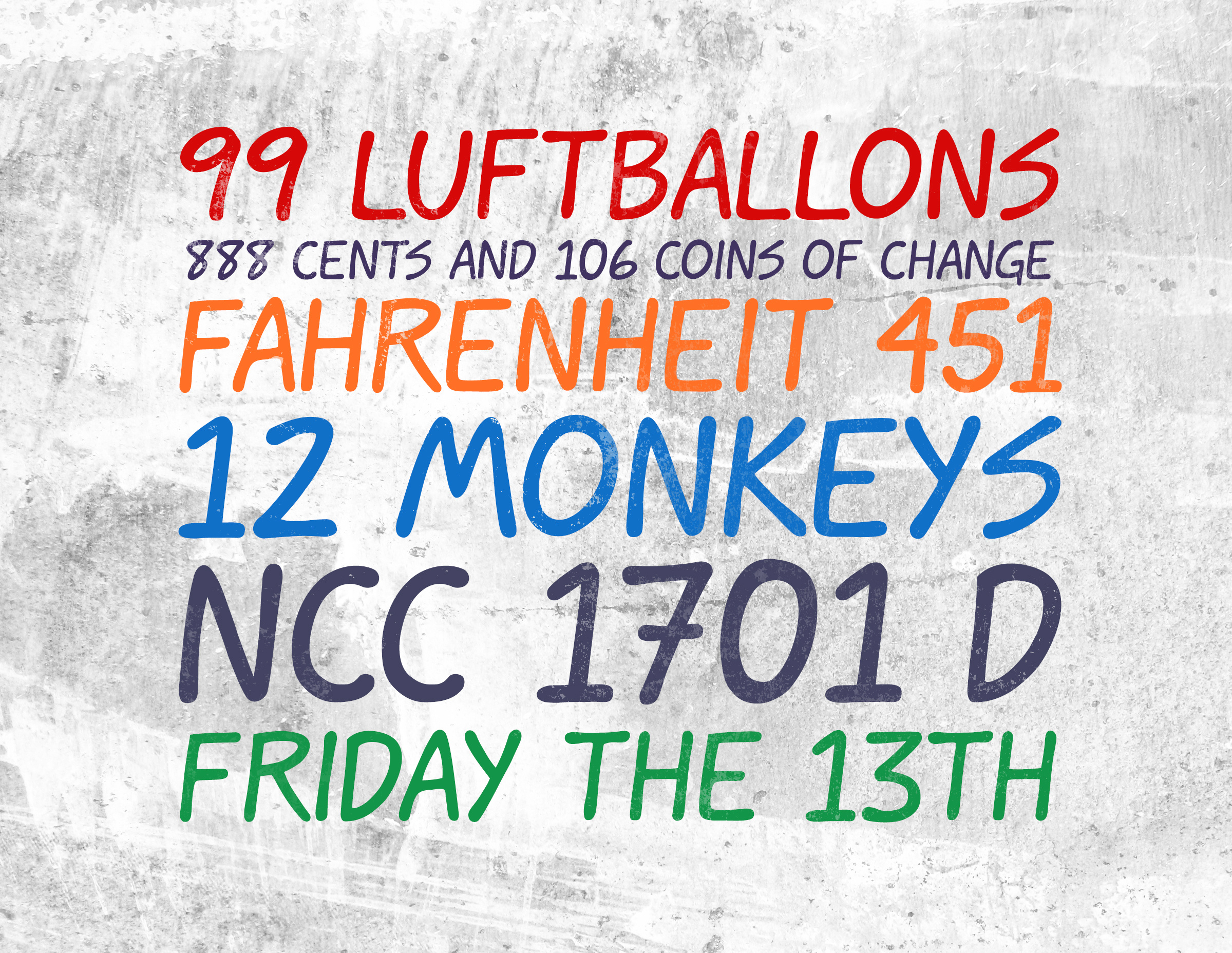
Now with numbers!
I spent my time after work this week adding numbers to the font. Now I just have punctuation to do yet and I'm done. Sort of.
I had a bit of a setback this weekend. I've been pretty disappointed about it, and it made it really hard to work on this project. But I decided to press ahead anyway because I really want to see this done and usable, and it's never going to get there if I'm just moping around.
Long story shortwhen I was playing around with the font in Photoshop and Indesign, I realized that the font weight is just too thin at small sizes. I think one big reason this bugged me so much isn't necessarily the amount of work I need to do to fix it, but that I probably should've known better. More testing as I was developing it, making better use of the preview window, etc. It's a good learning experience, but still pretty annoying.
It's definitely going to be a lot of work to fix. It was a pretty huge amount of work to get the font looking this consistent to begin with. Fiddling with it now just enough to get it a little bit thickerbut not too thickis going to be a real challenge.
However, I'm really happy with how it's looking so far. I think the letter forms are working really well together, and when I use faux-bold in Photoshop to bump up the thickness, I think it works extremely well as a comic font. Also there aren't a lot of really good, professional looking comic fonts out there. There are a lot of crappy half-assed ones. And Blambot pretty much has the market tied up for professional ones. While their fonts are fantastic, everybody uses them too. So I think there's room in the market for something a little more unique and fresh, and also pro. With all the time and polish I'm trying to put into it, I genuinely think it'll be worth the ten or fifteen-ish bucks I'll probably ask for the full version.
So my plan for this project is to keep going with this version of it and get all the punctuation in place and finish a complete and working font. (At this point I'm not going to include international characters, unfortunately. But if there's demand for them, I might add them later.) Once that's done, I'm going to go back through and convert that entire font into a version more suitable for lettering at smaller point sizes used in comics.
That'll give me two complete fonts which I could sell in a set too. This version being something like "Pulsar Display" for use at larger sizes, and the other being "Pulsar Book" or something to that effect. I've also been considering making a version called "Pulsar Sketch" which is much closer to my original (sloppy) handwriting, but less consistent for use as a text font. I think it'd make a nice companion face for things like subheads or just as a looser display face.
Anyway, sorry for the wall of text, but that's where I am with this. It's going to take a few weeks (or maybe a few months) longer than I expected to finish the entire thing, but I'm going to keep plugging away at it. So apologies in advance for flooding your Patreon feed with all this font nerd stuff.
Files