Home
Home

 Artists
 Search
 Recent
 Random
 Posts
Posts
 DMs
DMs
 Tags
Tags
 Random
 Importer
 Import
 FAQ
FAQ
 Account
 Register
 Favorites
 Login
Login

Thank you! (Patreon)
Published:
2016-08-28 18:46:56
Imported:
2021-05
Content
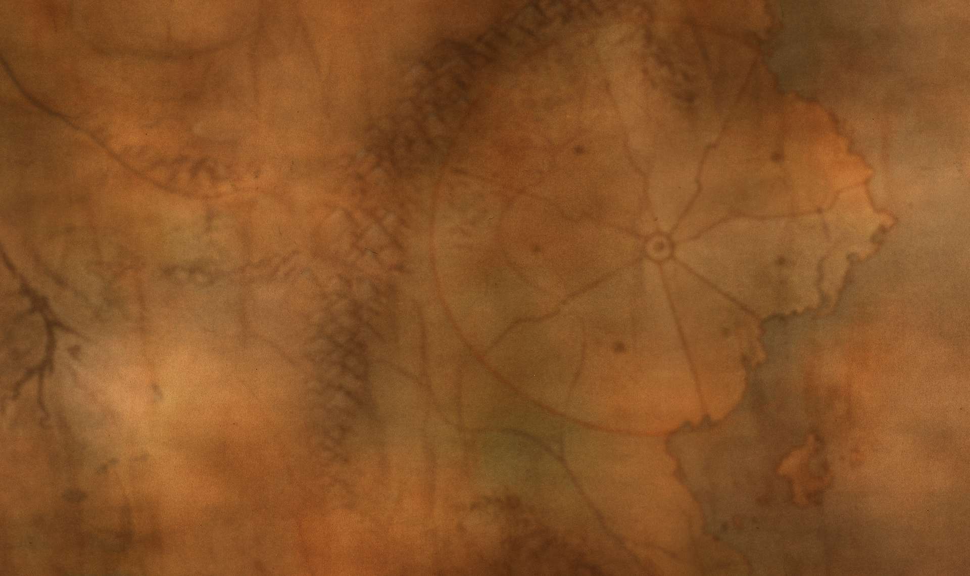
Just sharing another quick sample of website background art- I quite like how this remix of the map came out. Making this post public, because the art is right on the site anyways. It's almost done now! At long last.
I also wanted to say, thank you to everyone for helping us continue work on the series! Thank you to our long-time supporters, and to the new Patrons who have appeared as well. New Prelude in the pipeline for this Thursday- it's going to feel so good to KO the website, and get back on creating new comics. E )
Thanks again for sticking with us, and I hope you're having a delightful day. E )
Files