Home
Home

 Artists
 Search
 Recent
 Random
 Posts
Posts
 DMs
DMs
 Tags
Tags
 Random
 Importer
 Import
 FAQ
FAQ
 Account
 Register
 Favorites
 Login
Login

04-13-2024 Artist's Commentary (Patreon)
Content
Haven, Master Of Ceremonies: Hello all, welcome to the 15th Anniversary Update Artist’s Commentary! This one’s kind of loaded, months of work went into this one. I hope you enjoy!
James, Director: Yippee
Chumi, enthusiastic about this update: Hello everyone! Thanks for celebrating Homestuck month with us, I hope you all had a great 4/13! Speaking of 4/13, let’s get to commentating on this update’s art shall we? Getting to see Dirk again in all his smarmy glory was soooo exciting. To be honest, I was hyped for this update to drop for ages. It’s got plot advancements, it’s got some lil’ sneaky hints for the future, it’s got emotional beats that made me feel some things for a big jerk… I hope you guys got hooked and are looking forward to the next update HEHE.
Kim, your best friend: What a month last April was! I feel like I say this every year, but I feel like each and every 4/13 just gets more and more amped up every year. But, y’know what, people were probably feeling especially sentimental this year because it was the 15th anniversary! Got a lot of old fans even crawling out of the woodwork for it too, heheh. But enough sappiness from me, I already got all mushy in the newsletter – onwards to the commentary!
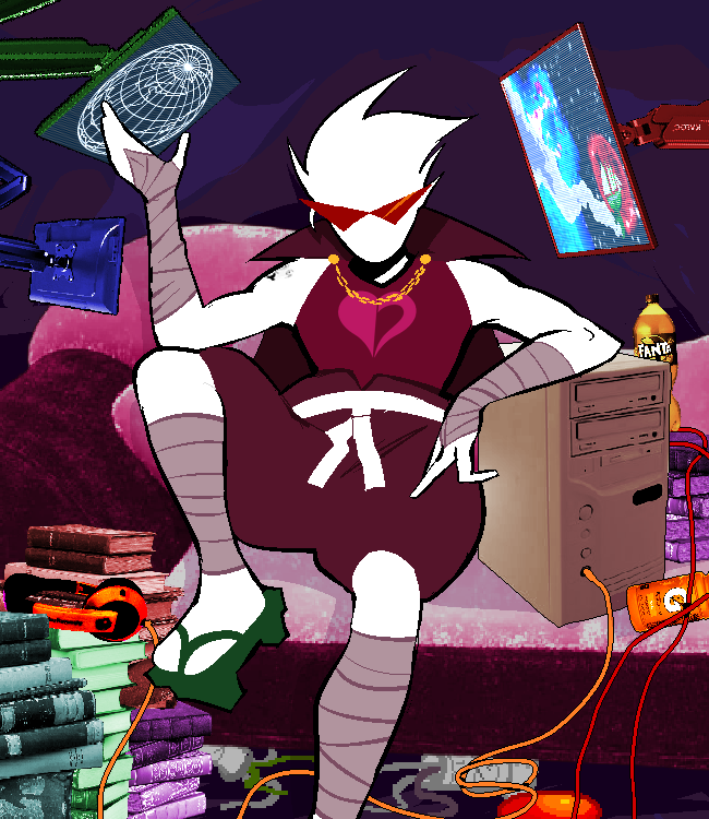
This update is a bit more concise on the panels this time ‘round, but DAMN was each one BANGIN’!!! More beautiful Guardian Mode panels, Rosebot’s new outfit, and not to forget the introduction of GUARDIAN SPRITES!!! Seriously, big props to Haven for spearheading the art for this update! I’ll hand the mic over to him to let him talk about his process.
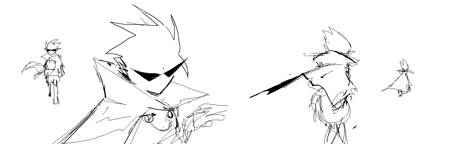
Haven: Alriiiight!! Okay let’s take it from the top.
Haven: I went and thumbed all of these on call with Miles alongside his initial script.
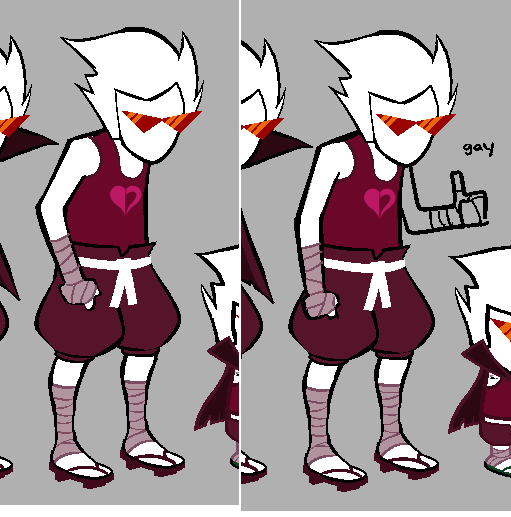
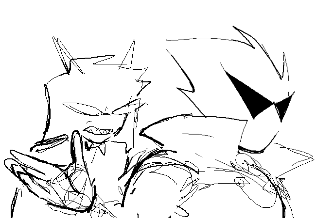
Chumi: Anime-villain-ass pose.
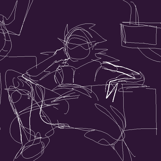
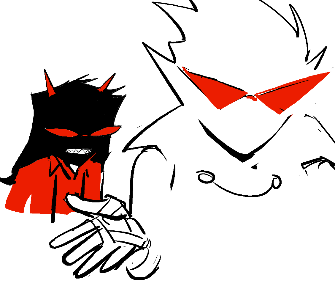
Haven: Third sketch had his spread going a little wild so I reeled it in just a bit
Kim: Bro ur spine….
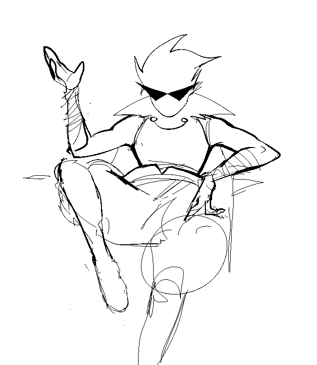
Haven: There we go.
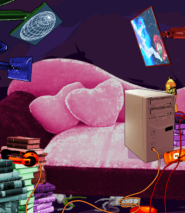
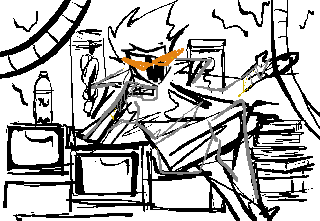
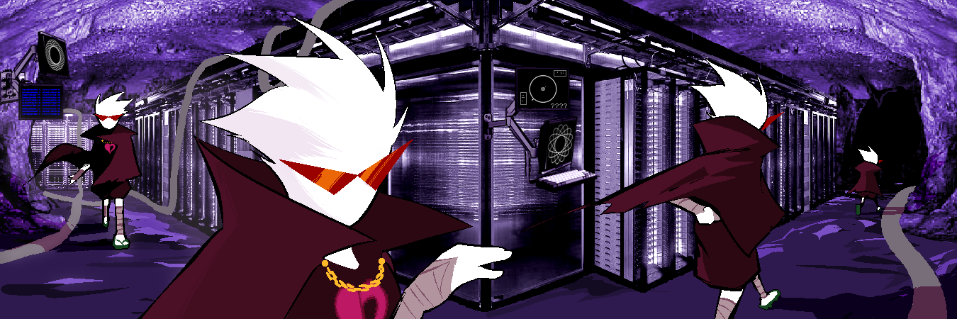
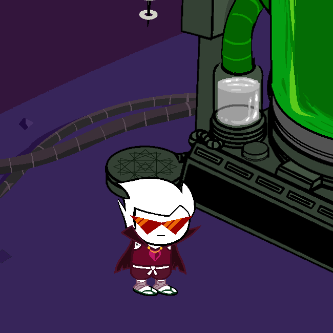
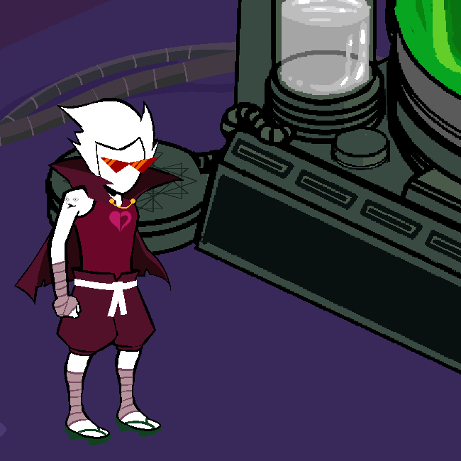
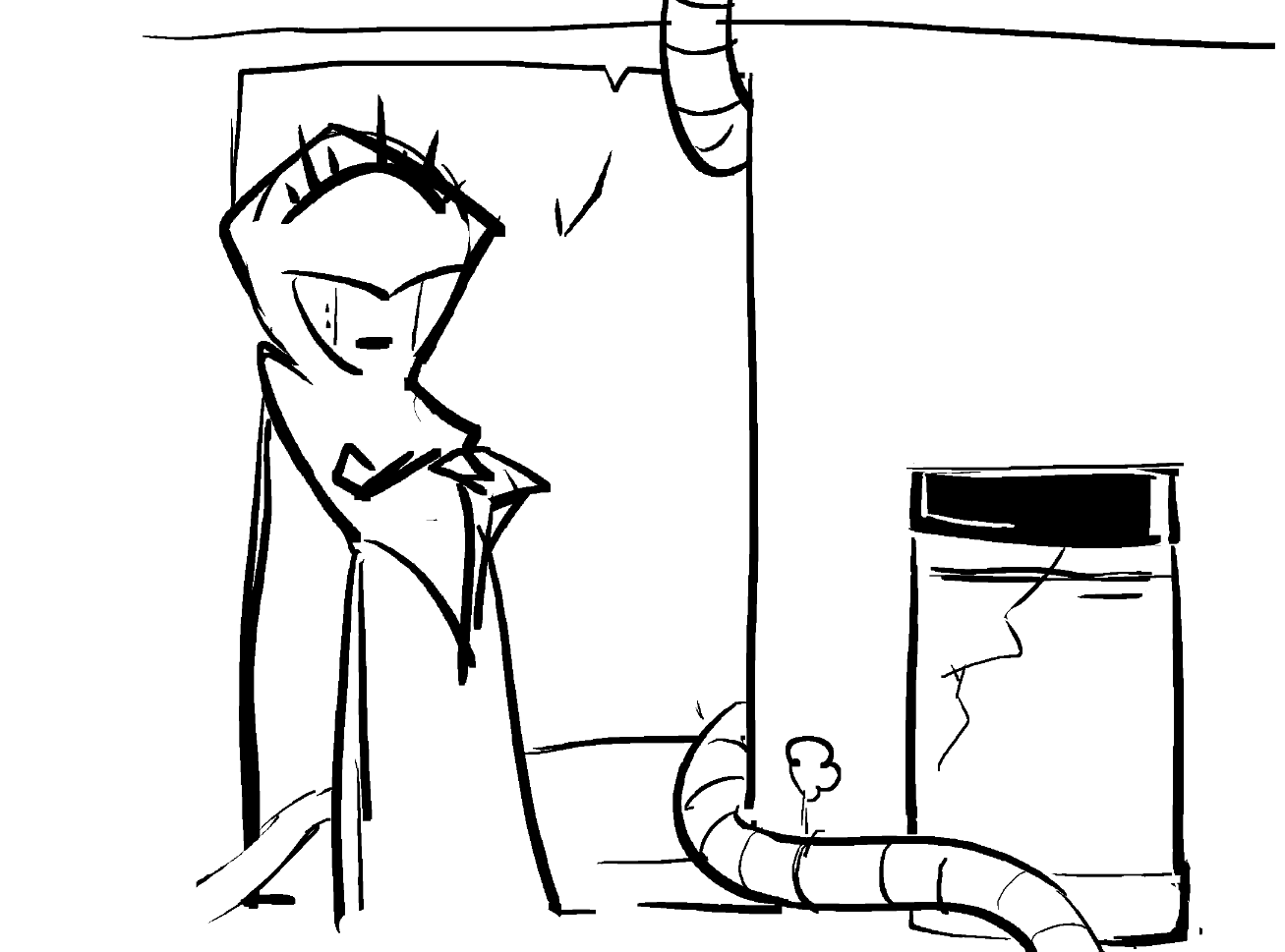
Haven: After that sketch I went into shuffling together this background. He’s got everything he needs back here; music, fine color coded literature, color coded drinks, color coded monitors to check on the progress of his color coded pursuers.
Chumi: This room looks sorta comfy actually, especially the cute chair….
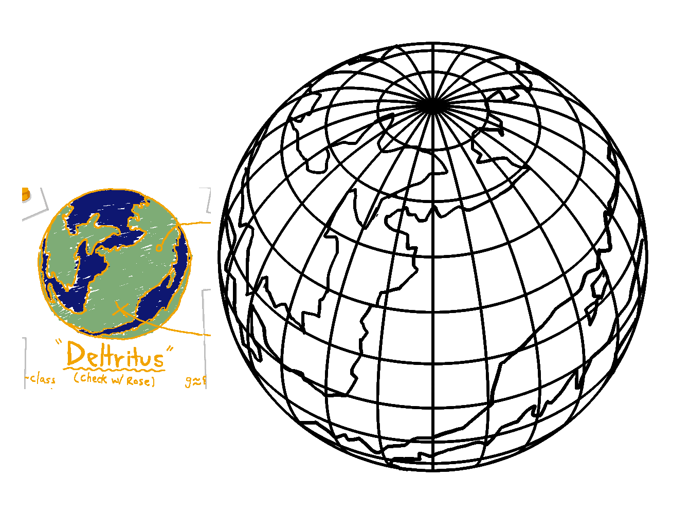
Haven: On one of the monitors here you can see a gridded globe of deltritus I based off the drawing from a previous panel.
Haven: Voilà. Also, I switched dirks sandals from zori to geta (but more on that later.)
James: He needs to geta job
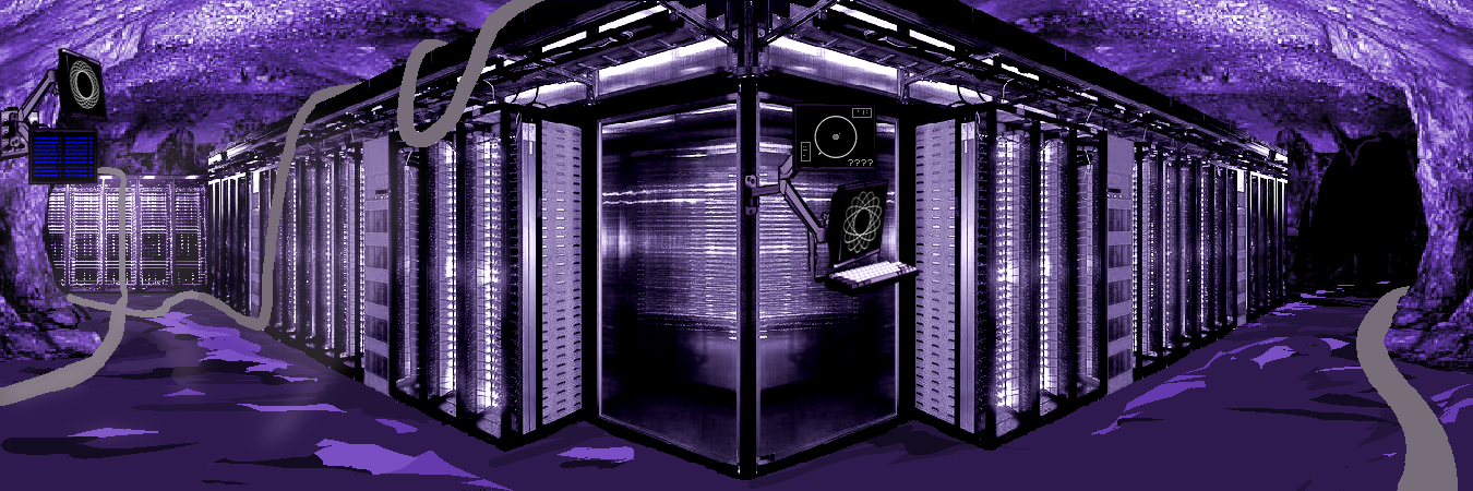
Haven: This panel was so fun to do, on the left side there is a monitor tracking meteor landing sites, all blue because they are a long long time from touching ground. I typed out like 30 random coordinates with relevant numbers but they all got shrunk so you can’t even read them.
Kim: Waiting for fans to zoom in and hyper-analyze those four compressed pixels to guess and see what it could possibly mean.
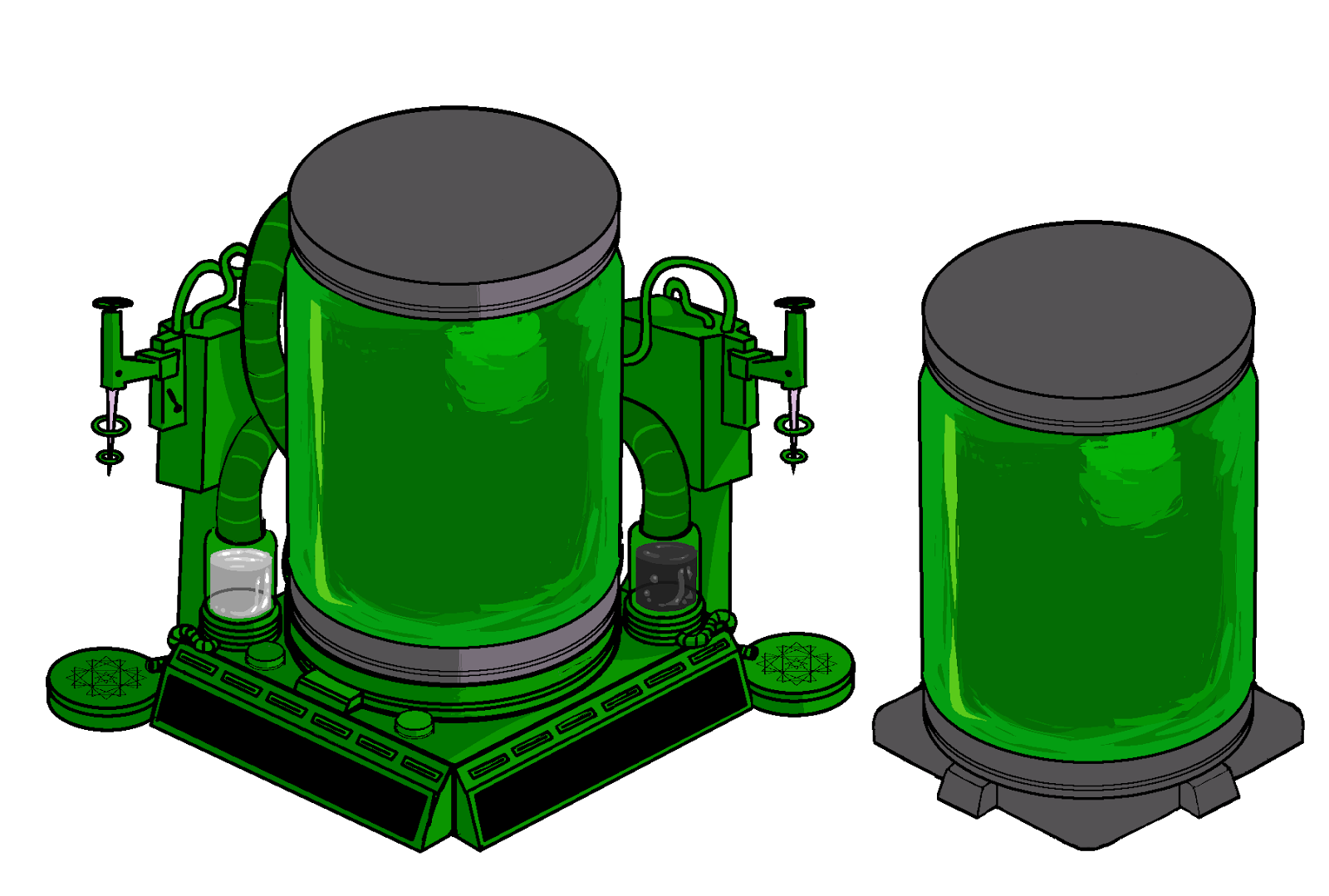
Haven: Goo vats and a variant of The Ecto-Alchemologizer from early Homestuck^2
Haven: Dirk looks directly at the audience for most of this update because he’s mostly talking to us. Anyway, transformation time…
Haven: I initially had this transition more like he was growing into it (also with the armless version of his sprite) but it was a bit off.
James: I like his little tattoo nub
Chumi: I love that it looks like he straightened his back… Posture improvement.

Haven: Luckily Andi then came in with this much snappier version.

Haven: Which I then edited into this!
Andi: Really like the white fade into this, that was a great touch.
Kim: Another subtle detail I particularly love that Haven did with this is how the background proportionally adjusted to them as well. No longer are we Kid Sized… This is a grown-up’s world now!!
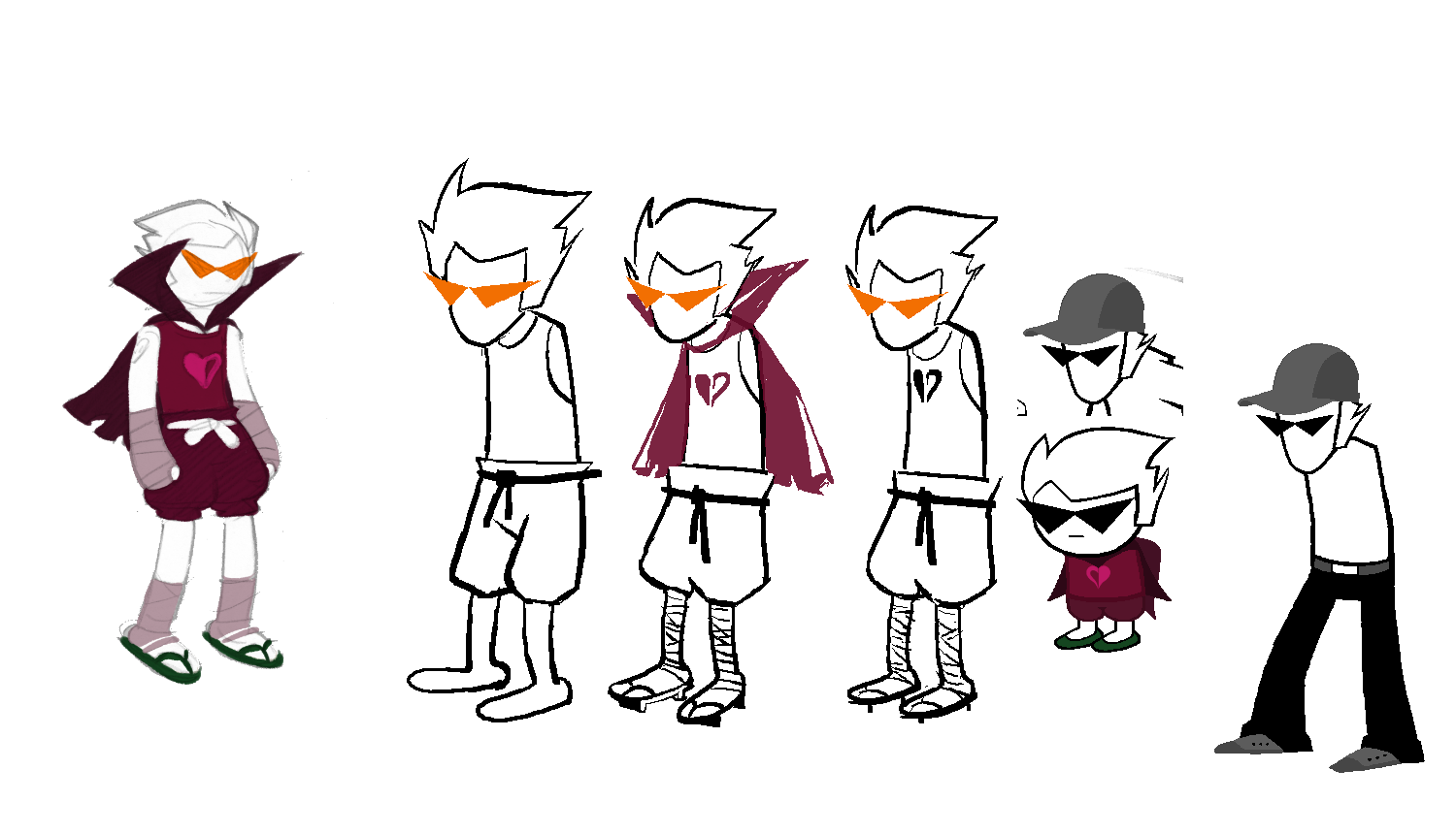
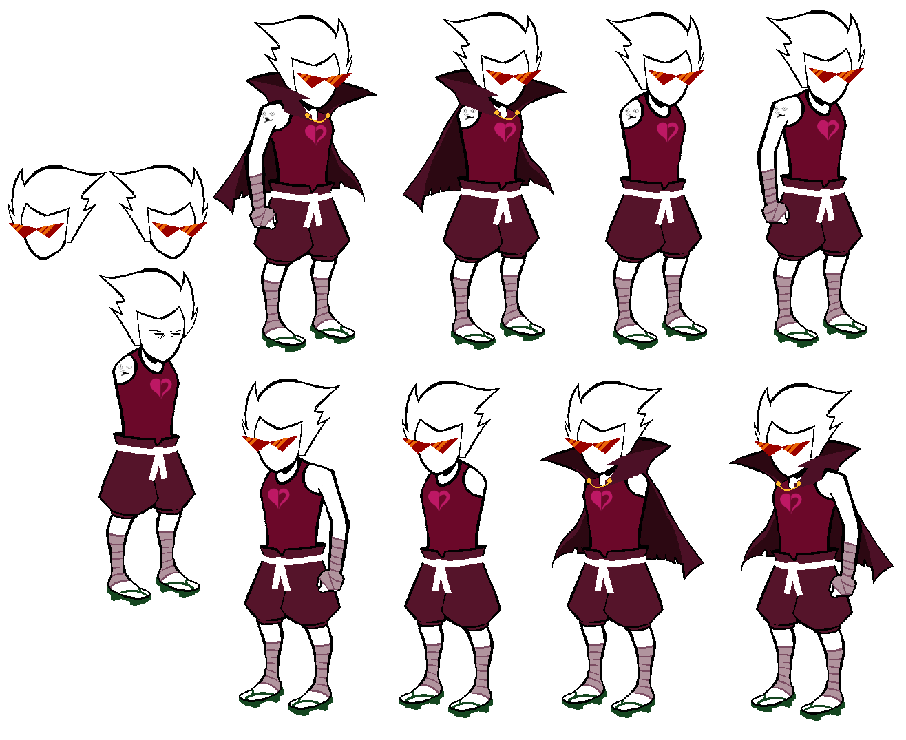
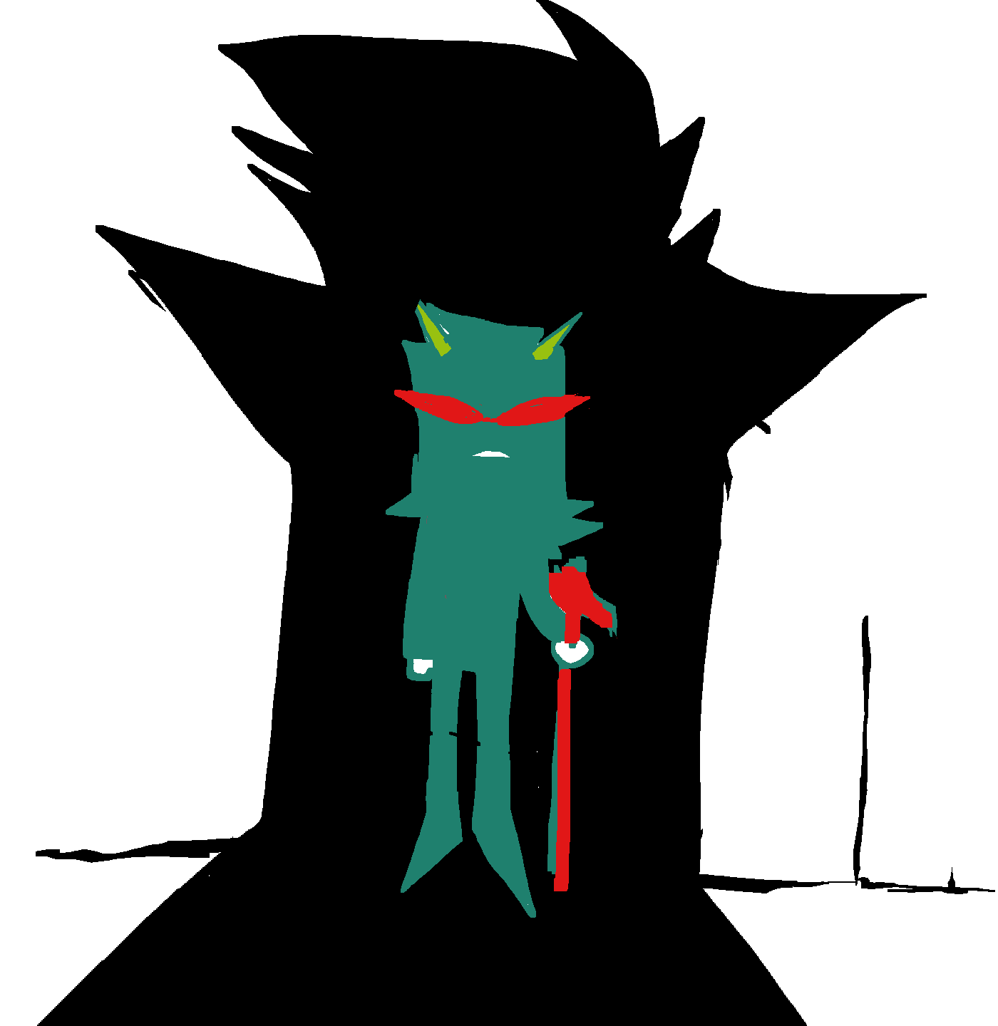
Haven: Now the sprite itself. Like I mentioned earlier I swapped out his zori for geta, a little less Kamina and a little more Mugen. They’re drawn bigger in the non-sprite panels than they are on the sprites themselves because I think it looks cool.
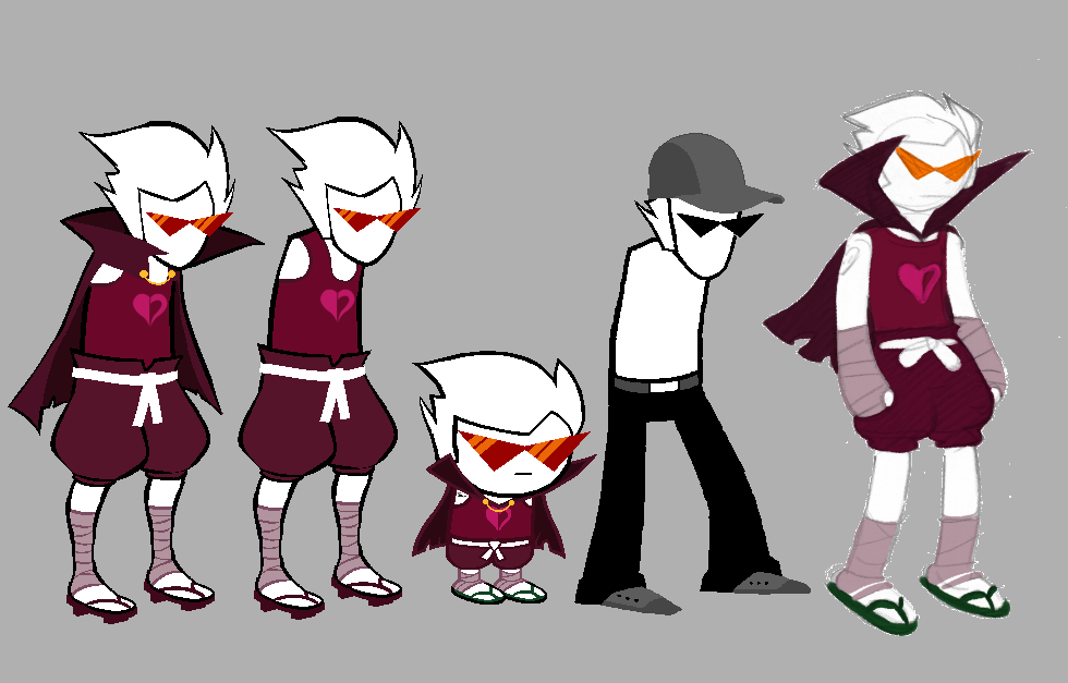
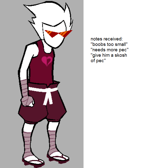
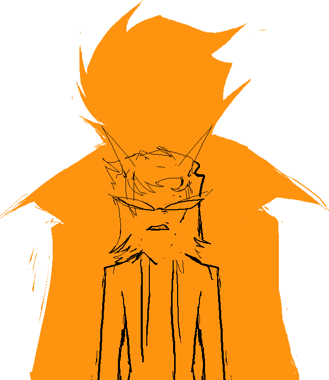
Haven: First real version of the Dirk sprite; pants a little too poofy, shirt a little too loose, James said he looked like Carl from Aqua Teen Hunger Force, and to top it all off I didn’t even notice I colored his sandals incorrectly (I am colorblind.) Clearly some work was needed.
Kim: I still remember when we were all concepting over this sprite and you literally just found out at that moment you were colorblind. Still shocks me to this very day LOL.
Haven: Kim swooped in and dropped some initial arm art and some thoughtful commentary.
Kim: I almost forgot I added that there LOL. Early on, we were considering whether or not the Guardian sprites should be with or without arms by default. We initially considered armless, cos that was always Homestuck’s odd funny little trademark. Though, with the more proportional Guardian sprites, it might seem a little off lol. Haven came up with the brilliant idea to opt for a nice in between– a single arm approach, mirroring Dad Egbert’s sprite!
For Ult-Dirk, I proposed two “default” arm versions to see how everyone felt. The version on the left, I was initially thinking something sharp and angular like the arms on Bro’s original sprites, but it was a bit too clenched for what we were going for. So, I proposed a more relaxed version alongside as well, as it was more in-tune with Dirk’s overall seemingly composed personality. As you can see, everyone was very pro-arm!
James: There was also a point where he had the original bro sprite arms and it just looked like they were ten feet long.
Haven: oh yeah i almost forgot about this, the bro sprites with arms look fine because of the posing but these are for dirks neutral stance.
Andi: This exploration process made me really look at bros sprite and jesus his arms are fucking long. I think it makes sense to sort of proportion Dirk to be a little different, he does have bro’s likeness of course, but this is Dirk, yknow? He’s gonna have his own unique set of shapes.
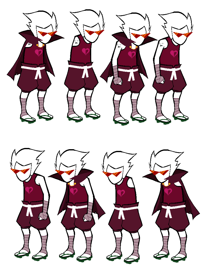
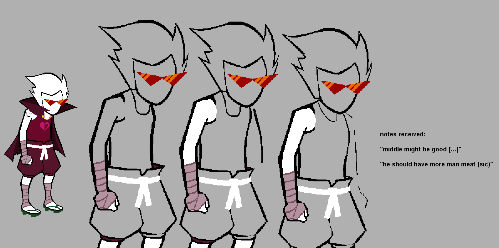
Haven: And we end up with our 2nd draft! I was a fan of these, but the hunch... I was told the hunch had to go.
Chumi: Omg the hunch is insane on these.
Andi: It’s weird. Sometimes I like the hunch, and it suits him, but then sometimes it just doesn’t. I flip back and forth, but I do think choosing the straightened posture was a fitting choice.
James: Part of me was a little sad to see it go, because the bad posture always felt a little OG Homestuck. It leaned a little too hard into the old bro sprite. It just wasn’t reading as Dirk. I think there was some point where we joked about giving him a hat, too.
Haven: We continued to cook.
Andi: We felt like Dirk could have a little bit of a chest. I’m sure he’s got muscles, a lean cut. Some of us who are quite passionate about those of herculean nature, we were a little adamant about having that visible, even if a little. LMAOOO
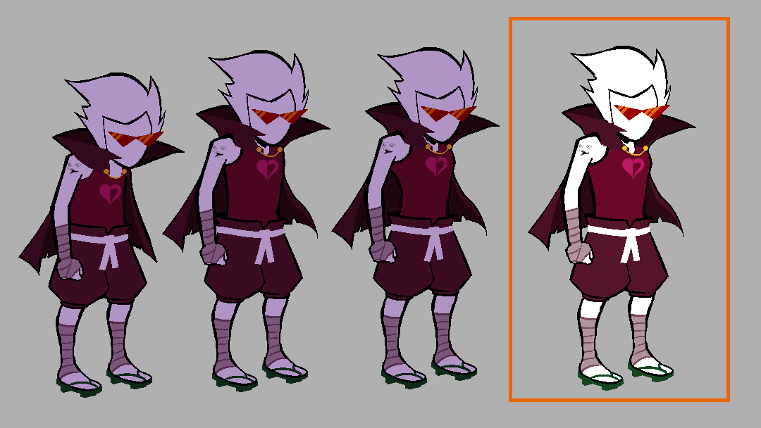
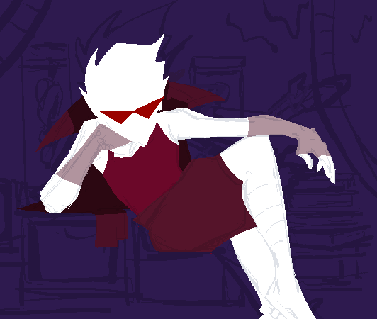
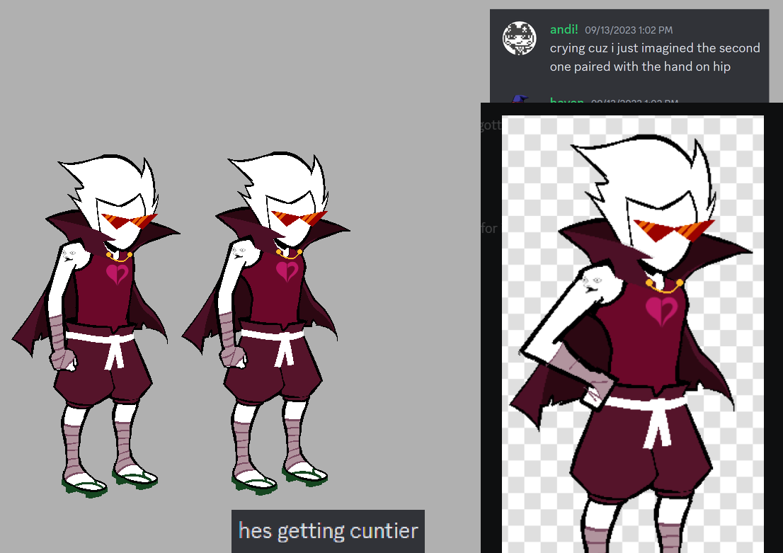
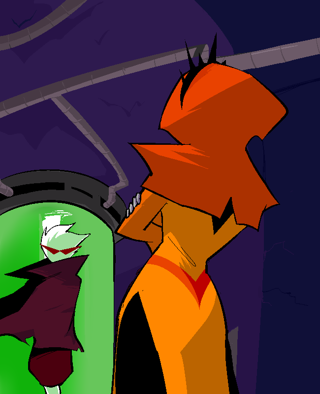
Haven: our victor, our... ultimate dirk.
James: Playing that like, Ultra Instinct stinger in my head right after you said that.
Andi: And it was final, the first adult sprite to be seen in HS:BC. And no better choice than to make Dirk be the one to start the chain. This man is in his late TWENTIES, being a little kid sprite must have felt like being stuck in a peanut shell. Cramped and stuffy. Then he shed it all, gloriously. We finally see the sprite of another iteration of Bro, the younger one who grew up in different circumstances, one who is still just pretentious as ever, donning a shitty anime cape and exuding zero swag whatsoever, but still handsome nonetheless. A minute slay, if you will.
Kim: I also wanted to appreciate– I love the inbetween Haven ended up settling on between the more boxy VS. defined torso! In the progress of this sprite, we were all at a back and forth how much definition these sprites should have. I think it was a good move to make that Homestuck follows a little bit of cartoon design logic where it’s not too detailed, but strong enough simple shapes to get the point across.
Haven: yay
Kim: I love the sunglasses-less version. That man has never seen an unfiltered light of day.
Andi: The dark circles on this man must be an abyss.
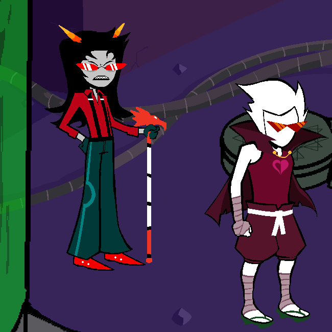
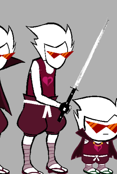
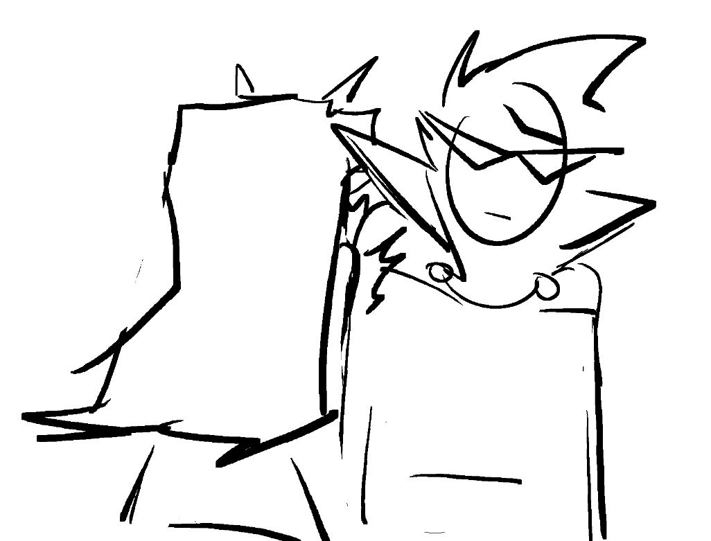
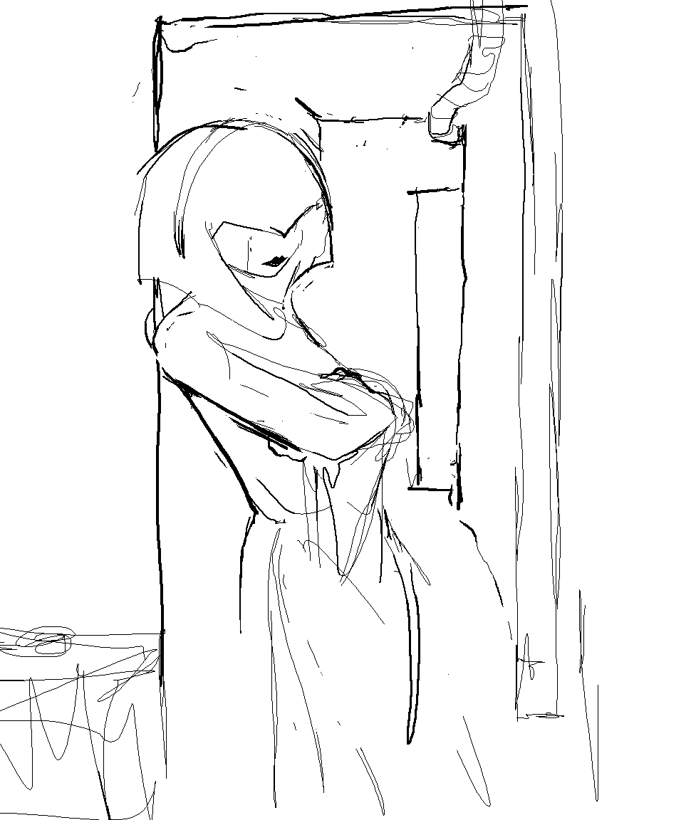
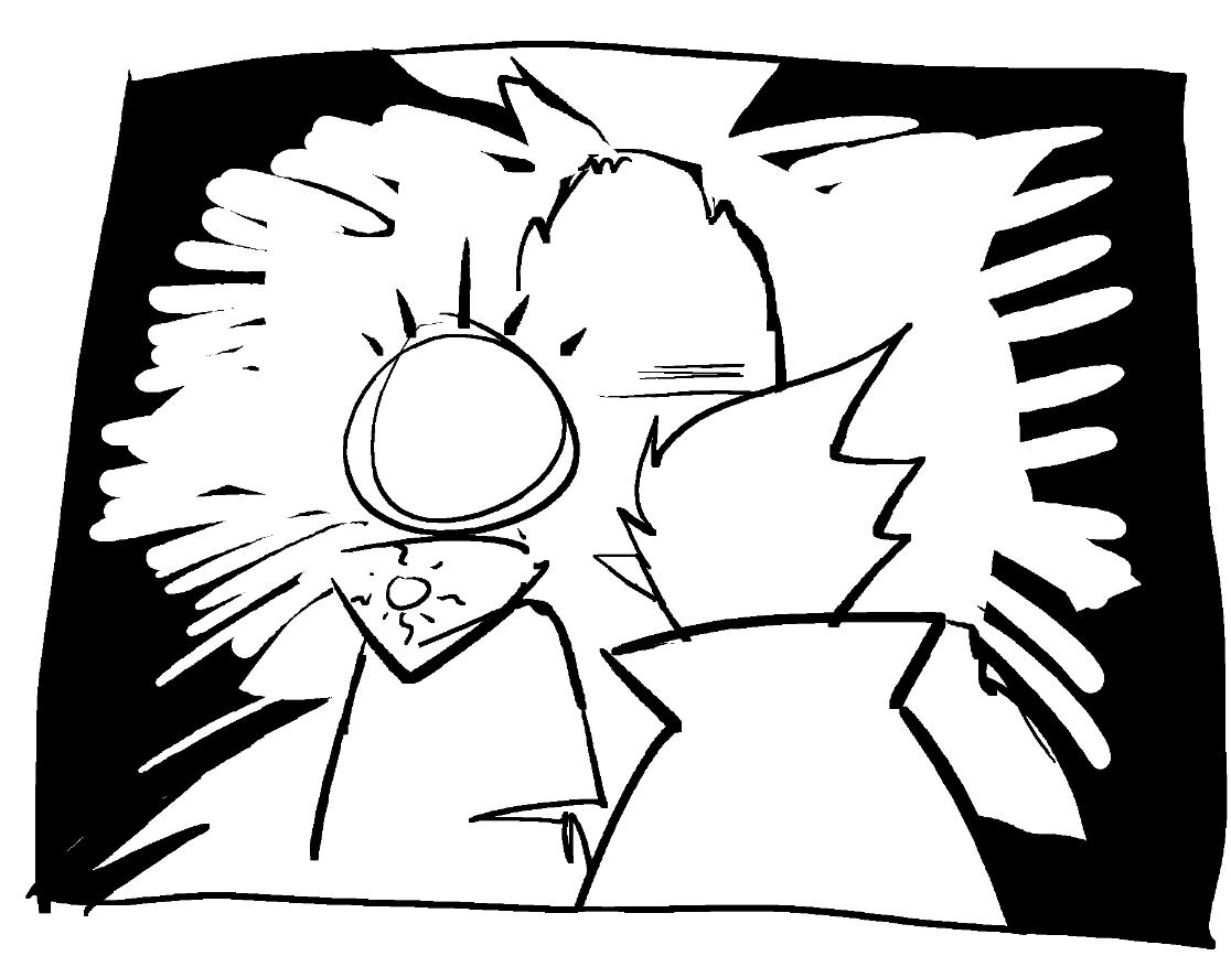
Haven: Ok next up we got Terezi, originally I wanted to have the panel having dirk turn around and strike a defensive pose looking more like bro; but I was short on time so I just made him swing around and that didn’t look very good to me so I kept him standing still, trying to ignore her interruption.
Andi: Still in character. I love her impatient tapping.
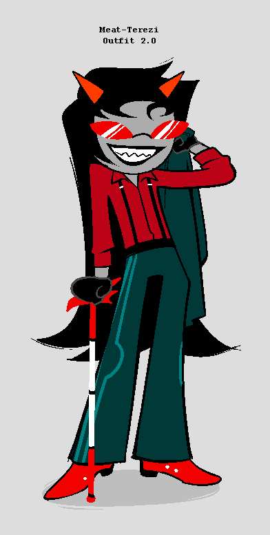
Concept art of Meat-Terezi by Kim Quach
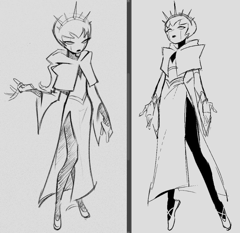
Haven: Now the Terezi Sprite itself was done to resemble the art of Kim’s updated Terezi design.
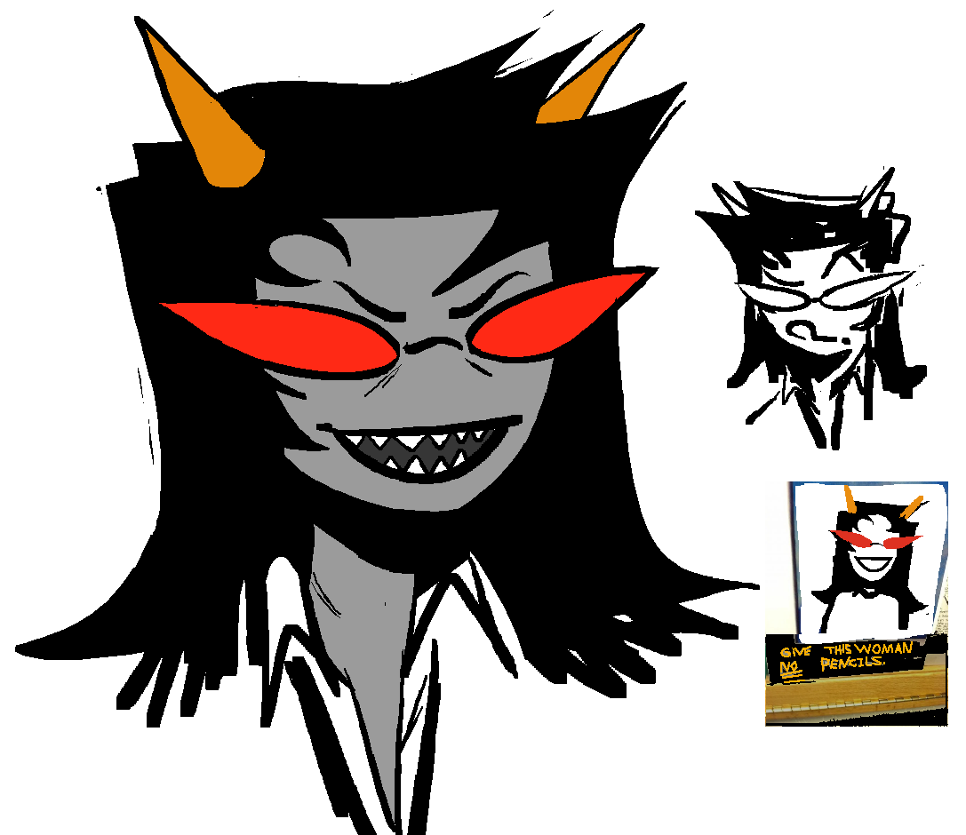
Haven: Here’s some warm up sketches i did trying to get a hold on her new look.
James: At some point I hope we bring back the bright red jumpsuit from Terezi’s courtroom drama.
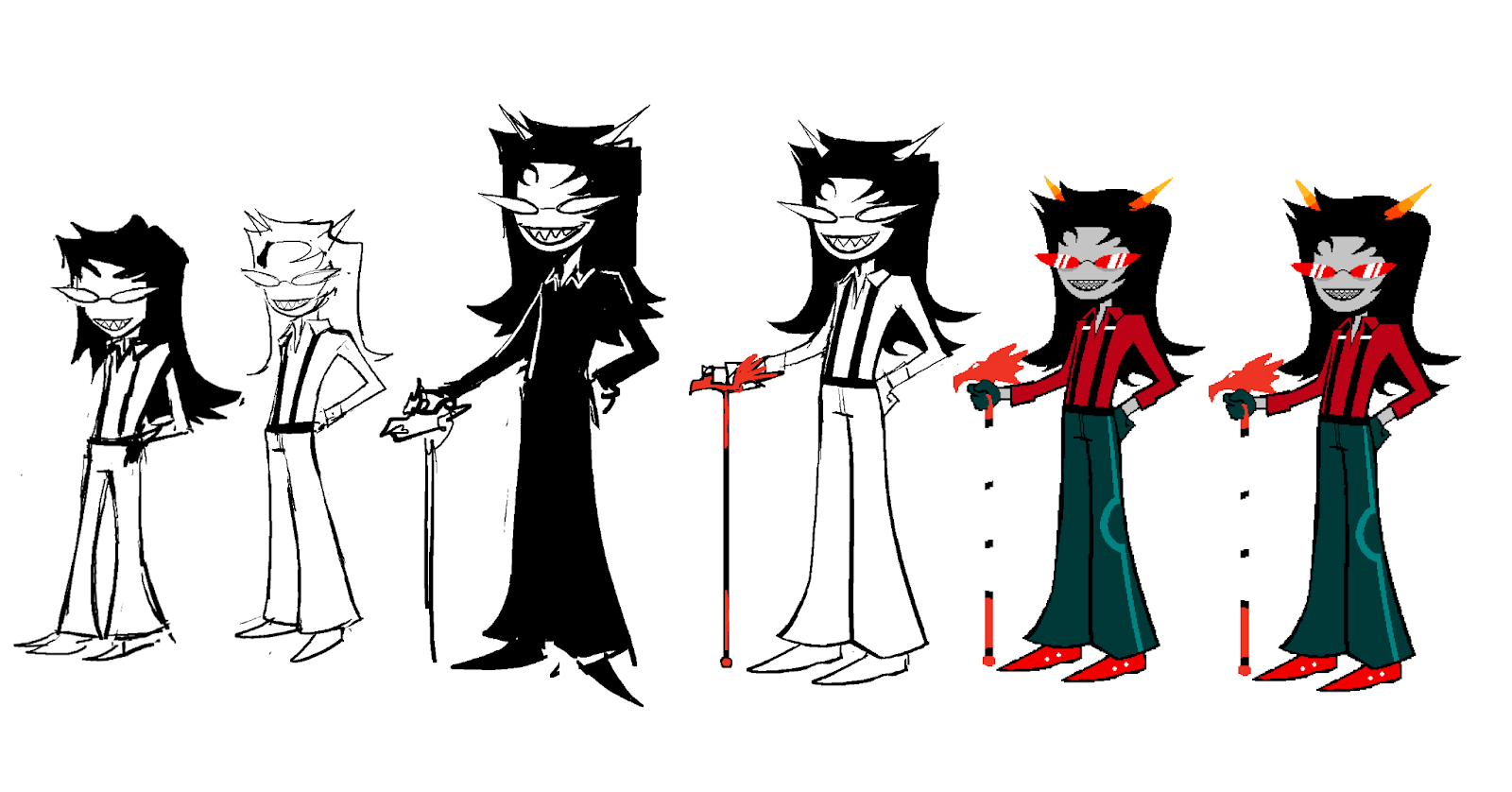
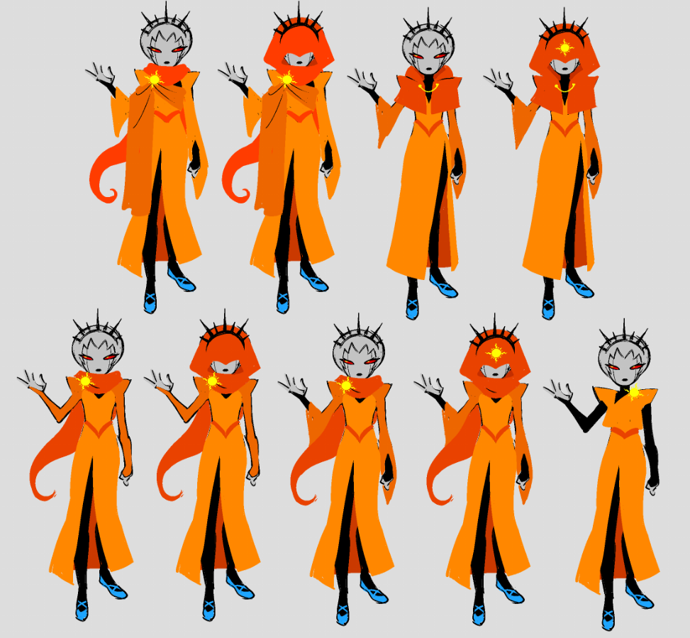
Haven: Terezi’s process went a lot quicker than Dirk’s, with far fewer iterations.
James: I think it's pretty visually interesting how this outfit translated into a Homestuck-style sprite. Homestuck characters are so often… very bottom heavy. I’m not an artist so it is hard for me as a layman to explain this, but the visual shorthand of sprite mode lends itself to flaring outward. Thinner at the inner joints. You don’t see a character's ankles or legs that often. When I originally proposed this outfit change, I had in mind a much more straight legged cut on Terezi’s pants. Much more tailored around the cuff. I think we touched on inspirations for this in the very first artist’s commentary.
But what we get that ultimately feels so much more Homestuck is this sort of Flared, almost Bell Bottom cut. I think visually this feels much more comfortable for the sprites even if as a ‘fit it's a bit crazy to think about.
Kim: They’re chic! I imagine them like stylized flared slacks. I think what’s also nice about the Guardian sprites being more proportionally sized is that it’s easier to design more unique silhouettes for Homestuck designs! When it comes to the usual kid-sized sprites, I always feel it’s a bit odd to make them too detailed– their charm, to me, is being very simple, straight-forward, but strong designs.
Andi: She's soooo cute, no wonder she gets bitches.
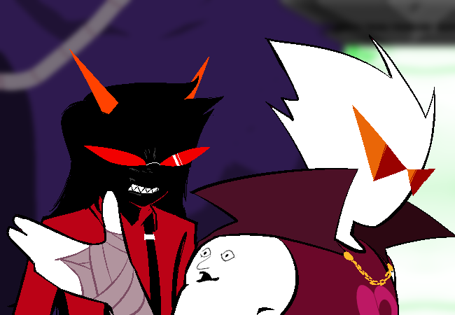
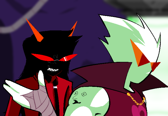
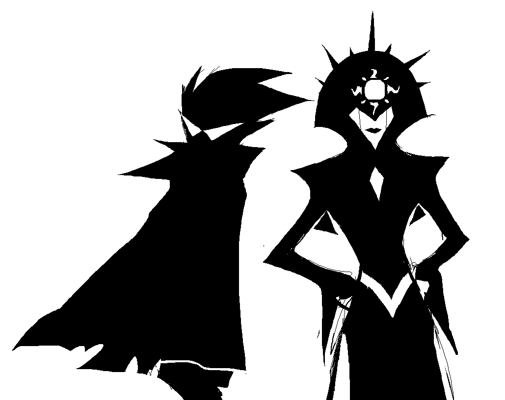
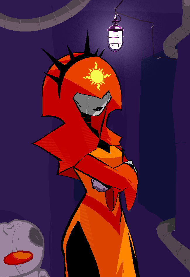
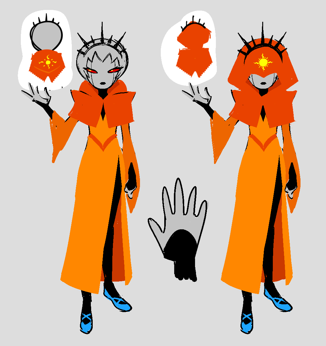
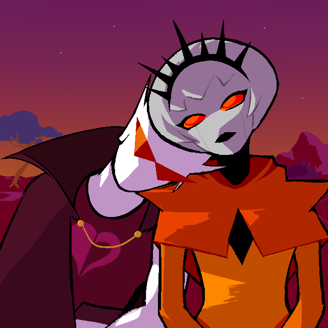
Haven: I loved having both #ffffff white blank Dirk next to #000000 black ancestor style Terezi
Kim: You know when there’s shadows shit’s getting serious.
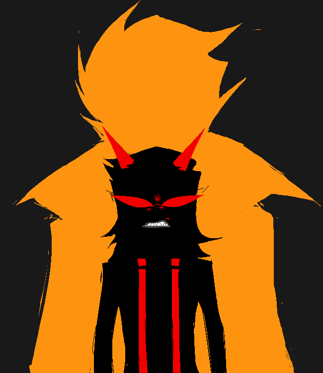
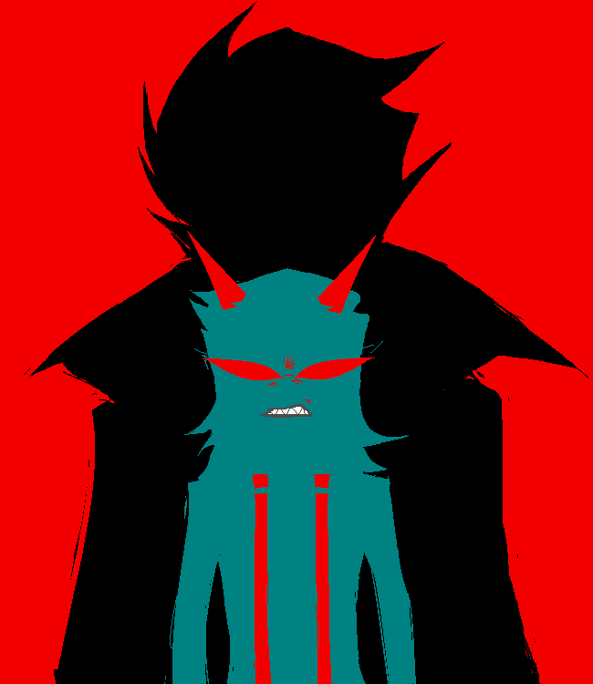
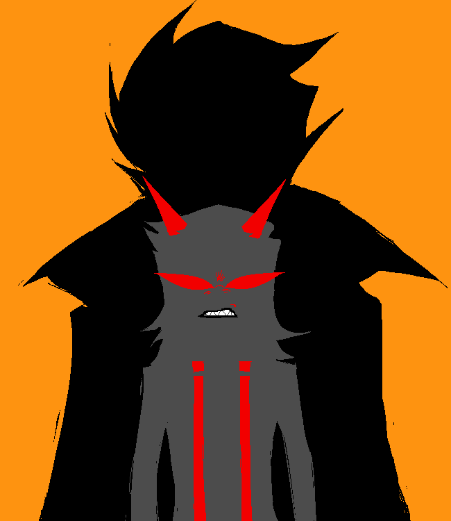
Haven: So menacing... We went through a couple color variants on this but the team settled on black Dirk and grey Terezi.
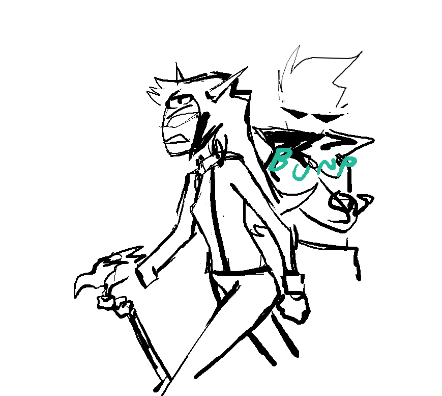
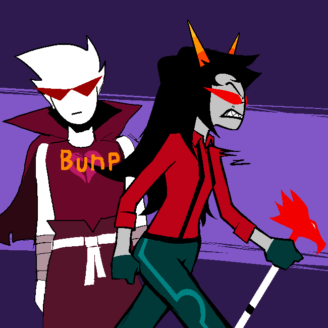
Haven: bunp (also the only panel where you can see dirks mouth, yes he still has one)
James: how would he eat
Haven: oh shit
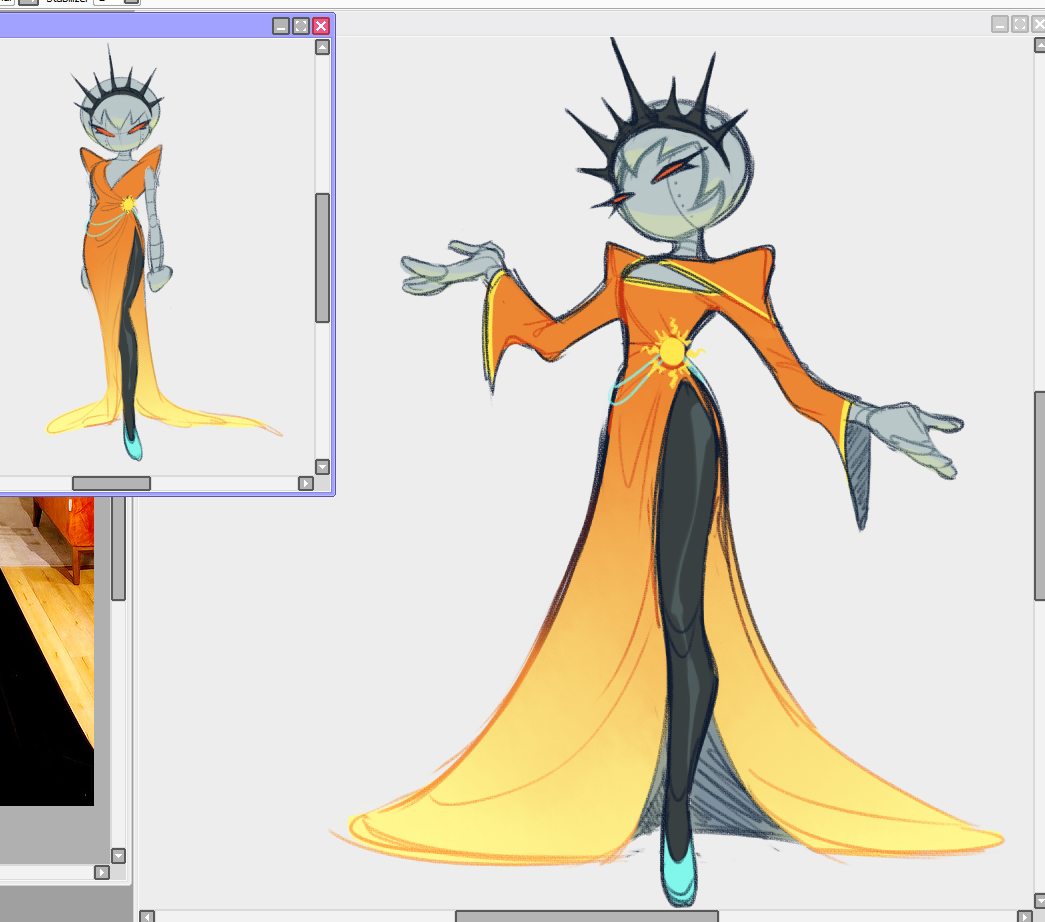
Haven: This was initially a single panel reveal of Rose but I felt it would read more coherent if it was: rear shot with dirk in view -> reveal. It also lets everyone see the front and back of the new design immediately.
Haven: also of note is that rose originally had a shorter cape with an opening highlighting her robo-trapezius
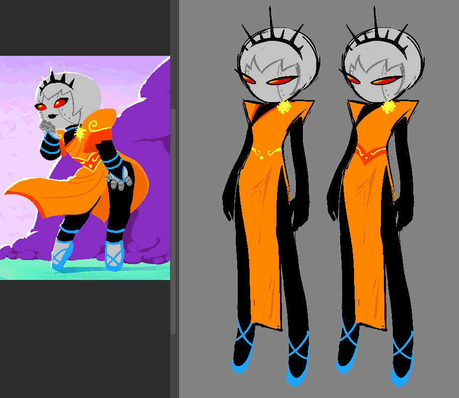
Concept art by Kim Quach, Haven, and Andi R.
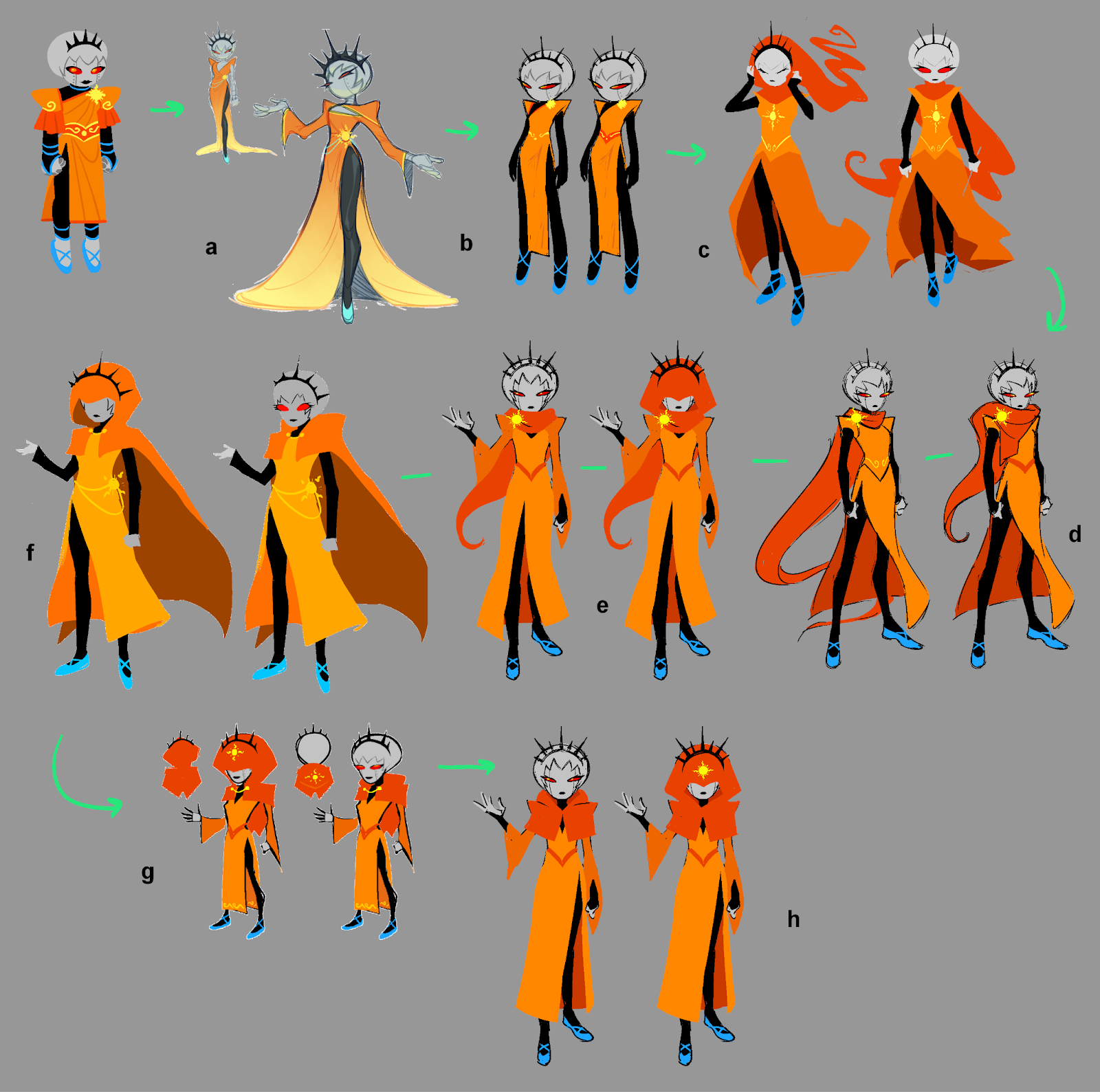
Haven: ok let’s talk about the rosebot redesign
James: lets fweaking talk about it
Haven: This underwent INTENSE deliberations. A, B, D, E, and H were done by Kim. C, and F by Andi, and G by me (Haven)
Kim: And of course, huge props to Xam for the original Rosebot design! It really gave us a solid base to work off of. The black bodysuit and the pointy shoulders were a MUST HAVE to keep.
Chumi: The side slits on her dress too (smexy)...
James: This was a heated couple of days in the concepting channel. I really pushed for two elements: The return of The Seer Hood and the sort of pointed under-armor sleeves. I will get more into the reasoning of some of that in the writer's commentary.
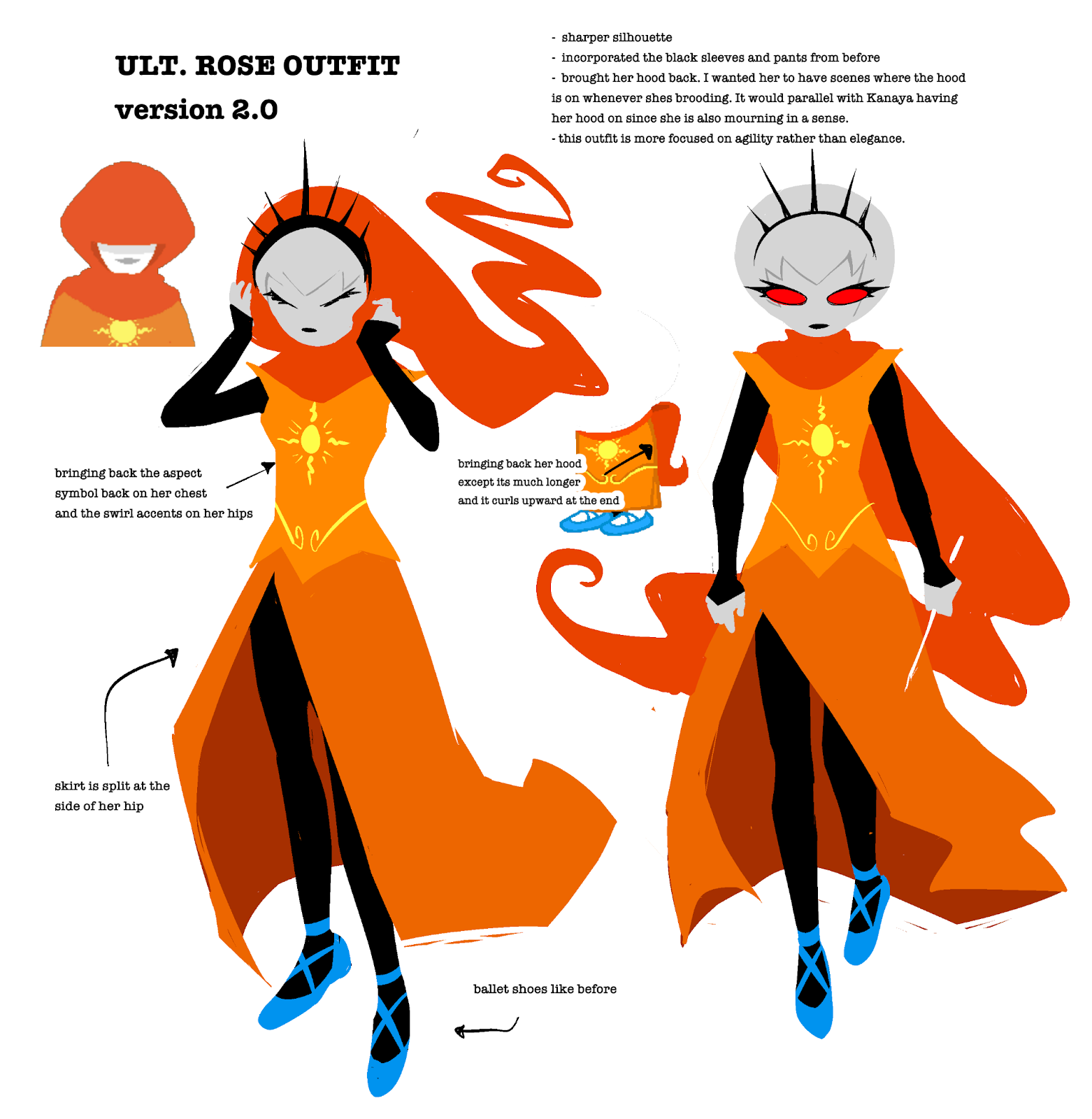
Concept art by Kim Quach
Kim: The first iteration was actually a fanart I made waaay before I even did anything officially for Beyond Canon. These were simply some inspired drawings I made when I saw some high fashion dresses on Tumblr that I felt would look cool with Rosebot’s other-worldly vibe. Though, now that I look at it, they’re probably a little too high femme for her, but I figured I would throw it in the ring to help as a starting point and stir some ideas.
Concept art by Kim Quach
Kim: This one here is an early version made about the time when us artists were approached to do Beyond Canon again, and one of our first assignments was to rework Rosebot. As you can see, it’s pretty plain! This was an attempt to simplify Rosebot into her most essential design points (with a little bit of inspo from my old drawing) to see how we can add onto it and/or work around it.
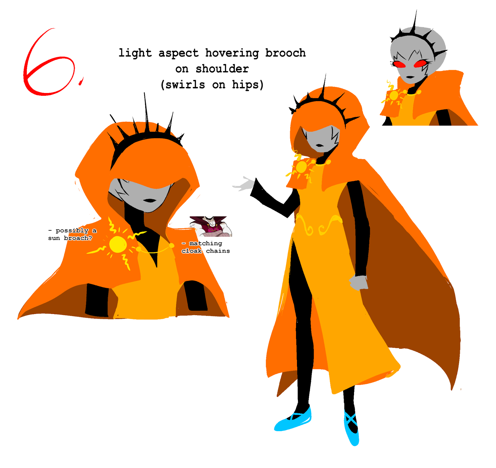
Concept art by Andi R.
Andi: When I first did C, I first suggested bringing back the hood starting the chain of designs. I felt like it was important to enhance the seer visual similar to when she first god tiered, I’m glad the rest of the team was on board with that and we made it work. We also fiddled around trying to figure out where to put the aspect. I also thought a matching cloak chain would be interesting, but maybe it was too derivative to Dirk.
James: I was a big fan of the belt chain from F.
Haven: I combined what I liked from B, E, and F into G.
Concept art by Kim Quach
Kim: After 5 million iterations and deliberations– we finally came to our new design of Rosebot! There were so many discussions of what little details to or not to include; what seemed the most essential, what seemed extraneous, etc. I’m really proud of what we all concluded though! Her design is very sleek and fun to draw.
I think what I especially also really like about this new iteration is that it touches upon a bit more into Rose’s personality/interests. It’s more wizard-y, a little mysterious, and looks a bit more like robes and feels other-worldly than just a dress. Enjoy the Rosebots!
Concept sketches by Kim Quach
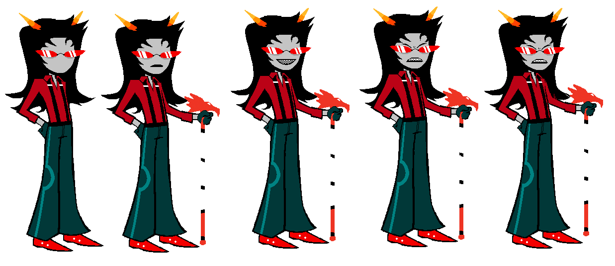
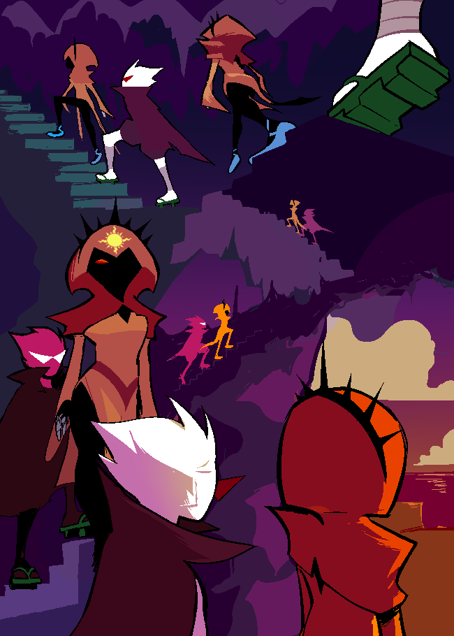
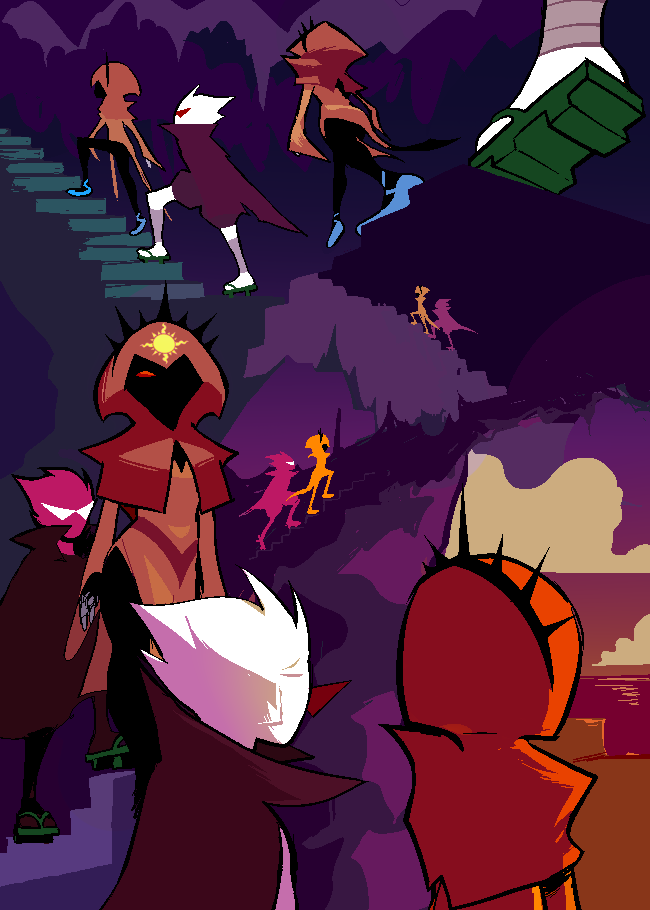
Haven: Be careful who you call ugly in sprite mode! 😂
Andi: Man, they all look so grown. Haven did a spectacular job capturing the guardian sprite vibes and keeping them in-style and looking good next to each other.. I think it's interesting how Terezi is the second “guardian” sprite troll we’ve seen. The first one being the Condesce.
James: Oh hey look who it is.
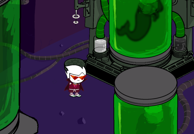
Haven: what the hell is that
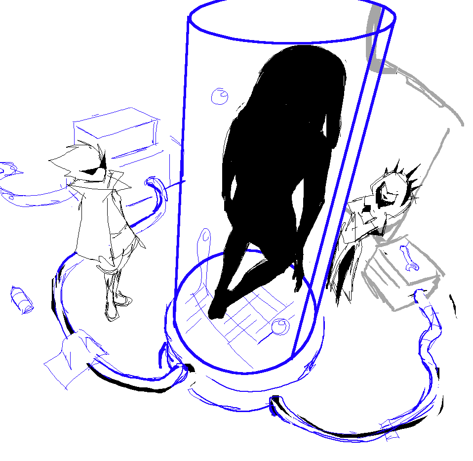
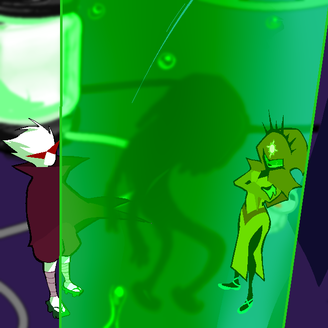
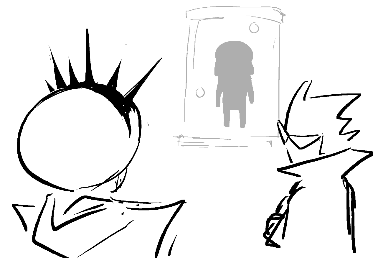
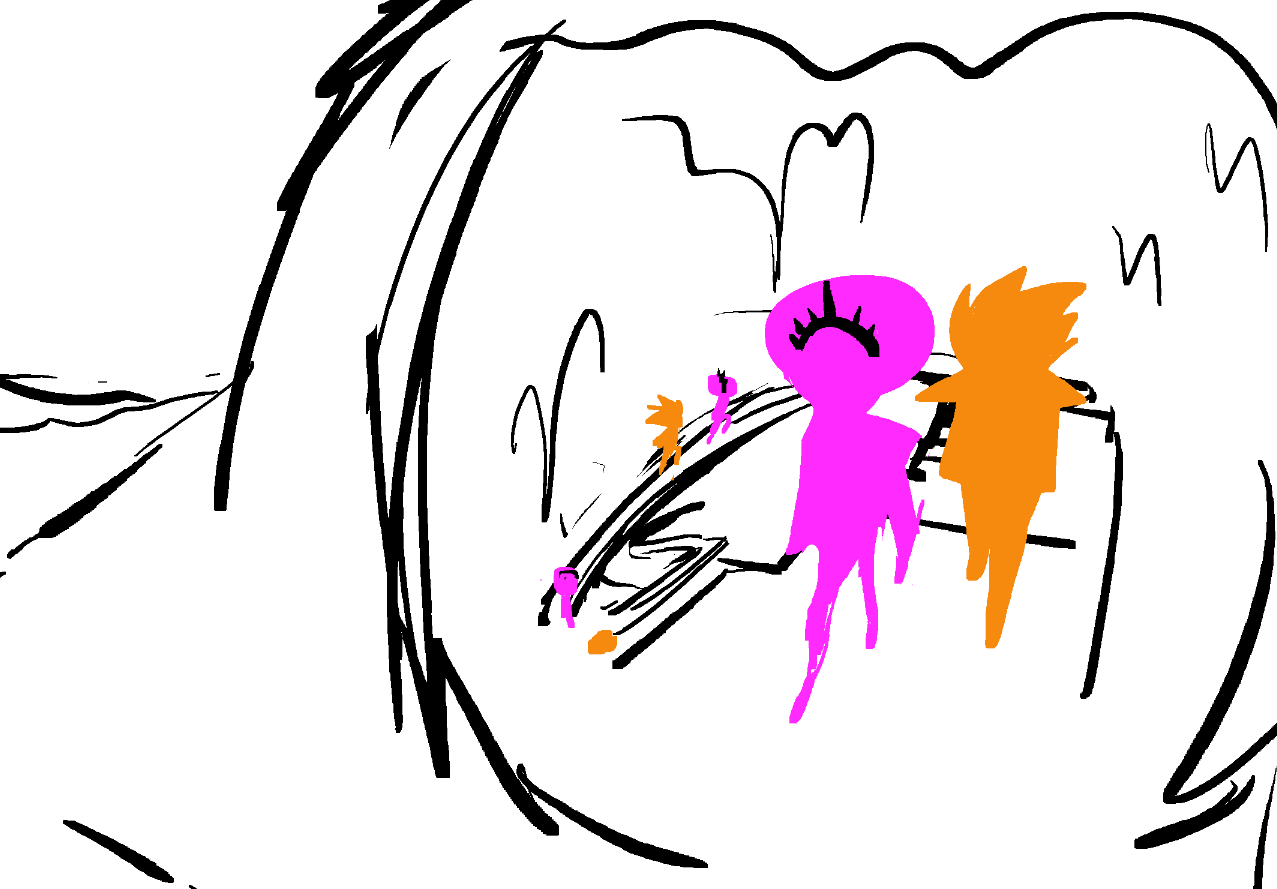
Haven: onward, alright so here they are looking at what is presumably a member of the species rose constructed for the contest (i like saying presumably even though i know that it is in fact exactly that)
James: could be anything.
Haven: I wanted to frame the shot so that Rose is inside the vat with her creation and visibly uncomfortable at that association.
Andi: What an interesting specimen in the vat there… humanoid appendages are quite different to the usual eldritch slop that Rose was previously littering around Deltritus. Curious.
Haven: everyone reading this should draw what you think the weird shit in the vat looks like
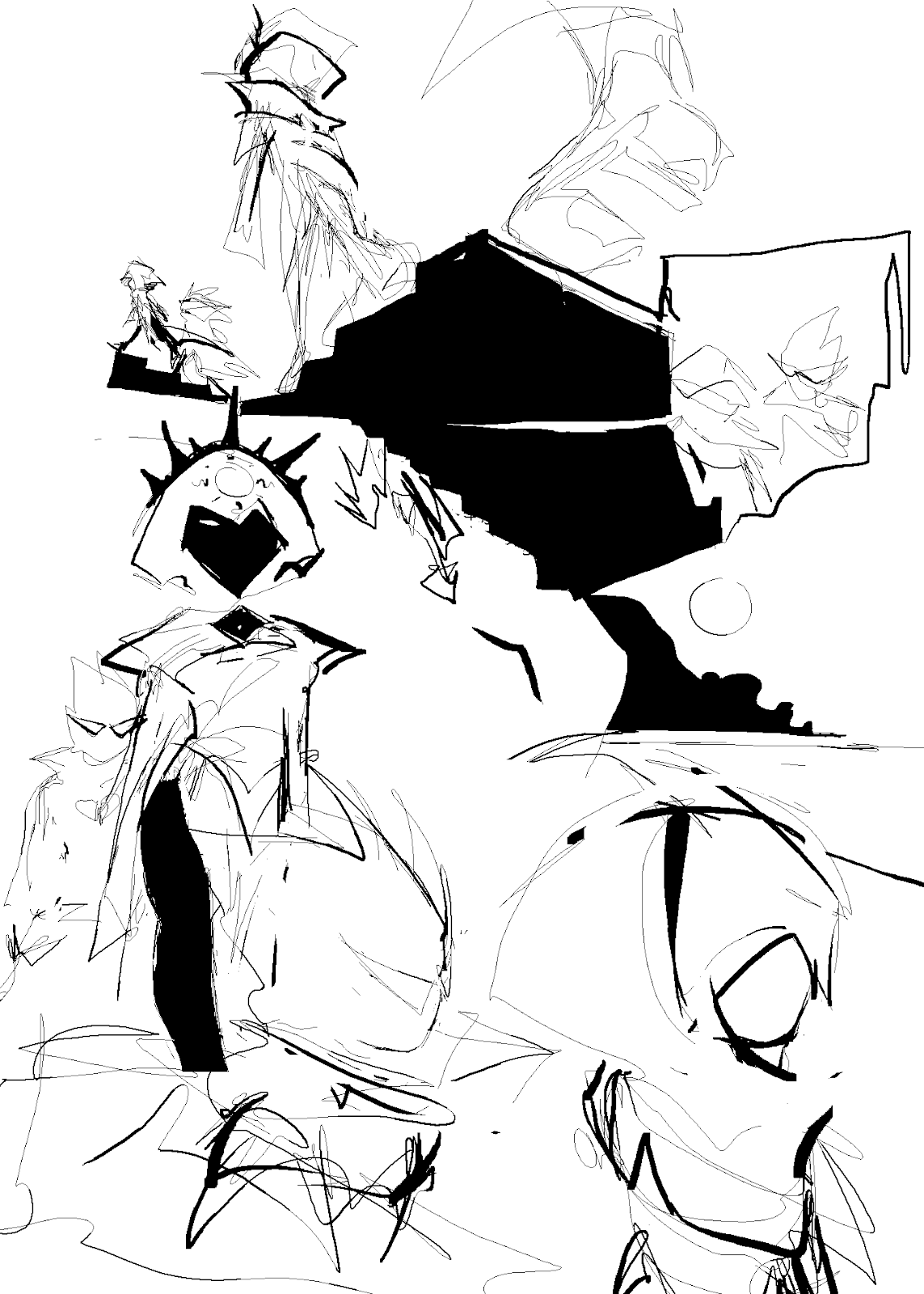
Haven: Looong panel, this was a lot to plot out but very fun.
Chumi: I remember team members were talking about her hip swivel in this pic and if it was too sexy or not HAHA.
Haven: I came into the chat like “Is this too much guys let me know”
Andi: Her smooth sashay…. lets just say, we were fanning ourselves profusely after seeing that. I need a towel.
James: nobody in homestuck should be sexy
Andi: They can and they should.
Kim: completely ignoring everyone else Can I just say I love how Haven drew Rosebot’s hood here. That extra sharpness of the hooks on the side is such (mwah) beautiful shape language. (<-- guy who loves strong silhouette designs)
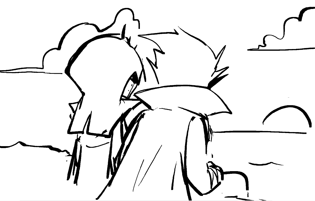
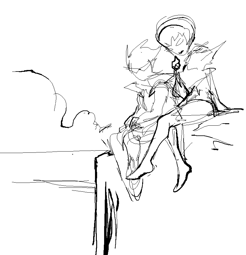
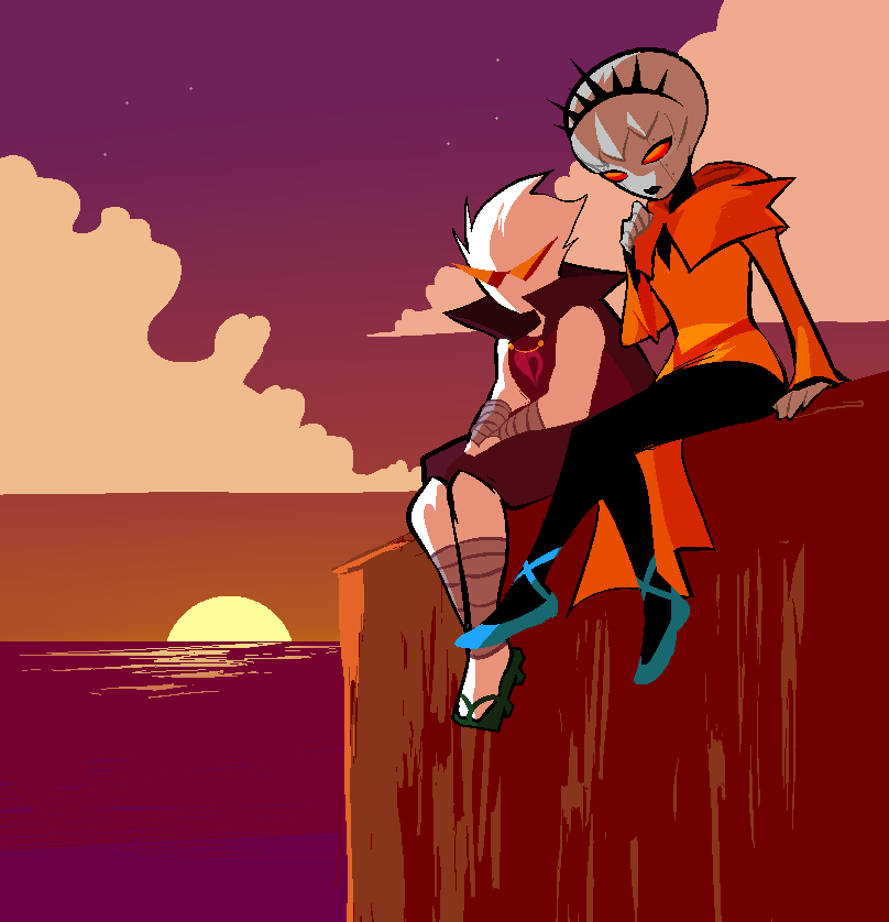
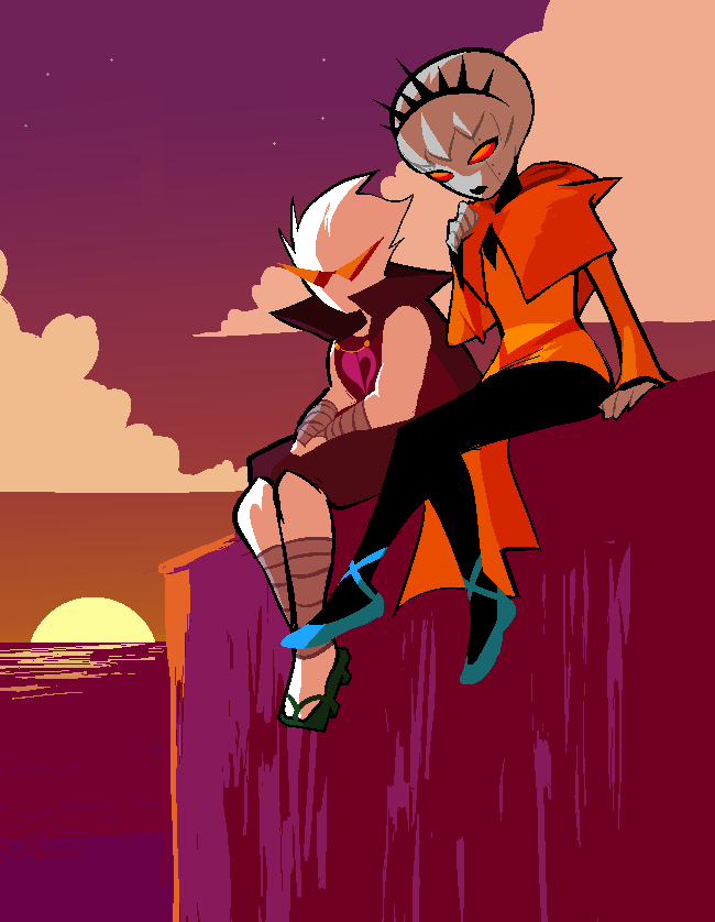
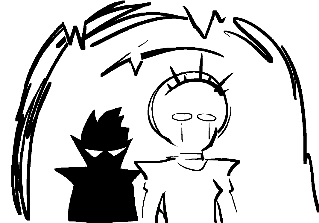
Haven: Strilonde Cliffside Feelings Jam... by the sunset, a combination of their colors. Purple and orange stars dance overhead, alike in dignity but the arrangement makes them seem as though they’re drifting apart.
Haven: Dirk is making himself small here, legs together, hands in his lap; He’s nervous, afraid that even sitting right next to her he might still be alone.
Chumi: AHHH… THIS IS IT… My favorite part of the update starts here. By the way, is that an Umineko reference I detect?!
Andi: I gotta read umineko already, I need to see the references LOL
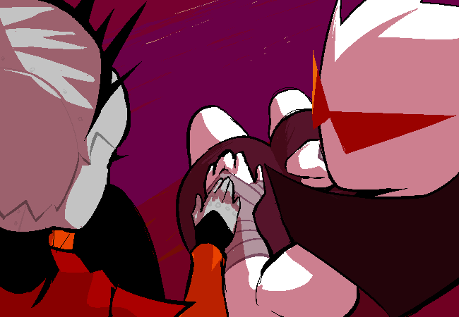
Haven: With a single touch he’s reassured.
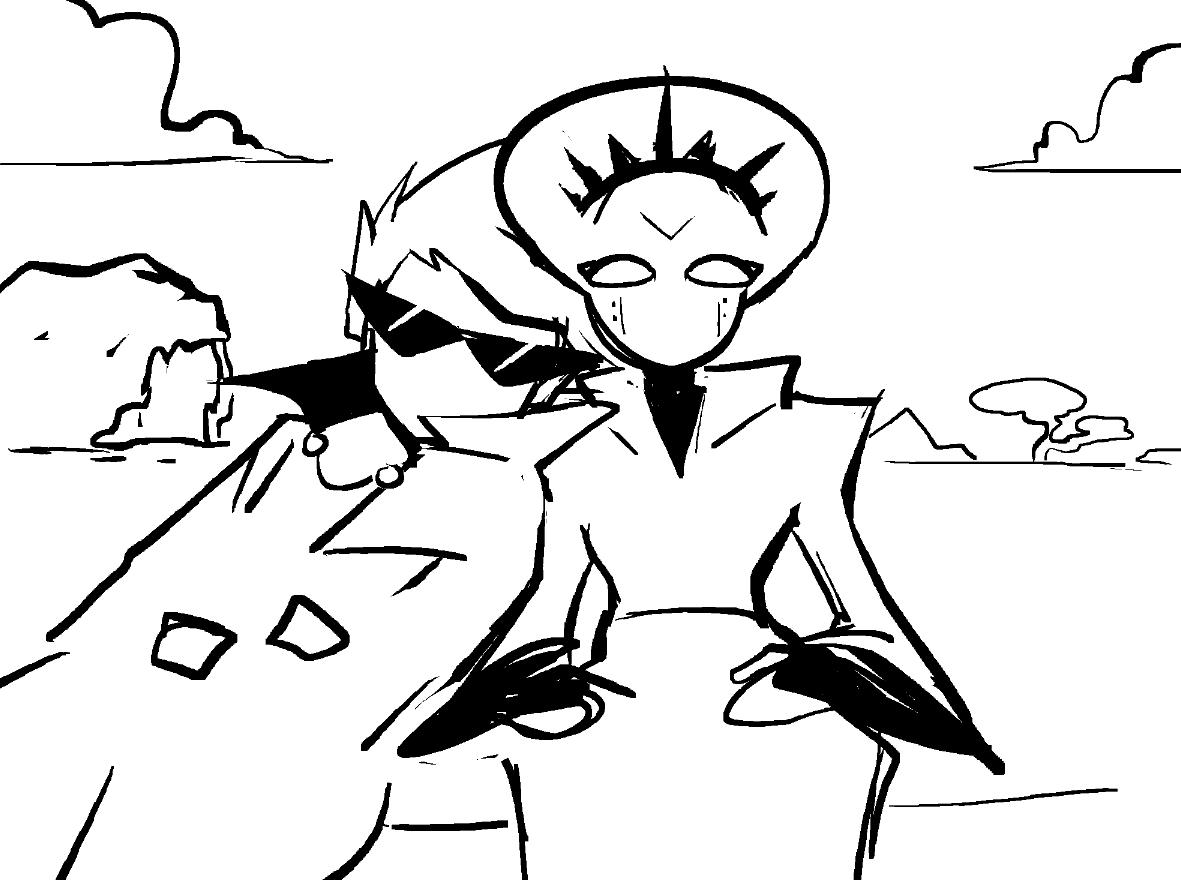
Haven: Dirk is here vulnerable, cape over him like a blanket, alongside his family. He’s acting out of love and despite everything he hopes they can understand that.
Chumi: This panel was really it for me. I was so excited for this update to be released so the audience could experience it too. Family… Working towards a greater purpose…. He’s doing it for all of them…This moment of vulnerability hits home after getting to see the Big-Villain-Bravado-Dirk. I felt my heart squeeeeze a little the first time I read this.
Andi: At this moment, they feel that they only have each other.
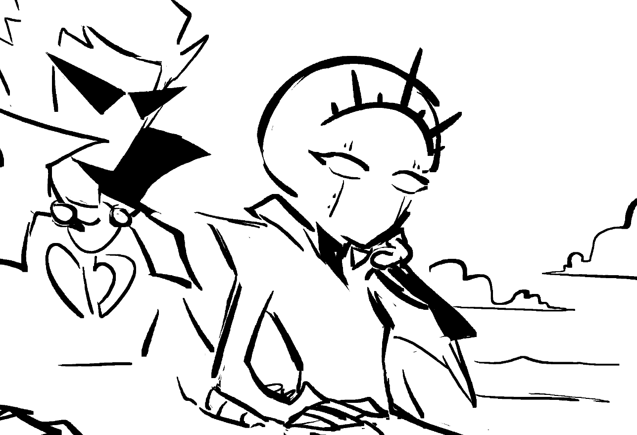
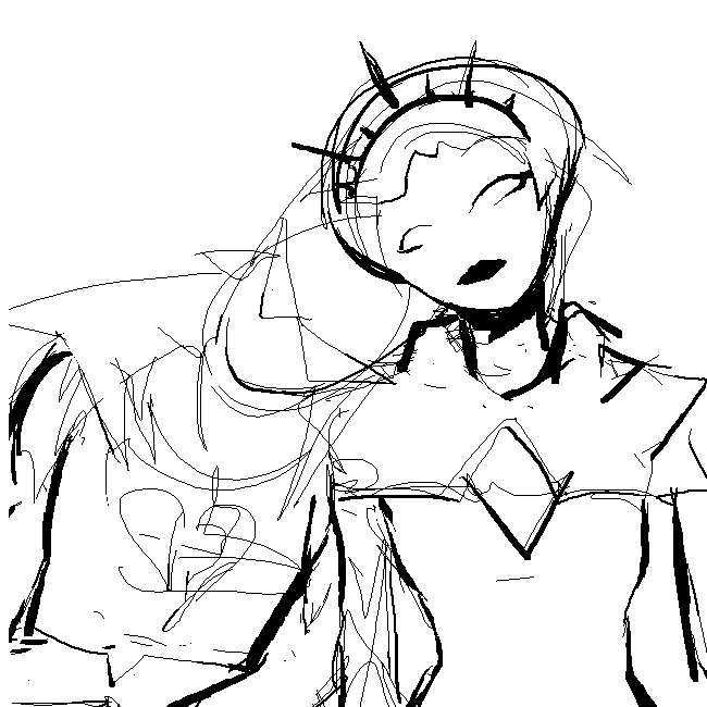
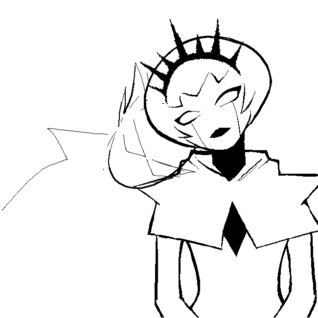
Haven: Here are some bonus sketches and other stuff i didn’t know where to place made during this update's production. In the previous artist's commentary I spoke about how we probably won’t do unique update art for every update but right as we were about to launch this update we were talking about which panel to preview for social media I immediately was like “WAIT... I’ll get something together in like 5 minutes.” I couldn’t help it. I love Homestuck too much. And with that it’s a wrap, I hope you enjoyed!