Home Artists Posts Import Register

Content

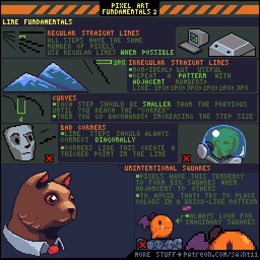
My original plan was to explain more stuff but I ran out of space :P So, banding will be explained in more details on another tutorial!

In pixel art I always try to "hide" the squares as much as I can. When the pixels are too aligned they tend to look very stiff, so I always try to break as many lines of pixels as I can.

Don't forget to check the part 1 here: https://www.patreon.com/posts/pixel-art-1-6971422

As always, thank you so much for the continuous support!

Files

Comments

Anonymous

this is just awesome. Obrigado

Anonymous

I'm not sure I understand what you mean by big squares. Do you mean: where there's a 2x2 grid with 2 colors made up of two 2x1 rectangles of a solid color? I think this is what you mean, but patterns like this show up a bunch in the top right image (all along the top), and also some in the cat and the mountain... My gut says these probably aren't all exceptions, so I think I'm looking at the wrong thing, or not understanding why these are fine but the others are bad (is it about contrast maybe?)... Either way, some clarification would be great, thanks!

saint11

Yep, I think you got it right, and yes, those patterns appear a lot, but some are more "recognizable" than others. In general I try to avoid/hide them as much I can, but I'm pretty sure it's impossible to not use them. Since we are working with squares (pixels) it's a good idea to avoid making things look even more square. This is probably very similar to what some people call "banding". Helm has some pretty good ideas about it, check this tutorial: <a href="http://www.pixel.schlet.net/" rel="nofollow noopener" target="_blank">http://www.pixel.schlet.net/</a>#C2