Home
Home

 Artists
 Search
 Recent
 Random
 Posts
Posts
 DMs
DMs
 Tags
Tags
 Random
 Importer
 Import
 FAQ
FAQ
 Account
 Register
 Favorites
 Login
Login

Maximum Max 1 WIP (Patreon)
Content
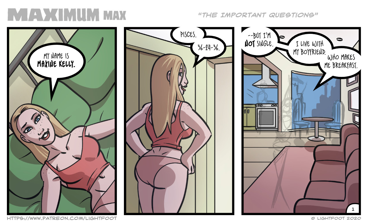
I dunno, worked on this a little today. Any thoughts? Is the font too small? Too hard to read? I've always been curious about making a comic strip comic. I mean you could just have a comic that was just a pinup or something. Having just 1-3 panels forces you to stick to one idea and keep things simple.
I figure she breaks the forth wall often, just to give the thing a whole different presentation. I'm trying to find ways to make her different than the leads in other comics I've made (by myself or with others), like Annie, Eve, Tifa, Erica, Xom, etc. She's meant to be more flirty and sexy than the others, while still trying to keep her realistic.
I added the old rounded page number that used to be on the old comics (pre-2006 or 2007 maybe). I always liked that, but it's harder to use when a comic has three-digit page numbers (like the old Pulse, PeEVEed, and Missing Materia had around that time).
Files