Home Artists Posts Import Register

Content

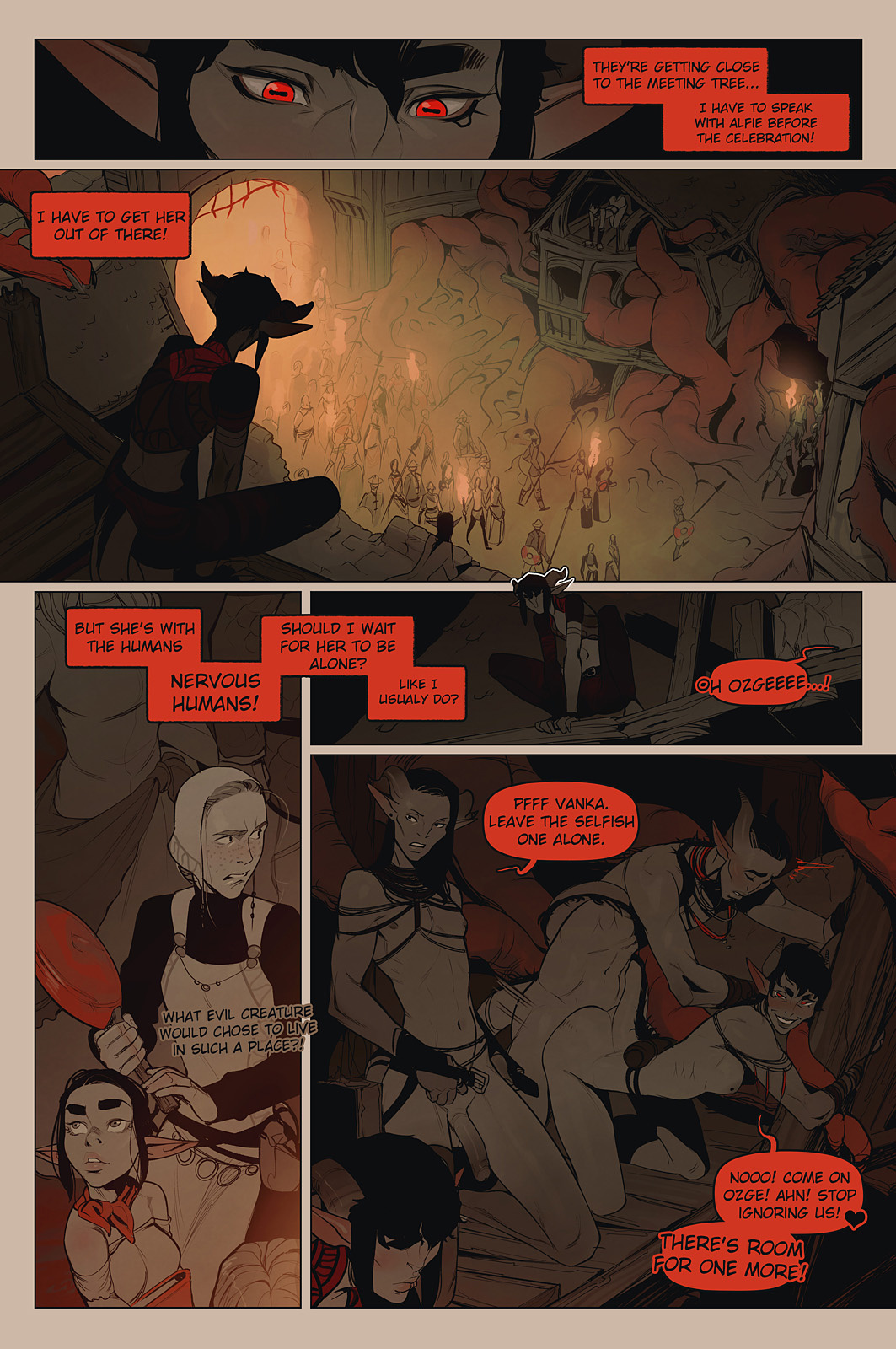
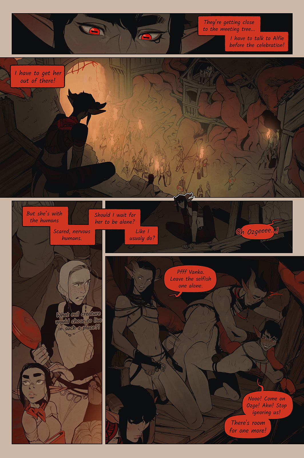
As most of you probably noticed I've started using a different font for chapter 10 of Alfie. I am not sure if it was a right decision. I wanted something more fantasy like and less comic booky. But now I think I might have overthought it.

I attached two versions of tomorrow's page to this post. Done with old and new fonts. I thought I'd see which one you guys prefer. 


Files

Comments

Shelby

I'll go with old, it's all about comfort with fonts. Moody fonts are good on occasion, but this one is a little too much for a comic.

Todd Whitesel

I know comic fonts have become a punch line for a lot of people, but other than a brief moment of being overused I really don't see the problem. Comic fonts are (by design) very easy to read and that's a plus. Many otherwise very cool looking fantasy (and space) fonts are more artistic than practical. Maybe save them for special cases to suggest particular audio effects?

Anonymous

The old font is easier to read.

Anonymous

I personnaly like both. But I have to admit that the old one offers a slighty better readability. Still, I think it is a good idea to try something every now and then. :)

Alessandro

Number 1 for me please :) It's much more readable. Not as stylish, true, but not ugly either. Being the difference in prettiness so marginal, I'll go for the more usable.

Anonymous

Needs more comic papyrus

Anonymous

Old font was not bad, but I like the new one.

Anonymous

My vote is for the old one, citing readability as well. Style and flair are nice, but I like not having to squint and struggle better.

Anonymous

I prefer the old one, personally. Stand out more and is a bit easier to read.

Anonymous

Bring back the old font, please! The new color scheme is already more innovation than my brain can handle. 🤪

Anonymous

I kinda like how the new font looks outside of speech bubbles, but inside them the old font just fills the space better. Perhaps it's not the font itself that's the issue but the casing? I'm voting for a return to the old font, but I think you should keep the new font for text outside of it. It gives the impression of more muted speech, as if it were drowned out by distance or whatever ambient nooses where around, and also because it obstructs less of the visuals, however minor that may be.

james hales

I voted for OLD FONT, but I don't think I'd mind the new font if the font size were a little bigger. Neither font is a deal breaker for me.

Chris Crowther

Old is so much easier to read for me.

Anonymous

Which one gets us back faster to watching Alfie and the gang get naked and covered in fluids?

Old Dragon

Old, please.

Anonymous

I'd PREFER the new one but I'm totally down with whichever you prefer wether out of style or convenience.

MAR

Old font is more readable, new font is pretty readable too, and you may be over thinking things if your messing with font at this level. Are you not feeling challenged enough artistically? Did you feel the old font was bad for some reason? Are font nazis picking on you?

Gixxian

but either is fine

The Weezel

I don't think you are over thinking it but I do think that the new font is less readable. So for now I think sticking with the old is a better idea unless you can find a fantasy font that is not so hard on the eyes.

PixelCrusader

I like the old font, personally Glad to have you back to drawing/writing, I've been missing my favorite story driven pornography :) Also hope you're feeling better!

Anonymous

I like the new font just fine, but it IS harder to read. Maybe making it thicker or a bit larger?

Anonymous

Old font for exposition, new font for talking or just for the delicious goaties?

Zack benYosef

I find the old font much easier to read, particularly with the new semi-color scheme you’re using.

Dawn2069MS

The new font has a nice fantasy-style, yet the old one is much easier to read.

Dominic Corbin

I'm fine with either. I find both readable, but the old one is slightly easier. Don't sweat too hard on this decision.

Anonymous

Old font. While the new font is nice, it was hard to read when outlined in the lower left panel.

Missing Link

Comic book fonts do tend to be highly optimised for legibility amidst a lot of other visual detail. I find the old font a lot easier on the eyes, personally.

OftenSane

I think I like the old font for most things, but the new italicized font for internal dialogue or whispering

Anonymous

Old font. Agree that new font would be ok if bolder?

Darren Stalder

I would only like the new font for specialized things, not as general body text.

Anonymous

I think the Old Font is easier to read because it's all in uppercase letters, whereas the New Font is not.

Anonymous

I changed my vote from old to new but I agree with what others are saying: keep a mix of both. Old for bubbles and new for stuff outside of word bubbles. I think that would be easiest on most people to read. Also I just finished reading this series so far, holy shit! It's so good!

Anonymous

Readability is pretty important, but modding the font to be more fantasy-ish would be good too. Just keep the letters straight and not like italics.

shedemon

Actually I wanted a choice of "any font" because I come for the art and stay for the story. The font isn't that important but that's imho.

Ama

on the one hand, sticking with the old font would be good for consistency. on the other hand, you've changed the art style plenty of times, why not the font? personally i like changing even if it feels a little uncomfortable, just to make sure I don't become resistant to change for the sake as I get older. the old font is familiar, comfortable, but the new font would become comfortable to me as well, if you used it long enough.

frank sands

I have to say I like the new font, I think it look more suited to fantasy

blank stare

the new font is cute but the old font is much easier to read.

odd-rose

for sure the new font is more "fantasy" like because it looks like handwriting (maybe Alfie's :D) BUT the old font is much easier to read for us folk with poor eyesight

Anonymous

Old font, and you spelled usually incorrectly.

Anonymous

I think keeping Alfie's journal/internal thoughts in the fantasy script might be nice. But if it slows down anything, I just assume keep it all one font.

Anonymous

Yeah, I really wanted to like the new font, but it's too small and crabbed. The old font speaks of comics and tradition.

Anonymous

use both in diff. situations. Internal thoughts vs external, whatever. Combine with diff. shaped text boxes, or a lack of boxes, etc. They are diff. narrative voices.

Zip Zop

older font is easier to see. was there a bold option on the new font.

Jeanette H

The old font fits the known characters, the new font really fits the Voch'Khari aside from Ozge - their exotic language, their exotic looks, their exotic accents when they speak the human tongue. I guess it would be too confusing to use both, though.

Anonymous

I thought the new font was a brilliant stylistic move to add even more sinister ambiance to the Redwood!

Anonymous

Old font is easier to read. I DO like the new font though, it adds more to the mystic feeling and I like that you are asking the readers what they would prefer.