Home
Home

 Artists
 Search
 Recent
 Random
 Posts
Posts
 DMs
DMs
 Tags
Tags
 Random
 Importer
 Import
 FAQ
FAQ
 Account
 Register
 Favorites
 Login
Login

Lettering-Type Stuff: Tear Them Apart Podcast Logo (Patreon)
Content
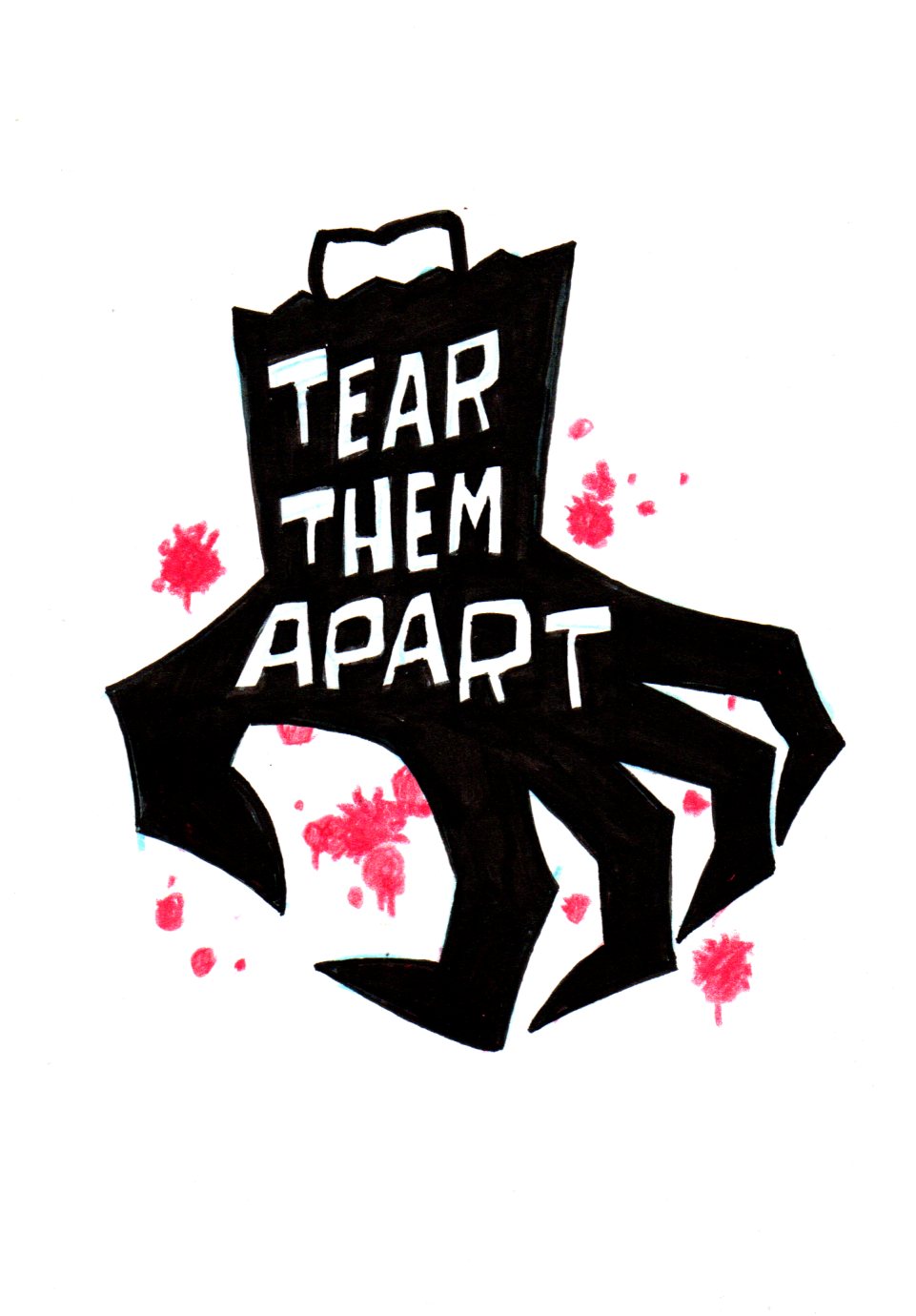
Here's the process I went through for the logo for Tear Them Apart, the horror movie podcast that my friend Paul Yellovich and I do.
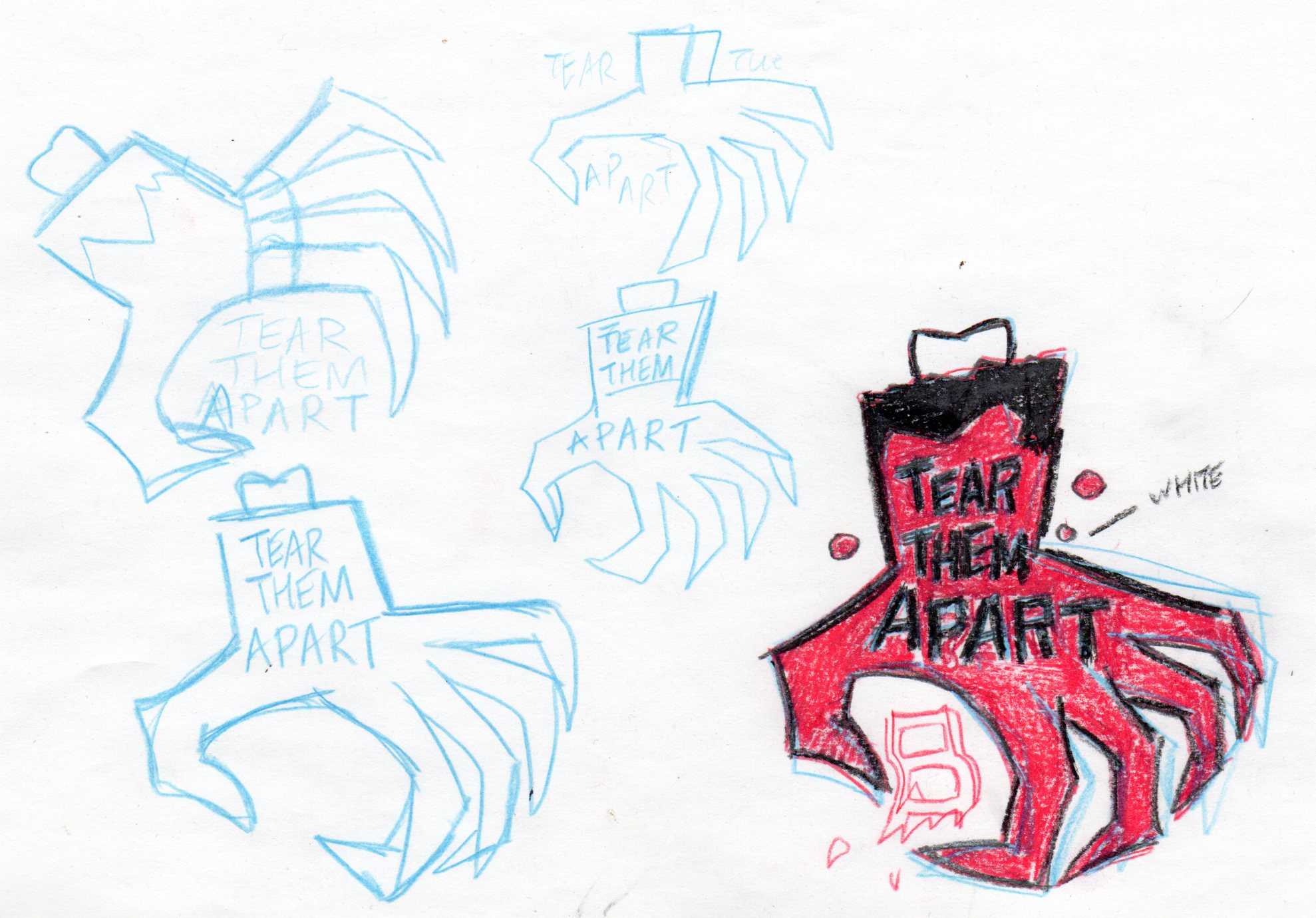
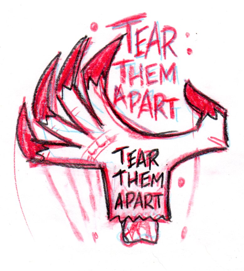
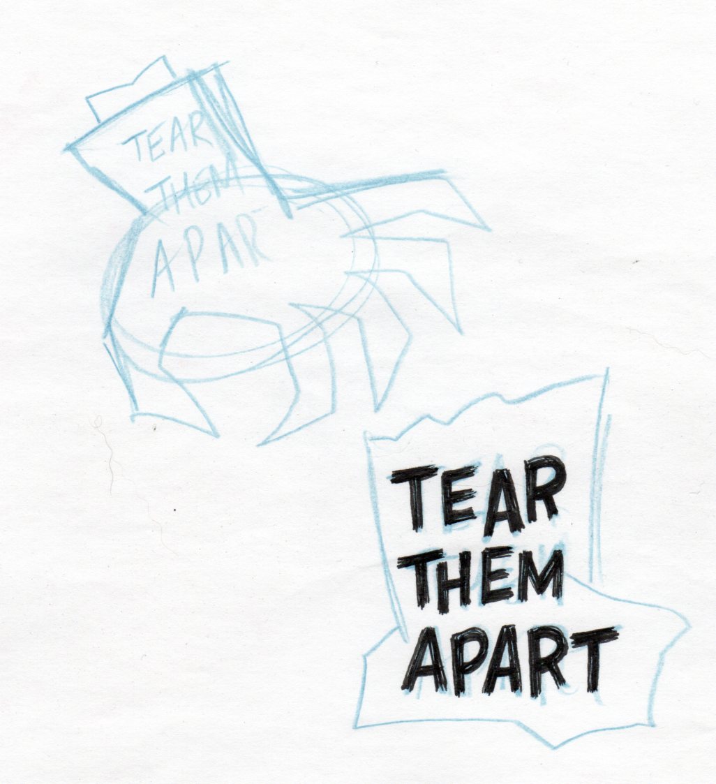
The logo, like the podcast, is casual, simple and lo-tech. It gets the jo done in telling you what's what. We do a horror movie podcast, here's a severed, clawed hand and a little blood. I would probably lose the blood if I was designing the logo now, it doesn't work for me, but maybe that's mainly in the execution. I dunno. Sarah cleaned up the original drawing digitally and suggested we remove the bone from the design (see second image). I prefer it that way, although some folks like it with the "bone in" (hi, Chynna!).
So, the process (what little there was to it). Well, I just wanted something that reflected the horror theme while avoiding caricatures of Paul and I, zombies, ghouls or any monsters, and horror comic book/movie style "shock" lettering. Which is all fine but I wanted something simple and hopefully striking.
I'm not a graphic designer but I can close my eyes and think of Saul Bass with the least of them, and that's what I was doing when I started sketching a severed hand, with the posters from Anatomy of a Murder and The Man With The Golden Arm in mind. Severed and distended body parts are a solid horror trope, so we have that covered with a "torn off" hand, with the extended claws positioned to tear something apart. Or something like that.
Anyway, it's a severed hand with some un-referenced, phony-ass Saul Bass lettering and a few blood spots.. I tried to keep it calm and simple and I think I drew it on plain printer paper so as not to freeze up any. I was happy enough with it, for a change, and it barely took me any time to do. Good enough! if only I could manage that kind of thing more often, losing over-thinking, and just relaxing and doing what needed to be done. Of course, if this was for a paying client, I'd have been a wreck trying to come up with an overcompensating, overdone car wreck of a design.
Anyway, you won't see many logos in these lettering posts, because I have only done a few, unless you count the titles for Fun Strips and the like. I guess they count. I'm not sure, like I said, I'm not a graphic designer, I don't even really know what graphic design entails. I draw stuff, including any and all logos or logo-like things I need for a project. It works out for the most part. My hand-drawn logos go well with my cartooning. Also, I work cheap.
As an aside, Paul and don't really tear apart as many films as we expected to when we started the podcast a few years ago. We both ended up taking a more positive direction in wanting to basically share films we liked more than bashing stuff we didn't like. We do tear a few things apart, but considering how argumentative and picky we have been in the pas, we're a lot more relaxed and positive than I expected us to be. People change, for sure, I know I've mellowed a lot, especially in the last few years. The podcast is really about friendship and connection through shared interests, here being horror, the fun of seeing the good and the bad and discussing why we liked or disliked something. There are no real aspirations for the podcast, like I said, it's a simple, casual thing we do for fun.
Two notes: First, we've always wanted to make a T-shirt of the TTA logo for ourselves and any listeners who might want one. if all goes well we should soon have a Teepublic site going where the design would be available.
Also, after a lengthy hiatus, Paul and I are finally going to be recording a new audio episode tonight. We'll be discussing three found footage (or found footage-adjacent) movies we actually liked: The Borderlands (aka Final prayer), Butterfly Kisses and Lake Mungo. And we might tear at a few we don't like in passing.
You can find the 17 episodes we've done so far along with several video hangouts we did here: https://tearthemapartpodcast.home.blog
Halloween isn't that far away.
More soon, later.
Files