Home
Home

 Artists
 Search
 Recent
 Random
 Posts
Posts
 DMs
DMs
 Tags
Tags
 Random
 Importer
 Import
 FAQ
FAQ
 Account
 Register
 Favorites
 Login
Login

Promo: Abby 'n Nabby's Bombastic Photobomb! (Early Access) (Patreon)
Content
Synopsis/Description:
I decided to revamp my logo, which became revamping Abby 'n Nabby's logo, which turned into a photo session for Abby (which Nabby just had to bomb)!
(luckily for Abby, Nabby can't get naughty in promos. Maybe some other time?)
WiP Outline/symbol breakdown:

The Rant:
It's been a while coming, but the impetus isn't/wasn't what you think it is/was.
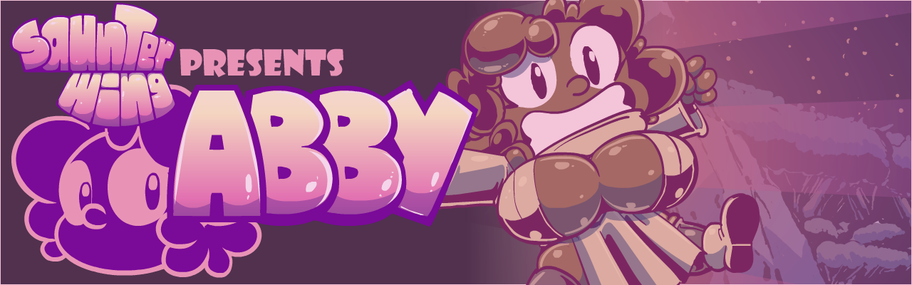
So, I started working on device Wallpapers for Abby for some reason, and decided to base the template off the design I use for my SFW content.
Just one problem; that design used logos for both my personal account and character brand that neither Saunter 'nor Abby had. I'd done some initial logo designs to fit the style of the character and brand, but one (in the case of Saunter) didn't say what I wanted it to say, and the other (in the case of Abby) wasn't finished.
Well, the only remedy was to redesign the Saunter one and finish the Abby one!
In the case of the Saunter one, I ...liked the old design, but it was a little too loose for me...

Also, the specular shines were too vibrant and and scattershot, and the exclamation point, while capping off the text, was hard to read and created confusion as to how to read it (SaunterL? Saunter!Wing? SaunterWing? You see the conundrum)
So, I decided to condense the shapes a bit, and go for something that looked like a lot of boob, butt and chub squished together. I also went a little more conservative on the specular so they look like actual, three-dimensional shapes, rather than a bunch of blocks dipped in chicken grease:

I think that reads a lot better.
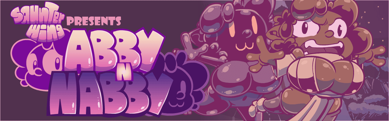
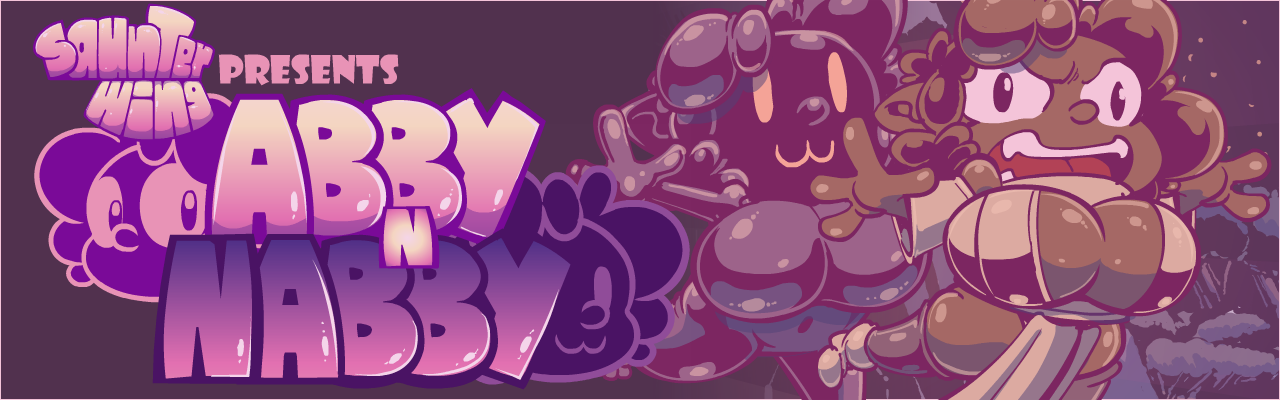
As for Abby'N Nabby (which wasn't the original name, but screw it),
I'd started making a logo for them (or rather Abby) back when I first started planning my exodus from DeviantArt. This was when Bonnefant was in full swing and getting hot 'n heavy, beyond what DA would be willing to tolerate. At first, I considered making proper promo images, but they ended up taking so long, that I was just better served ignoring DA (until I eventually came back). One of the experiments was an Abby/Nabby Logo that I even started making custom letters for!

So, I decided to take the "Abby 'n Nabby" logo, spruce it up in the same vein as the "SaunterWing" logo and voila!
Abby's misadventures have a logo!

However, I figured I could spruce it up just a little more. So I took my pictorial (the thing that serves as my profile pic) and added it to the Abby side. And because Nabby is just a customized recolor of Abby, I did some mild tweaking, sloughed it on the other side, and boom! proper logo!
![]()
Just enough Abby that you can see her definite features, but also enough of Nabby hidden that you know she's up to no good!
As for the animation.... that was tricky....
Rather, it would have been, where it not for symbol libraries and asset animations!
This allowed me to break things into pieces and/or carry out separate animations, rather than think about everything all at once.
But let me back up.
As some of you know, I have a safe for work side that I keep separated from SaunterWing for obvious reasons. However, that doesn't mean that lessons I learn as one persona don't/can't apply to the other. In fact, my approach to characters seems very universal across both personas!
In this case, I have a similar banner for my other persona, and I liked how that turned out. So why not apply it to Abby?
Similar premise: Extremely excited protagonist leaps onto screen, hovers for a bit too long, realizes gravity is a thing and has upset their middair balance, and they fall off screen, causing the the title to drop and everything to reset for the next loop. Yay? Yay!
However, there were some differences; some inherent (I have two characters) and some by design, and I decided to push it as far as I could.
The main thing is that all the logo elements pop in separately, timed to when Abby and Nabby themselves appear. This gives the banner an interactive and narrative feel; if it lasted longer and/or held on Abby's portion longer, one might get the impression that this was just her show (Its a banner, not a cartoon in its own right and I have to get to the goods, which is why it doesn't hover longer). That's also why Nabby's portion animates the way it does; to give a similar impression to the character that it (and she) just butt in whenever they want to, regardless of whatever Abby is up to.
Sadly Nabby can't be involved in any of her trademark shenanigans, as this is intended to be a public banner, and as such, can't risk incurring the wrath of the all-important ToS (which is also why Nabby has no nipples where she would normally).
I think, also, narratively, this banner captures the Saunter experience much more succinctly and expressively than the previous banner did. Since most of my content skirts that fine line of "this is kinky" and "this is VERY kinky," I couldn't really go ham on what it was actually about, but I think this does a very wonderful job of hinting, with less need for an actual comic in the banner.
If there's something I'm not entirely satisfied with, it's the background. I doodled up a cave in a forest, because that's where most of Abby's misadventures tend to take place; secluded away from society and safety. But it didn't feel right for her, because I haven't defined an Abbyworld, and I don't intend to. I then tried for animated starbursts, but that didn't feel right either, especially with the work I'd put into everything else.
So I went for a compromise of having the starbursts rotate in when Abby and Nabby appear, and fade out as the excitement slows down.
I think it works, but it's definitely something to fix for next time.
Its also funny to me how much this looks and feels like the introduction to a cartoon and/or a more official capacity. It's also reminded me how much I loved making narratives for Abby to get into trouble, and I need to get back to that (especially since I've figured out what I want to do with the other character who was supposed to be the other main character of these narratives).
We'll see....
What do you think?
Let me know in the comments!
Your feedback lets me know how I'm doing!
Thank you for your continued support and patronage, and I'll catcha over yonder!
-Saunter!
Files