Home
Home

 Artists
 Search
 Recent
 Random
 Posts
Posts
 DMs
DMs
 Tags
Tags
 Random
 Importer
 Import
 FAQ
FAQ
 Account
 Register
 Favorites
 Login
Login

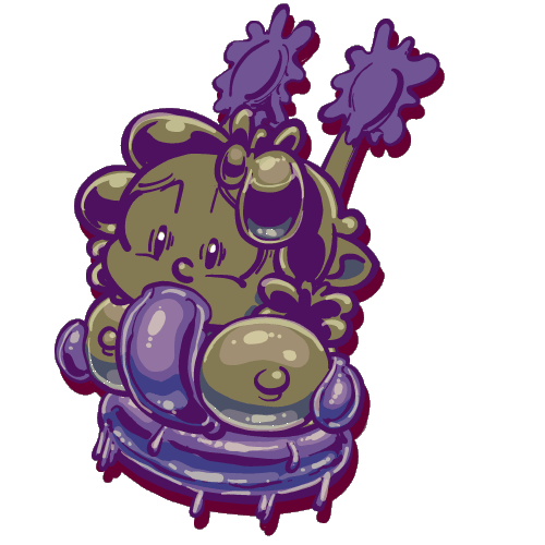
Abbymations (Patreon): Slimey Pai-Z! (Patreon)
Content
Synopsis/Description:
Man, those tentacles really are something!
Giving Abby a boob massage while feeding her... something!
(You'd think Abby'd be more grateful...)
The Rant:
This was a lot of fun! I'd kinda had this in my head since I started working on the strip, and that made it a lot easier to work on!
The interesting part is that this is a lot more forceful and repetitive than in the text. In the story, its implied to be one continuous shot, rather than a regular pumping. I just like the pumping. Another difference, specifically between here and the comic, is the placement of the tentacles, and the boob massage by the slime. Again, some extra flourishes on my part.
A lot of that is due to exaggeration. Exaggeration, as an animation principle doesn't simply have to refer to exaggeration of action; it can also refer to exaggeration of subject matter. Subtlety and I are not friends, so if I can squeeze as many kinks as I can into a work, I will (which is also why everything is ALWAYS SHINY). If Abby's gonna be pumped by a slime tentacle, which the text explicitly has slithering through her boobs, why not add some pai-z (alt word for the censors) as well?
I'm also starting to figure out this asset-imation thing as well. This was the animatic for this animation:

I probably should have smoothed it out a bit before creating assets, but it works.
What works here is a better balance of switching between assets. I think I probably could have smoothed it out some more with some more custom assets. You can see this with the tentacle in middle, and how choppy the transition feels in some parts, as well as Abby's head having the same sprite for all but two frames, which could have better transitioned into each other. Still, way better than this time last year, which I'm glad of.
I also added a drop shadow for some stylistic flourish. Its an evolution of my "animated sticker" aesthetic, when it comes to rendering out gifs. You might have noticed that my loops tend to have some kind of transparency to give the distinct silhouettes (rather than being rectangles of varying sizes). This is just another extension of that. I'm hoping it works and sets me apart from others, but if not, no worries. I like it, and hopefully you do too, and that's what's important!
What do you think? Let me know in the comments! Your feedback lets me know how I'm doing! Thank you for your continued support and patronage, and I'll catcha over yonder!
-Saunter!
Files