Home
Home

 Artists
 Search
 Recent
 Random
 Posts
Posts
 DMs
DMs
 Tags
Tags
 Random
 Importer
 Import
 FAQ
FAQ
 Account
 Register
 Favorites
 Login
Login

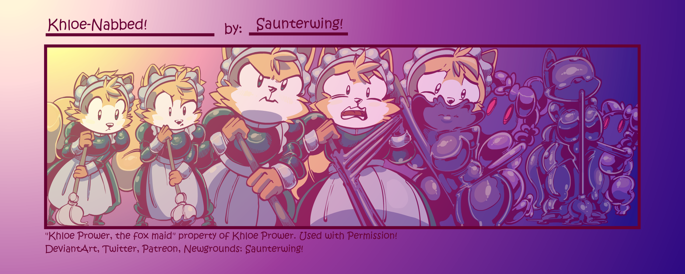
NabbyCapers (Early Access): Khloe-Nabbed! (Patreon)
Content
Edit:
- Comic Complete.
- Commentary Rant added
Synopsis/Description:
@KhloePrower is such a bad maid. Missing spots everywhere! What's that? That spot is Nabby? Oh, well that explains why the spot is getting bigger... still, no excuses! Especially now with another spot!
Process Gif:

The Rant:
So, Khloe broke the purple OC streak... the thing is, it was bound to happen. When I did my picks for OCs, there wasn't really any themed cohesion. I picked Zetta because, of most of the subs I've encountered, she's currently the most likely to pick on Abby without provocation (most OC owners have asserted that, despite enjoying Abby's predicament, they'd be neutral to her at worst), and thus, most likely to activate a Nabby-trap that relies on mistaking Nabby for Abby. I picked Fem!Bose because I was running up against deadline for WiPs, I didn't get a response out of my initial pick fast enough, and Bose was kind enough to volunteer. Khloe got in via the suggestion thread, as, to me, the joke of someone trying to mop up Nabby in addition to the serentdipity of Khloe suggesting their fox-maid (who's profession involves cleaning) was too good to pass up. Heck it wasn't until I started sketching this one that I realized all the subs were anthros and thus, I should have used the ChinchiNabby design instead (which is why Bose and Zetta are picked up by a Halfling-style Nabby instead)
Surprisingly, this one has no background! I honestly thought it worked better that way, though admittedly, that's because the middle 3 panels take up so much space that negative space is minimized and the reader theoretically shouldn't miss it. Also, a blank background implies a clean space, which makes sense for a maid, even if her spotless record is about to get some slime on it.
This is also one of the few where I think I enjoy the earlier stages moreso than the latter ones, partially due to the hatching texture work in the pencil stage. I think it gives it more color, but I haven't figured out how to translate that into inks without losing the slick shininess of latex. By contrast, much as I've tried, I don't think I have a middle ground between grainy hatching -> no texture -> noir latex shininess, at least, in regards to inking. My hatching lines, when I ink, are too strong, so I tend to omit/redesign them, which I think, could be fixed. It feels like the artwork loses a lot of personality in the process otherwise, from pencils to inks. But, at least now I know there's a problem, and I can start working on solutions. I probably need to study inking more.
But that's me!
What do you think? Let me know in the comments! It lets me know how I'm doing and where I should be going! Thanks for you continued patronage, and I'll catch over yonder!
-Saunter!
Files