Home
Home

 Artists
 Search
 Recent
 Random
 Posts
Posts
 DMs
DMs
 Tags
Tags
 Random
 Importer
 Import
 FAQ
FAQ
 Account
 Register
 Favorites
 Login
Login

COMICS RIFFS I LOVE: Inio Asano's vertical-only bleed pages! (Patreon)
Content
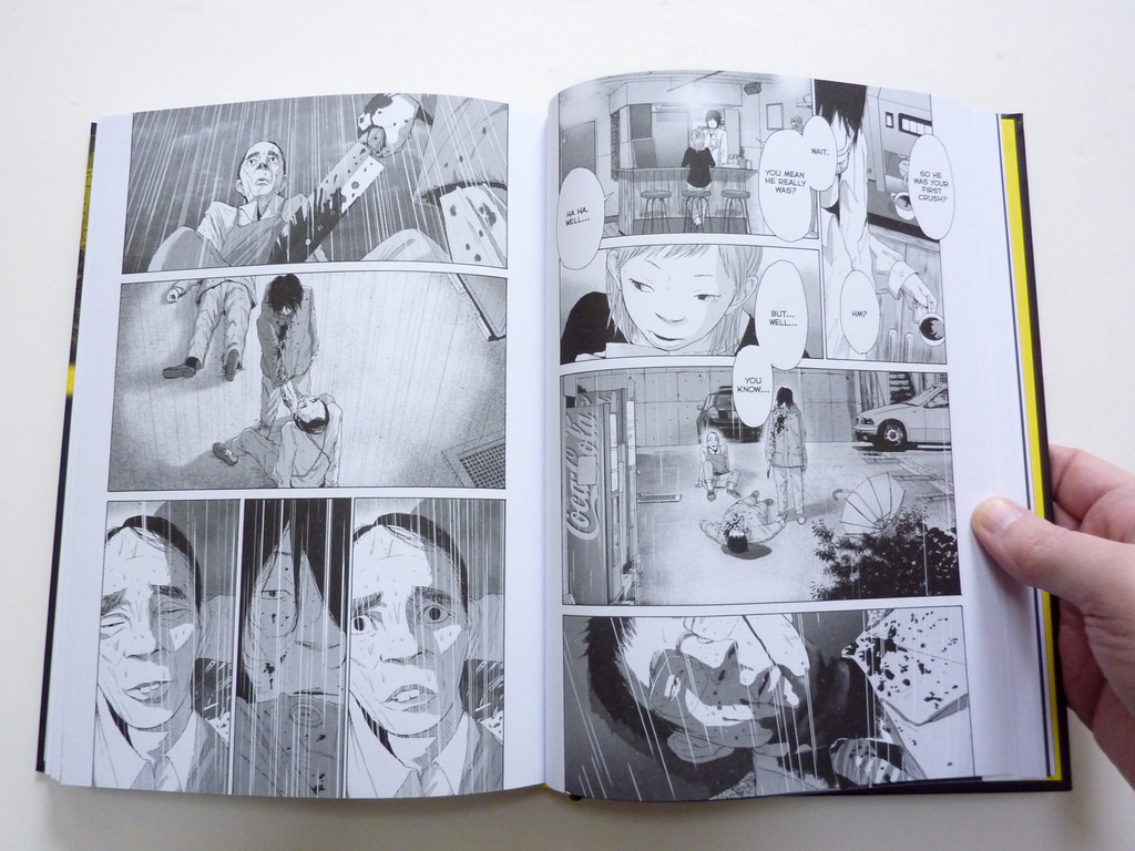
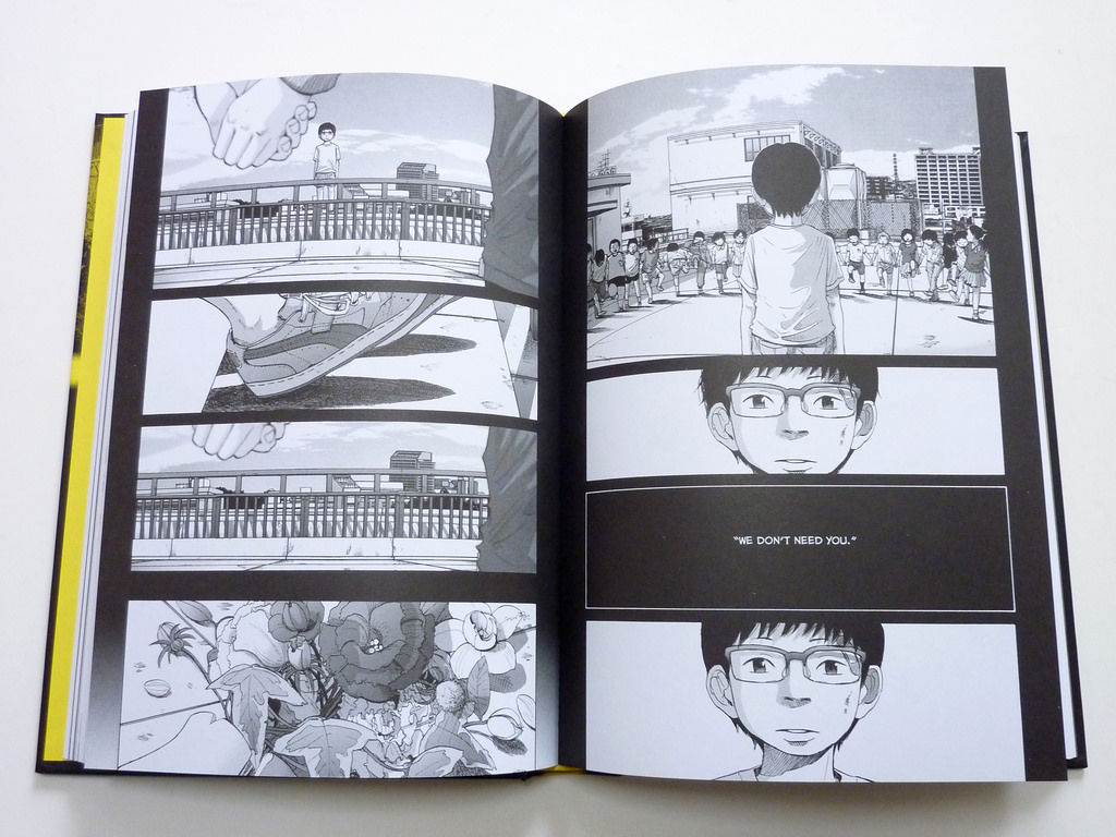
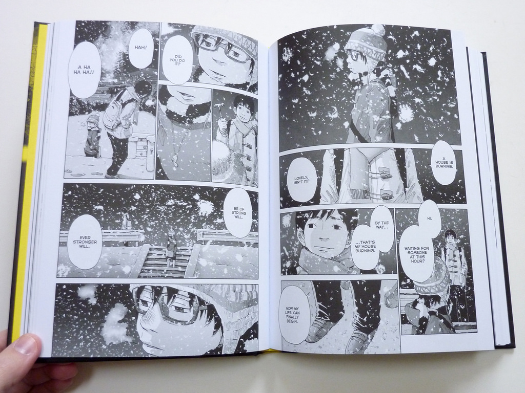
So! The acclaimed mangaka Inio Asano (Solanin, Goodnight Punpun, A Girl on the Shore) has a really interesting approach to using so-called "bleeds," which are comic pages in which the artwork extends all the way out to the edges of the printed paper, as seen in the images gallery above. (And below, too!)

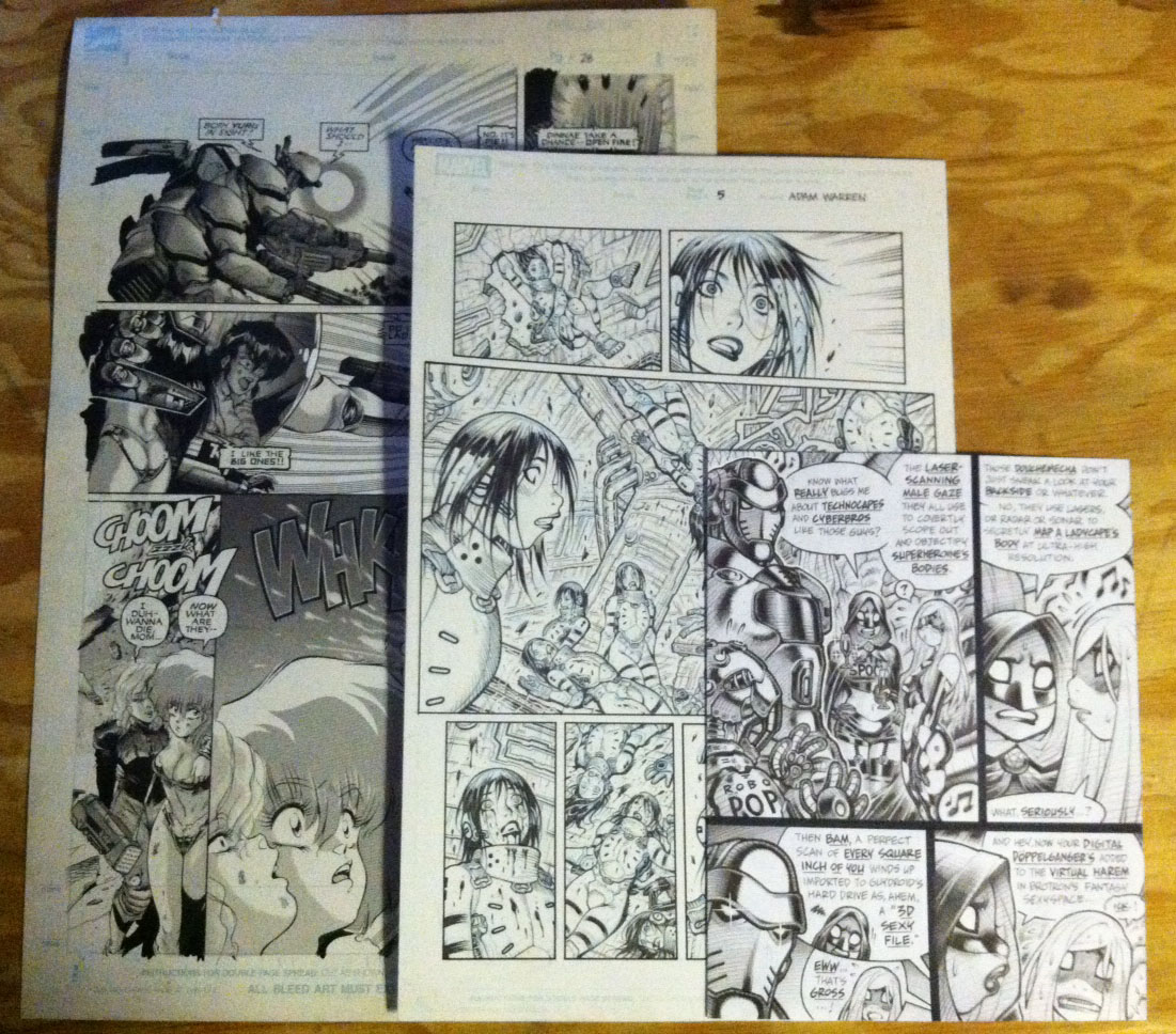
Now, a "full bleed" is a comic page in which the artwork extends out to all four sides of the printed page. If you look closely at the Dirty Pair page below, you can see that it is indeed just such a "full bleed" page, while the Marvel page next to it bleeds only horizontally.

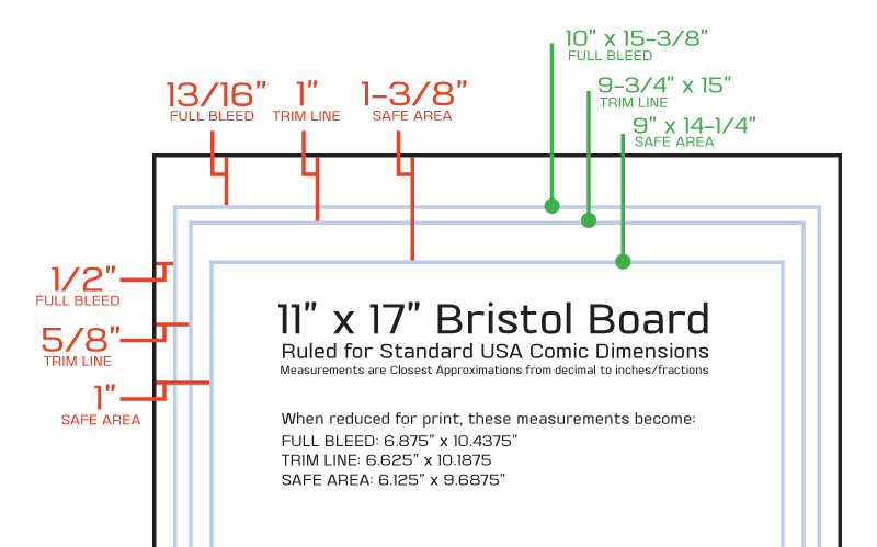
For clarification, here's what those faint blue lines on the art boards above indicate; note the "full bleed" indication below.

Back when I regularly drew comics in conventional formats, from Dirty Pair through Titans through Gen13 and Livewires and beyond, I used full-bleed pages all the time, as I liked to have all the available comic-page real estate contributing to the struggle. Why, look at all that open, unused white gutter space around a printed comic's artwork; let's put that empty space to work, I thought!
However.
One frequently occurring problem with a full-bleed page is that artwork horizontally bleeding on the side of the page can get sucked into the printed format's binding and become unreadable, or cut off in trimming for a similar effect. Arguably worse, two separate full bleed pages printed next to each other can have panels accidentally line up, possibly confusing readers into thinking they're supposed to read all the way across the pages from one to another (when the artist didn't intend that to be the effect).
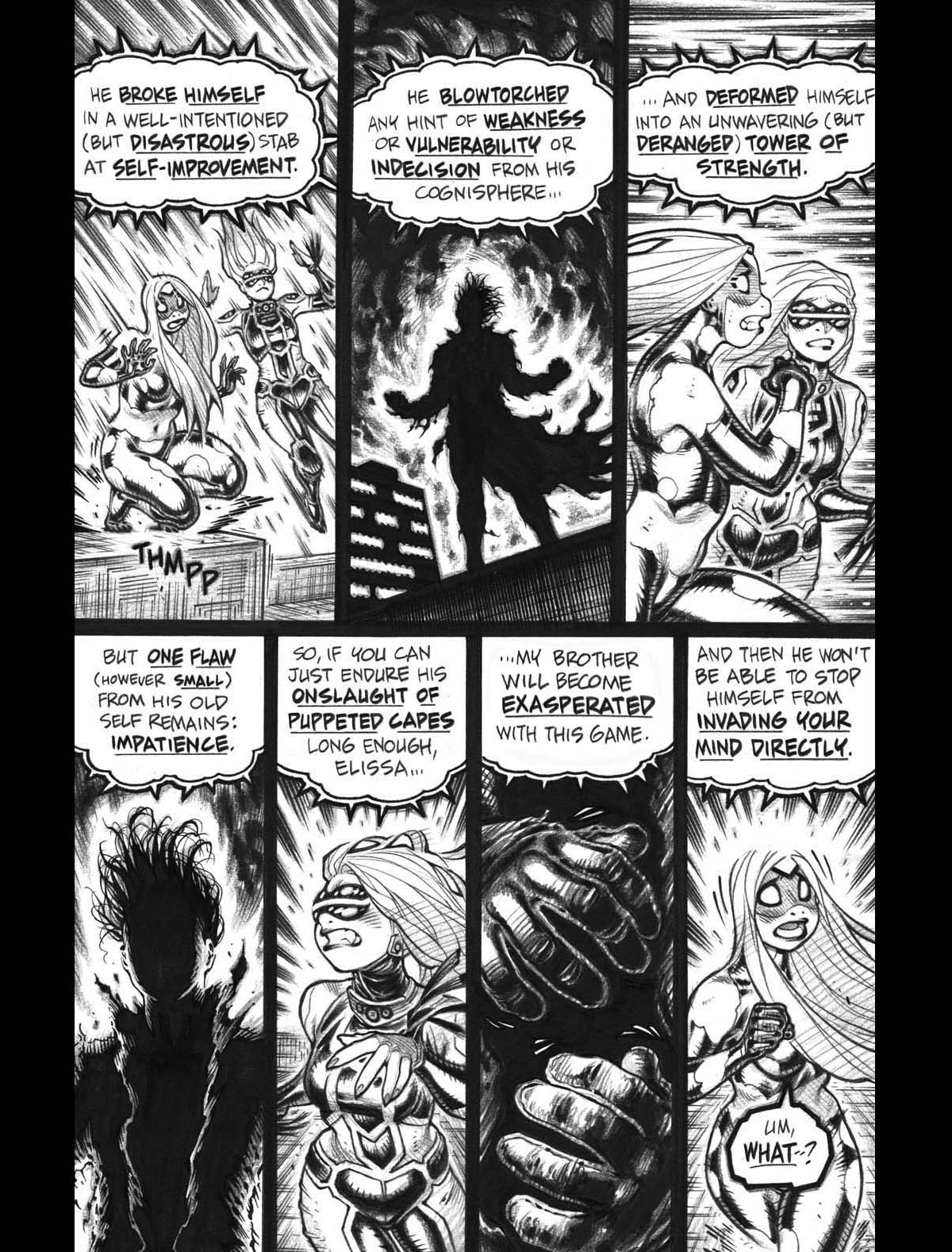
Asano, however, uses an approach that avoids all the perils of horizontal bleed artwork. That is, he uses full bleed pages almost constantly, but for the most part his pages only bleed vertically, as seen below:

The vertical-only bleed still gives the arts the space-craving comics artist plenty more room to work with, but avoids all the hassles of the sideways bleed. A fine solution, IMHO!

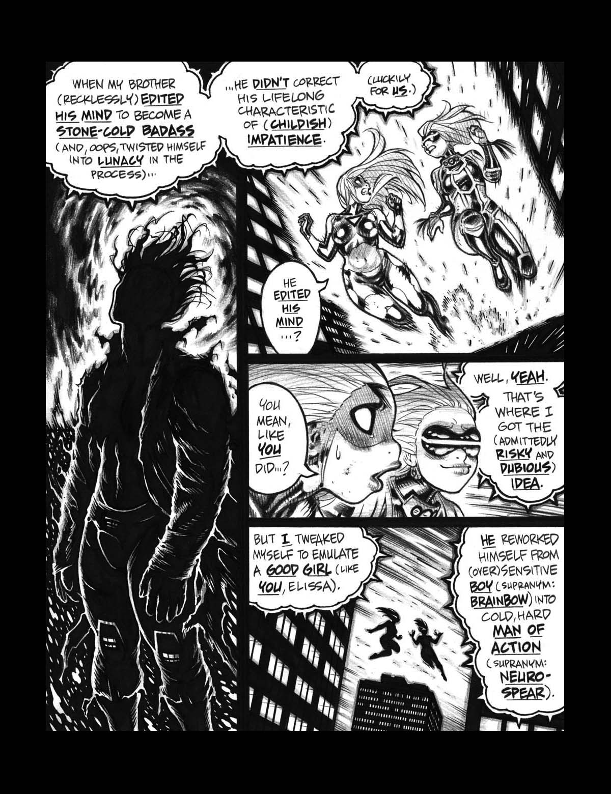
I used a similar technique on occasion in the recent Empowered vol.11. Below, I'll start with a mock-up of a conventionally formatted vol.11 page, with the usual black gutters on all sides. (For the record, this is a crappy, "work-in-progress" jpeg with gutters tacked onto it; the printed version looks much better, thanks to to skillful work of Dark Horse Production guru Chris Horn.)

And here's the subsequent, Asano-style vertical bleed page:

I wanted more space for each of Mindf**k's thought balloons, but didn't want to crowd the artwork; hence, the vertical bleeds.
Note that Empowered vol.11 did feature plenty of visually striking pages that bled fully on all four sides, but I was very careful to never put two such full-bleed pages next to each other. (I'd post examples here, but they're all pretty spoiler-y and hail from the book's climactic act.)
So, there ya go, folks! Vertical-only bleeds; consider 'em, the next time you're laying out a comic page!
Files