Home
Home

 Artists
 Search
 Recent
 Random
 Posts
Posts
 DMs
DMs
 Tags
Tags
 Random
 Importer
 Import
 FAQ
FAQ
 Account
 Register
 Favorites
 Login
Login

Full-Res of Trainzguy261's Commission (Patreon)
Published:
2021-04-26 22:01:00
Edited:
2021-04-28 00:30:47
Imported:
Content
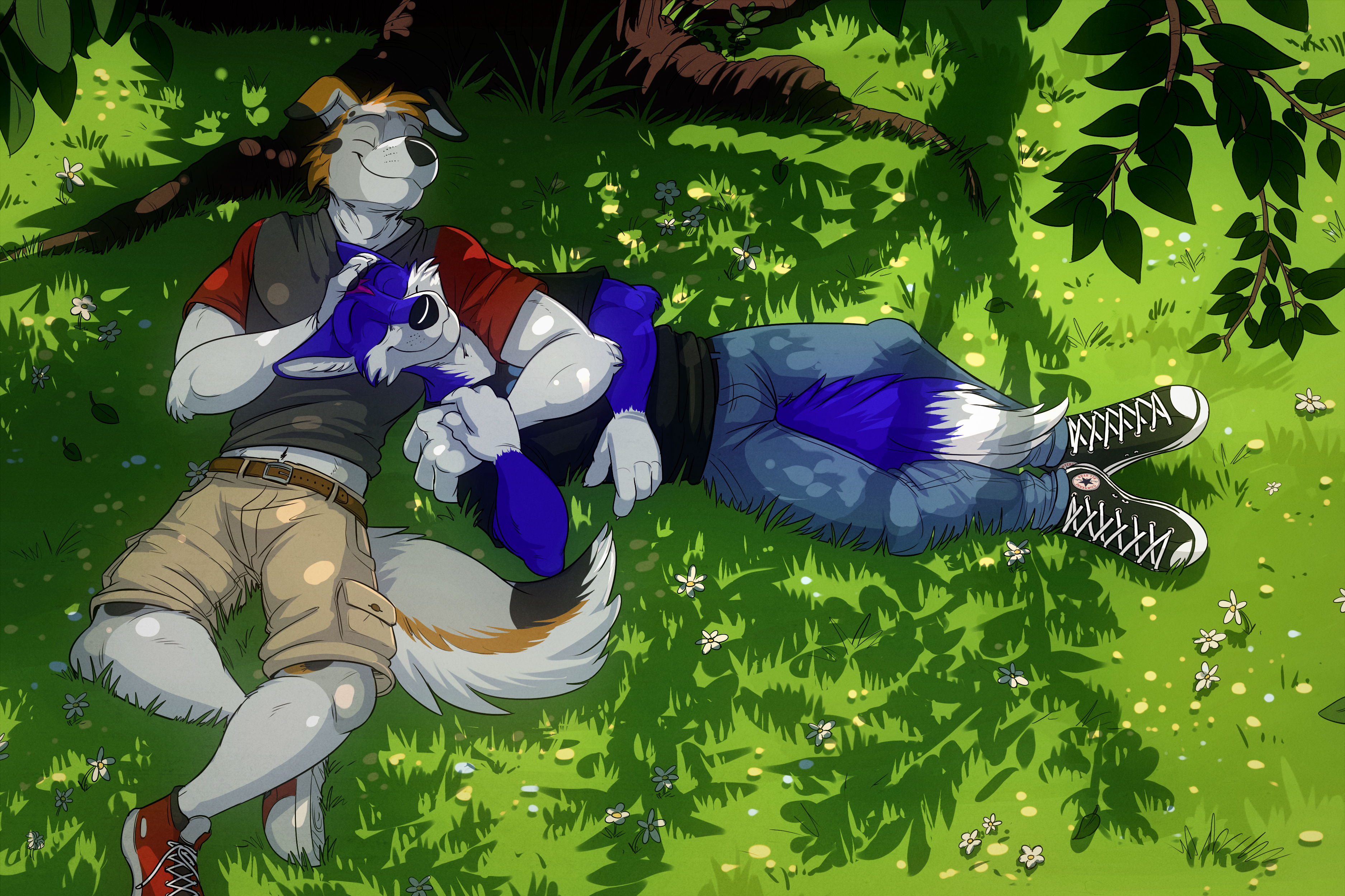
One thing I've been trying to do recently is push my color contrast further. I used to be very afraid of making things unnaturally saturated and bright, but I think as a result my coloring never really popped as much as it could have, losing extra appeal it otherwise could have had. This (as well as several upcoming commissions) I've used Levels to push the color contrast further, and I think it's really helped! :3
Files