Home
Home

 Artists
 Search
 Recent
 Random
 Posts
Posts
 DMs
DMs
 Tags
Tags
 Random
 Importer
 Import
 FAQ
FAQ
 Account
 Register
 Favorites
 Login
Login

Little Willy | testing comic styles (Patreon)
Published:
2021-04-04 16:00:05
Imported:
2021-04
Content
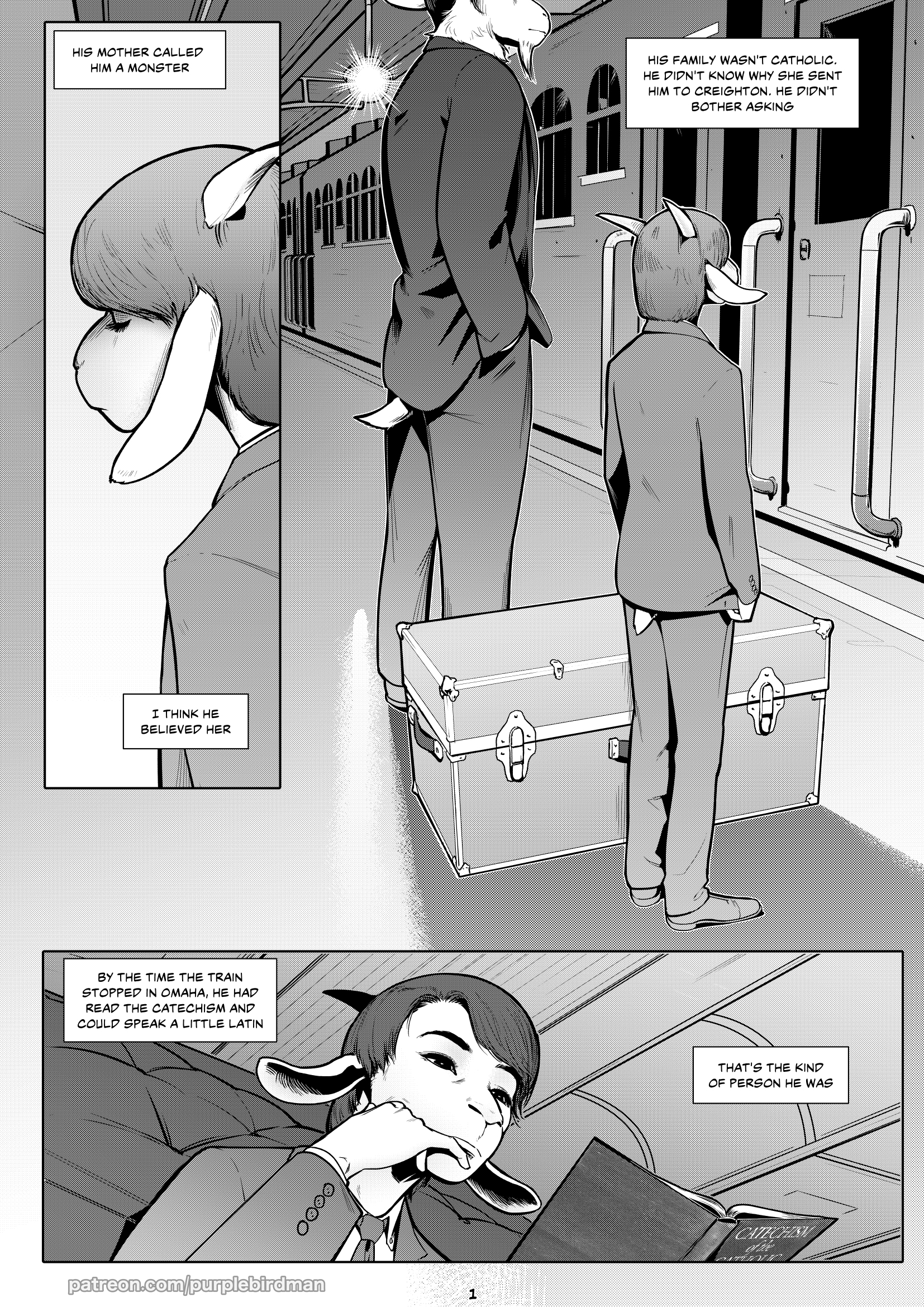
Hey y'all gold+ people! Here's lil sneak peek at some behind-the-scenes research I'm doing and my thought processes. Let me know if you have an opinion about this art direction!
I'd like to put more effort into linework generally and detail specifically, but I think it's important to use tones or greyscale or color to bring out the best possible shapes
Tones can make weird moire artifacts when combined with anti-aliasing, but I do like the textured look that they give
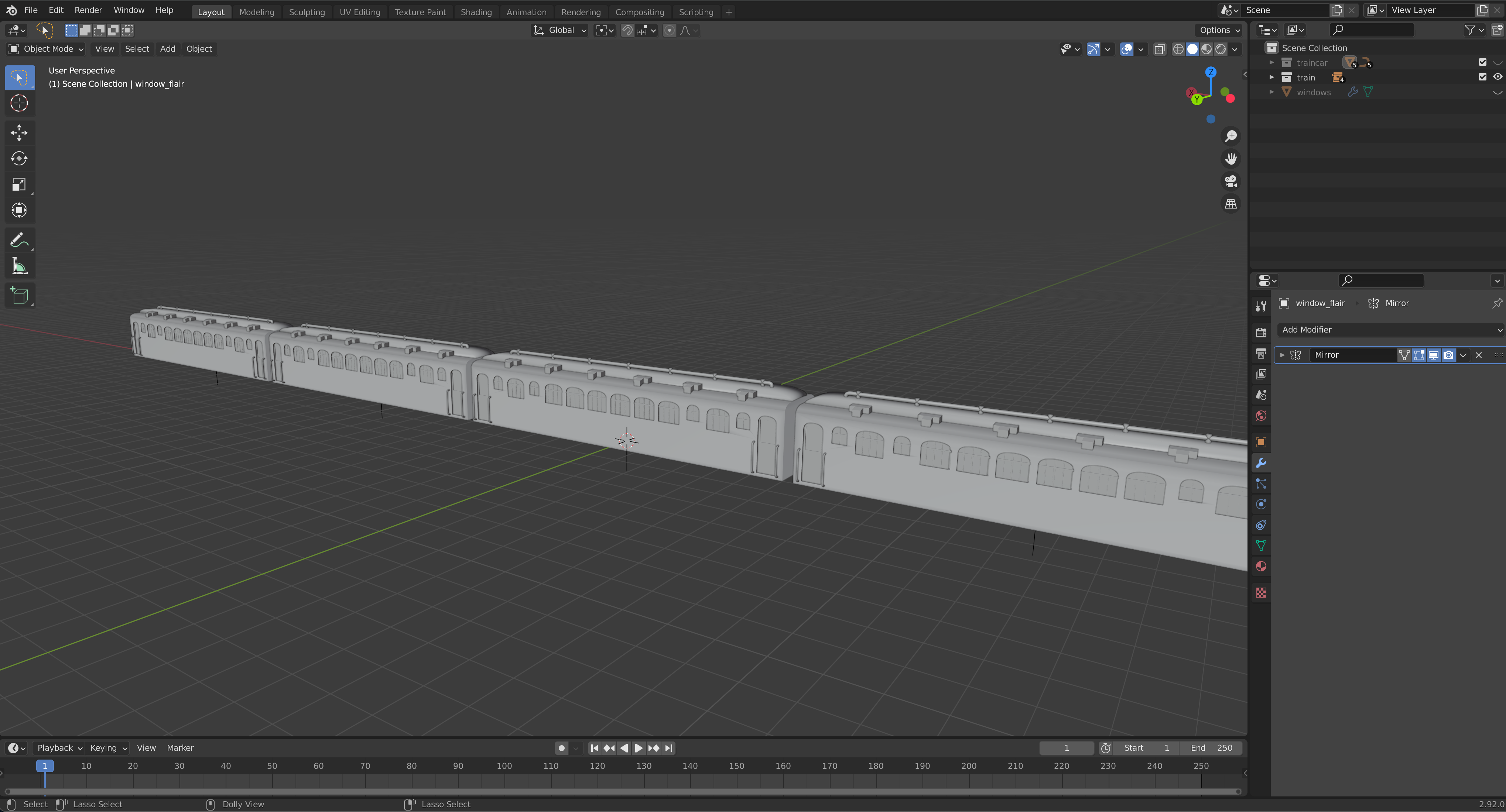
The train is a 3D model that I knocked out in blender real quick. Cool shit!
Files