Home
Home

 Artists
 Search
 Recent
 Random
 Posts
Posts
 DMs
DMs
 Tags
Tags
 Random
 Importer
 Import
 FAQ
FAQ
 Account
 Register
 Favorites
 Login
Login

Restitched: Dev Diary | Logo Evolution (Patreon)
Content

Throughout the development of the Restitched branding, the now-familiar logo was once completely different! In this post, we will explore the evolution of the logo from conceptualization to the final product, and explain the reasoning behind its key features and changes.
These designs are the product of team input and were designed by Halston, the main graphic designer for Restitched.
Style Tests and Concepts

The test sheet was the first attempt at establishing a brand for Restitched. The idea was to use something crafty and commonplace, like a ruler. The needle and thread were thought of in order to stay true to the name of the game.
This concept sheet is very rough and was not polished past this point. Only the idea of the needle and thread iconography made it into later revisions.

Another test was to make the logo appear threaded by stylizing the typeface. This proved to be too tedious and cluttered, and the end result wasn't worth exploring more.
Text Concepts

These text concepts were made to test how the font/typography of the game would look. A modified version of the game's signature font was used. This font style was chosen to make sure that the game stands out and is bold and impactful, without being too "industrial" and taking away the softer, rounder, friendlier vibe.
The circular ears were added to the letter "S" to represent Stuffy, the game's main character which is a teddy bear. However, this was later removed and then added back to the R, which is the more prominent text letter. The space between the R's ears and the needle "i" was a good balance of space as to not clutter the logo with too much iconography in one spot.

Another attempted composition of the logotype was to use the needle and thread it for a letter "T" effect. This looked odd when used with extra margin space between the thread, until the point where it didn't resemble a thread. When threaded, the needle becomes less apparent as being a needle, and so the idea was scrapped in favor of simplicity so that we could keep the bold and evenly-distributed composition of the logo intact.

This concept was proposed by a team member and aimed to give the logotype a stitched-together appearance, but ended up looking too Frankenstein-esque / Halloween-ish. This logo idea has not been entirely discarded yet, since it could make an appealing seasonal logo change for a future event, content, etc.

Proposed by another team member was a logotype tangled with loose thread. Since these are only concepts, the thread texture and style isn't apparent, but the idea was to have it more textured and thread-like than shown above. This image was a quick draft concept, but it was quickly decided that this logo was too busy and didn't convey the style prominently enough, so it would be hard to see that it's a thread at smaller sizes. The logo would have run into positioning, scale, and legibility issues if used. Like with the former concept, this style idea has not been completely discarded, as it would make a neat seasonal logo for a future event, content, etc.
The Final Compositions

Once the typeface style was decided, we started to explore the border of the logo. Typeface alone wouldn't have conveyed the feeling of the game well enough, so we opted for a thick border that's lined with stitching so the name and aesthetic of the game are emphasized more. The above concept was an attempt at the stitching style on the border but does not use the final typeface.

Once the logo was laid out properly, the border was added. Because we wanted it to be visible on nearly any background and color, we chose to double the border with a white outline as well. The white outline complements the white text and makes the pink filler color stand out more, giving it a more polished look overall.
In the above image, you will see the referenced provided to the team for their input. Although #1 ended up as the final composition, the team was fond of style #2 as well. Style #1 connects to the "R" directly, making the logo feel simpler and bolder. Style #2 connects the ears but uses them as loops instead of being filled as solid white. This was done to represent the inner secondary color of Stuffy's ears, but it was ultimately ruled out because it took away from the bold, impactful, cohesive layout/linework of the rest of the logo. Style #3 was simply an extra option made with ears split away from the "R" by a small border, which was proposed to bring more attention to the ear shape, but instead just looked odd in comparison to the rest.

You'll see here that the stitching was ditched from the logo. This was because of issues with scaling. When the logo was scaled down to the most common sizes, the stitching would become so small that aliasing issues would appear and distort the linework. It was hardly visible, and the stitching was too close together and thin. We started to explore patterns instead and looked at textures such as fabric and effects like paint splats. Neither of these felt right to us, so the logo went back to the stitched border idea.

Nearly the final version of the logo, we played around with the splats and stitches more. Splats were made fainter but then ditched altogether. Stitching was eventually added back and the scale and length of the stitched were tediously adjusted until it looked right.

Right after the patterns were ditched, the stitching was added back before being further adjusted later on. The idea of ditching the white border was on the table, but it ended up becoming part of the final logo.
The Final Product

After many slight tweaks and adjustments, the final logo was created. The final logo uses the same typeface design as proposed earlier on, but has been cleaned up along the edges and slightly warped in certain places to look themed, polished, and balanced.
The logo has a slight curve to the text for extra style, and to draw attention to the needle graphic a bit more. The "R" settled on the bold, connected ears design. The stitching was added back at a lowered opacity, as to not draw attention away from the text and clutter the design of the logo. The border was made a bit thinner than in earlier concepts, and a slight gradient was added to the pink background. Finally, the text itself now has a faint drop shadow behind it so that the logo has more depth and the letters are easier and more prominent on the eyes when read.
Update - June 2021
After many months, we're now revisiting this Dev Diary to update it with even more exclusive content! Following Q2 2021 developments on the project, Restitched has undergone a slight branding redesign. The game's design aesthetic has been polished a bit more, and the logo has had an overhaul.
Exploring the Restitched logo redesign:
Creating the first logo for the game (seen above) was a challenge, as we were still exploring what Restitched meant to us and how we wanted the public to see it. The original idea wasn't the wrong one, but the execution of it could have been improved. So, during a design brainstorming session, the logo was fully redesigned.

At first, we knew the redesign had to be true to the Restitched name. It needed to feel aesthetically crafty, showcase a needle, and have stitching somewhere in the logo while also scaling well at small sizes. Because the word "Restitched" is a rather long one for a logo, we wanted to tilt and stack letters on top of each other while also curving the entire logo at an arch. This reduces length but also gives the logo a unique look.

To add depth to the logo, the letters of the new logo were shaded to give the illusion of shadowing. This new base text for the logo proved to be too crowded. After team feedback, it was further spaced apart for better legibility. We then tried the new logo text in the same style as the original logo, but then started to explore other design possibilities before committing to it.

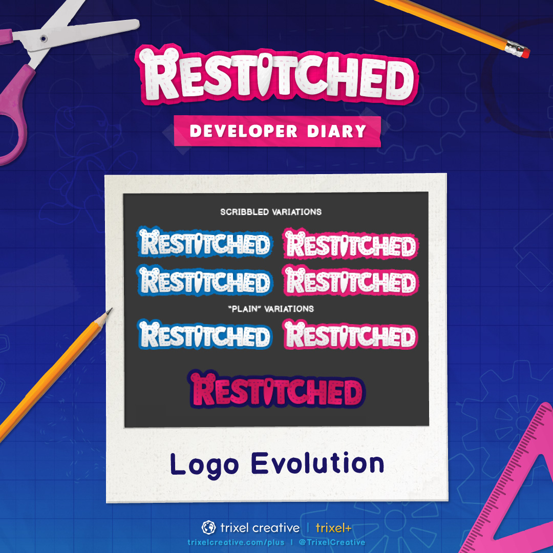
A few of the trial designs included changing the entire logo's color, but this appeared too dark and unappealing. We also tried a fabric border background with prominent pink stitching over the text. This was a serious contender for the final logo version, but we continued to explore once again. Another option we tried a lot was the sketched background as if it's been scribbled on. This was a unique look that we liked, but it didn't fit Restitched as well as a fabric/paper style does.

Again, we tried a lot of the scribbled backgrounds in both a sloppy style and a tight sketched style. This felt too puffy or messy, and so we went with plain variations of the logo. We considered changing the logo's color to blue since it's often seen on pink backgrounds. Restitched's signature colors are pink and blue by default, so shifting them around wasn't entirely off the table. In the end, this would have been too drastic of a change on top of the logo redesign itself, and so we didn't change the color. Many things also rely on the pink color scheme being arranged the way it is.

The final logo style was finally found! The pink stitching was toned down in saturation and opacity so the focus is more on the white space of the text, thus increasing legibility. The background takes on a blueprint paper border with scissor-cut edges and subtle snips/tears. The text was further spaced apart on the logo, shadowing angles refined, and a subtle fabric texture was overlaid onto the text itself (the needle, however, takes on a metallic finish). Finally, the standalone signature "R" graphic with bear ears was remade from the new logo.
And that brings us to the end of the logo's redesign process!

We hope this has provided some interesting insight into how Restitched's logo came to be, and even though it endured minor changes from the original ideas and concepts, there's an in-depth process and team decision behind nearly everything you see!
Stick around for future Restitched: Developer Diary posts!
Files