Home
Home

 Artists
 Search
 Recent
 Random
 Posts
Posts
 DMs
DMs
 Tags
Tags
 Random
 Importer
 Import
 FAQ
FAQ
 Account
 Register
 Favorites
 Login
Login

Sunny Day Re-Direction - Making Sunny Day Jack Efficient and Fun (Patreon)
Content
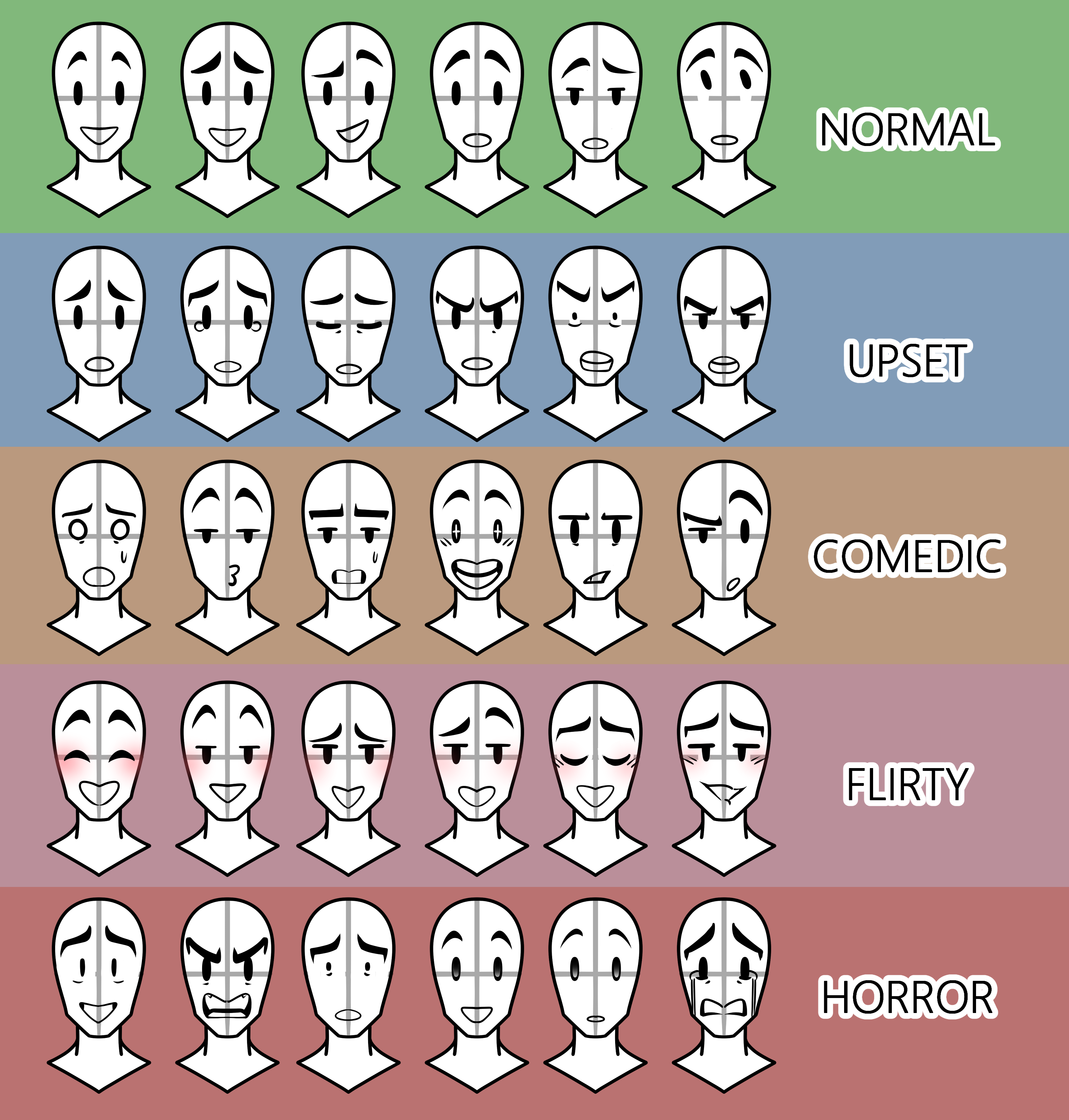
One of the biggest criticisms Sunny Day Jack's newest sprites have garnered was that they felt flat, lifeless, and lacked the cartoon-y spark that so many fans of the previous demos enjoyed.
Part of preparing Sunny Day Jack under a new management team is examining what about production works and what doesn't. For us-- that starts with the art.
While the SnaccPop team settles, implements more deadlines, and adjusts to more balanced workloads we've gone back to basics to find a style for the series which will then be translated into character model sheets to give to additional artists sharing the workload on Sunny Day Jack.
Once those model sheets are done, they can be used to work on both improved, multi-pose sprites AND CGs for the final game.
We hope you all enjoy this sneak peek as we comb through feedback and continue to prioritize putting out a game that reflects the fullest extent of quality!
Files