Rebranding Difficulty Modes (Patreon)
Content
This is the draft for a new blog post coming soon...
A couple years back I introduced difficulty settings to Cogmind. At the time I wrote about the benefits and drawbacks of difficulty modes in roguelikes, along with an introduction to Cogmind's difficulty-related features, and overall I've been pleased with the results, but with experience I've discovered there is definitely room for improvement in a few areas, so here we go again :)
The Accessibility of Accessibility
Players have had a number of ways to discover that Cogmind even has difficulty settings in the first place. Aside from being described in the lengthy manual (which isn't suggested reading for new players), it's also buried in the packed Options menu (which many players won't open, or if they do still won't thoroughly explore) and mentioned in a tutorial message (which in Cogmind are fairly easy to miss depending on the circumstances since they're not very in-your-face and just appear in the message log).
These haven't done a very good job of advertising difficulty modes, meaning lots of players still don't even know they exist!
Well there are also my blog and relevant announcements about these settings, but those are both time-sensitive and can only reach a subset of players--we need a good in-game method of teaching players that they have this rather important option available, something that also serves the long-term in that new players also have that opportunity. (Having separate leaderboards for each setting is yet another avenue of discovery, but again, only a subset of players actually check those.)
One of the usual ways games introduce a difficulty setting is having it be one of the first things players select when starting a new game from the main menu/title screen (maybe even the only thing between pressing New Game and starting!).
Cogmind does not have a main menu xD
For immersion reasons I always wanted to go straight into the game after the startup animations. Before release I eventually gave in and added a short title animation as well, which itself disappears automatically after animating so it's not really a menu, but that was it. I didn't want a main menu, which means forgoing the functionality that might normally appear there.
But over the years I've noticed a fair number of people were unaware difficulty settings are available, have to repeatedly inform players on forums and such. Even recently when I announced in various places that I'd be "rebranding" Cogmind's difficulty modes (another topic we'll get to below), despite the fact that rebranding implies I'm making changes to an existing system, some thought I was just now adding them even though they've been in place since 2017 xD
In light of my findings, I started to come around to the idea that it would probably be a net benefit if this important option was somehow placed front and center.
Considering my desire to maintain the flow of starting up the game (and lack of a main menu), along with Cogmind's overall goal of avoiding breaking immersion where possible, there's really only one option: add a new menu before even the title screen. There it wouldn't interrupt flow, since once that's chosen there at least won't be any more need to stop the usual animation sequences and wait for input. And although I really like the idea of players starting up the game and having it automatically proceed through the opening into the gameplay, I've decided it's worth making this exception for new players.
Cogmind has always defaulted to the hardest difficulty setting and expected players to lower it on their own if necessary (again, if they even know they can!) but this approach clearly has a number of drawbacks. Some of them I'll get into later, but at this point let's say difficulty setting obviously has a broad effect on the player experience, and players should start better informed about that choice, and take an active role in making it. Cogmind may have been designed for its hardest difficulty mode, but on that setting it's also too punishing for a fair number of people who would better enjoy the game with some survival aids :)
Dedicated Difficulty Menu
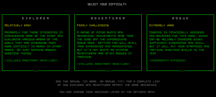
Enter the dedicated difficulty menu. This menu only appears the first time the game starts up, so it's not like it's becoming a permanent fixture before every run, but it's nice being 100% sure that players know this is thing, and can start where they feel most comfortable.

^Interacting with Cogmind's new difficulty settings before the first run.
Selecting an option brightens it, and like most important decisions in Cogmind requires confirmation to continue.
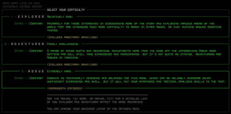
Designwise my first instinct was to align the options horizontally, which overall works better when a user has to select from two or three options, so I was experimenting with some styles in REXPaint:

^Early mockup of horizontal-style difficulty selection.
But the options were too verbose for that kind of treatment, at least with the content I wanted in there, resulting a lot of short lines which are annoying to read. A horizontal alignment that also looks decent would require fewer words and instead rely more on images or icons, a route I didn't think was appropriate here.
One of the advantages of having a dedicated menu is that it has plenty of space for more words with which to describe each mode and set expectations, compared to the limited space available in the Options menu.
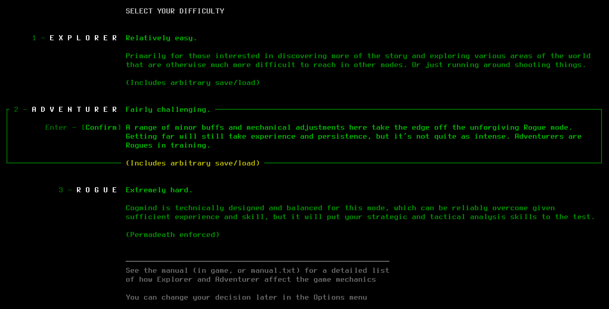
So the final version of my mockup was instead a vertical design:

^Vertical difficulty selection mockup.
I then used REXPaint to also draw out the subconsole breakdown for implementation:

^Mockup showing how each difficulty option is broken down into areas in the underlying architecture for rendering and input processing.
Expectations and Rebranding
Taking a closer look at the menu's content, each mode has a name, a short two-word definition, and a longer description, along with an indicator of whether the mode includes quicksaves (which also introduces players to the fact that this is a feature).

^A screenshot of the difficulty settings menu, for reference.
The short definition exists to enable an at-a-glance understanding of the approximate level each setting represents, while the the longer description sets expectations more clearly. One could say that rather than naming the modes at all it'd be even simpler just label them by their definition, or even go with easy/normal/hard, and although that could technically work, the idea of "normal" being in the middle there would imply it's the standard/intended way to play, when it really isn't. Besides, the unique names are both thematic and more evocative.
The reason I've been calling this effort a "rebranding" of the difficulty modes is that besides the new menu, one of the biggest changes happening to the difficulty modes is that the naming scheme has changed. The substance of each mode is largely unchanged from its initial implementation, but how players respond to the new options as they're presented will definitely be quite different.
Since difficulty settings were introduced, Cogmind has silently defaulted to the hardest/intended way to play, and the two other choices were available in the Options menu as "Easy Mode > Yes" and "Easy Mode > Very," or so-called "Easier" and "Easiest" mode.
This original scheme was me being way too conservative, emphasizing the "proper" way to play, and everything else is below than that. This introduced bias and people didn't really want to proactively select lower modes due to how they're named. For some the nomenclature didn't matter much, but for others it could affect their decision to switch modes or not, even if subconsciously. Would you rather lower the difficulty setting from the default to "easier," or switch from Rogue to Adventurer? Even if the end result is the same, for some people the answer is different for each question, regardless of ability or need!
Psychologically, having the default difficulty set high and later asking that players lower it in order to better enjoy the game can be harder for them to stomach. Basically, by letting players start out with their own informed choice, and using less loaded names (Explorer, Adventurer, and Rogue are all cool :D), we can side-step multiple issues.
Beta 9
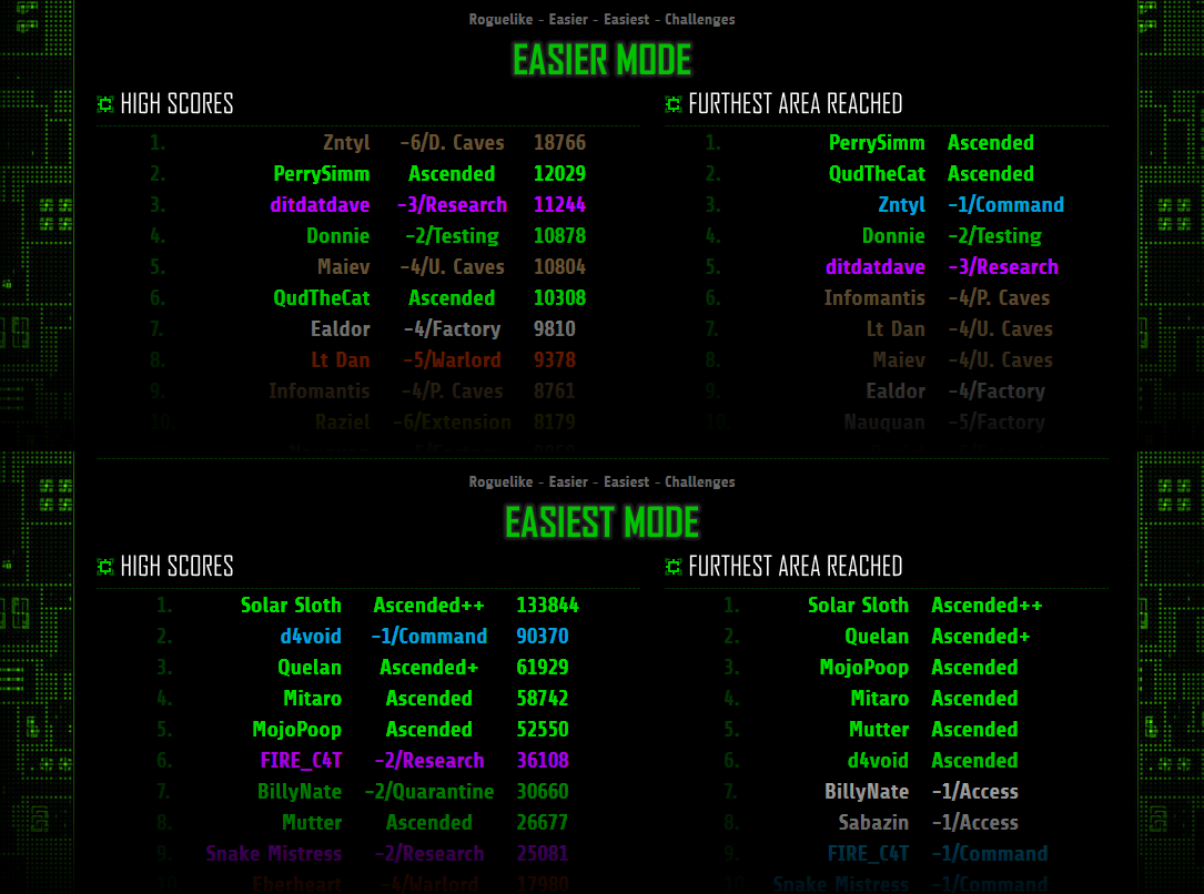
When this feature goes live in the next release and everyone's difficulty is reset so they have to see this menu for the first time, it'll be interesting to compare the percentage of players using "non-default" modes (excuse me, Adventurer and Explorer! :P) vs. past data. Currently only about 9.5% of players are using those modes, but I'd be willing to bet that the ratio is going to grow by a decent amount in the future.

^Sample "Easier/Easiest" mode leaderboards as of September 13, 2019, representing only a small minority of players. Still Beta 8, as you can see, pre-rebranding!
In any case, it was important to get this rebranding into the game before 1.0, when even more people will be starting it up for the first time. The goal is to focus on making the game fun for new players, and many who might otherwise enjoy it could be turned off by automatically experiencing the hardest mode as the default. Defaulting to the hardest mode might make sense for a traditional roguelike, but less so in the context of modern games. It is not uncommon for games to not default to their most challenging level, though I think in this case it's better to not have a default at all, in the end possibly saving the player time.
Besides, the option to go all-out roguelike masochist is still sitting right there for those who want it, and at least they'll know what they're getting into ;)
