Home
Home

 Artists
 Search
 Recent
 Random
 Posts
Posts
 DMs
DMs
 Tags
Tags
 Random
 Importer
 Import
 FAQ
FAQ
 Account
 Register
 Favorites
 Login
Login

October Pin-up - Dracula (Patreon)
Content
HEYA!
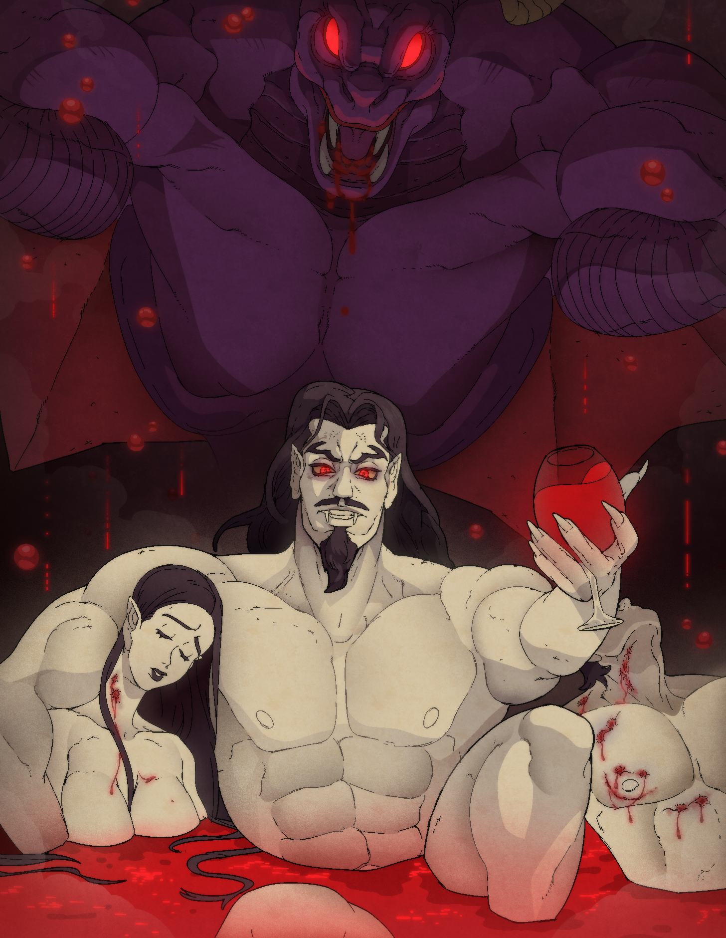
Spooky month.... spoopy pin-up!!!
As I was finishing this piece I noticed I was rendering it a bit too graphic?!?! It's a bit of a change of pace, but I guess I'll put a content warning when I get it to twitter LOL
I'm a castlevania fan so ofc I loved to tackle Dracula!! I heard the Order of Ecclesia soundtrack while I was at it too...
I felt like doing that second extra piece when I was finishing it and thinking about the character...
I kinda mashed up some draculas from different castlevania titles!
I think this one is more consistent not only to the netflix show (I haven't watched it yet!) but also to the OoE one. I even tried to make a similar expression tbh LOL I just love dracula here.
Actually I'm inclined to say the animated series design was kinda also inspired on the OoE artwork? the triangular goatee, menacing look and shaggy hair.... or maybe it's just a vampire thing. Who knows! Just found it interesting.

And well.... sometimes he's just inhumanely huge. I went with that direction too LOL.

> Ever since I checked the pool results, I've been thinking on a composition like this one! His hideous (sexy) true form hanging behind the scene, while the charming usual presence he has is in the forefront.

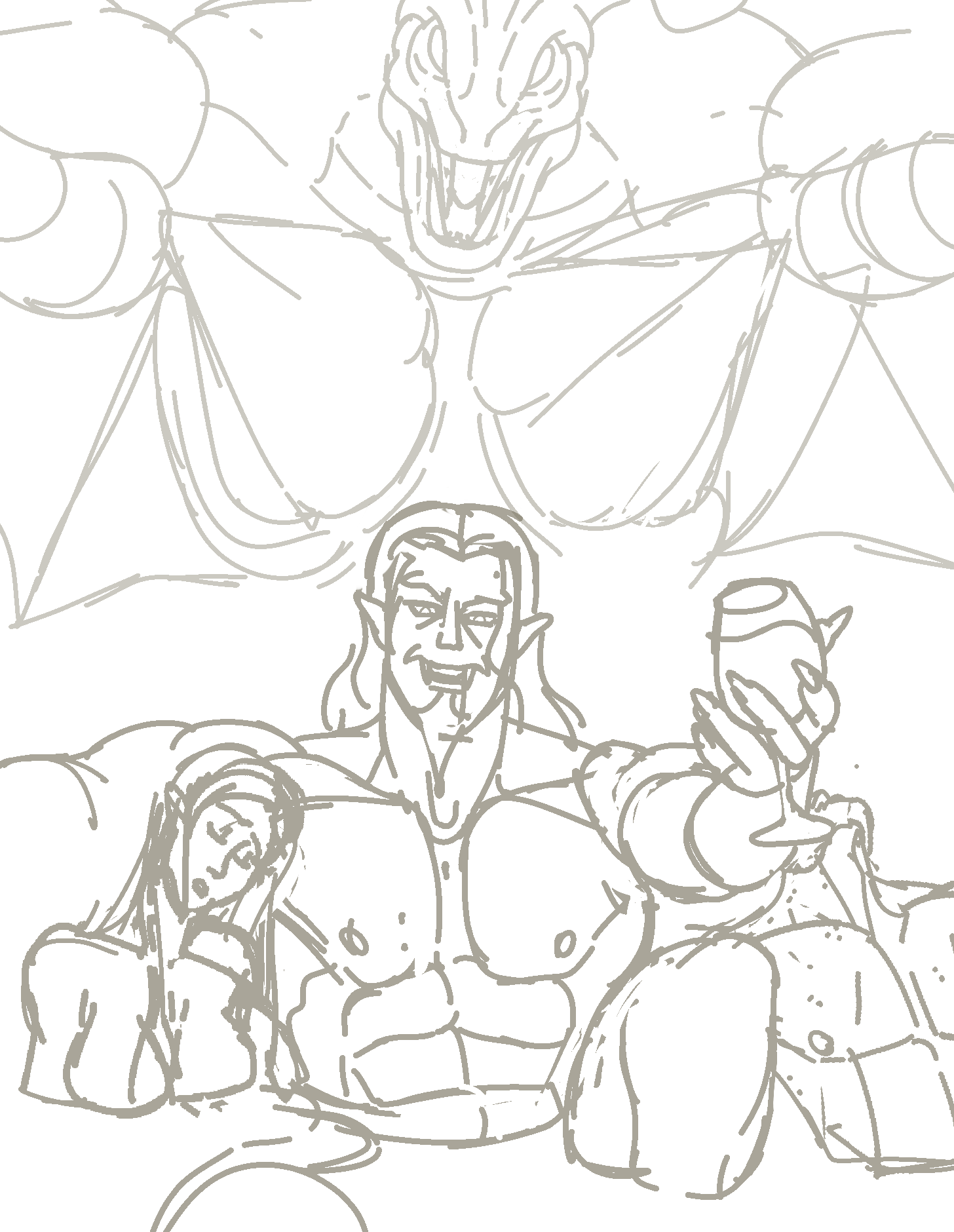
> As this is a piece without background and clothes, the structure pass was already the final sketch!
I feel I lost some energy these had from this stage to the finished one. Well, let's always try to keep improving regarding that right!

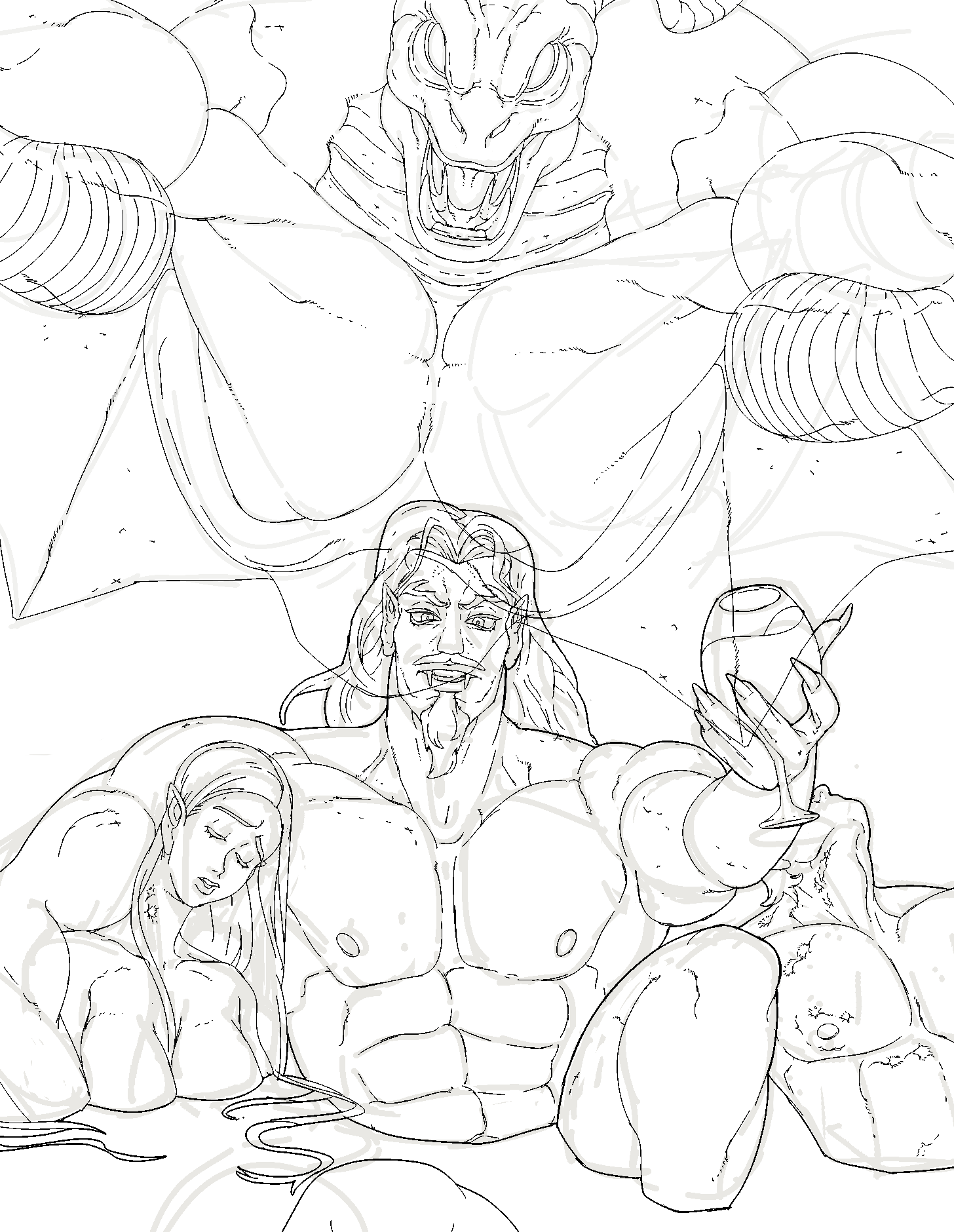
> Lineart for the foreground elements.... I had fun doing the chick's head!

> Weight pass for the foreground lineart! The figures are in distinct planes even if they are kinda lined up, so the contrasting widths for the lineart help with that.

> BUFFO MENACING (background) MONSTER.
Sometimes I think I lose a bit of my lineart's appeal when I paint. Maybe using lighter colors? It's a thing I've been practicing.

> Flats! Wanted menacing red glowing eyes on the background.
Initially the other characters had a more lively complexion as if they were just recently captured, but in the end everyone was pale bloodless white.

> Primary shadows!
Played with different light sources for the different planes. The monster form has a lighting from below aspect that I really like to add some menacing spooky spice to a figure!
Dracula has a side lighting to make his facial planes evident. I usually do this one!
The other figures would have smooth shadows to contrast with the more rendered draculas and well the dude........ he kinda feels like he has snapped his neck???!!! I mean, the shadows kinda pushed it further into the background. While I was doing it I was thinking to myself wtf why this coming out so graphic LOL but maybe it's the halloween spirit coming into me...

> Secondary shadows..... Always so dramatic!!!!!!!!!!!!!!

> Added some blood falling from the ceiling, and rendered the bloody bites ( EEK! )
It still felt a bit empty, so I added some mist after this one!!

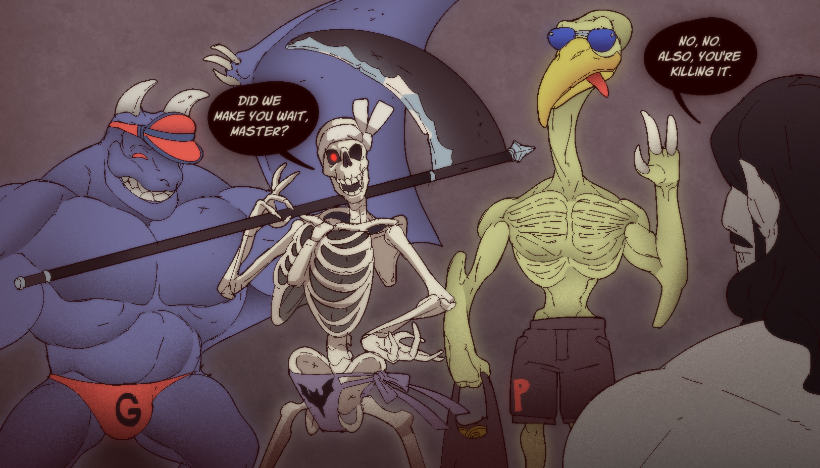
> Now just as an extra step by step for the other piece I did .... check this silly ass thumbnail. Sometimes it just needs little to communicate what you want. In order from left to right that'd be bulky figure, sassy death, long neck and foreground stoic buff figure LMAO

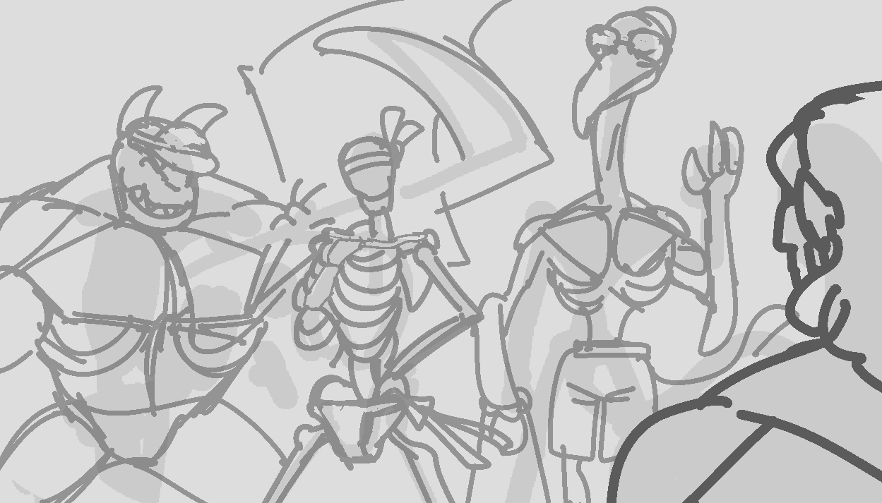
> sketch sketch sketch!
Didn't want to make a super anatomically correct skeleton for death tbh. I admit I was already kinda tired LOL but I liked it in the end.

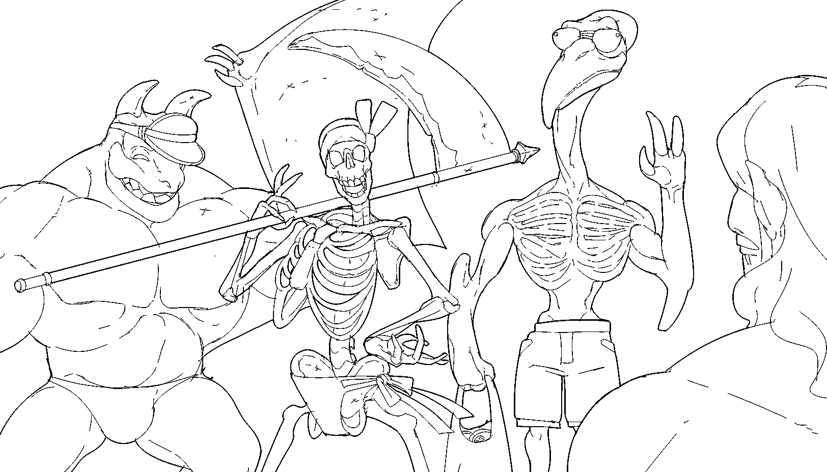
> The lineart for this one turned cute...... I've been training this style a lot with the comic so it's flowing nicer!

> Finished without speech balloons!

And that concludes our monthly pin-up post. I'll be opening the voting for the next character on the 1st!
Files