Home
Home

 Artists
 Search
 Recent
 Random
 Posts
Posts
 DMs
DMs
 Tags
Tags
 Random
 Importer
 Import
 FAQ
FAQ
 Account
 Register
 Favorites
 Login
Login

Logo Angst (Patreon)
Content
- The Chatcaavan Empire (pre-Lisinthir)
- The Chatcaavan Empire (post-the events of Princes' Game)
- The religion of the Living Air
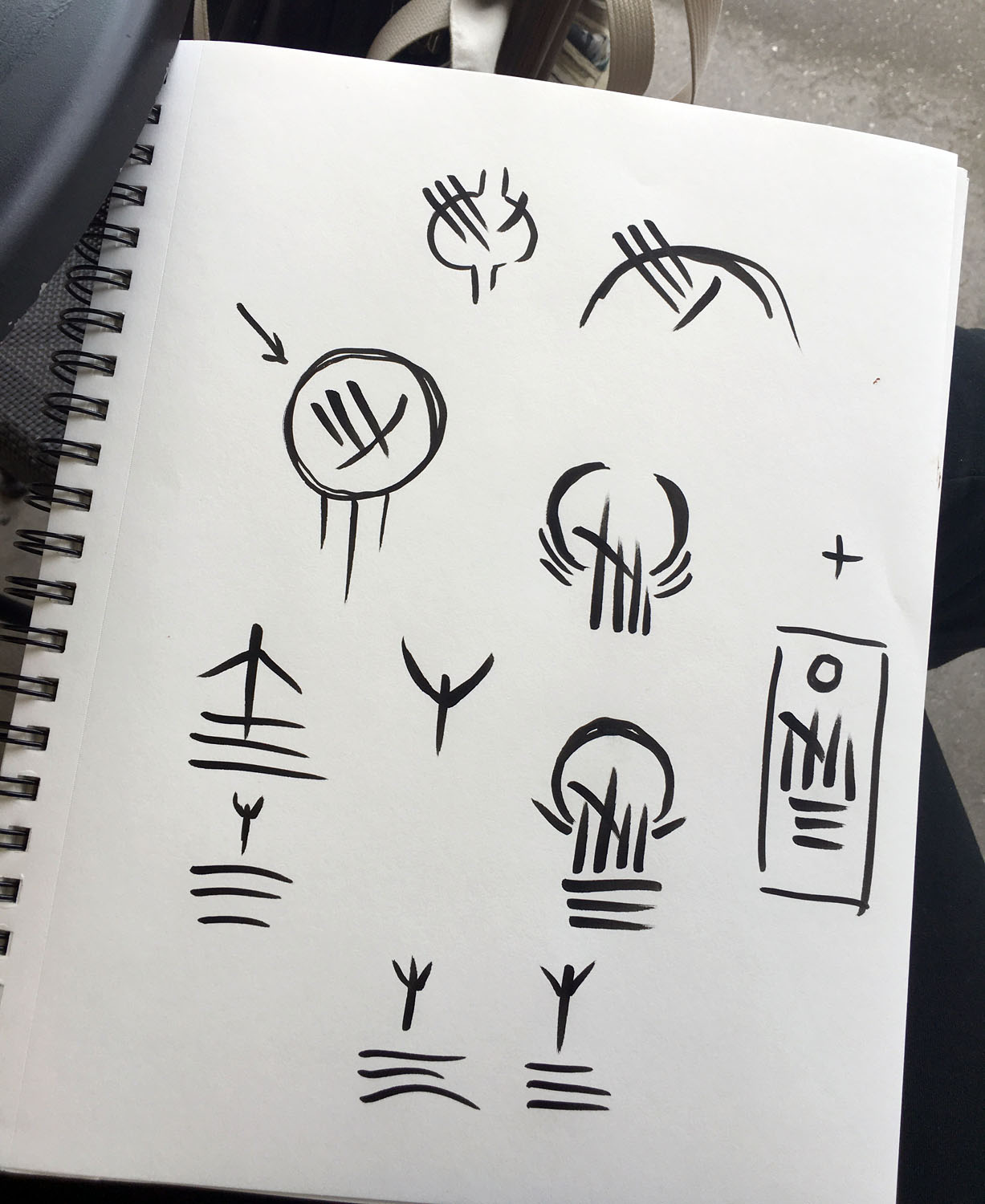
I knew these should be old symbols, dating back to the original writing systems of the Chatcaava, which are based on digging claws into clay. That's why they're all very austere, clean strokes. I knew that the Empire's was based on 'the imperial thorns', which cemented in my head that they shouldn't all be facing one direction. And I also knew I wanted the religious symbol to be clawstrokes moving from left to right (parallel to the "bottom" of the page, wherever that bottom might be, since sometimes the Chatcaava write sideways) to represent the movement of the wind.
Another clue for me was the consistent 'who would go down when he could go up' commentary in the series. A species that can fly will inevitably (to my mind) think of 'up' as good--free, expansive, possibilities, movement--and down as... not bad, but associated less with freedom and more with nesting or resting.
Final clue: the Chatcaava using their talons for fighting. Swiping downward is easiest, so downward swipes imply strength, power, winning: you are bleeding your enemies.
The original Chatcaavan Empire's sign then is the one in the circle with the arrow pointing to it. A downward swipe (pinky and thumb up) and then a swipe across it with the pinky, and the thumb traces a circle around it.
The new Empire's is in the box. The parallel lines of the Living Air, the base on which everything else rests. All four fingers going up (because we must go up) with one conscious swipe crossing them, going down (because sometimes we go down, and this is necessary). Above it, a star.
The Living Air's I'm still working on. I wanted the parallel lines, plus something above it representing a rising Chatcaava; I think I'm overthinking it too much because I want it to be unmistakable when people set it alongside the logos and sigils of dozens of other fantasy/SF universes. I have to remember it doesn't matter to the Chatcaava that their logo might be mistaken for someone's from Star Wars or Harry Potter or whatever. They're going to make the signs that work for them. Given that, I think it's just the parallel lines, and one swiped upward, over them. I'll draw it properly later.
I want to show you a little of how the swiping through clay works, though. And I just happen to have this new tablet that is no longer broken! I may see if I can animate it. :D
Files