CG Concept Preview! Nova Locker Room Undress (Updated) (Patreon)
Content
[This post contains gameplay spoilers related to Episode 2 content.]
If you've been keeping up recently, we've announced that there's art style changes coming to MA! This is for cg and sprite art, but you can learn more about that at the post below if you missed it! ^^
https://www.patreon.com/posts/ma-art-style-art-82664782
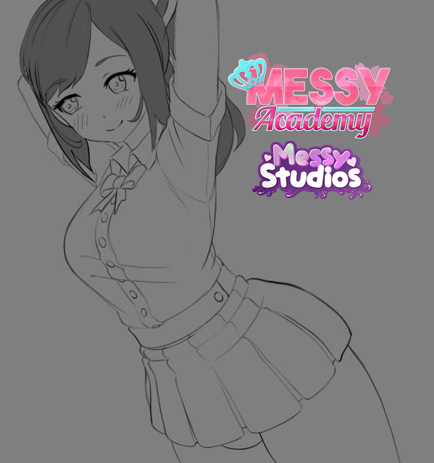
Today's concept art preview will focus on our efforts of updating ep 2's moment when Brandon is led to the locker room by Miki, unaware of what awaited him would be Nova in the process of undressing! The main thing is that the updates mainly focus on changing the head/hair and adjusting the expressions lightly, but we've been taking feedback in mind with our big announcement where some cg updates showcased there weren't quite the intended tone for the scene context. ^^"
There might be other aspects updated, as our cg artists are taking note of what feels fitting to update.
Without further text... Let's jump into this!
~Artist Credits: MarxeDP & AjoseMp

Our first concept look! Again the main thing is Nova's head, hair and expressions that's been updated. There is another thing, but we'll get to that along the way! :P

Now showing the variants and showcasing a bit of the undressing moment itself.

One thing we wish could've been done, is to add a variant to showcase her arms in another pose to feel better with the idea of her undressing, but it'd be a cost to consider that would've been tough on just what arm pose to go with. <.<

Clearly there's this arm pose that exists to help with showcasing her unbuttoning her top, but I guess the other pose would've had to focused on showcasing her grabbing her skirt maybe?

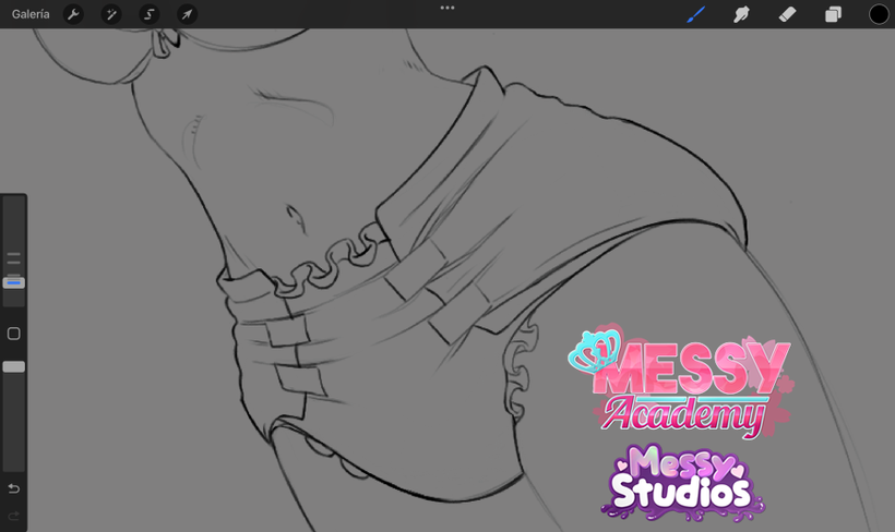
Now we focus on Nova's diaper! :O I've been wanting to improve how the diapers look in cg art for a while now and after tons of effort in research, expressing in detail how diapers roughly form around the body, why certain things look the way they do in typical diaper art... I think we might've nailed our goal!
The above image is the early process before said research and details shared, but...

Here we have the updated diaper design! No more ruffles along the legs! :P We still wanted to keep the tiny little ruffle effect near the crotch and along the butt/crotch area to match the MA's diaper references and sprites, but we wanted to make the diapers feel better overall.
(We can only hope we managed this! <.<)

The next step was adding the creases and trying to explain how or why they're there to the artists. (Remember Marxe and Ajose went into MA without any prior knowledge of diaper art!) So, I'd say they've come along way in progress of understanding it better.
I had to explain the sides or wings of the diaper stretch tightly to the front and so the tapes and this stretching add tension to the plastic material of the diaper, causing those creases in the right way and method, etc. But you can also notice the wings themselves are now much more separate vs the front padding and overall I feel we're hopefully appealing greatly on the diaper visuals with this! ^^

Aaaand here's our last preview! I wanted to show how she looks in color, along with how the diaper designs look once colored too! (Ignore Nova's heart print and front icon details missing for the diaper, those are there in the finished version.)
I'd love to hear what everyone's thoughts are with how the diaper design looks, if it feels better than before. Our goal is to apply this diaper design changes to the rest of the art as we move along with this stuff, so we'd love to know if there's little details we've overlooking along the way! ^^


