Home
Home

 Artists
 Search
 Recent
 Random
 Posts
Posts
 DMs
DMs
 Tags
Tags
 Random
 Importer
 Import
 FAQ
FAQ
 Account
 Register
 Favorites
 Login
Login

TM529- comp and notes (Patreon)
Content
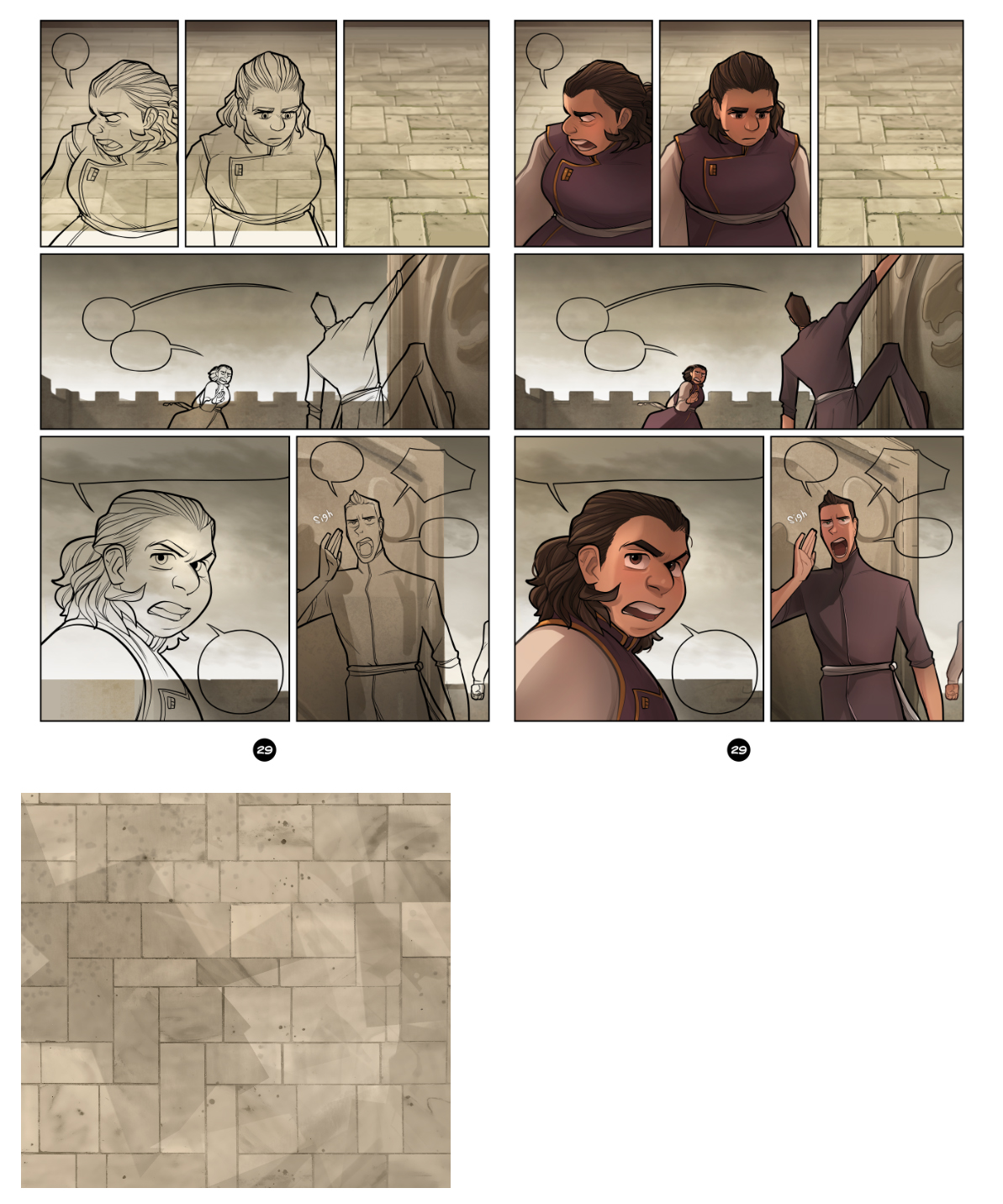
There are some patterns that show up frequently in some pages, things like wallpapers, floor patterns, wood grain, etc. There's a few ways a person can handle it... in Ch2 I think I straight up overlaid patterns into the bg, which is a little bit crude by my current standards. What I do now is try to make it look as organic as possible while still not hand-painting everything.
At the bottom is an example of the floor texture I've been using, this is just a snip of it. But basically, I found a tiled pattern I liked, I believe it was just a black/white pattern at the time. I blew it up and tiled it several times, then painted under it. You can see that the texture does not tile: there are a lot of random strokes and some spatter and etc texture because I want this stuff to look irregular, like actual stone would be. When I make a page, I have an idea of the perspective already in mind, and skew a selection of this larger texture to fit. You can see in the lineart/color page that the final bg is not the same as the raw swatch; that is just the base that I paint another level of volume and detail onto, stuff like moss and other cracks, just to make it look interesting and again like it is a bit more used and natural. It still probably looks too good compared to my usual crappy bg art XD My perspective isn't always the best... but it does save a bit of time for laying out backgrounds, and lets me put more of my energy into stuff I feel okay about, like adding in pointless detail.
Files