Home
Home

 Artists
 Search
 Recent
 Random
 Posts
Posts
 DMs
DMs
 Tags
Tags
 Random
 Importer
 Import
 FAQ
FAQ
 Account
 Register
 Favorites
 Login
Login

The Adventures of Dialogue UI 2.0! (Patreon)
Content
During the creation of this game, a lot of the way I've been going about "uncertain designs" (Like the UI) - is:
- Doing a bit of Thumbnailing
- Doing some research
- Making something "that works"
- then calling it "Good enough for now."
The good thing about this workflow is, it lets us not get stuck on any particular part for too long. It lets us move on and test the current design/system, and find flaws.
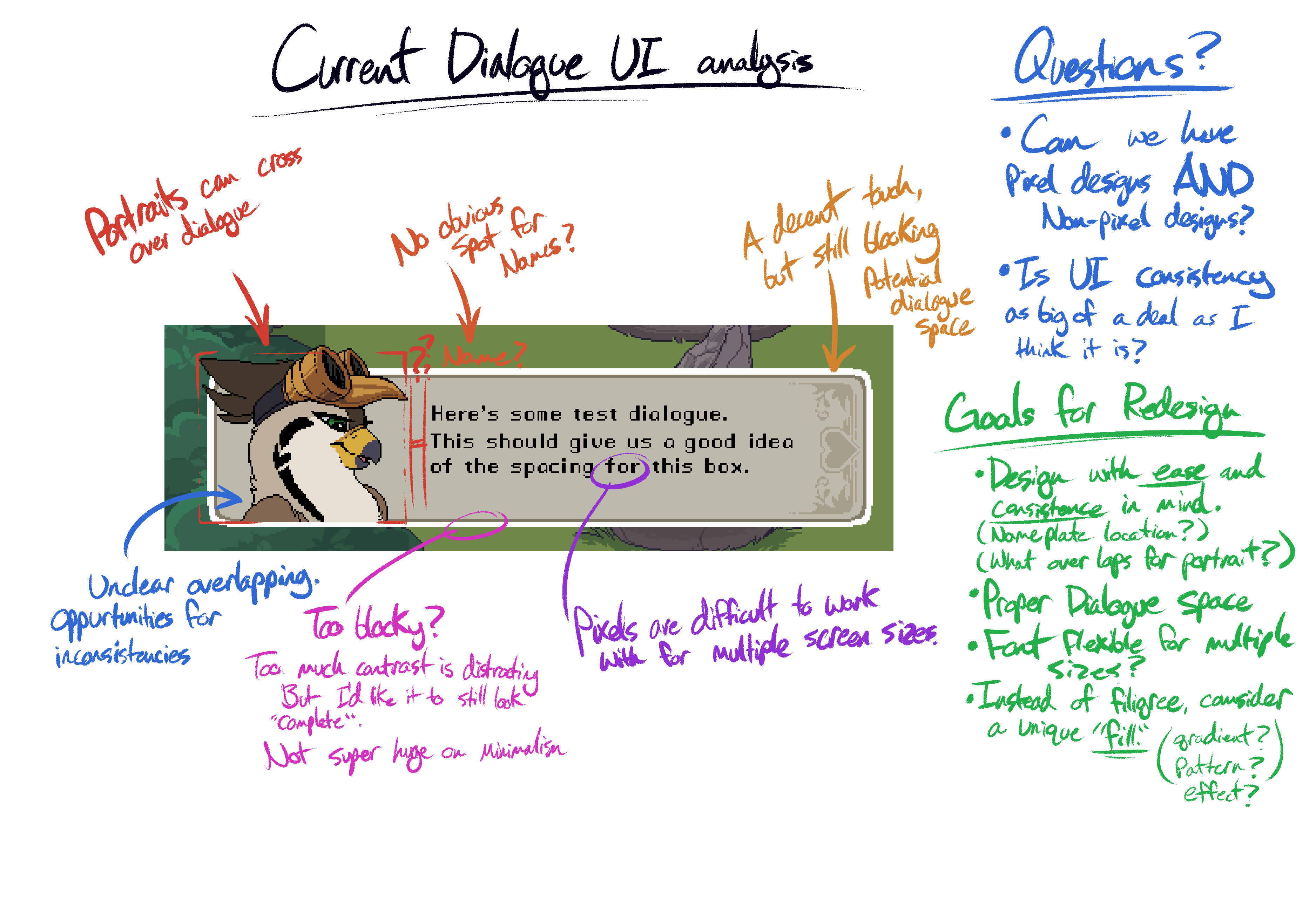
But it usually inevitably means we will need to revisit each part, and finely tune it as we go on. This particular focus was the Dialogue Box UI.
We had a couple issues with how our current one worked. I wrote a bunch of the notes on the first picture above! Give them a read if ya wanna see a bit more of what was holding us back, and what we wanted to design for!
SO! Now that I know the problems with the current design, I can do some research on other games, and see how THEY solved THEIR problems :> (sometimes they didn't! And sometimes there wasn't a problem at all!)

(You will wanna rightclick > open-in-new-tab to get the details.)
I look up whatever current games I'm playing, and just see what they're doing.

This process works for literally learning anything. Study the shortcomings of your own. Analyze the works of others, and see what they're doing right/wrong.

After a while, you'll either notice popular design trends, or get a better idea what's going to work for your particular needs. For us, this answered a lot of questions. And I had a pretty good idea of what to try.

So now it's back to thumbnailing. These tests were in a vacuum with NO other game art, just to see if they'd work on their own. Trying different boxes, but this time, accommodating a special place for both Art, AND name plates. (necessary design features going forward)
I ended up really digging how Hades does their dialogue boxes and went with that. But I definitely nabbed from the other games for lil' extra aesthetic and design choices.

Having this setup lets that "dialogue box" be modular. So it's a solid place for any other sort of UIs we may need in the future! In particular, we have a "Gossip" mechanic - which is basically the lore feature. It's a way to learn more about every critter, unlock extra info in the critter log, and occasionally, unlock extra items/dialogues/sex scenes :O!

While testing the visuals all together, one of the questions was: Should we try Drawn Art mixed with the pixel aesthetic?
If you look closely in our notes, there was many reasons to consider going non-pixelized, drawn/HD elements in the Dialogue UI. Particularly:
- resizing isn't a bitch for the portraits
- it's also not a bitch for the fonts.
- It can help differentiate the game visuals from the dialogue visuals. This contrast can give more of a "new age/indie" flare - I think it makes them a bit more memorable. Compare Celeste to Moonlighter above.
There were many reasons to consider going drawn, but there were issues as well.
- Creating a new "visual language of designs" in the game. (usually this means you should have other drawn elements somewhere)
- This could potentially create competition for the animated sex scenes. (Why aren't they drawn?)
- Though it is a more unique thing, it does kinda remove one of the main reasons why I wanted to stick with pixels (keep characters SLIGHTLY ambiguous in design, so the viewer can imagine and fill in the blanks (a huge strength of sprite/pixel based games))
- Finally, drawing allows for more complex techniques, so it kinda takes longer to make the assets.
At the end of the day, the nail in the coffin was the potential "value/economy" disrupt for the visuals. We didn't wanna devalue the sex scenes by keeping them animated yes, but pixelized. Essentially "Low res drawings" - why does the dialogue get high res drawings, and the sex gets low res drawing? It would've been a valid critique. AND I CERTAINLY DIDNT/DONT wanna animate things over again, nor animate them traditionally haha. Maybe next game ;b.
So a lot of time went into this whole journey, about 1-2 weeks. It's part of what set us back (and I guess my impromptu grandpa trip, and vixel's computer dying lol).
But these sorts of explorations are necessary for a game's growth and solidity! Definitely learned a lot from all this. What I've posted isn't even including the new Interaction System v3.0 xD.
The way we interact with critters has been an everchanging system - partly because not a lot of games exist that have what we need. Typically dialogue is handled linearly, and based on time or certain triggers, and the level of complexity there can be huge, but we also needed a system that supported not only linear, but non-linear conversations. Once we made the system, we needed to revamp the actual controls since our 2.0 system "worked" but wasn't visually intuitive yet.
WHEW~!
So now here we are. Near the end of the month, got a few more very very solid revamps, but still gotta plug them in.
Vixels buried under a mountain of things to fix and polish still, and now I threw all this on top of him lmao. We're gonna >try< to get this all in for this month's release, but if not, I think we'll do another release a week or two into February.
I really wanna get these new systems in so we can have more testing time with it. I'm PRETTY CONFIDENT, the UI Dialogue revamp, AND the interaction UI revamp are gonna be the final ones in the actual completed game. So I'm excited to see them in action as soon as possible!
-
OK that's it from me! Just wanted to show ya guys what crazy processes and how much consideration and study goes into decisions like these! It's pretty cool I think :>
EDIT -Oh I forgot to show what the final will look like.

Now we can play with depth of the dialogue box! And we also get a bit more of a waste-up/bust view for all the characters! This meant I had to go through and draw extra parts for every existing portrait! Oh I've also added about another 15 portraits :>
Files