Home
Home

 Artists
 Search
 Recent
 Random
 Posts
Posts
 DMs
DMs
 Tags
Tags
 Random
 Importer
 Import
 FAQ
FAQ
 Account
 Register
 Favorites
 Login
Login

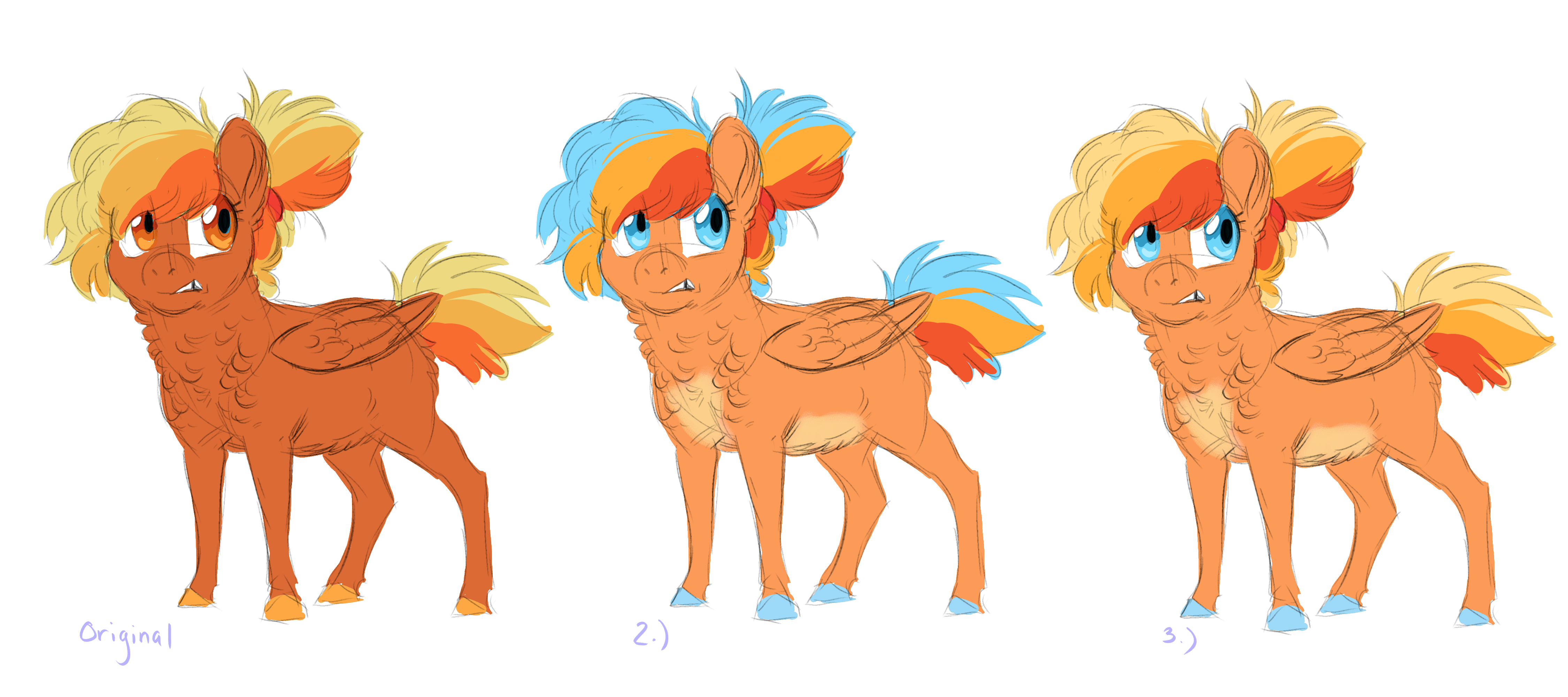
Phoenix Palette Test (Patreon)
Published:
2019-11-23 18:55:59
Edited:
2019-11-23 19:00:39
Imported:
2021-05
Content
Phoenix's original color palette is a little too analogous for my liking. She doesn't really read as Rainbow Dash's daughter. I've been wanting to incorporate some blue into her design for a while. Which palette do you like best? Her original color palette is on the left. Alternate suggestions are very welcome!
Files