Home
Home

 Artists
 Search
 Recent
 Random
 Posts
Posts
 DMs
DMs
 Tags
Tags
 Random
 Importer
 Import
 FAQ
FAQ
 Account
 Register
 Favorites
 Login
Login

Old Art | College [Part 2 - Finished Projects] (Patreon)
Content
Lots of stuff I did in college! This actually isn't even close to all of it, it's just the stuff I had documented. I'm sure there's a lot more of it shoved back in my childhood closet in Illinois somewhere. Luckily, I already made a digital portfolio many years ago, so a lot of this is actually organized and documented. I'll talk about the ones I have stuff to say on below:

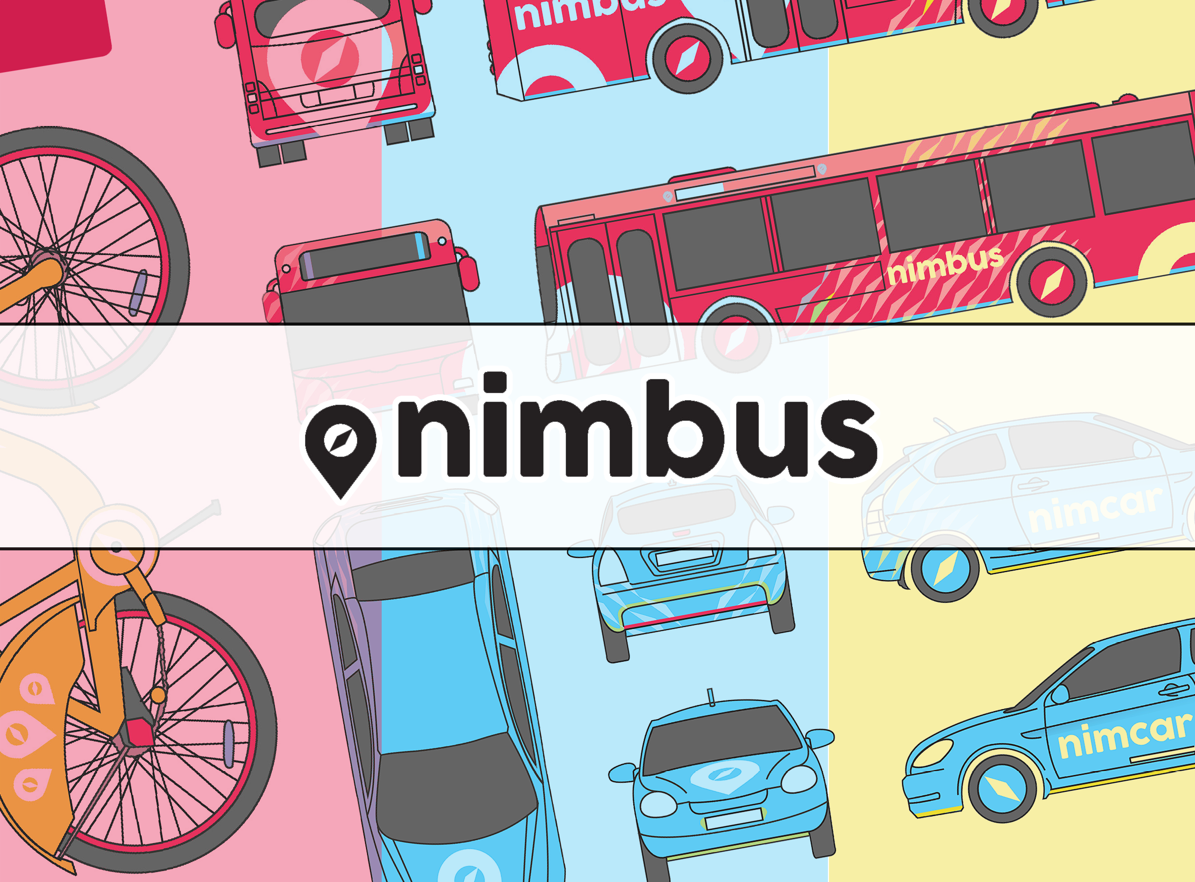
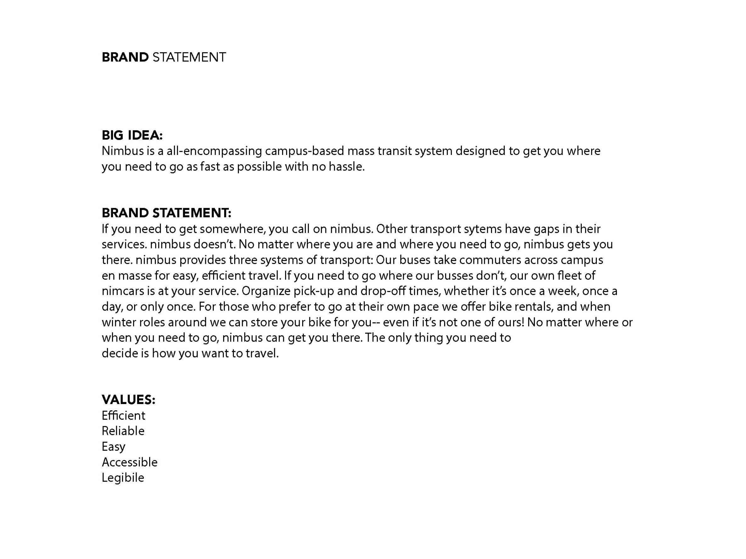
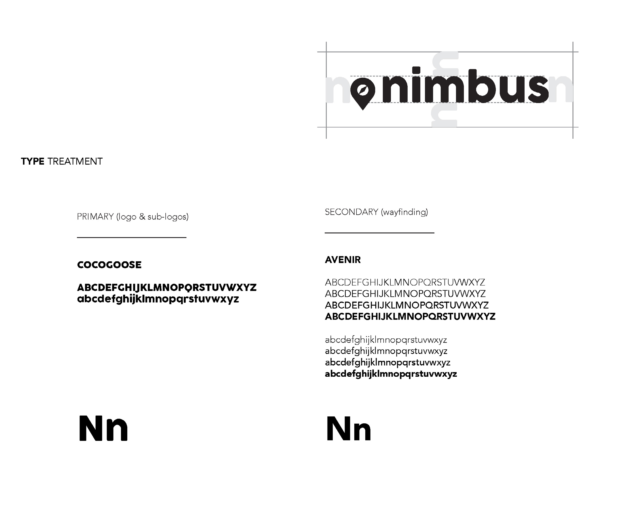
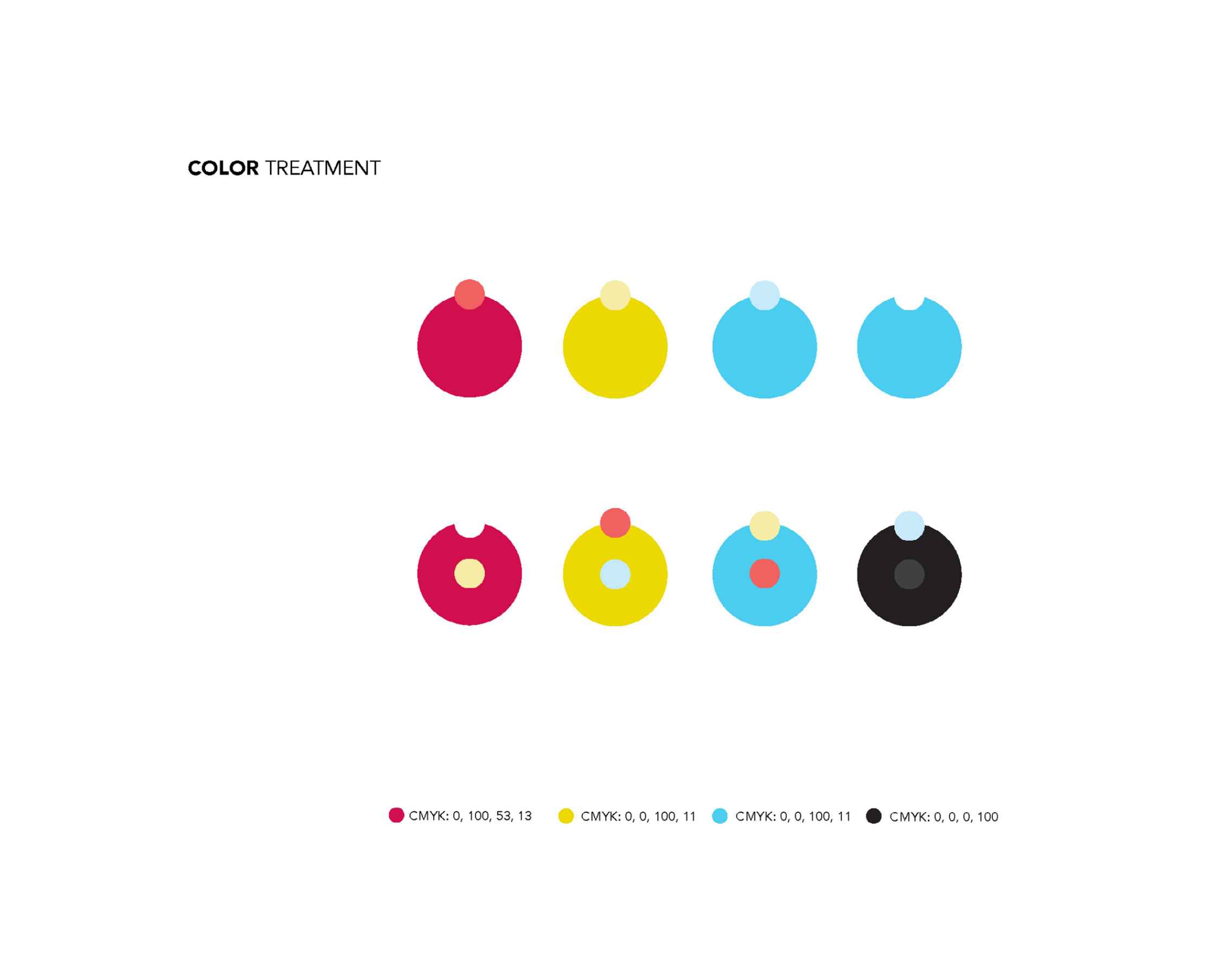
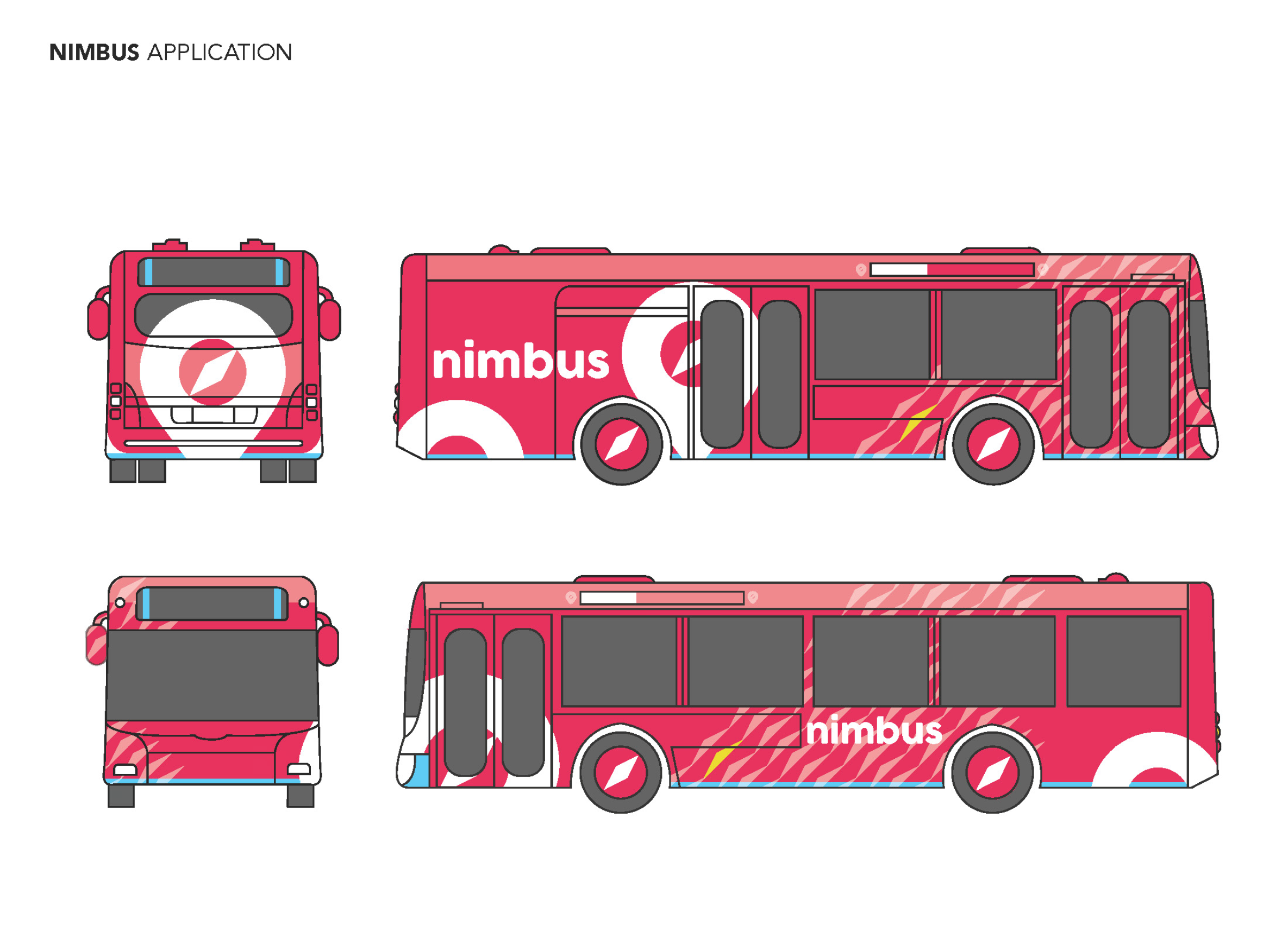
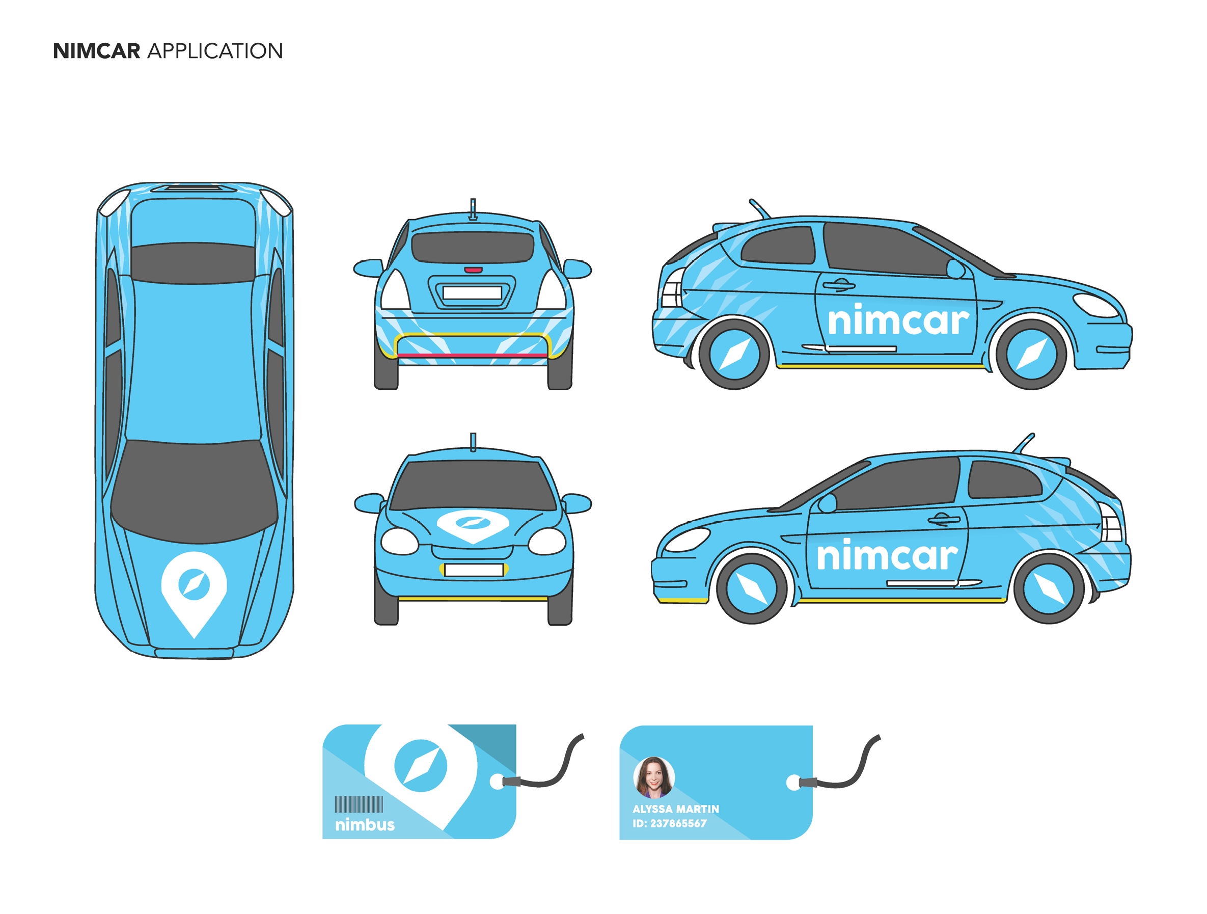
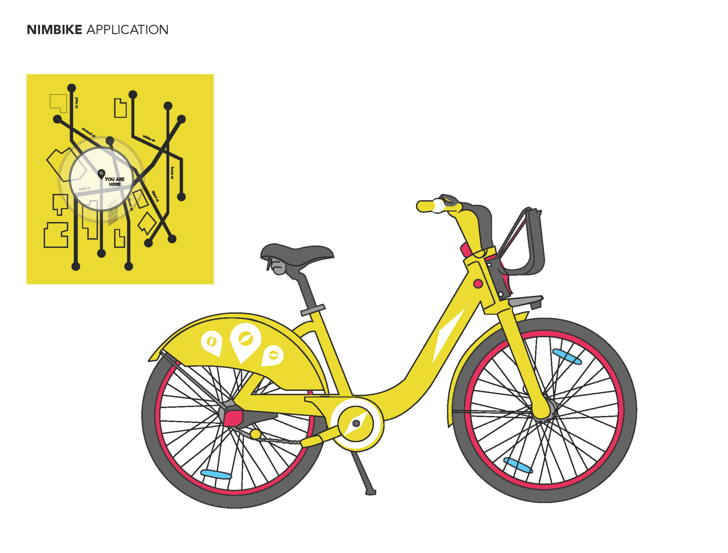
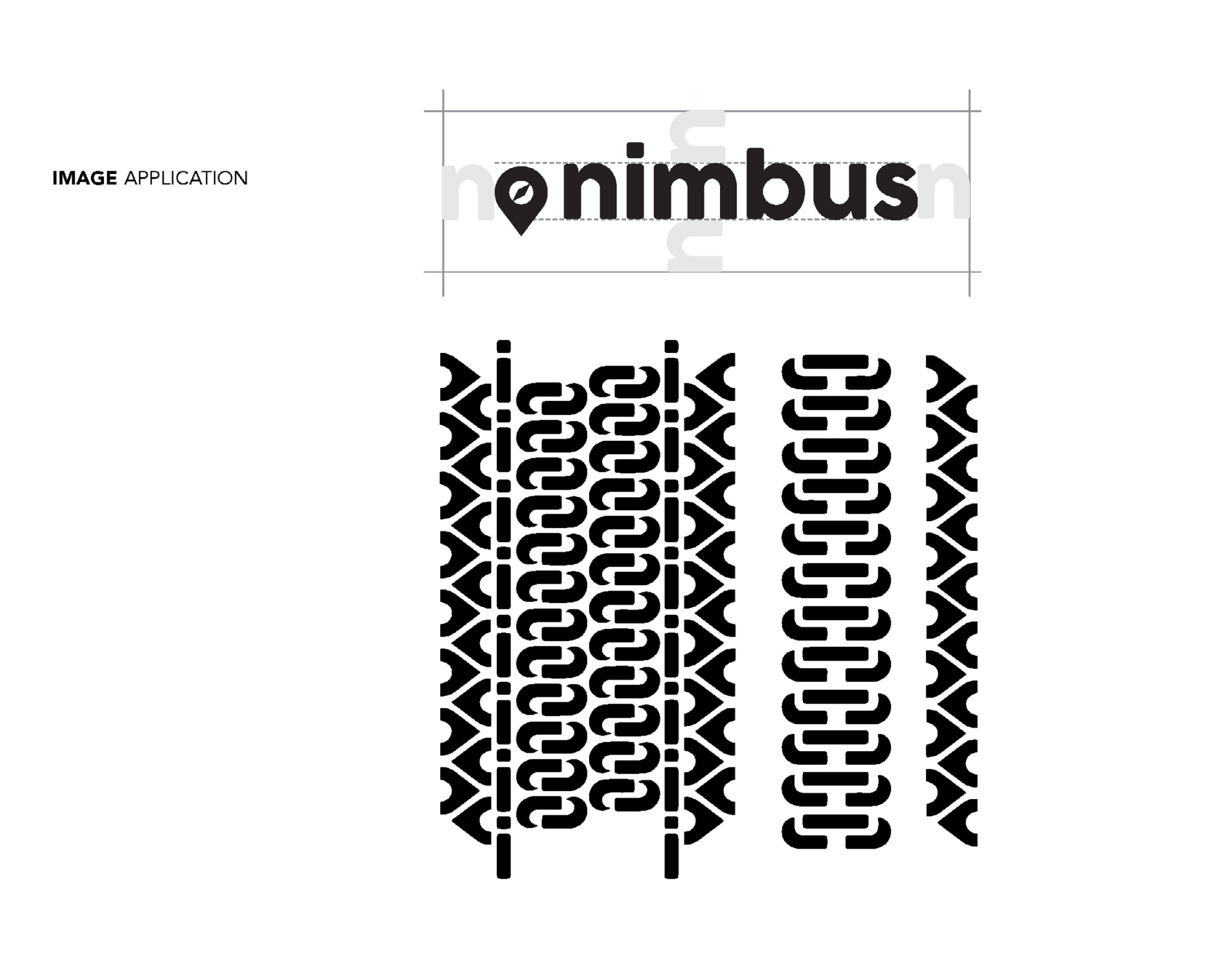
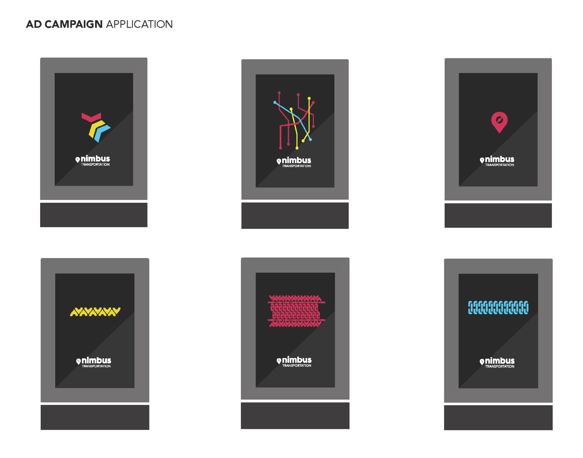
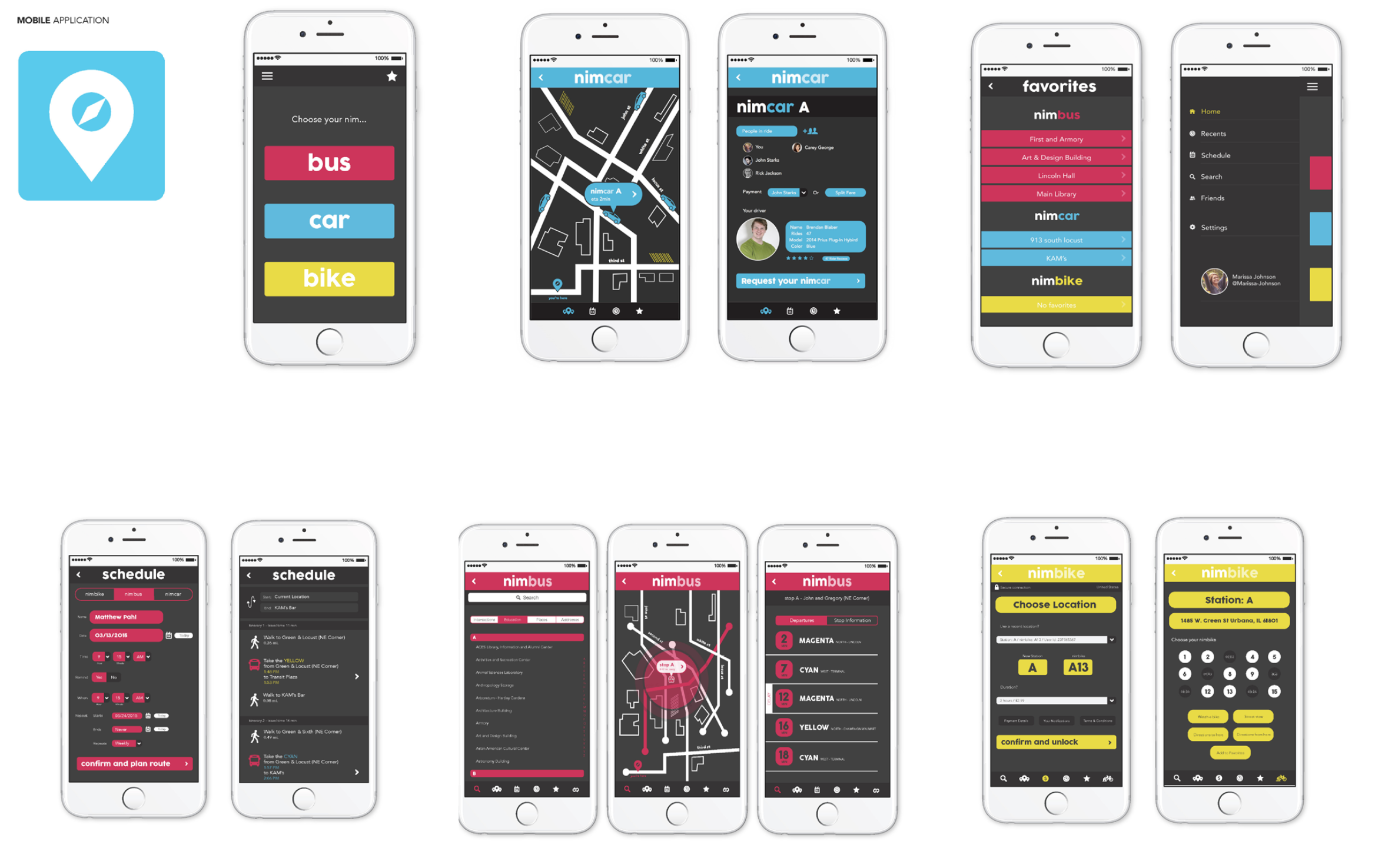
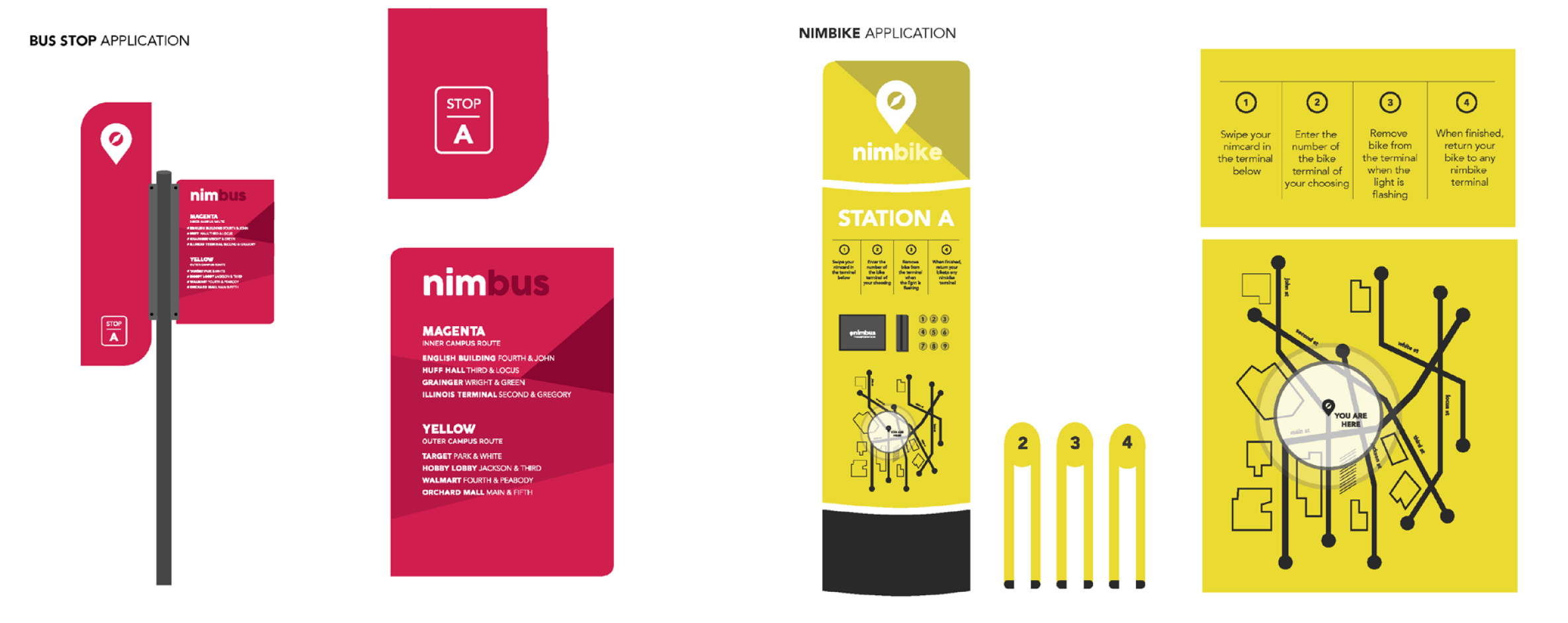
Nimbus was a big branding project from either Junior or Senior year. In case it's not obvious, I was a graphic design major so most of my work was actually in layout, design ideation, and like... basically art for business. Has a lot of in-depth stuff about the font and logo, which is kind of neat for documentation.
This was a public transport concept combining buses, cars, and bikes to be launching a mid-sized city. We had three people working on this project. I believe I was in charge of doing the vehicle design (the bus can be seen above) as well as the iconography. I took the logo and ripped it apart to make various tire tread designs, which the other two designers used in their app and wayfinding branding.
One of my partners, Bella Reinhofer, was extremely talented even then and has gone on to do a lot of very cool graphic design work in Chicagoland. All the cool-looking stuff in this project was her.

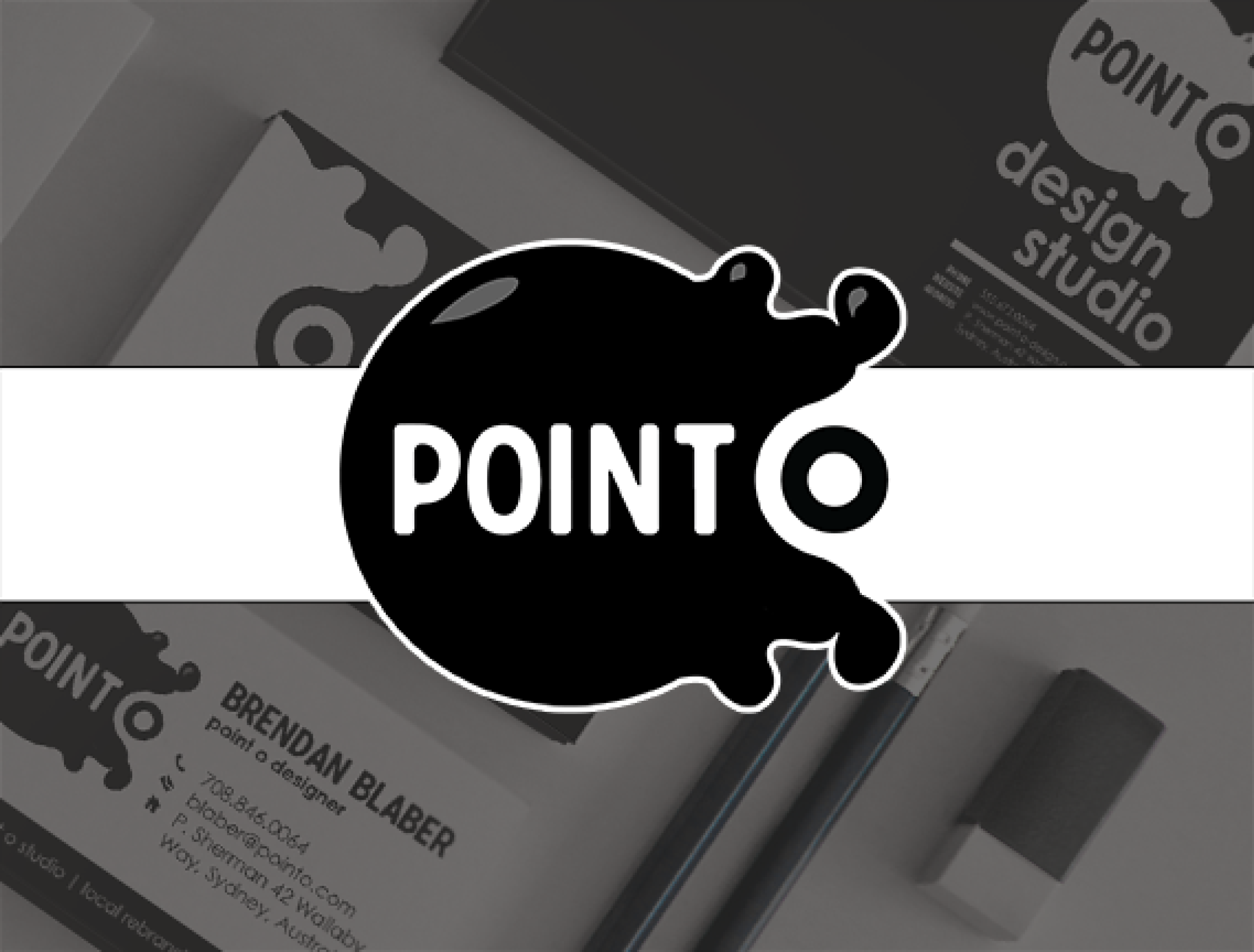
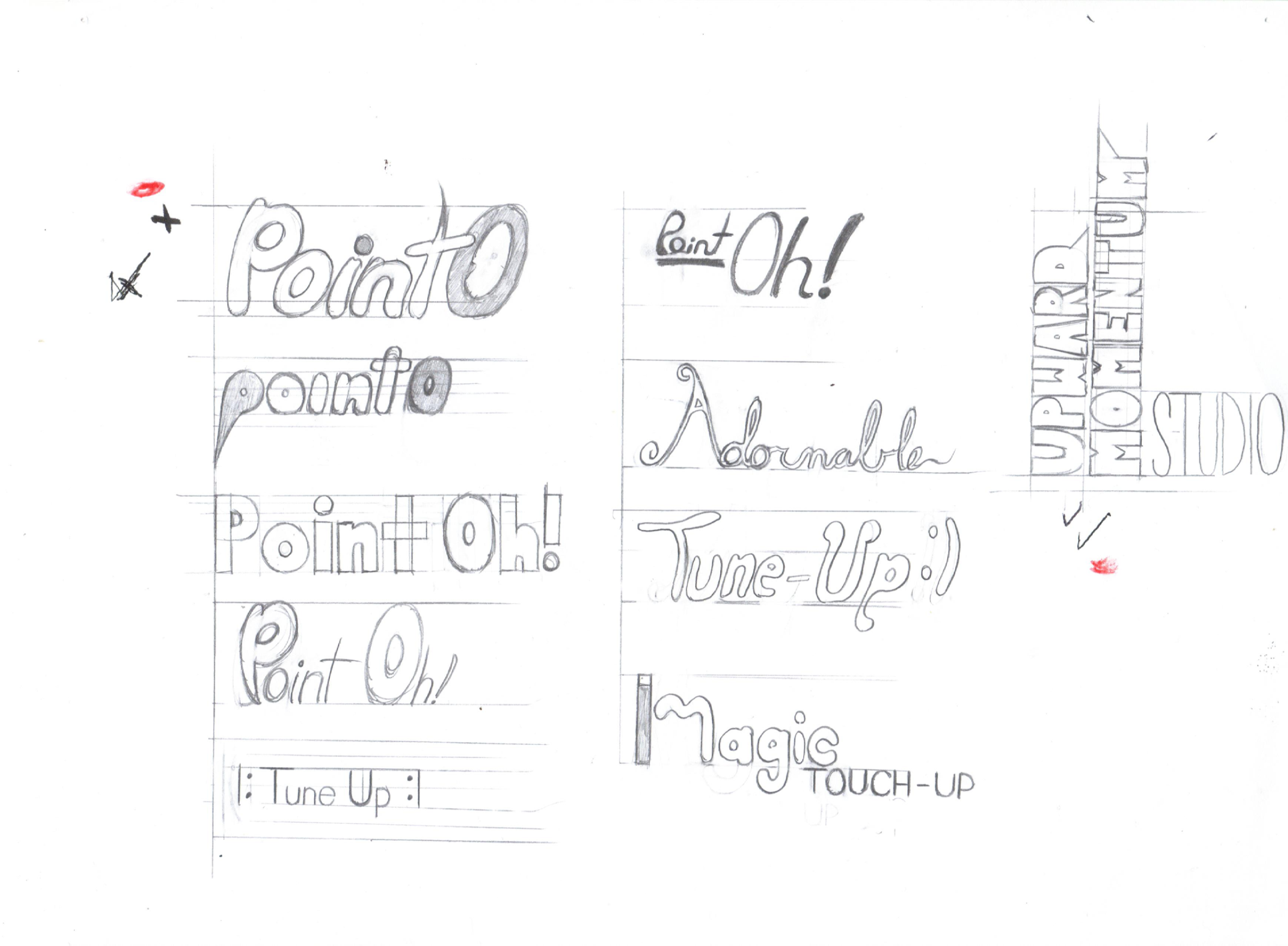
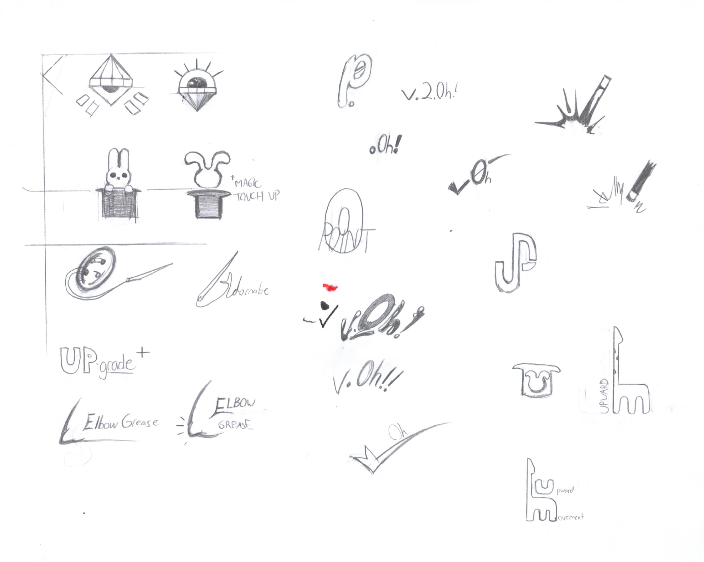
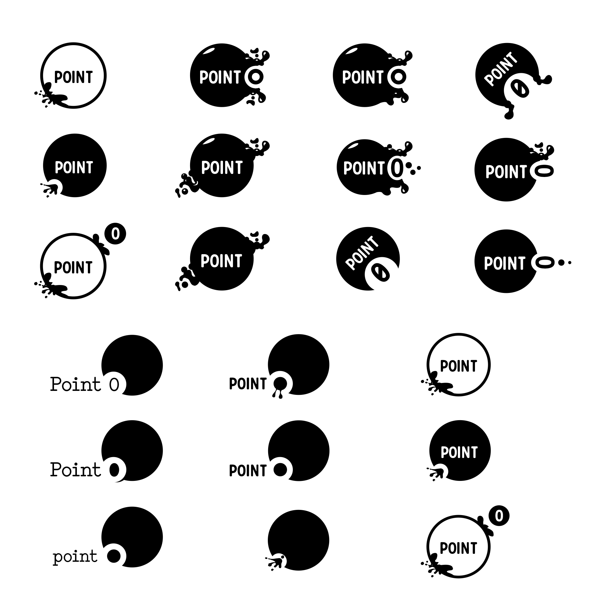
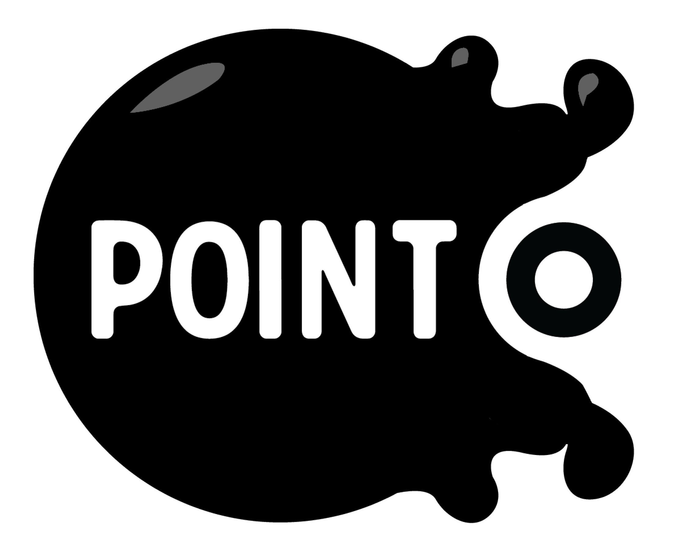
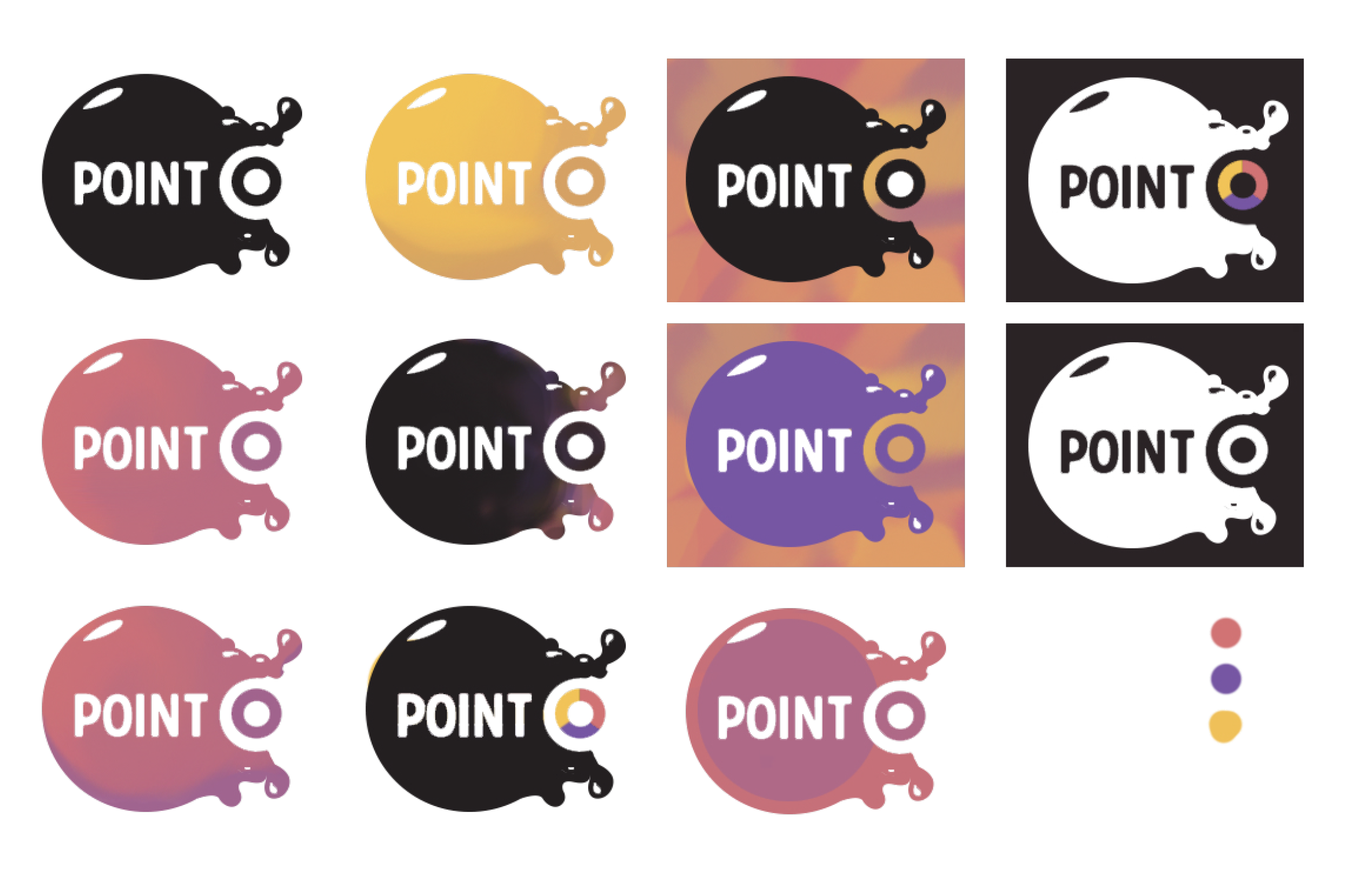
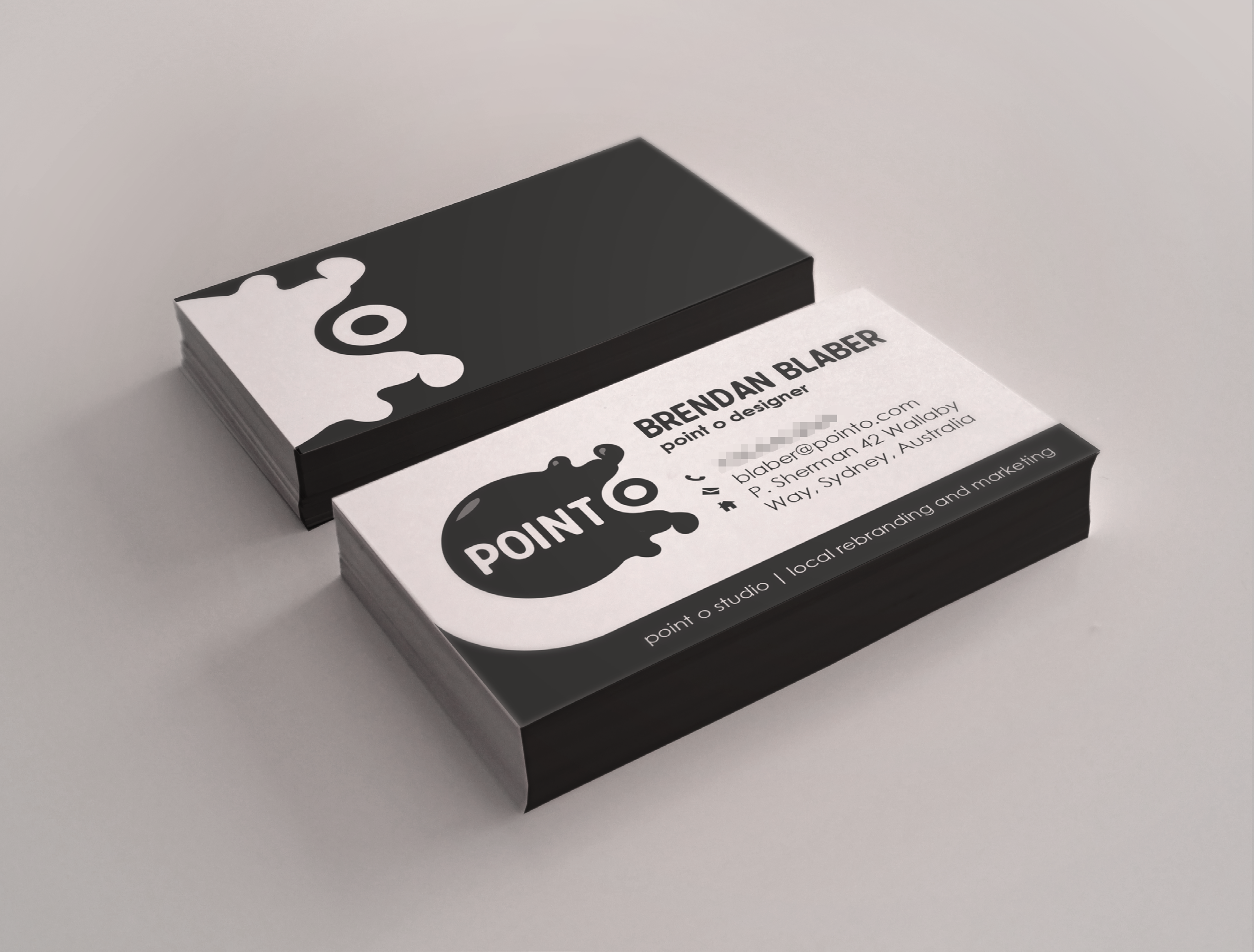
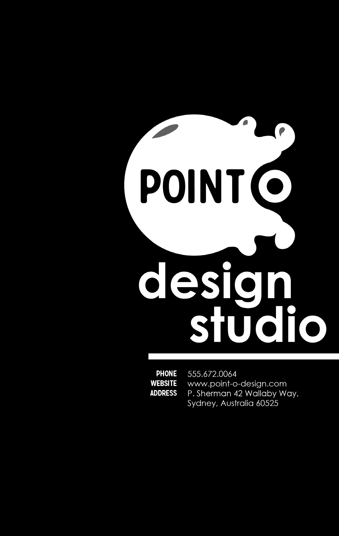
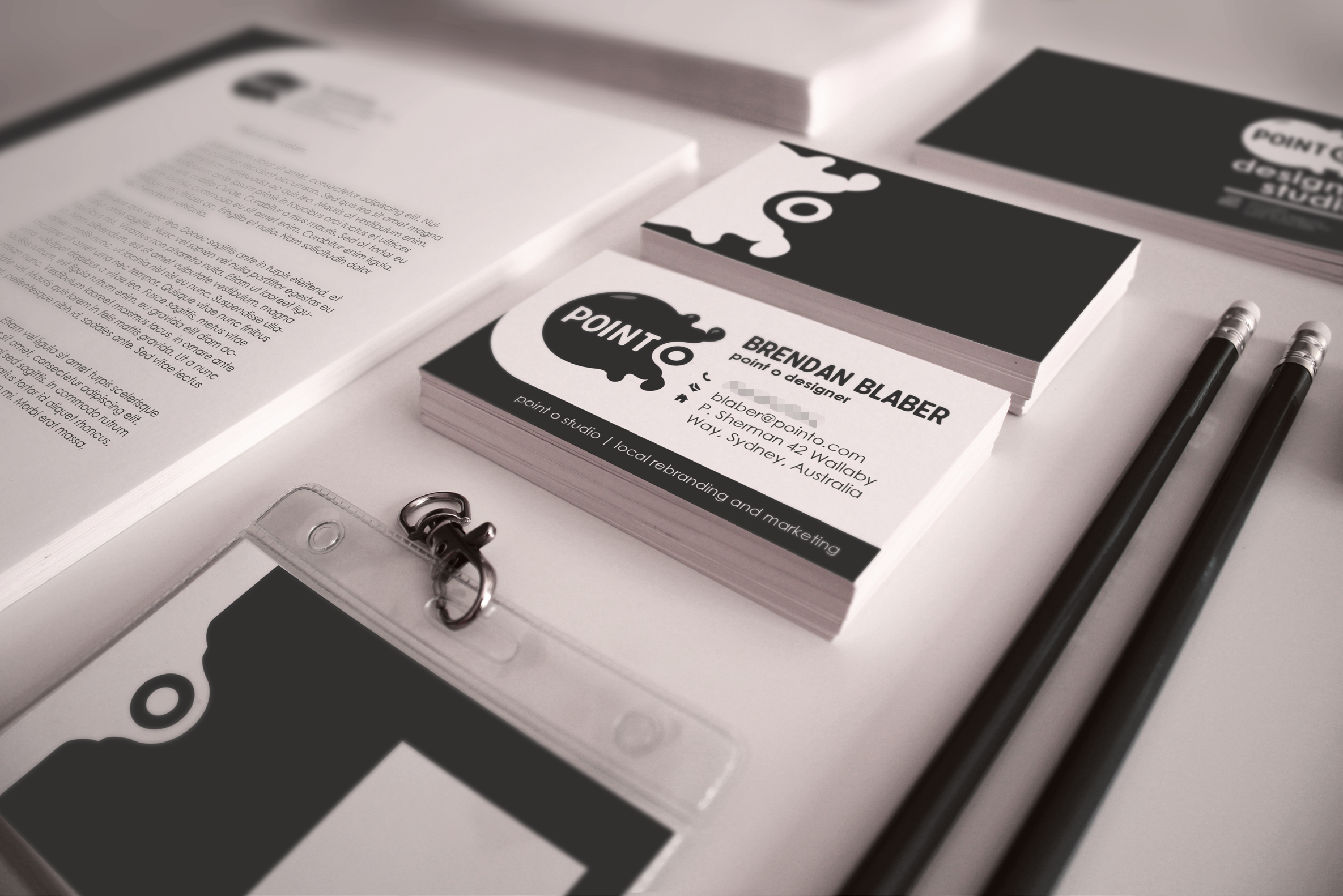
Point O was another hypothetical branding project. This time we were supposed to make an entire office kit for a design studio. This was another group project, though if I'm being honest, this time I kind of remember doing all of the work. I think this one was a Junior-Sophomore collaboration and I was the only Junior in my class so most everything either fell to me or ended up getting revised by me.
Note that none of these physical mock-ups are actually real. Usually what graphic designers will do while designing is buy a Photoshop template and plug their work into that so you can see what it would look like in a 3D space without having to actually go to a printer.
Trust me, you do not want to go to a printer until you really have to.

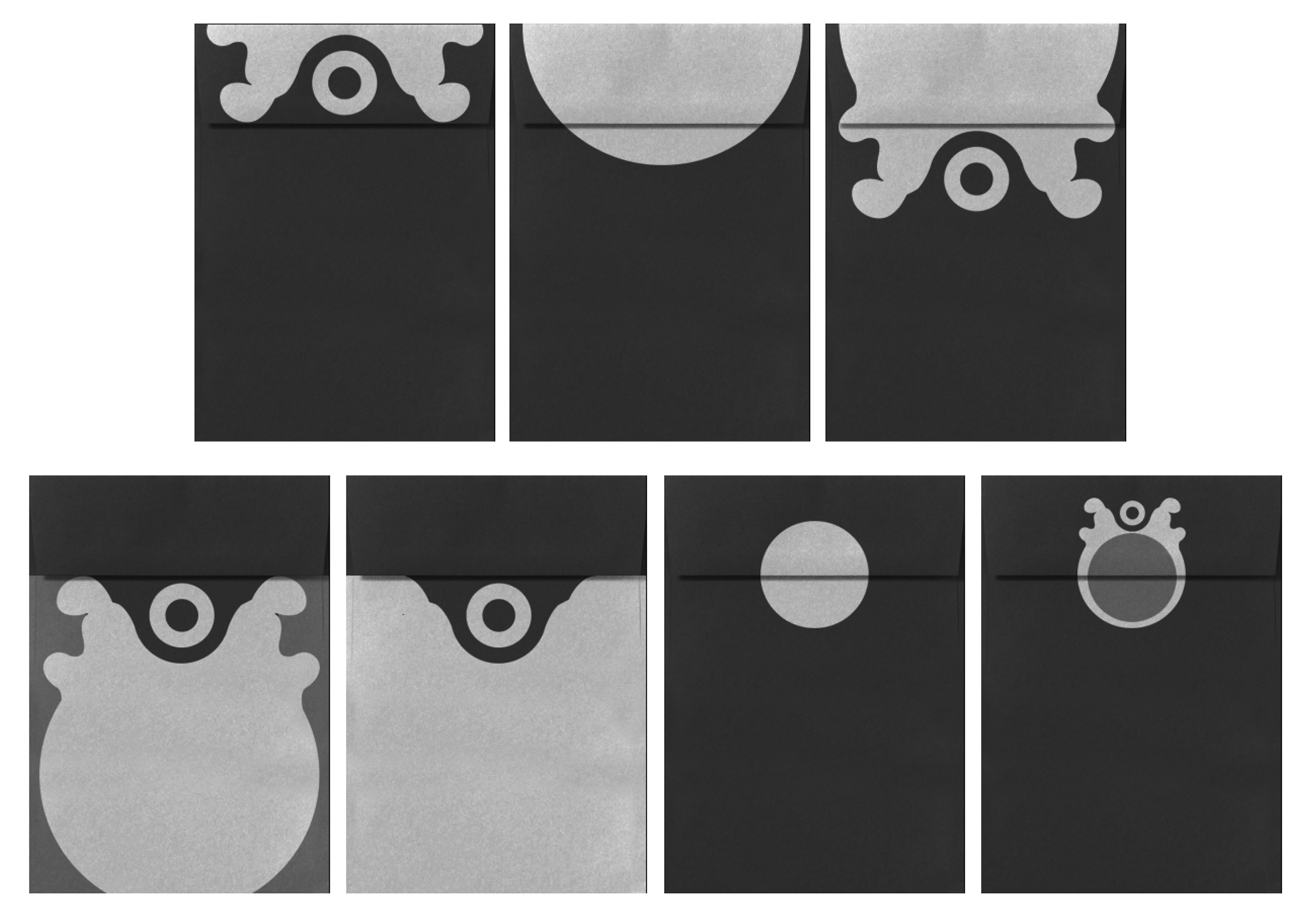
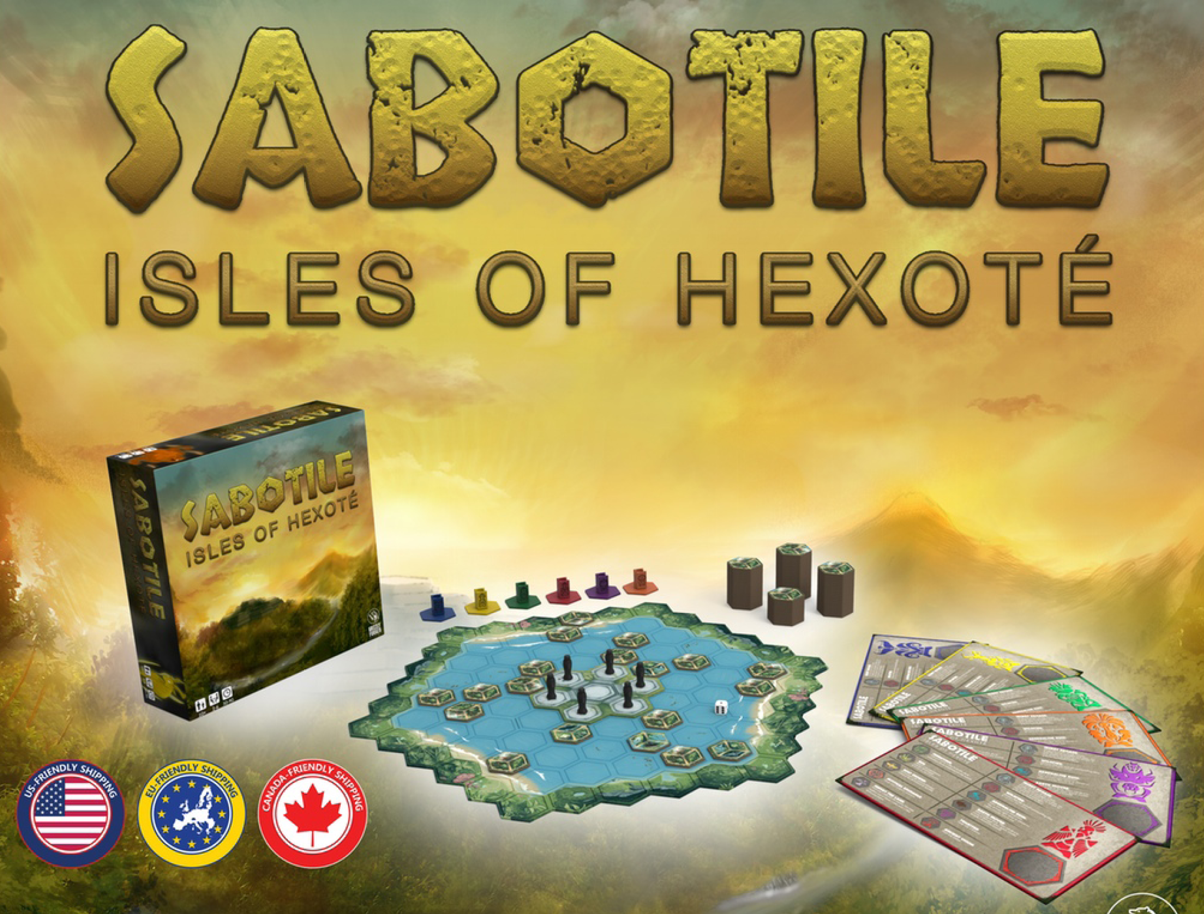
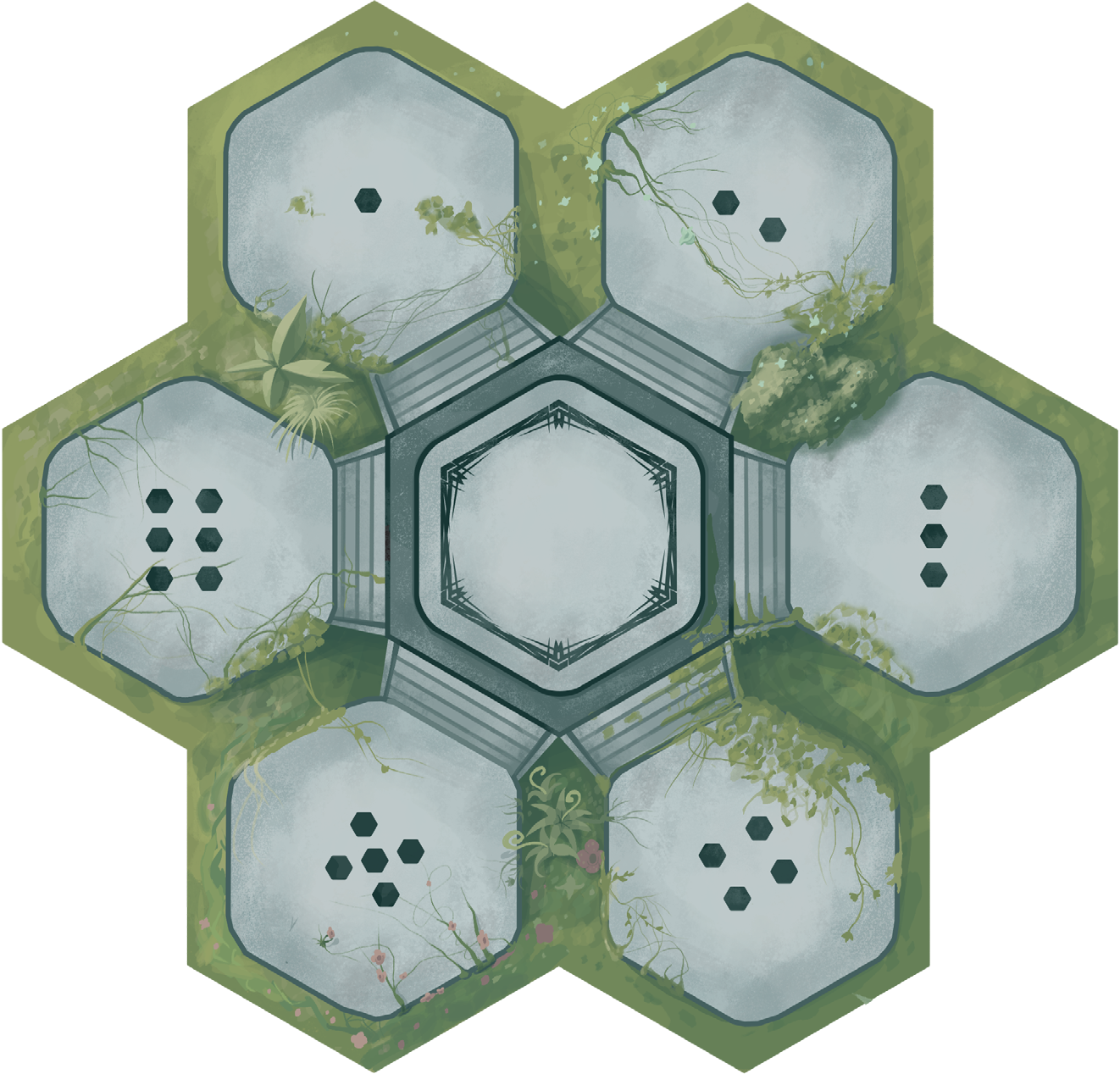
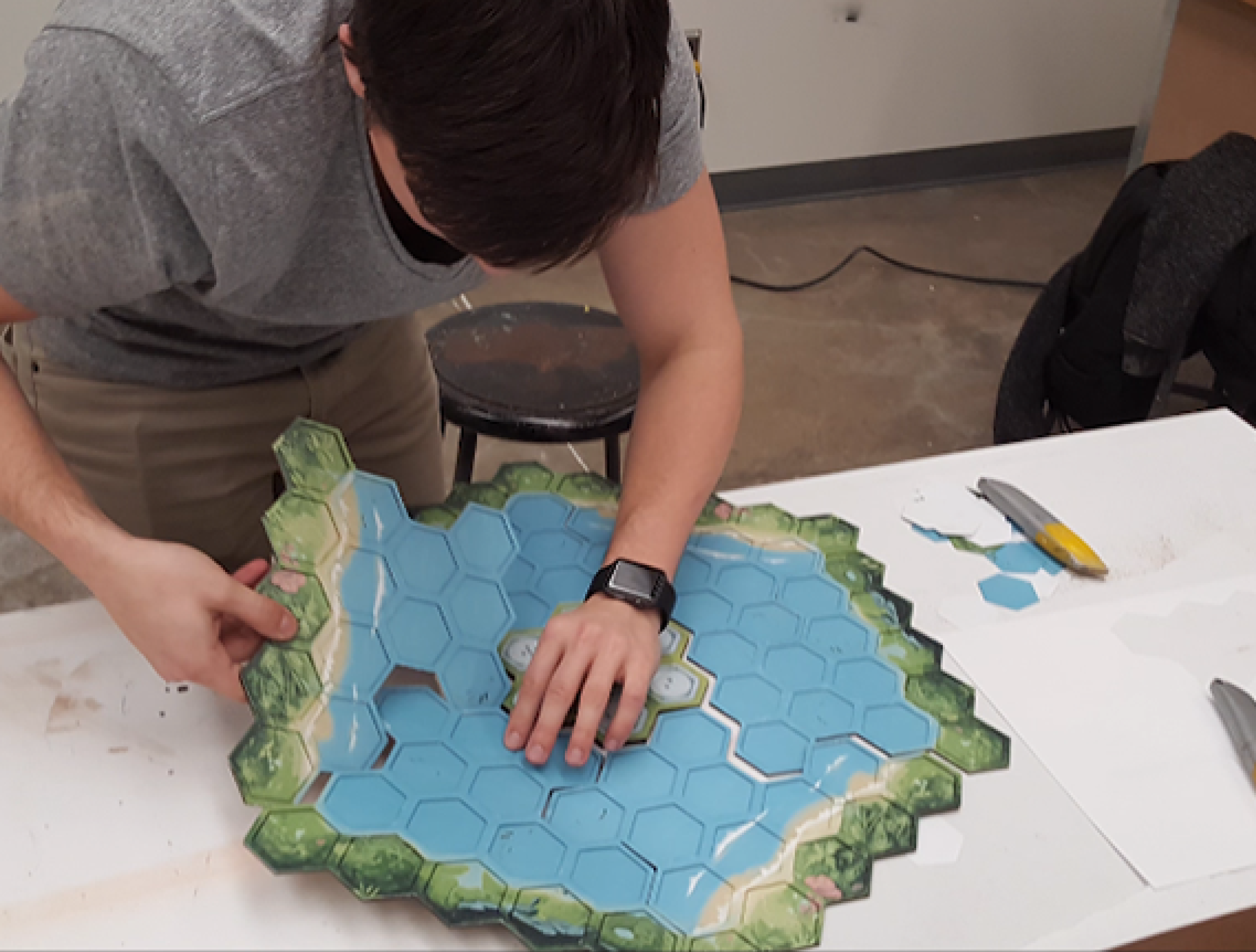
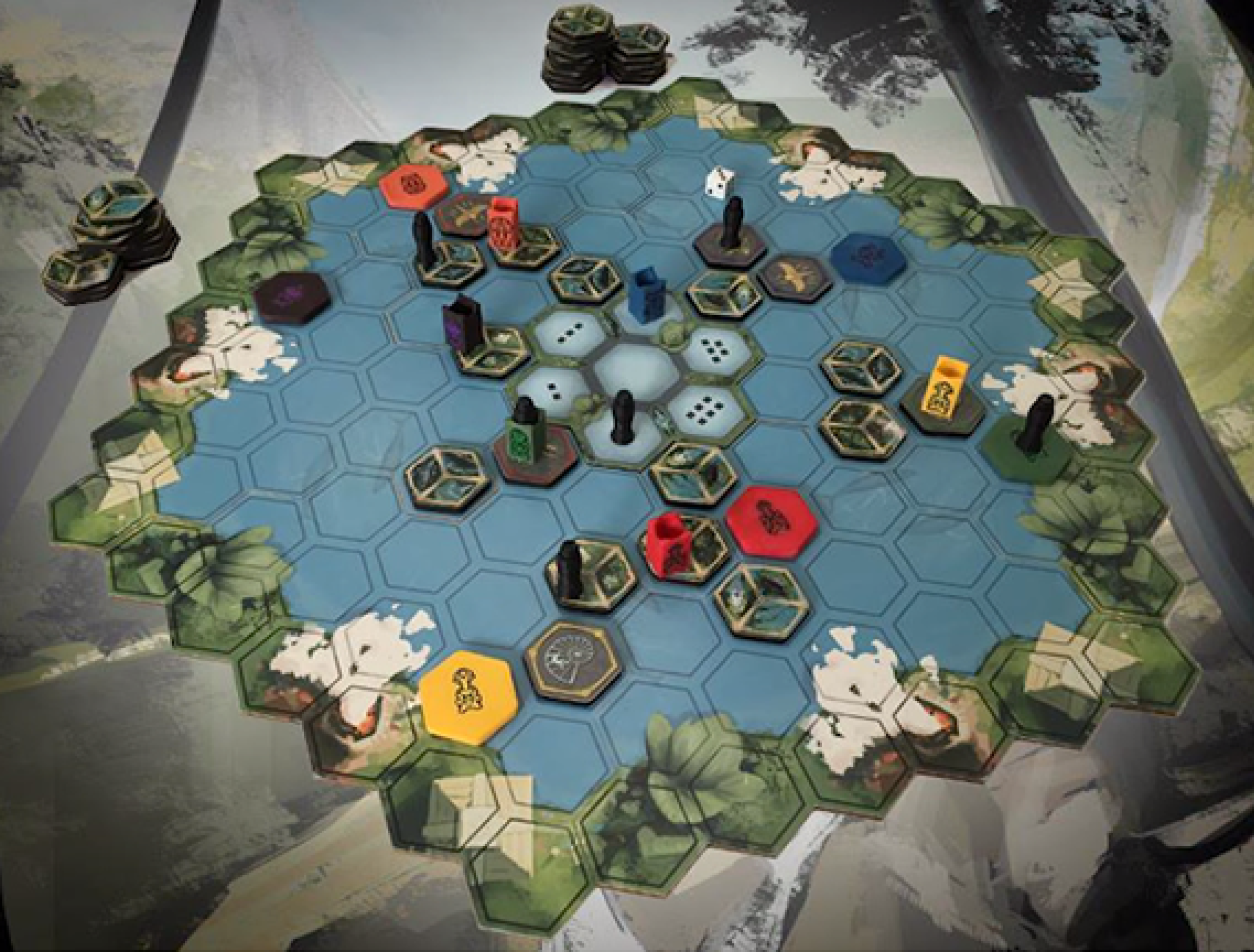
Sabotile was a board game designed by a friend of mine who was a year or two above me. I knew tons of little groups of seniors who were determined to make their own company. Literally none of them succeeded, lmao. This game does not actually exist.
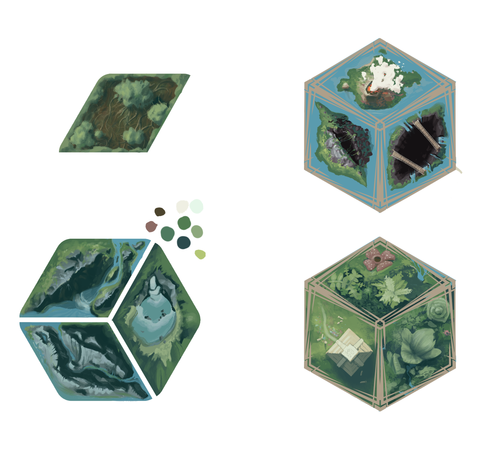
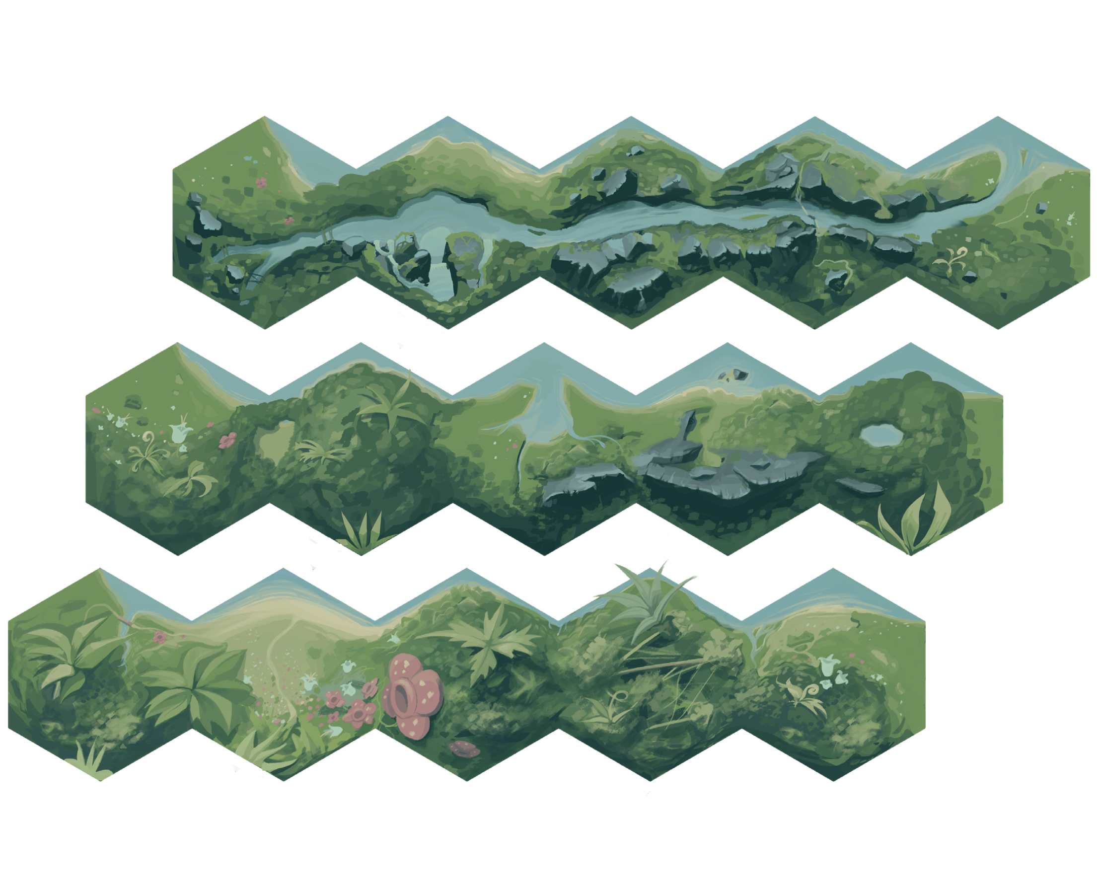
I painted the board art for this game. Originally it was intended to be a jungle exploration game where you put down tiles one by one. All of the tiles had one of three different types of land on them. I think they were all supposed to have different effects, but I don't remember any of them.
My painting is a little over-detailed for legibility considering the size of the game pieces and the perspective is kind of off, but I think most of them ended up looking nice.
I'm a little annoyed the devs didn't use the tiles I specifically designed as end-pieces though. They kind of mish-moshed my stuff together at the edges at a different size than the game pieces. Looked bad!

The edges were supposed to be made of these pieces. I spent a long time making sure the edges lined up smoothly no matter what order you used. Instead they edited my volcano tiles to be GIANT and just obviously scaled those. Strange choice.

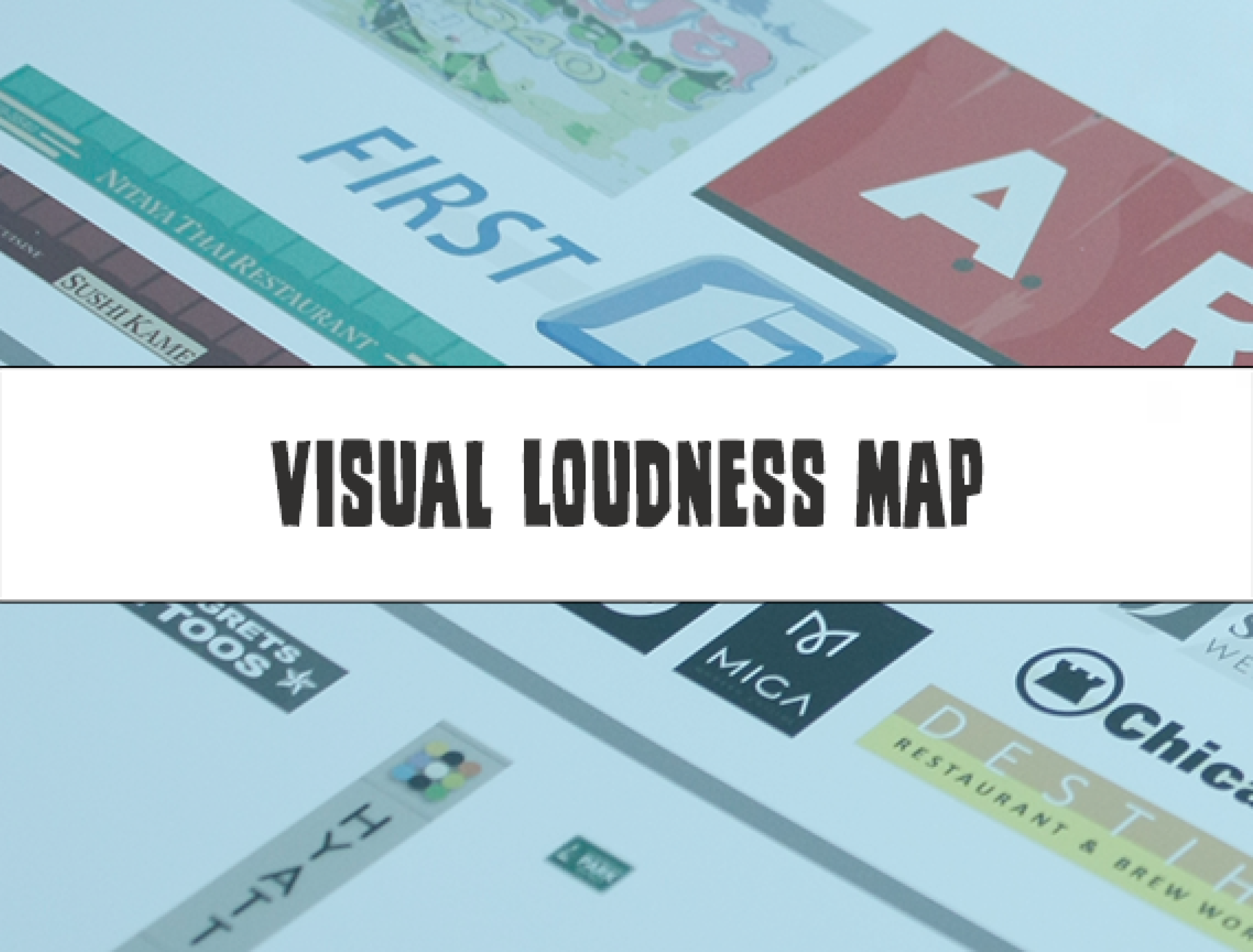
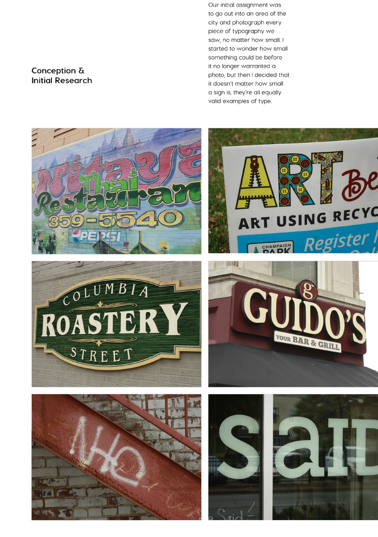
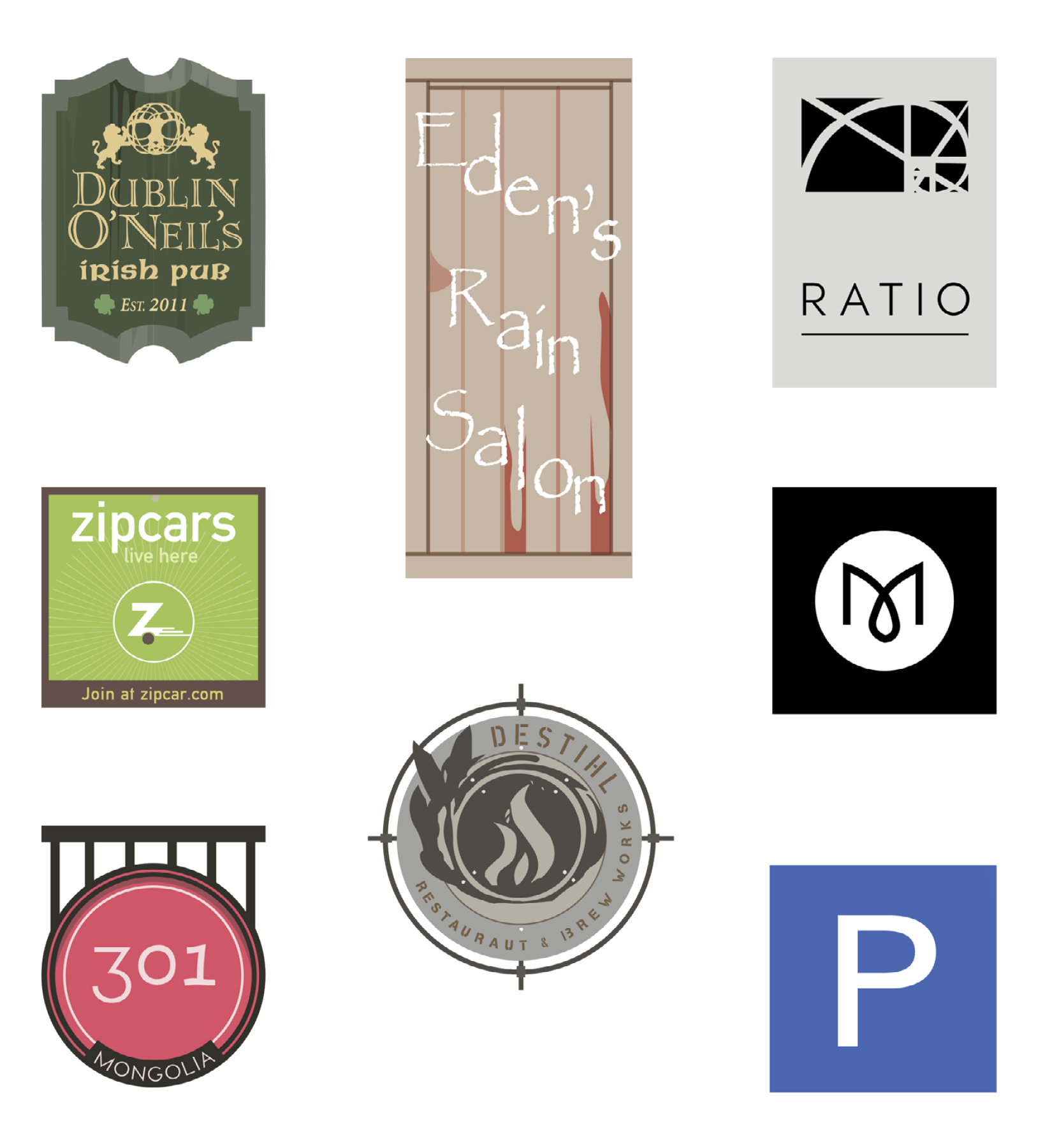
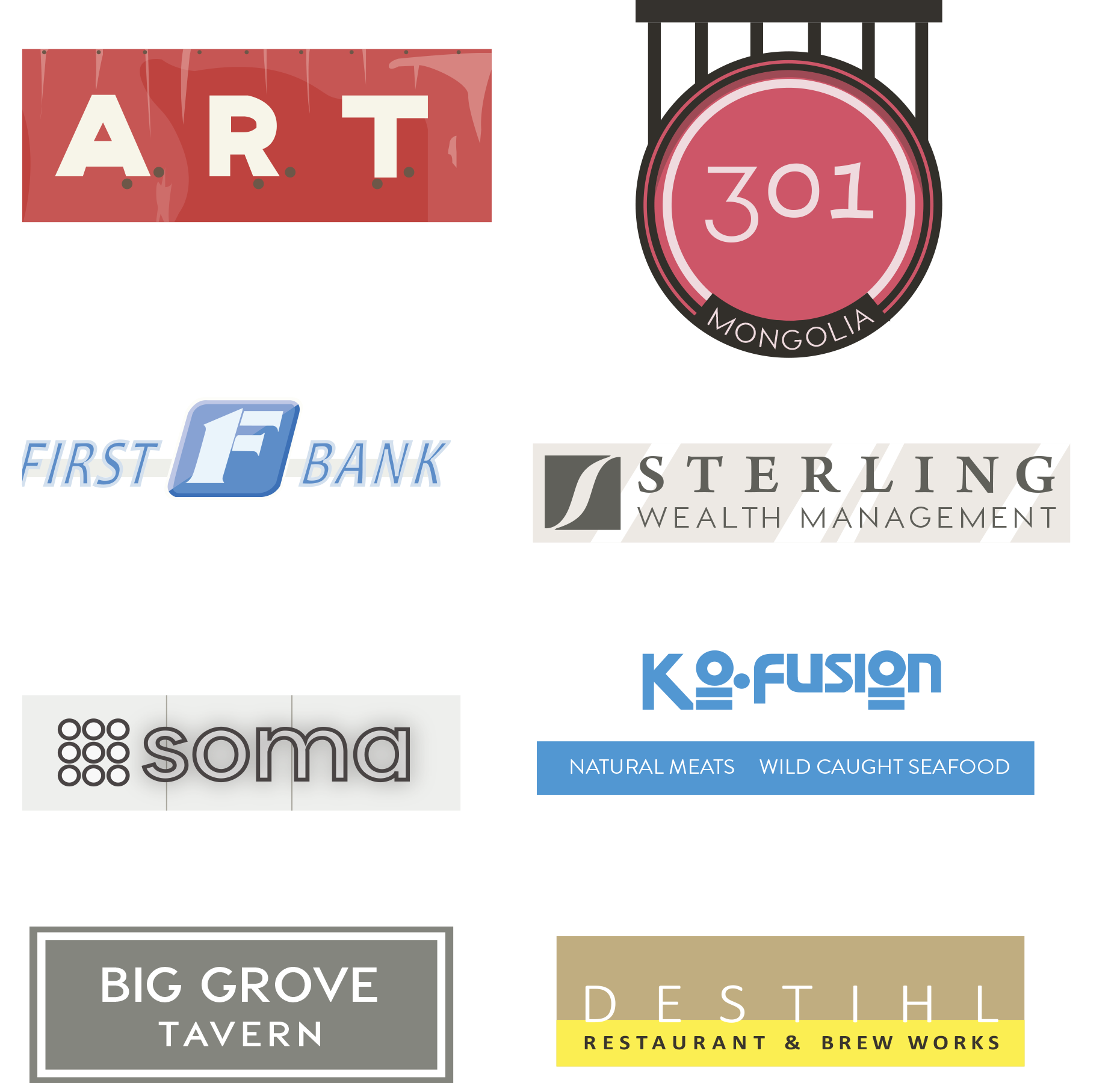
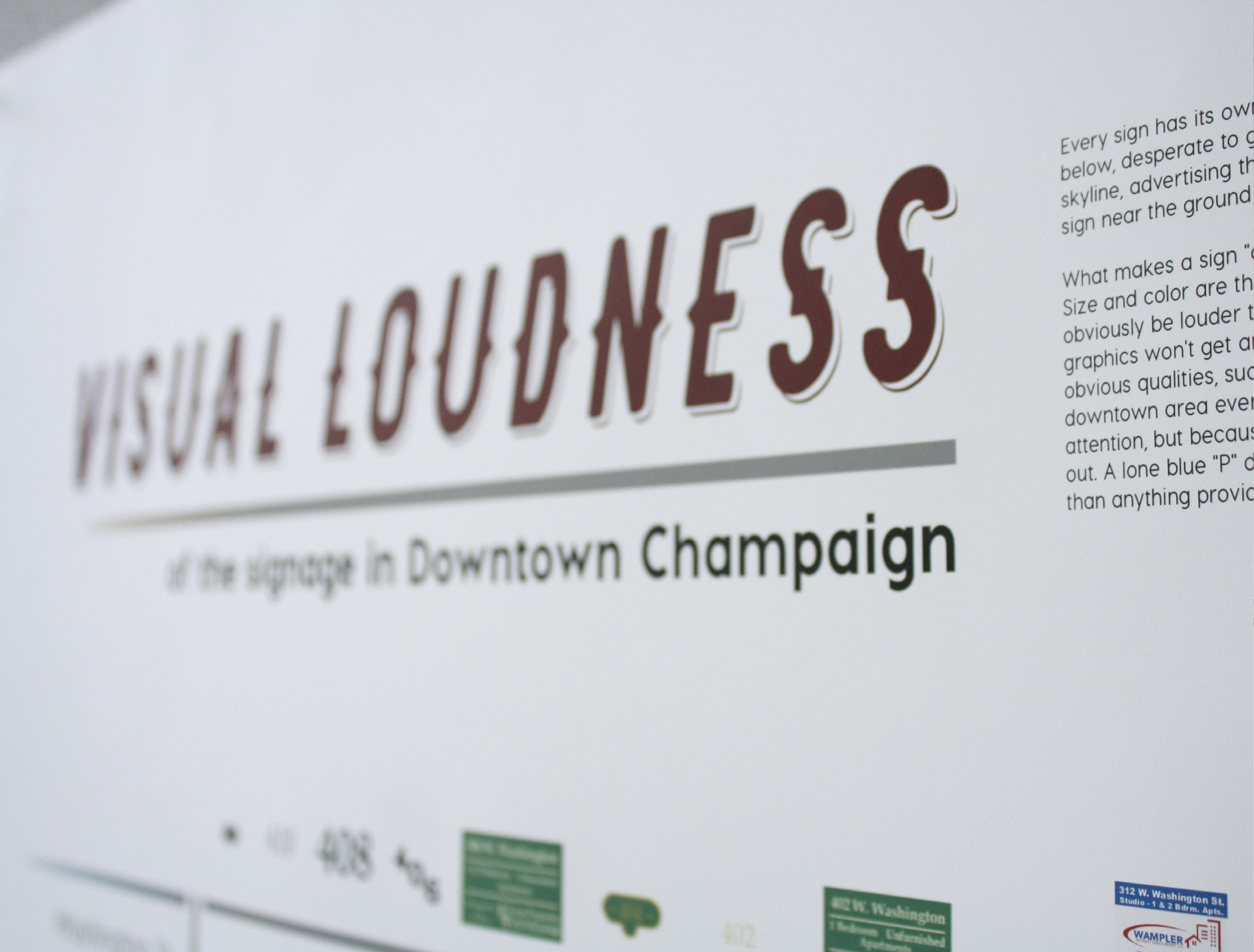
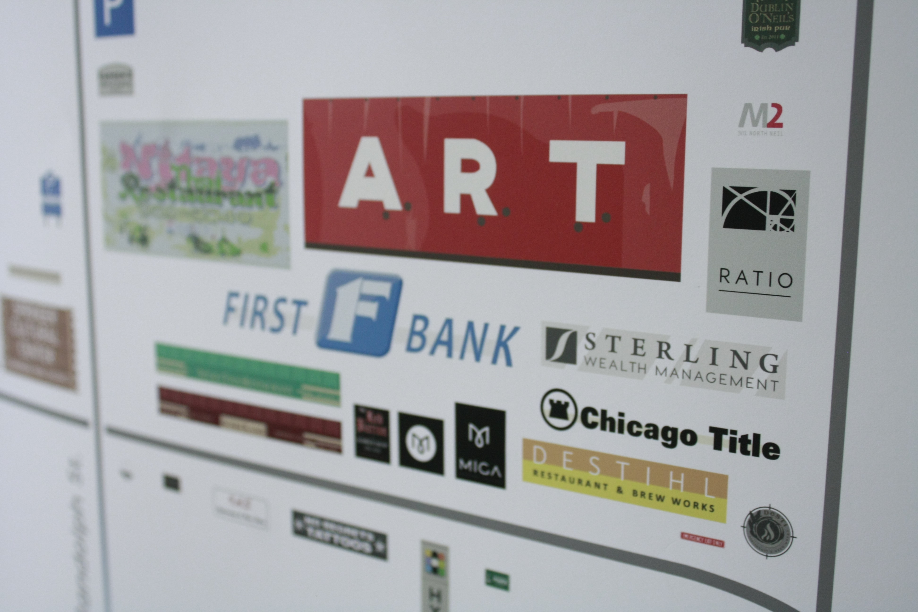
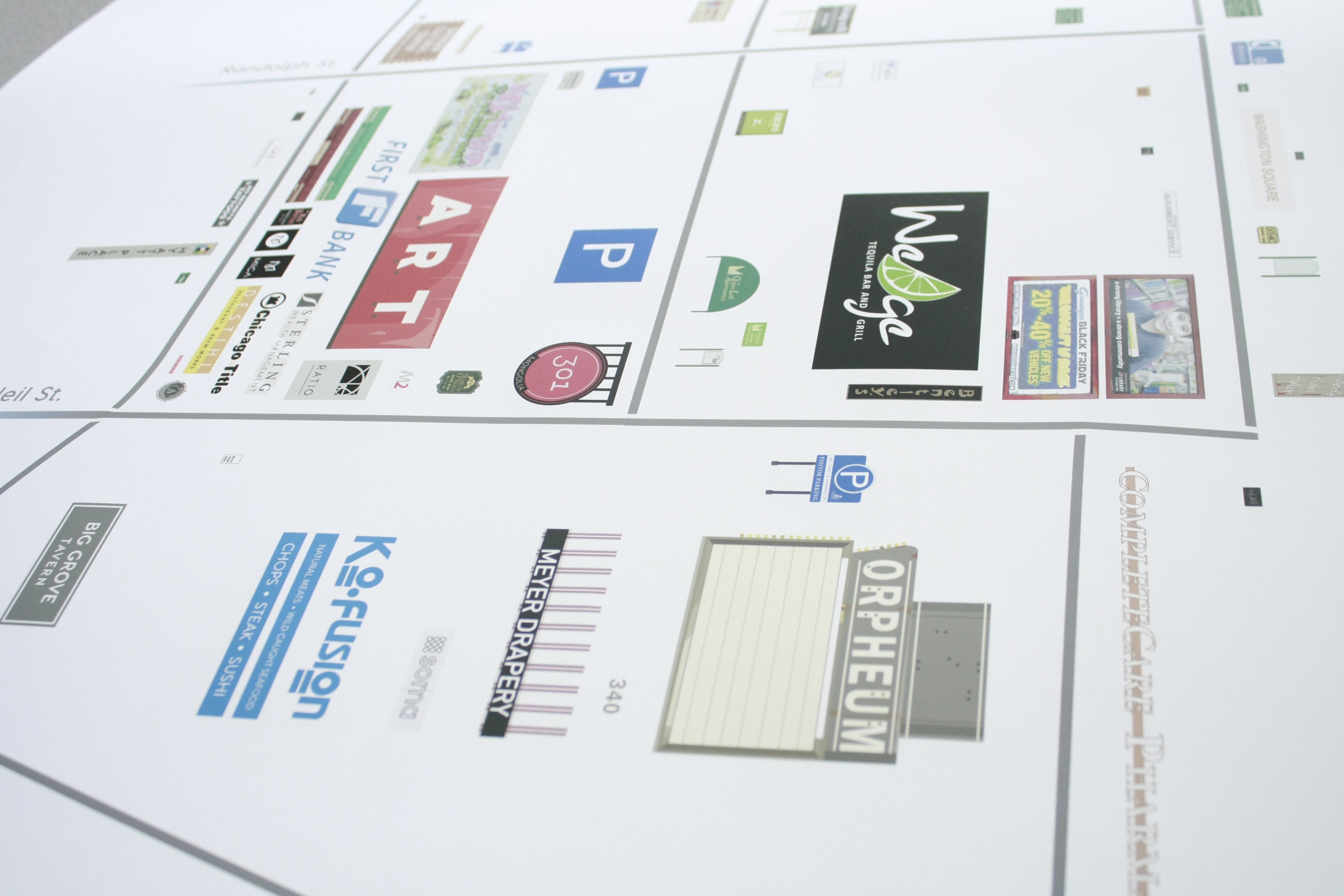
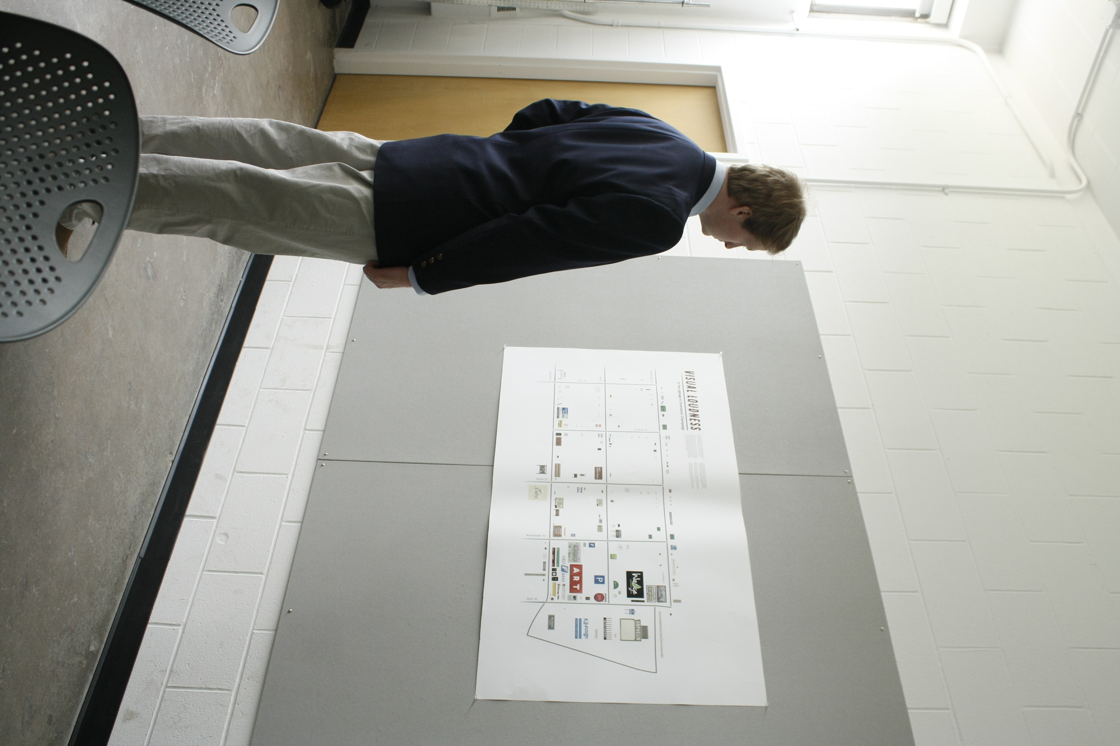
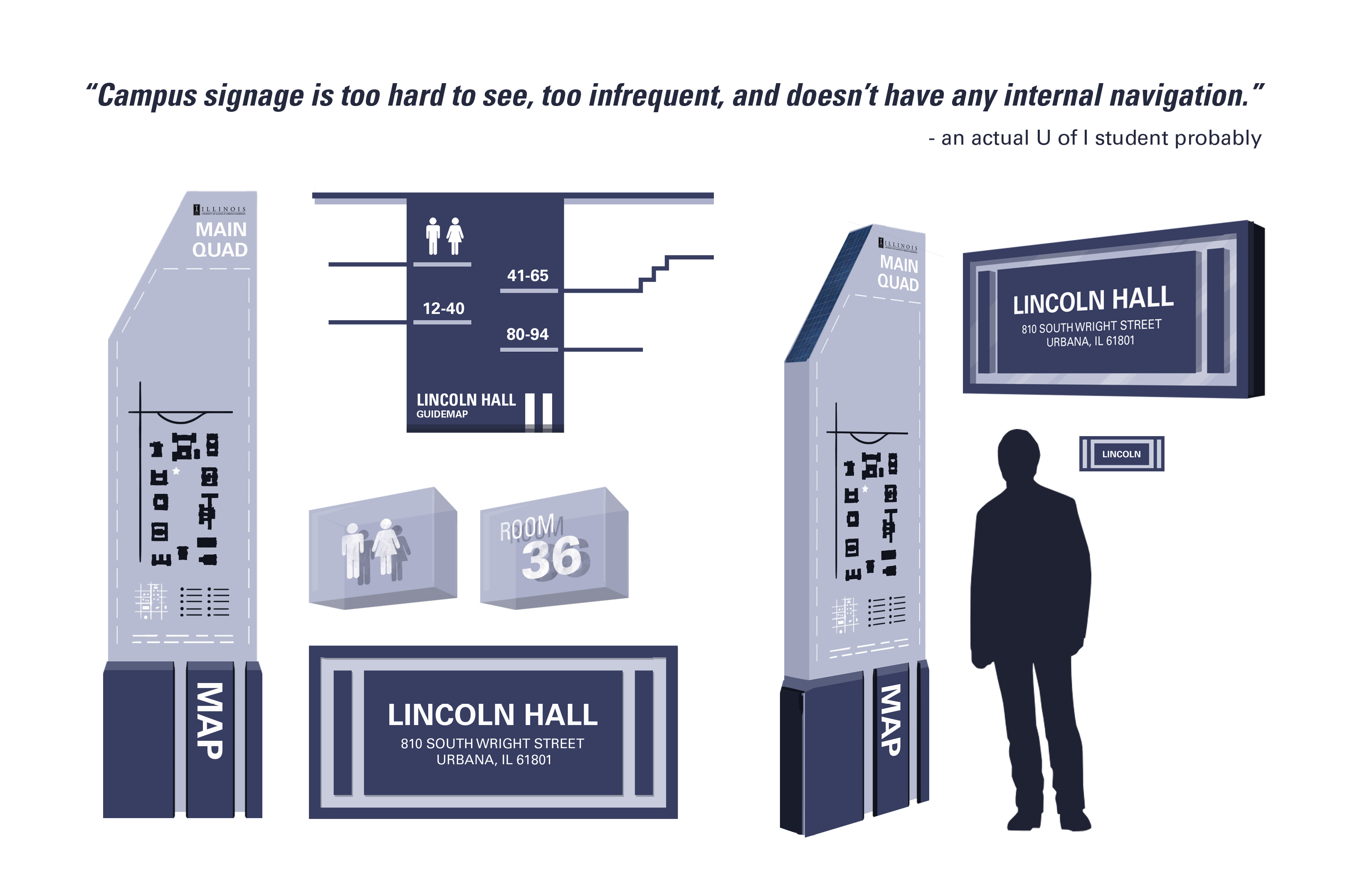
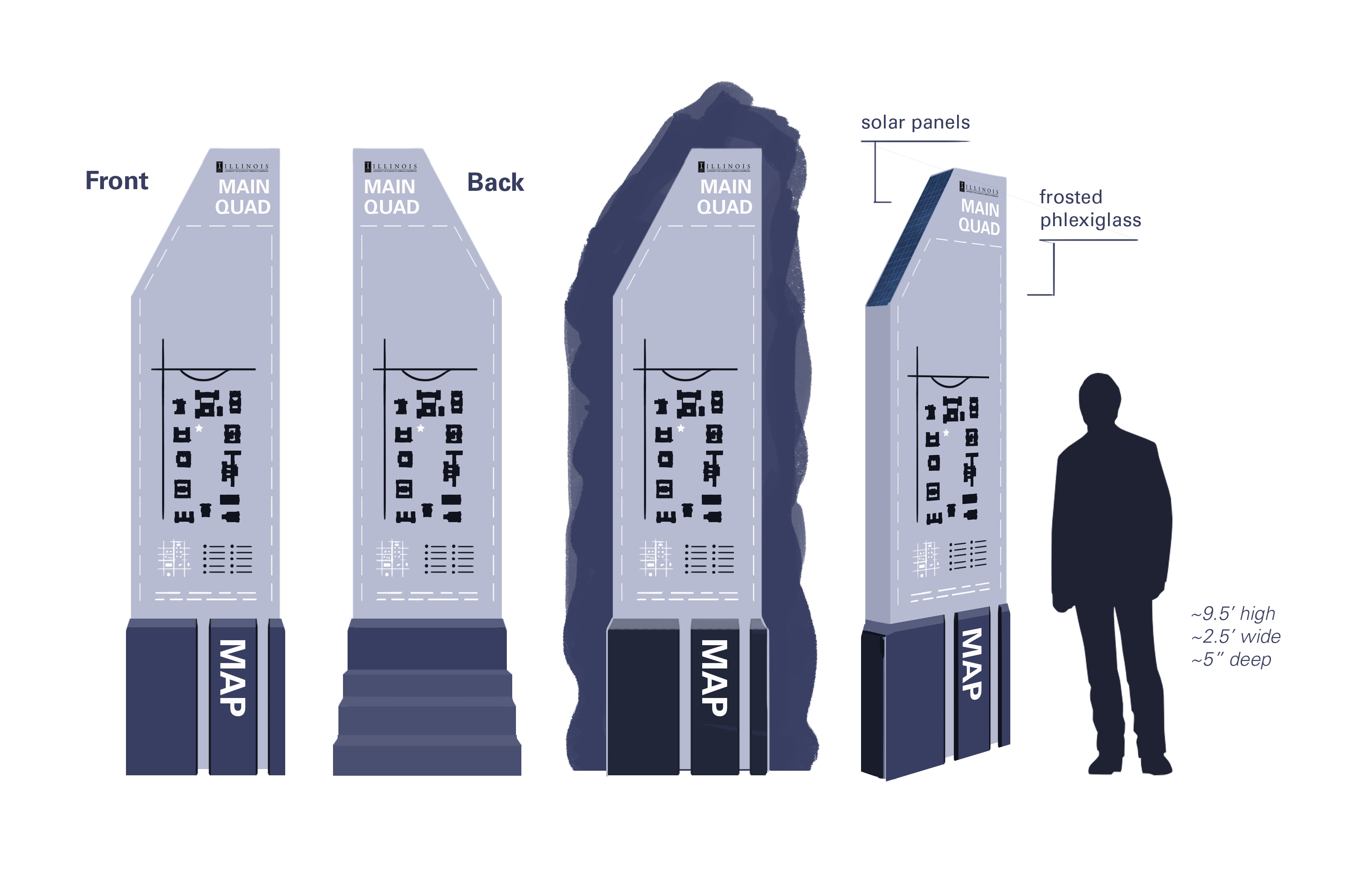
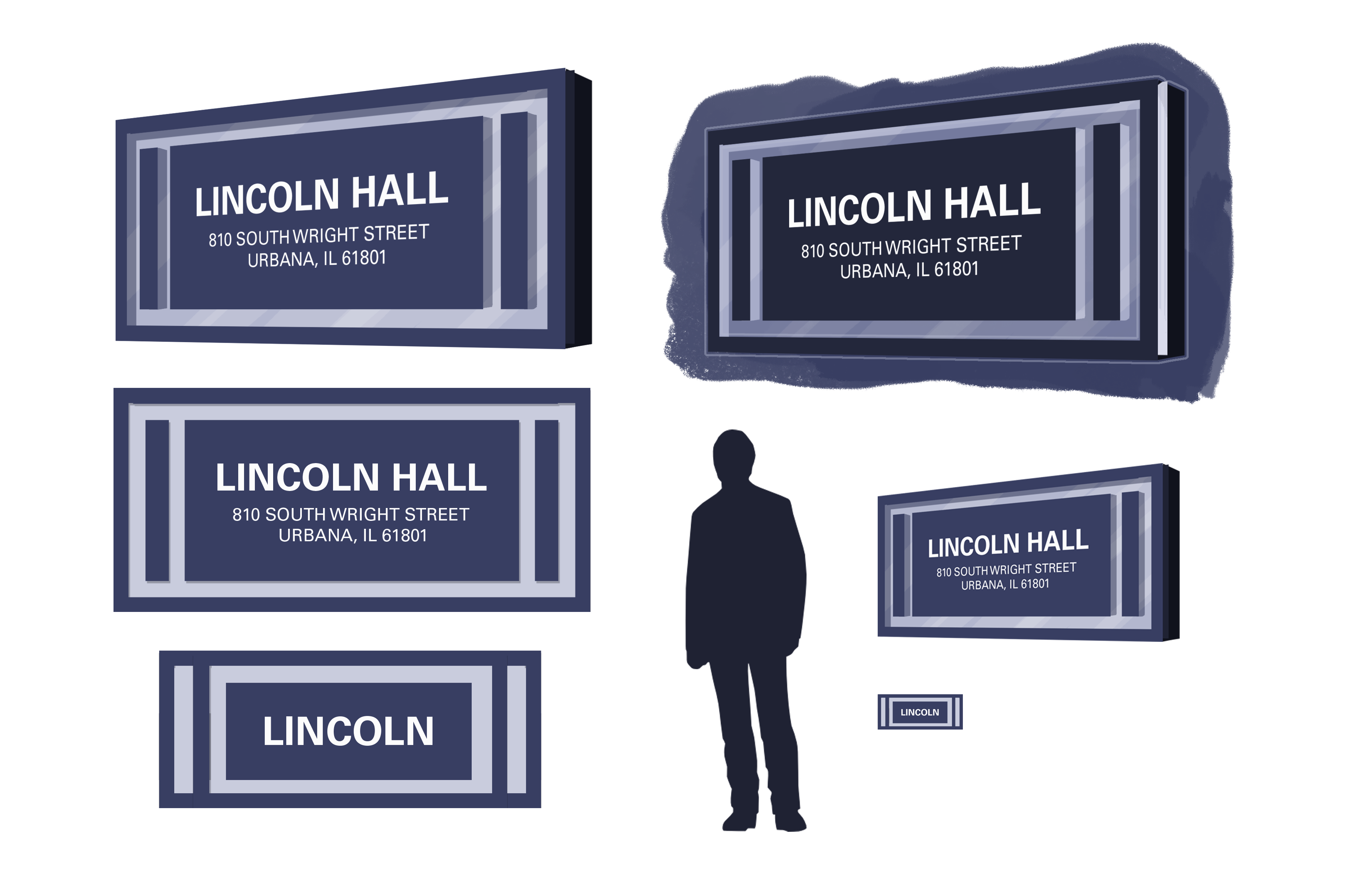
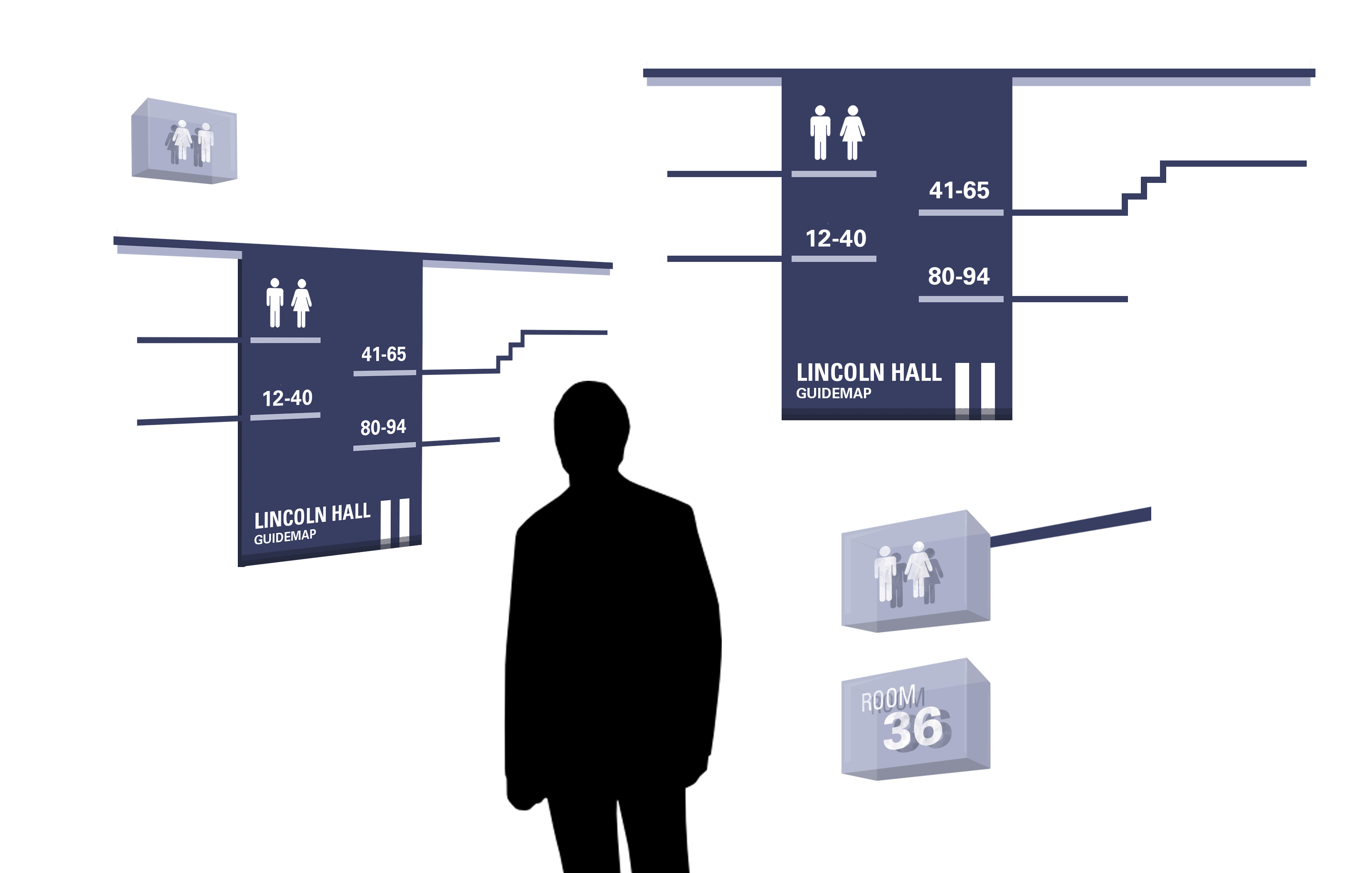
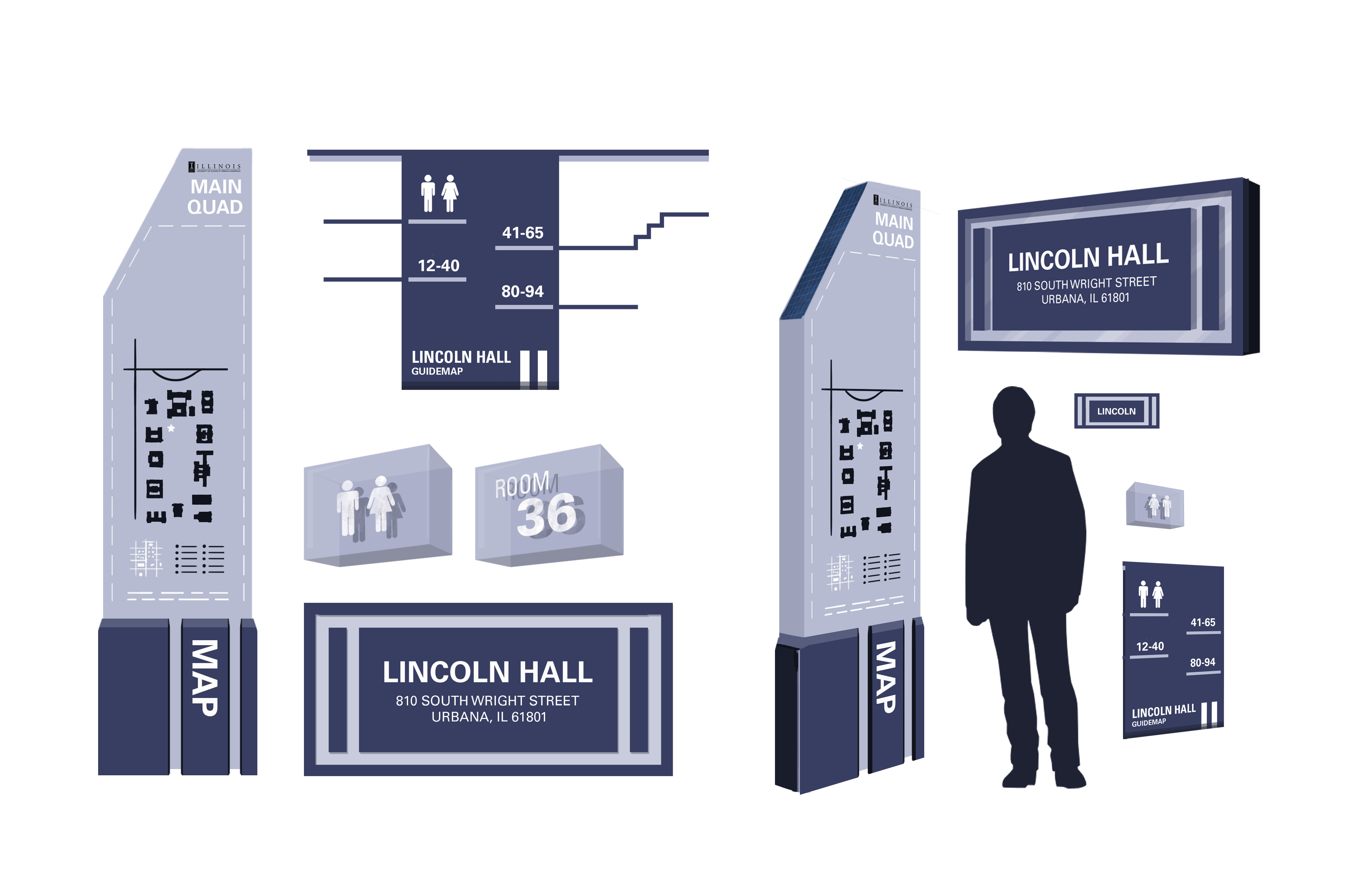
Okay, this is a strange project. Basically, I wanted to create a map that showed all of the signage in a district of my college town, Champaign. To do this, I went out and photographed every sign I could (including addresses, which like... tripled the length of my project). Once I had all the signs made in Illustrator, I organized them by size based on how "visually loud" they were.
I defined "visual loudness" as, essentially, how eye-catching something was. Size, bright colors, big fonts, recognizeable images, etc. It was kind of subjective, but sort of a cool project.
Recreating all the signage by hand in Adobe Illustrator absolutely sucked though. I had to go through SO many fonts. I specifically remember having an enormous amount of trouble with the Irish Pub sign.
There's also this photo of me when I was super malnourished. This is about the thinnest I ever was. Would not recommend.

I don't even look like me here.

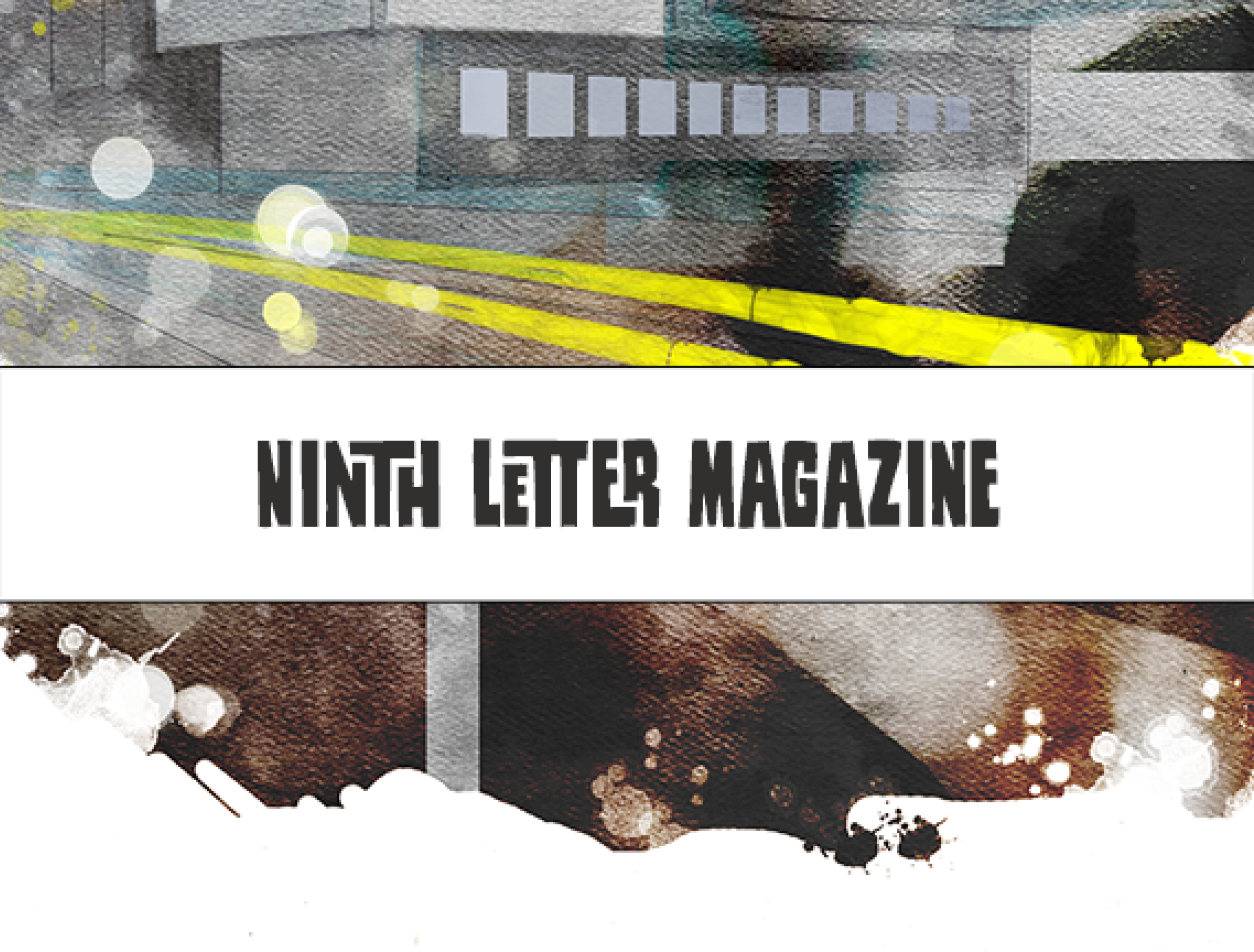
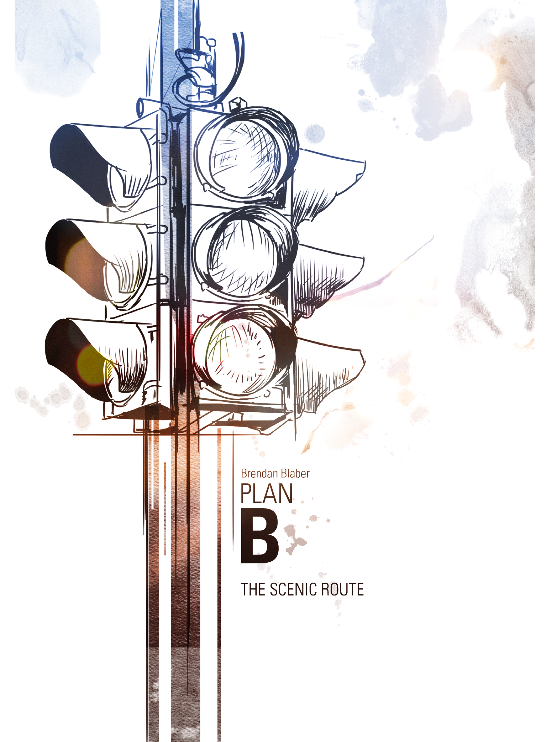
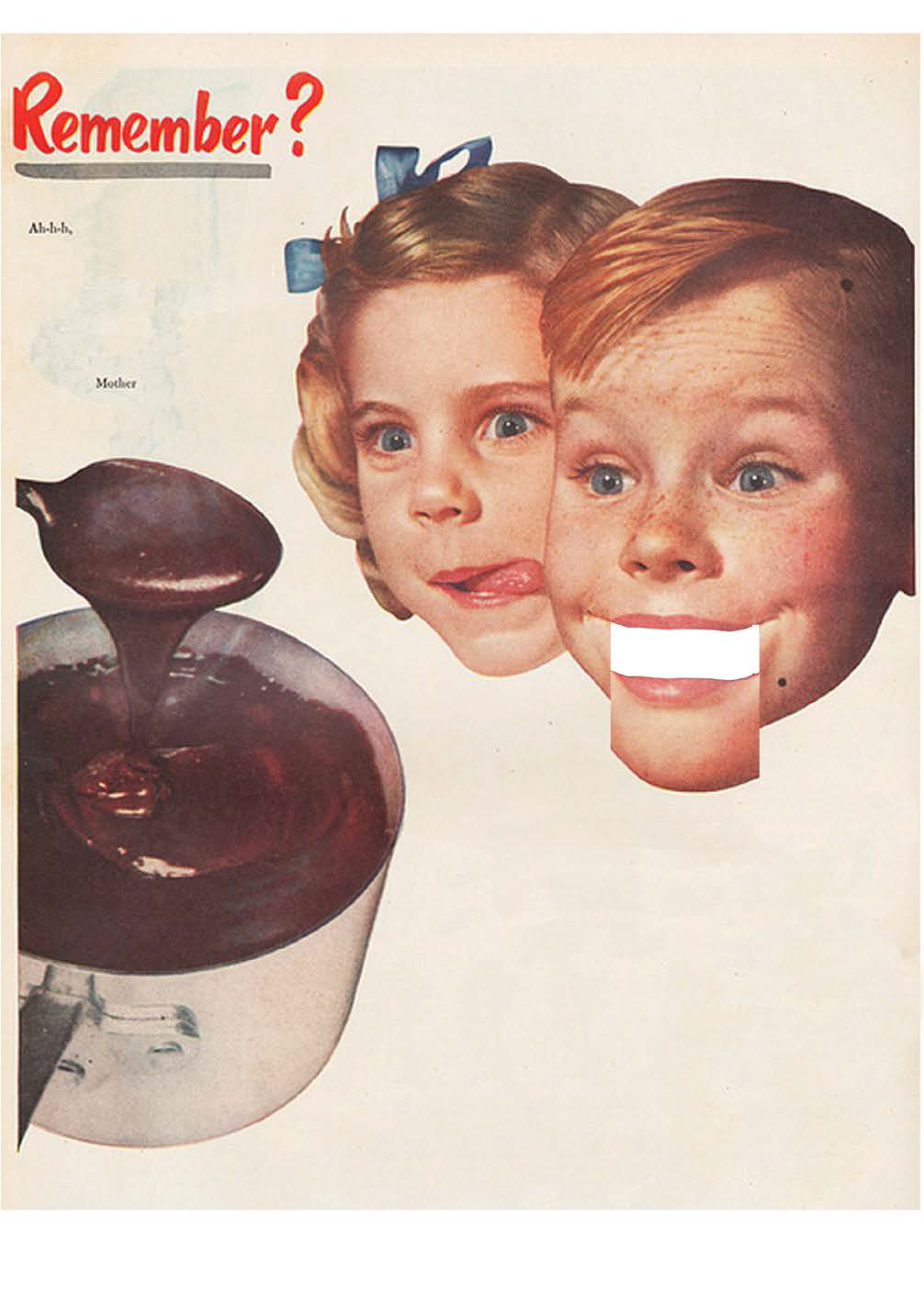
Okay so Ninth Letter (the letter "I", like Illinois, as in University of Illinois, get it) was an art and poetry magazine that students made with a rotating staff every semester. We got 20-something different short stories and poems and then had to craft a theme to put them in. Everyone in the class was divided into a pair and came up with their own pitch. Only one of them was selected.
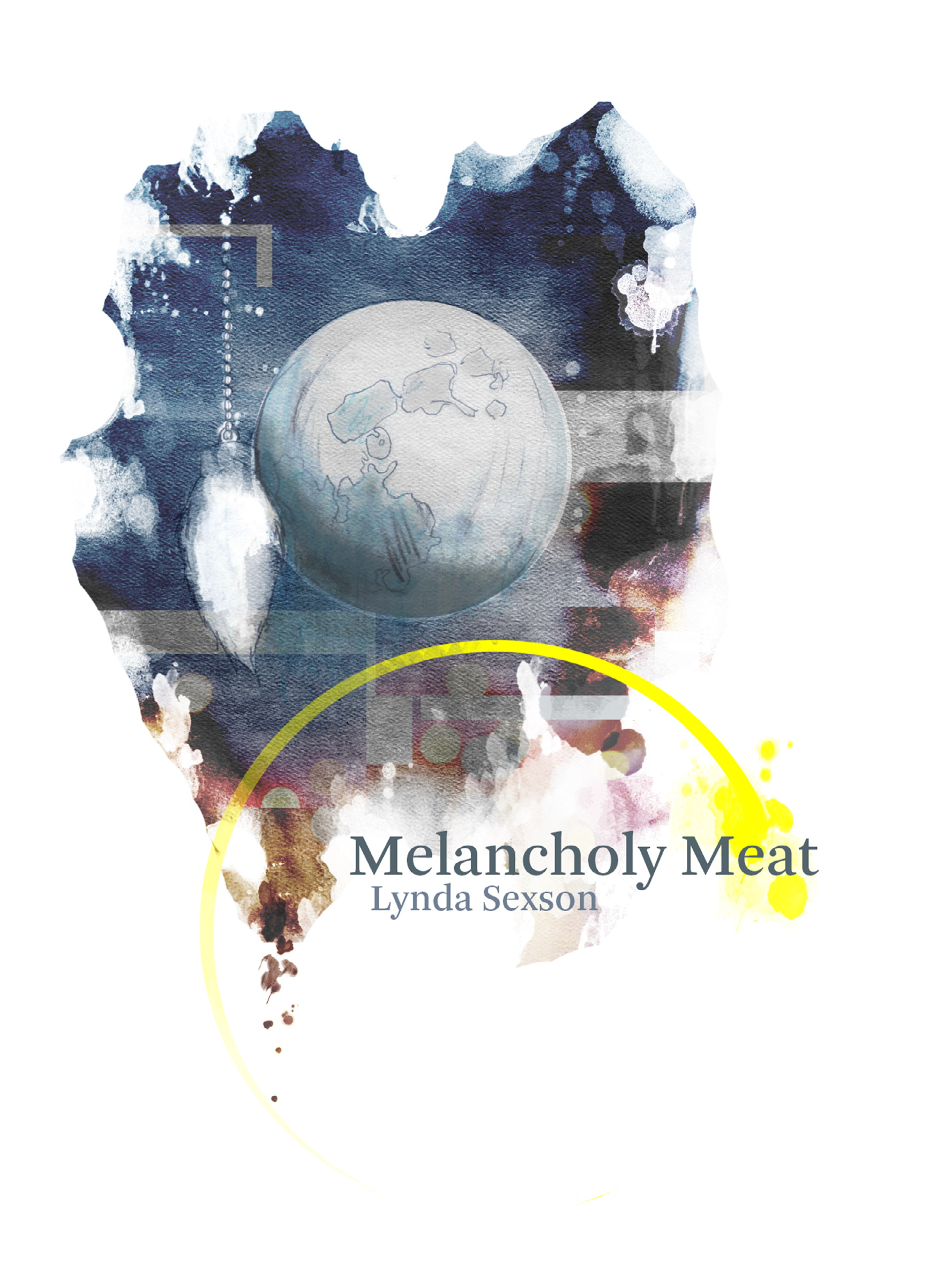
My pair's pitch was all about rainy city streets, bouquet lighting, and things reflecting in puddles.
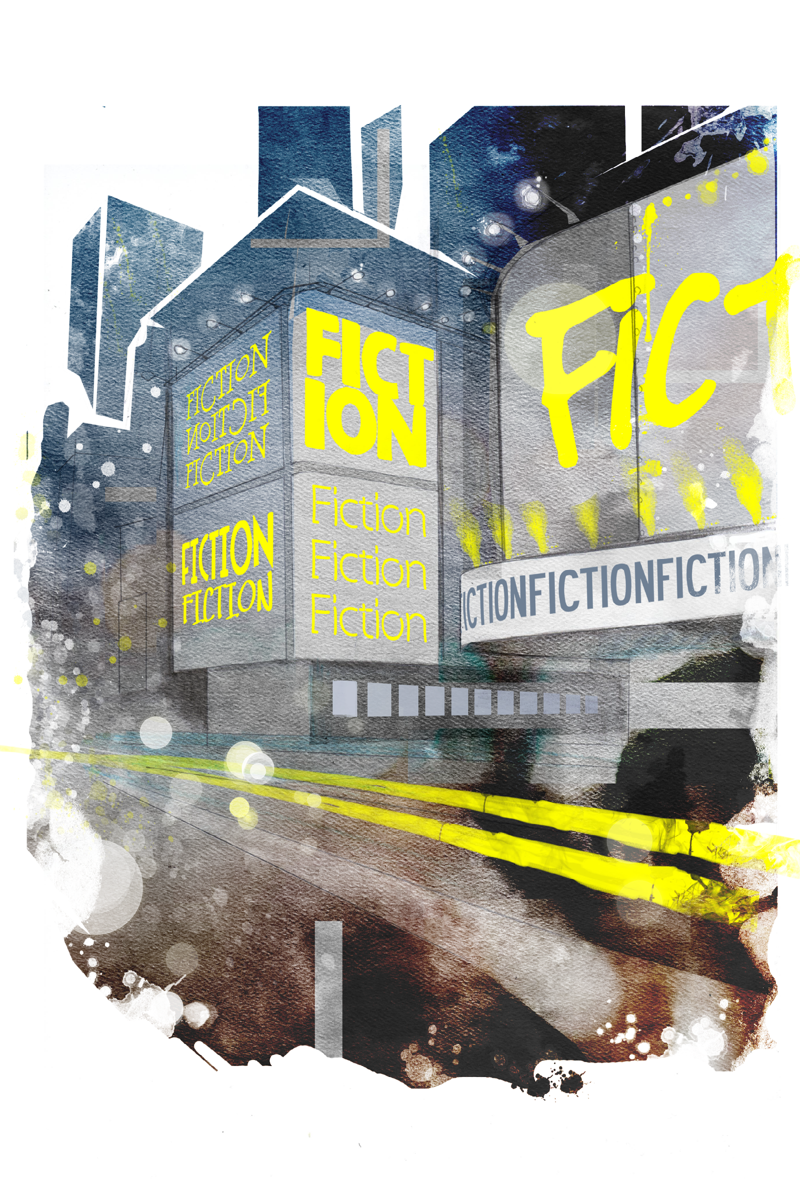
The selected pitch that our class actually went with was done by Bella (again! she was really good) and a guy named Dane Georges, who actually happened to be the artist I hired for So This is Basically Pokemon and Adventure Time. He's a nice guy.
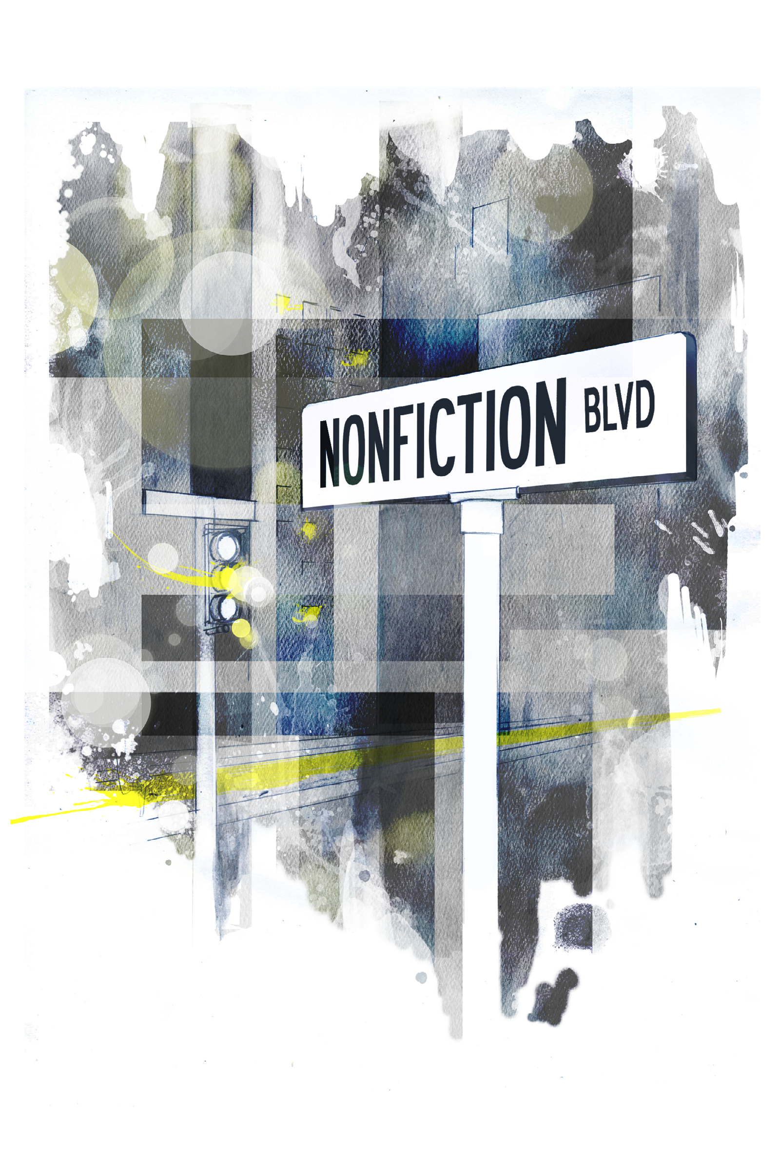
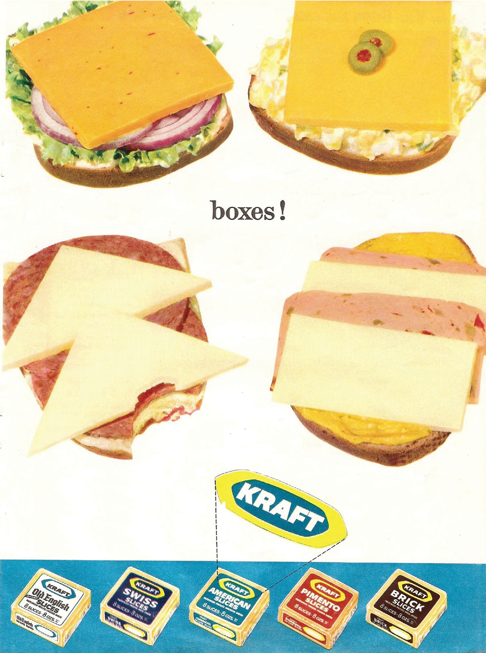
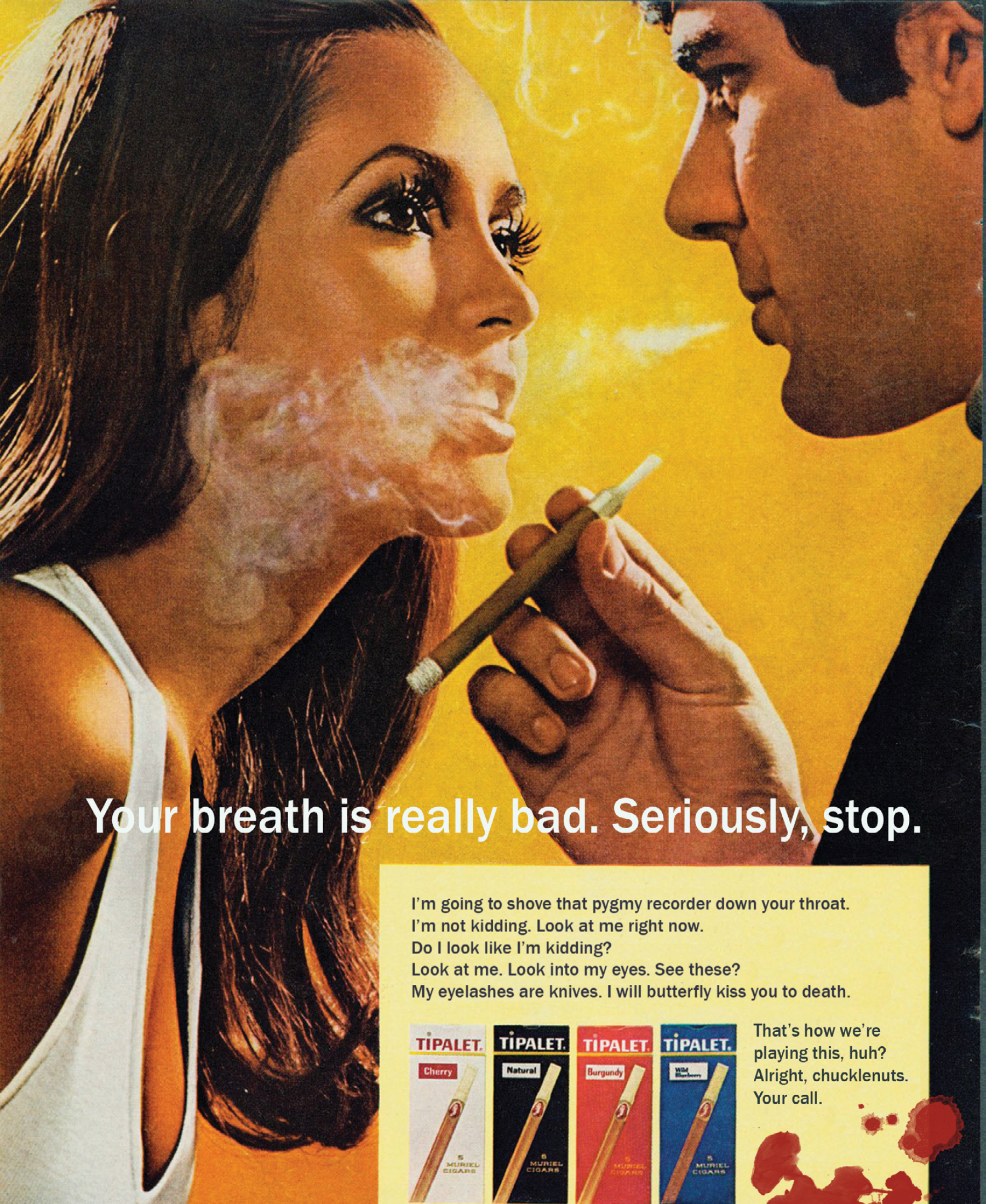
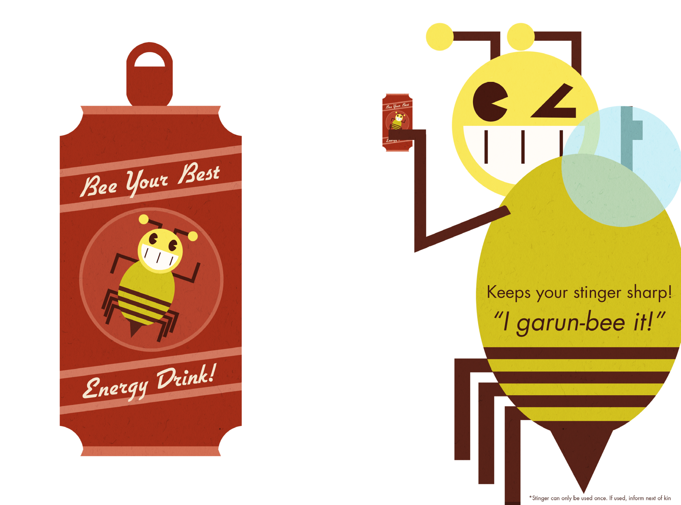
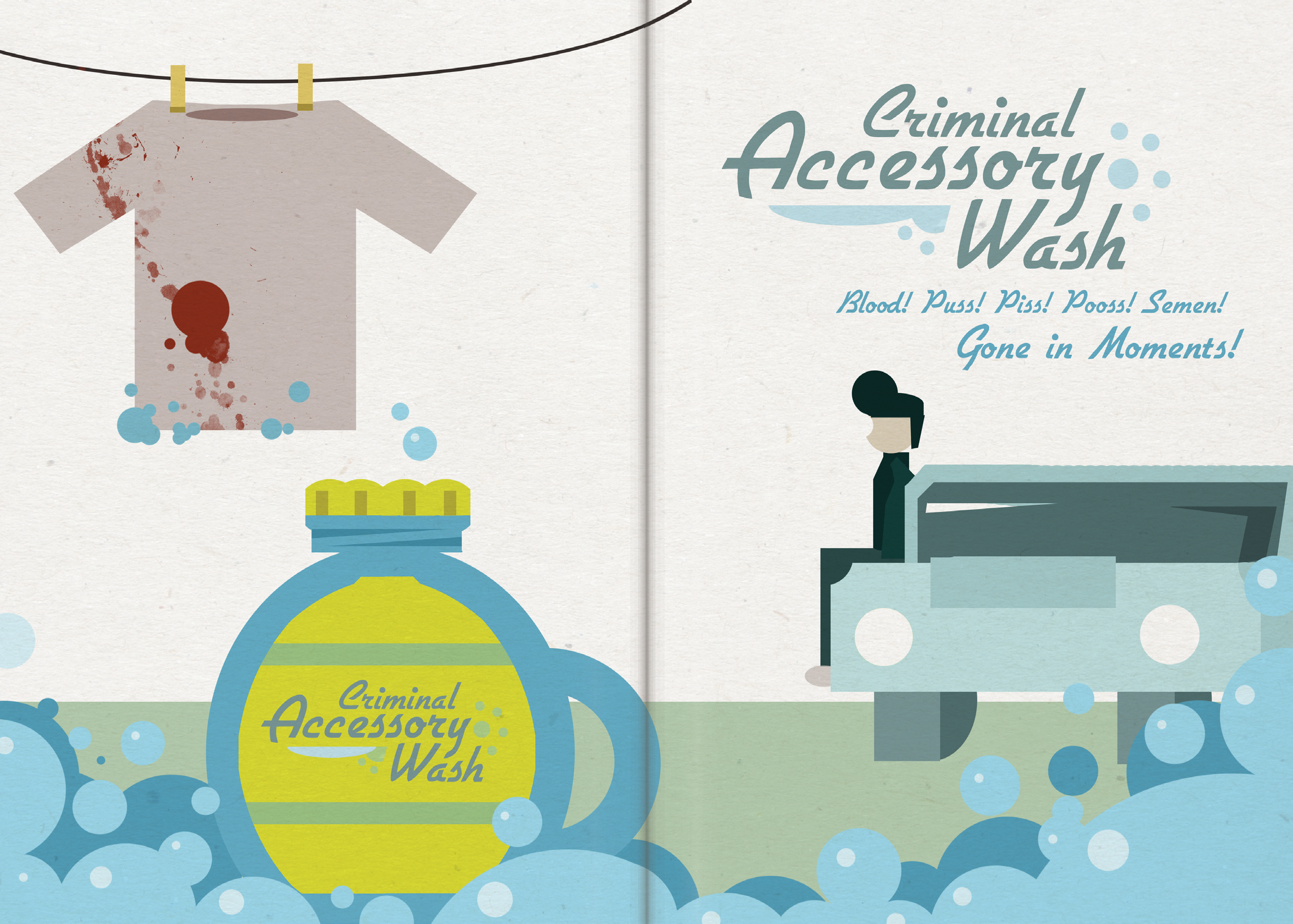
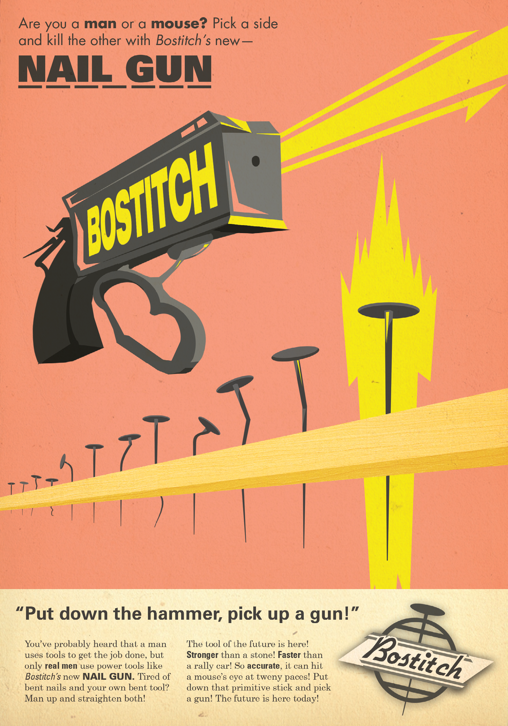
We went with a theme of like... 60s airline travel and advertising? The teacher was really into the idea of editing pre-existing weird 60s magazine ads. Making them either scary or funny by omitting certain words. I remember really not understanding this vision and to this day I still think that's kind of a weird theme for an actual art magazine. It's more suited for like... a tumblr post. I don't know about you, but f I were a writer I'd be kind of mad if my deeply personal autobiographical poem about my abusive brother was next to this:

Anyways, at the end of the semester we had to compile twenty pages worth of concept art from our original pitches that didn't get selected and turn them into a mini art piece called Plan B. Everybody in the class hated this because literally none of us did even 10 pieces of finished art for a pitch we knew had a 1 in 15 chance of being selected. We also only worked on these individual pitches for like... a month? Whereas we worked on the 60s theme for like 4 months. I dunno, it's just an extremely poorly-planned project in my opinion.
I remember Bella and Dane being especially annoyed because they had to do a Plan B despite having their pitch selected and all of their initial work going into the magazine, rendering it unusable in their Plan Bs. The real move would've been to make it so that the group who's pitch got selected didn't have to do a Plan B at all. That way, everyone would've tried way harder on it up front to get out of a massive project and therefore we all would've had more work to put in our Plan B instead of having to make up 15 new pages worth of design.
Also, not that I was super attached to them, but none of my work that year made it into the magazine as I completed it, which really pissed me off. All the copy on mine was changed too. Mad. Still mad.
The rest of these are assorted single art pieces or random design projects. You can probably figure out the context just by looking at them.

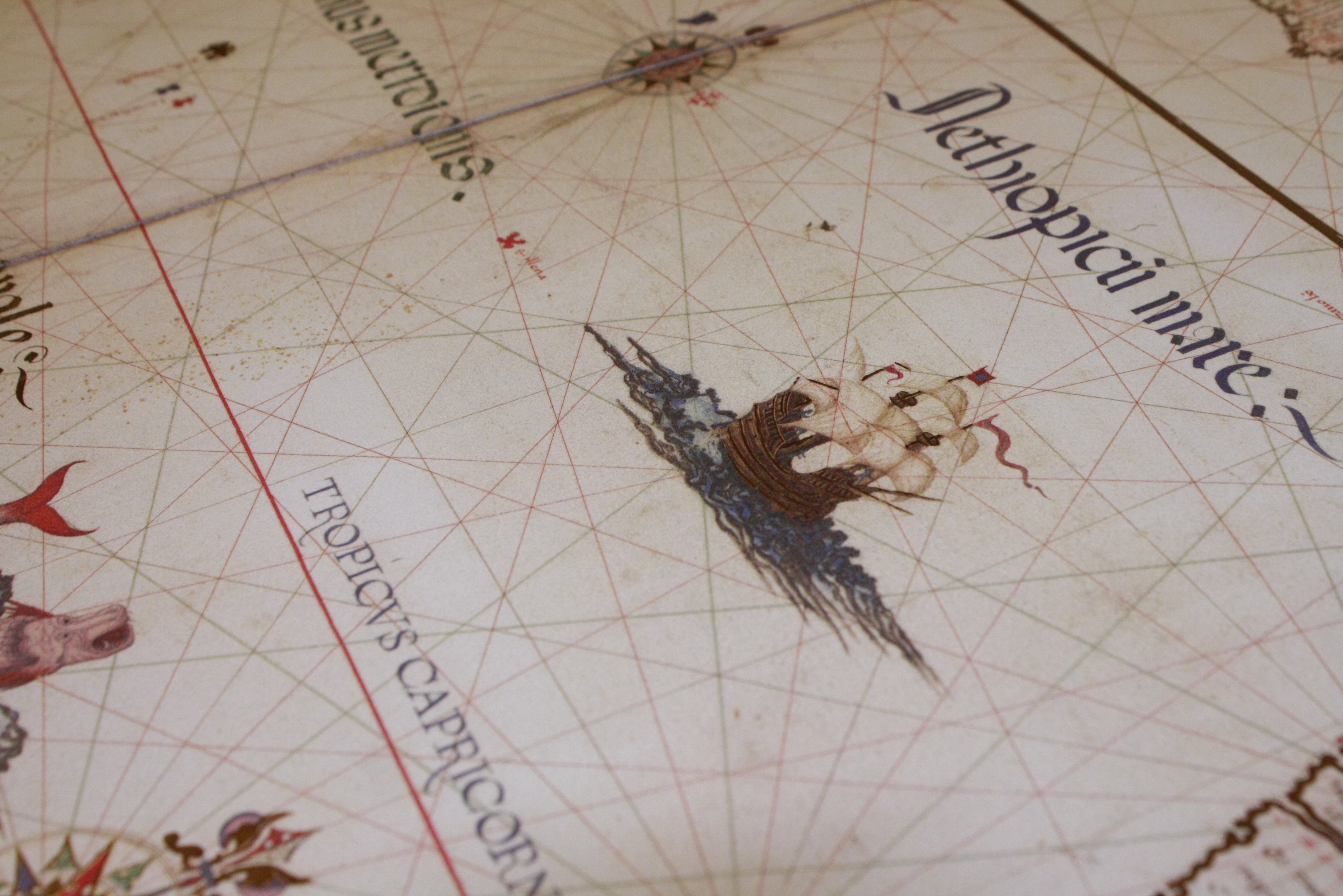
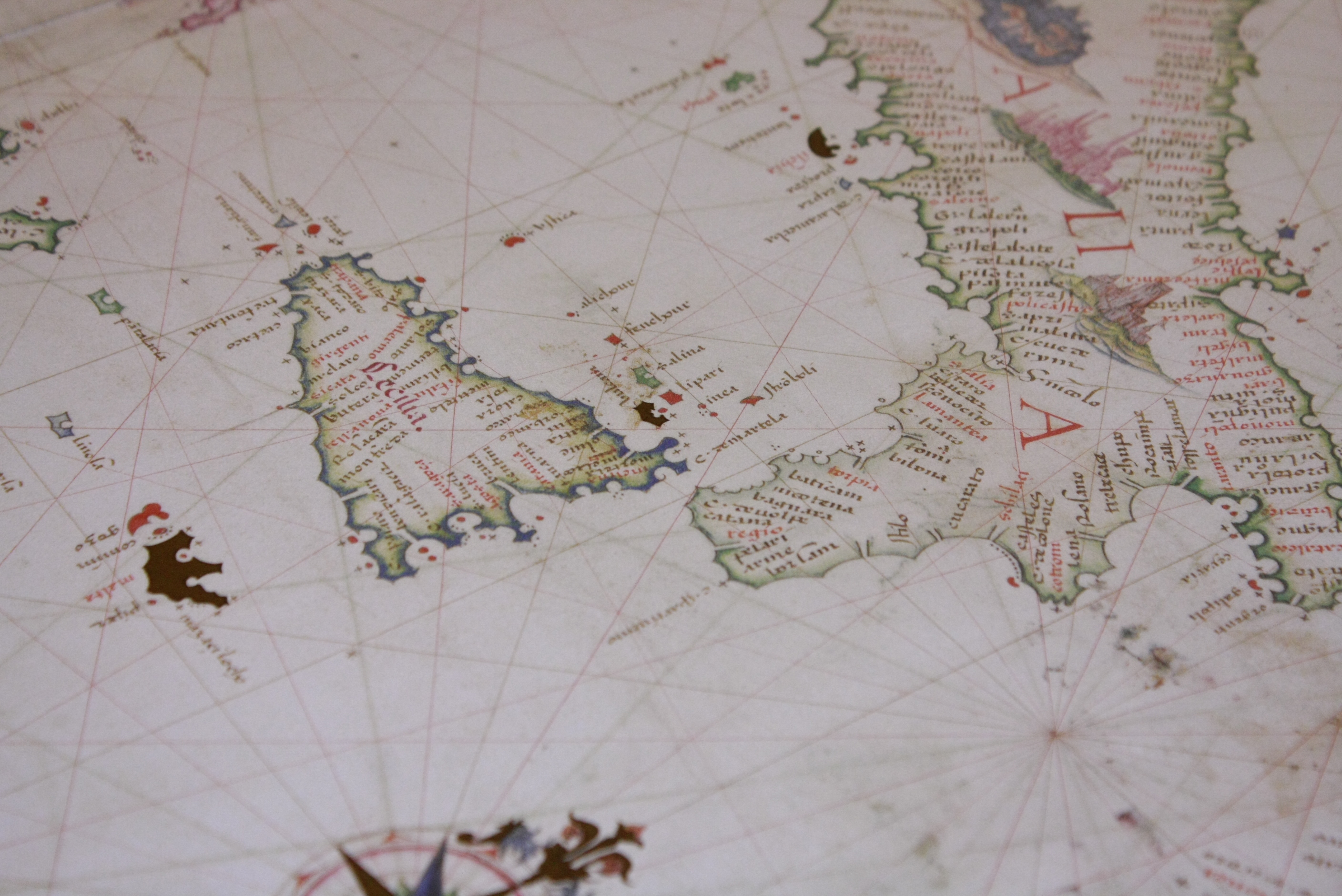
Of note, these photos I took were from the University of Illinois's rare book library. Some of the books in there were worth millions of dollars.
None of us were comfortable even coming close to touching those things.
(The book pictured above is not one of them)
Files