Home
Home

 Artists
 Search
 Recent
 Random
 Posts
Posts
 DMs
DMs
 Tags
Tags
 Random
 Importer
 Import
 FAQ
FAQ
 Account
 Register
 Favorites
 Login
Login

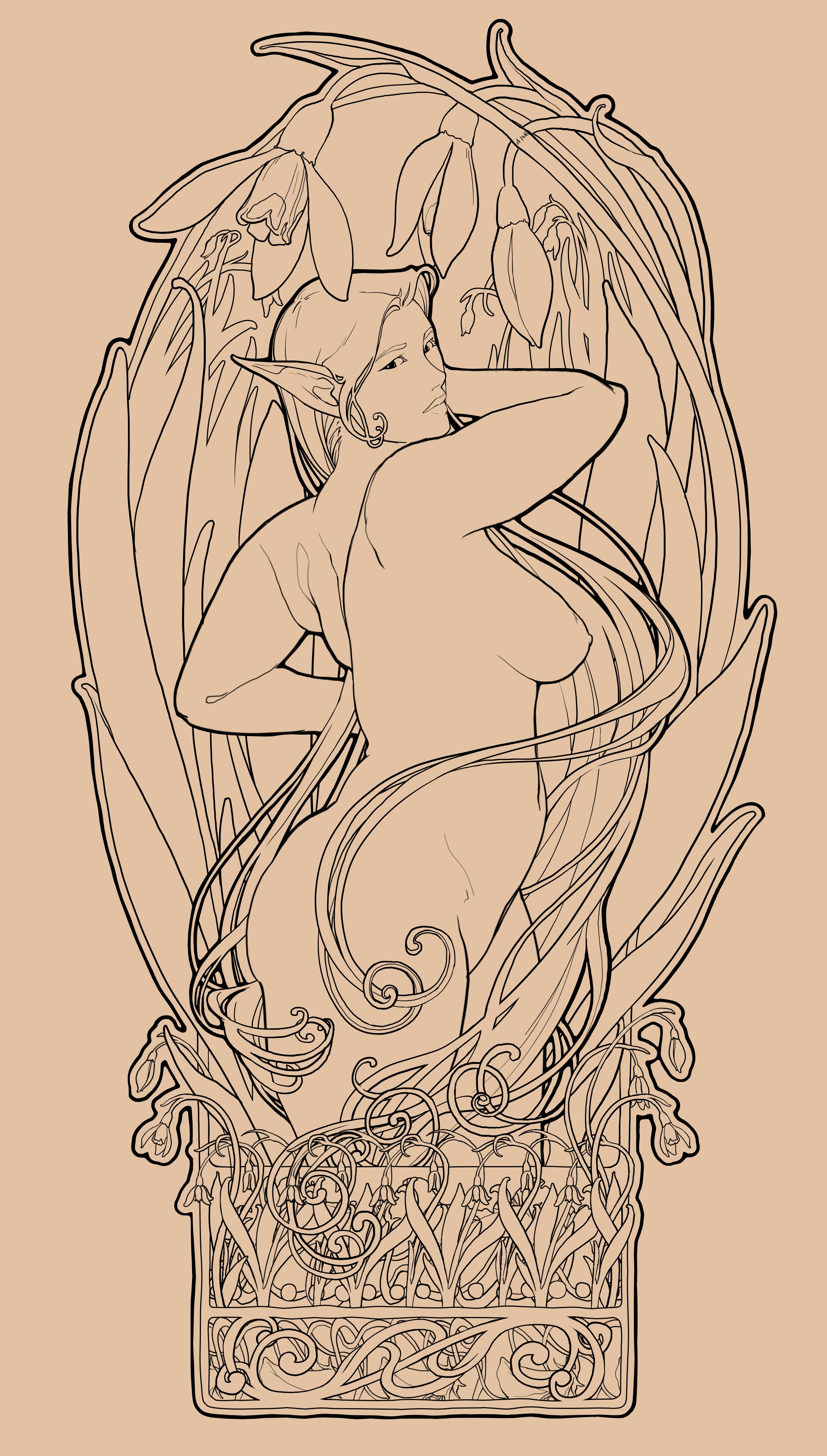
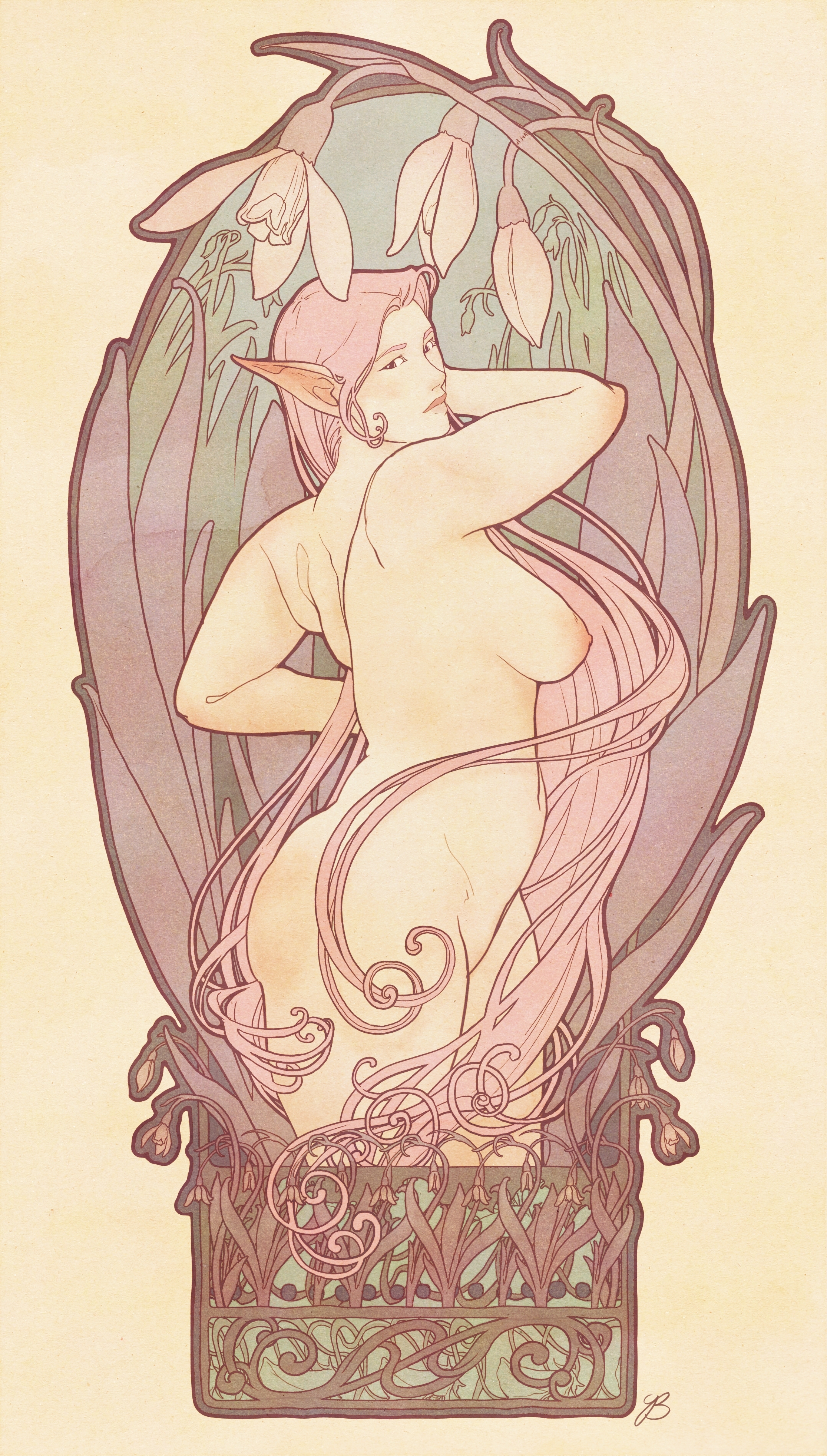
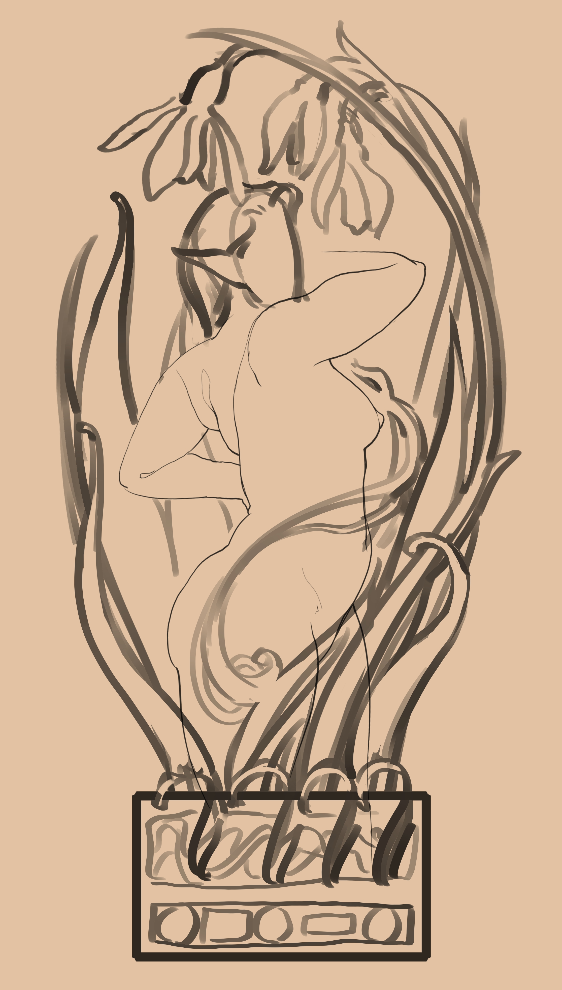
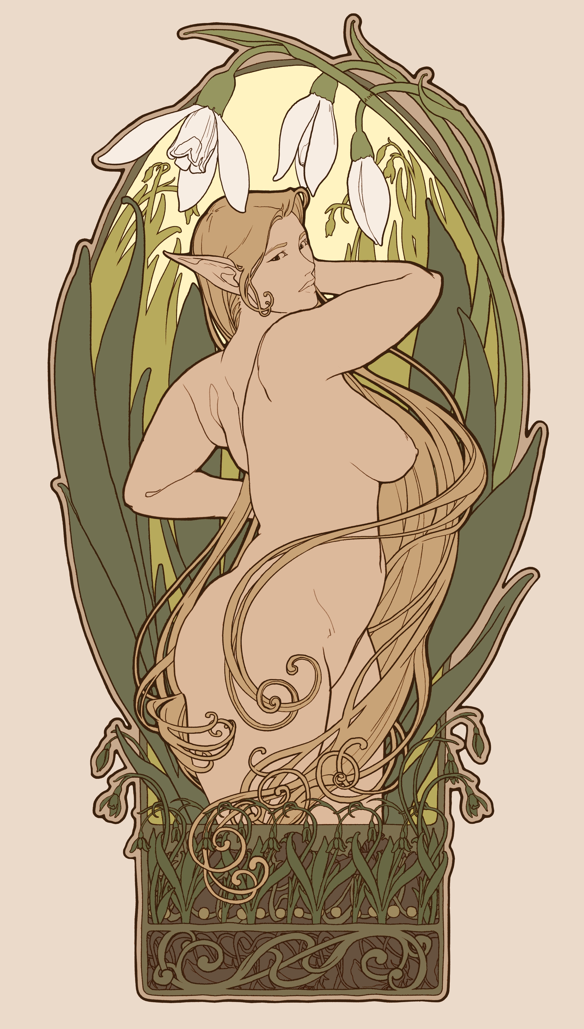
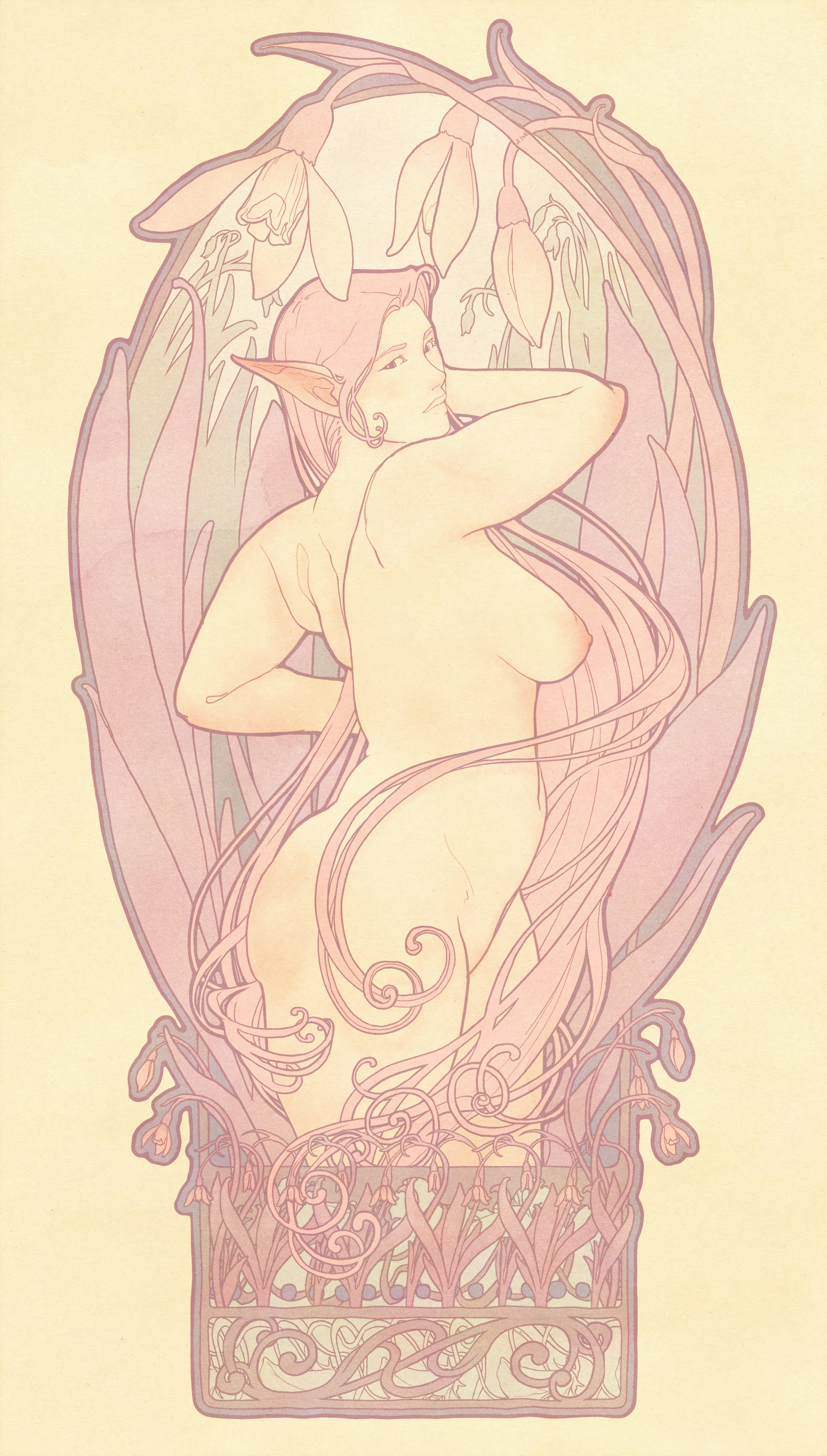
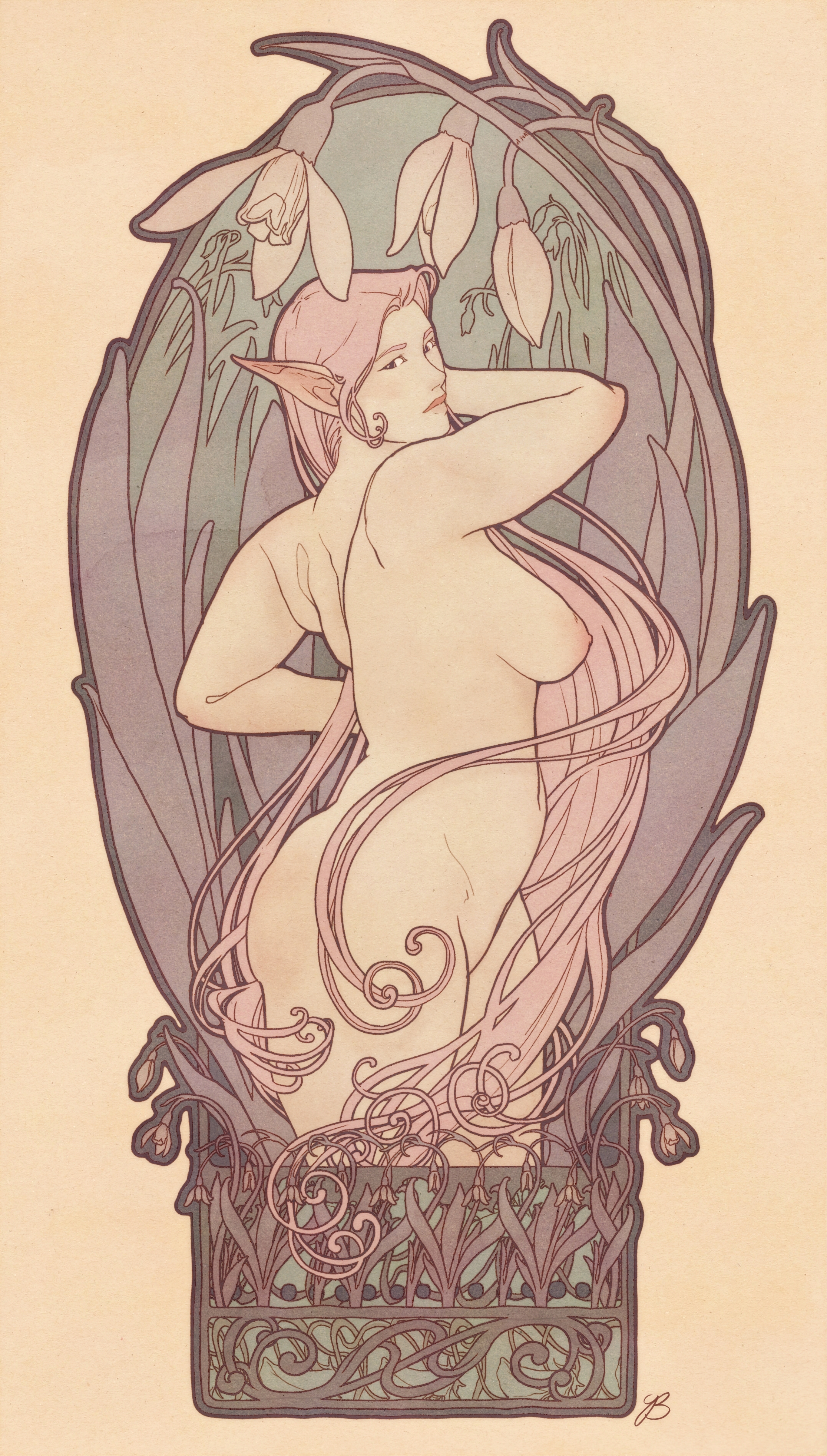
Schneeglöckchen (Patreon)
Published:
2023-03-20 14:00:04
Edited:
2023-03-31 17:19:39
Imported:
2024-04
Content
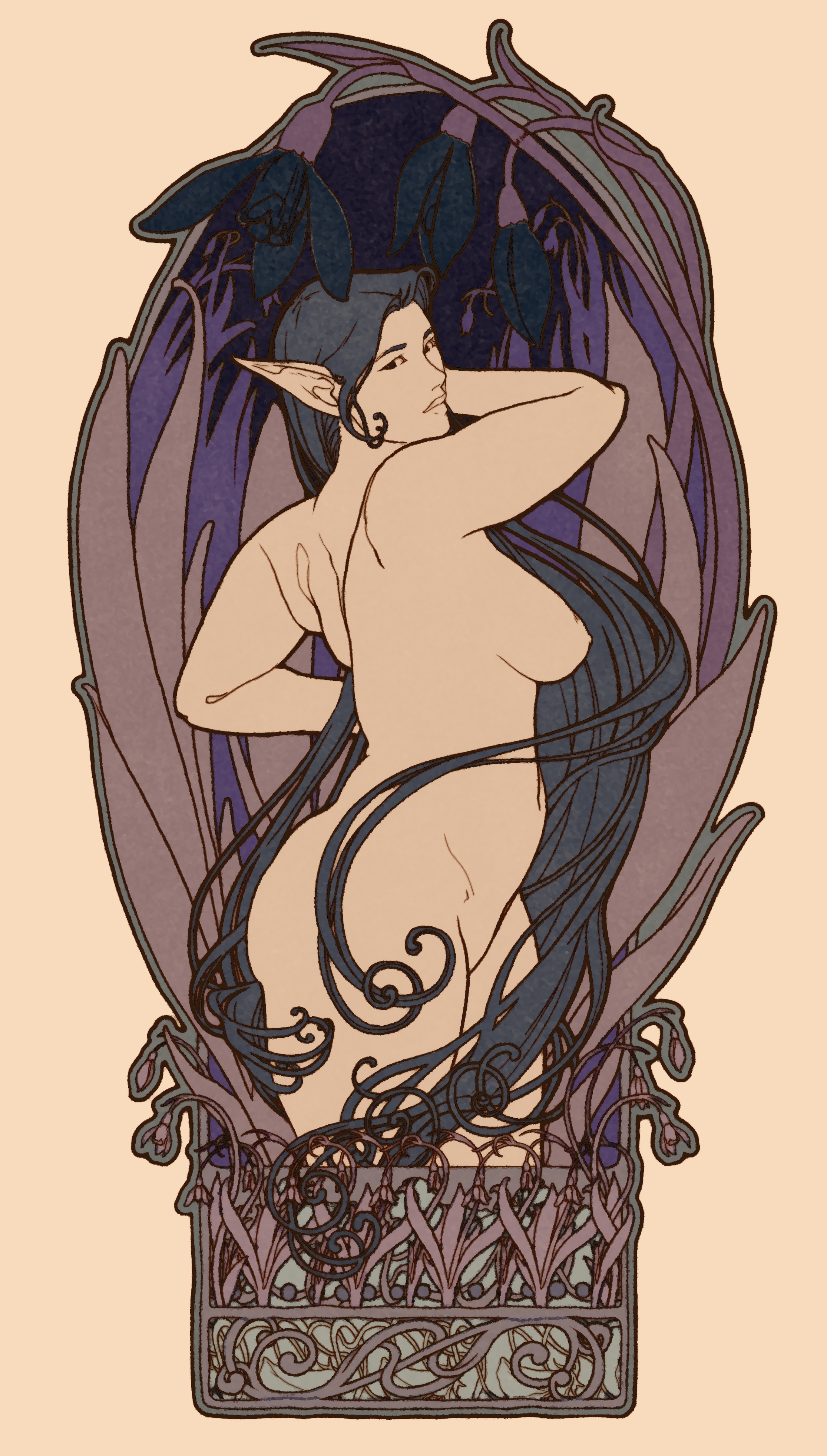
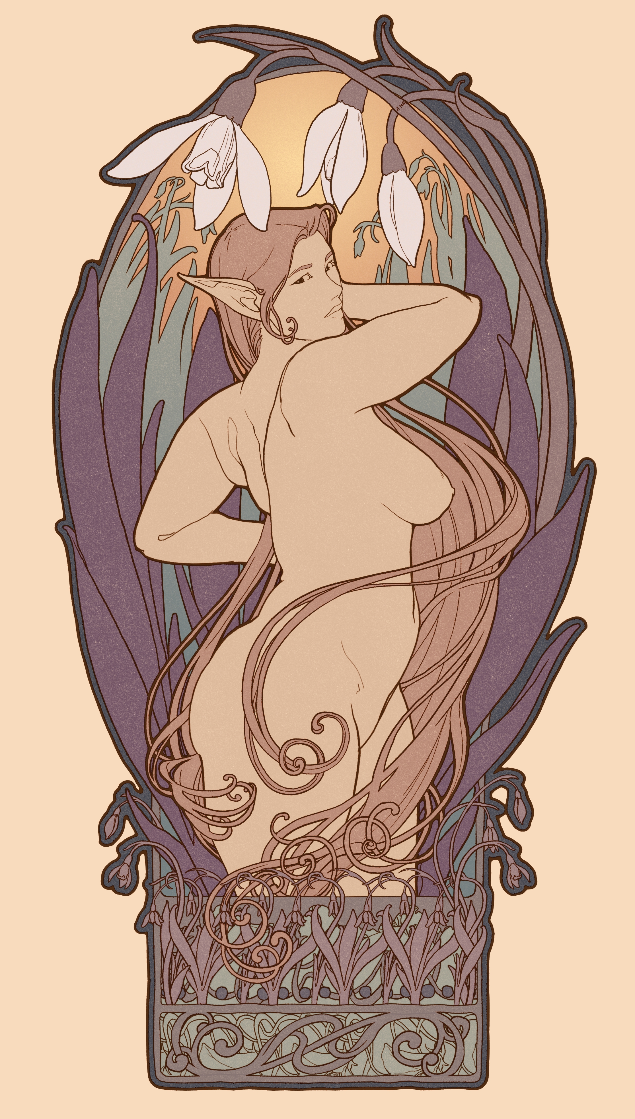
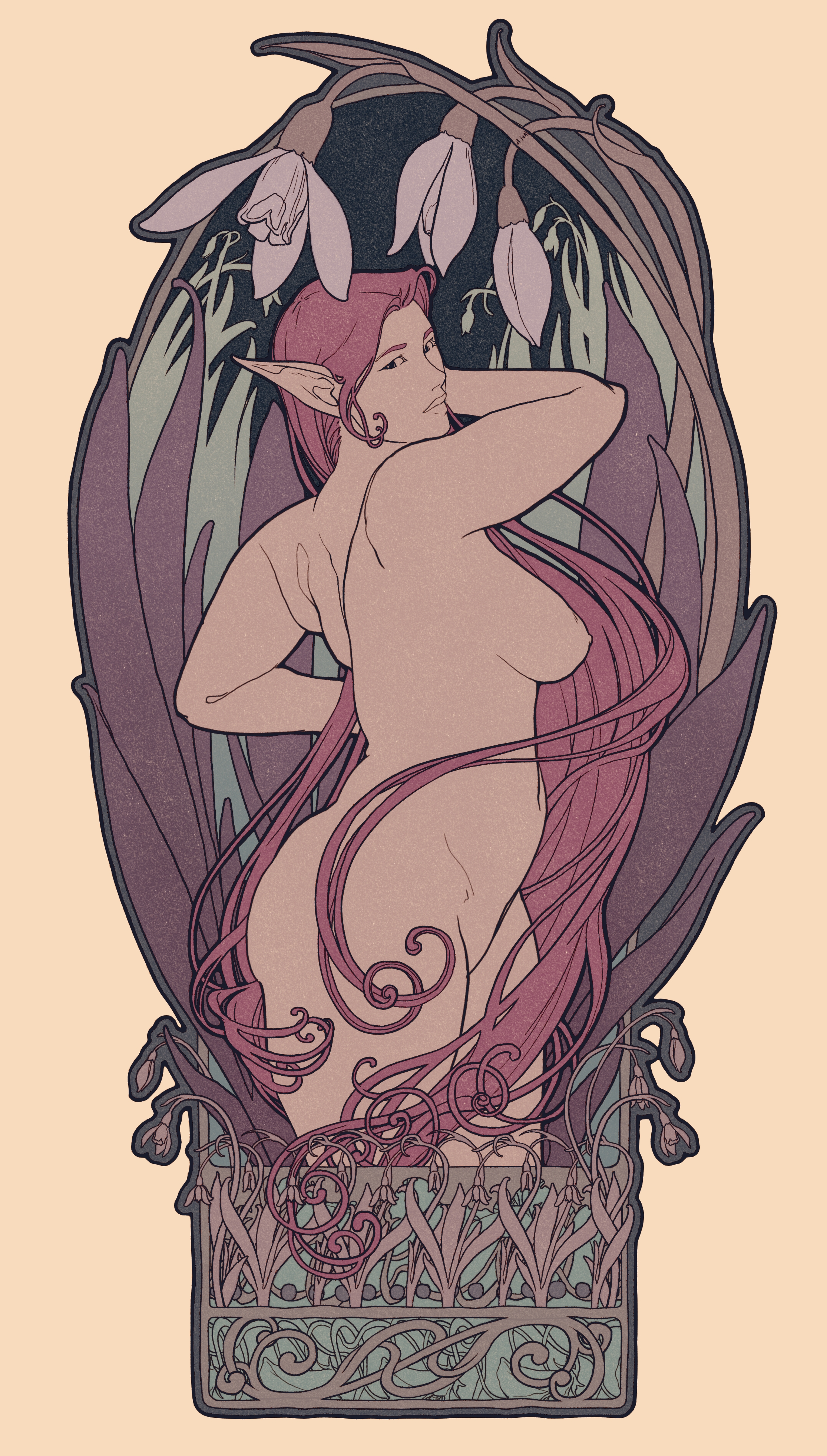
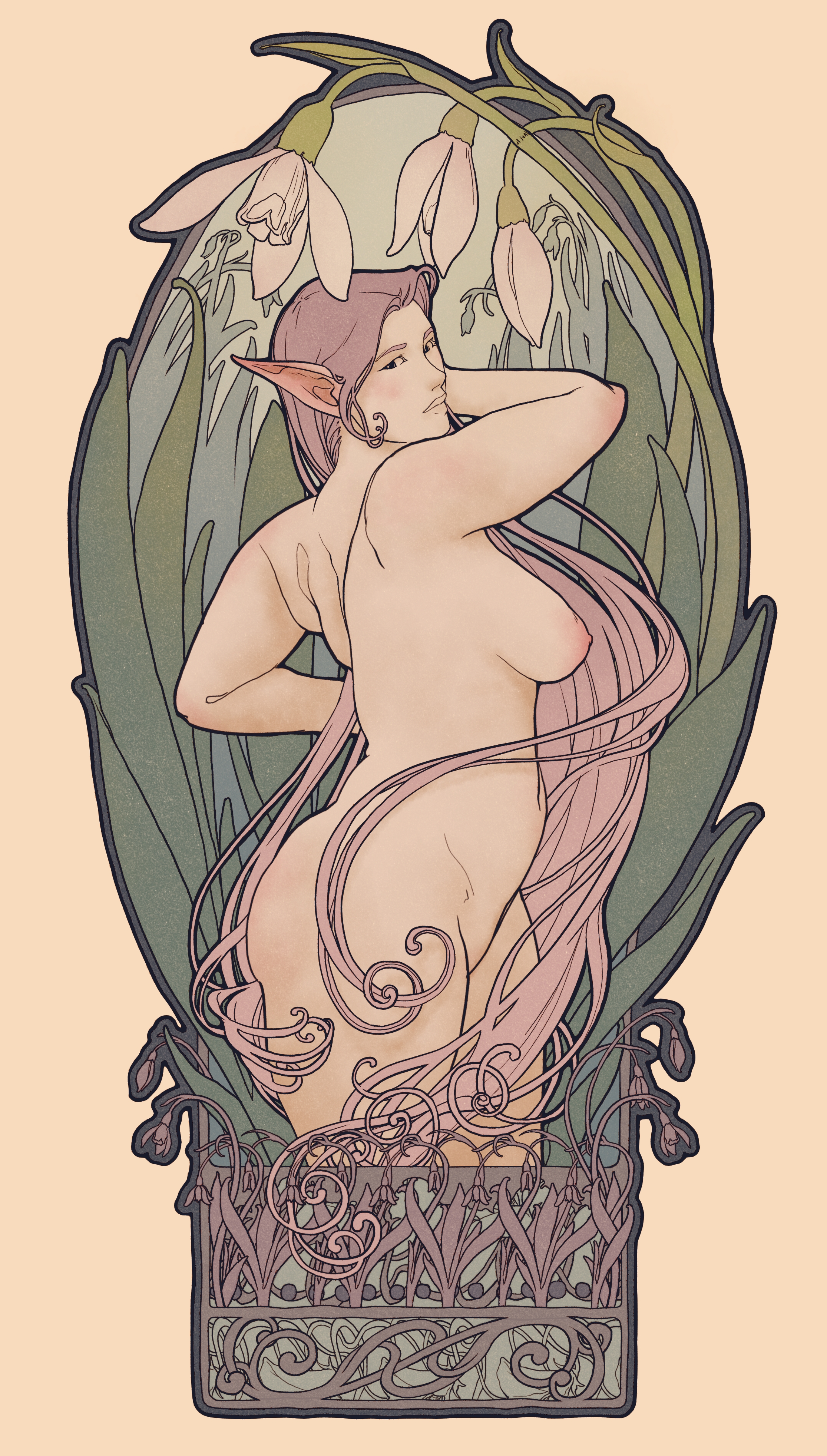
I had a hard time deciding on the colors for this drawing. Its kinda fun seeing them side by side now and how different the image feels based on the color pallette!
Files