Home
Home

 Artists
 Search
 Recent
 Random
 Posts
Posts
 DMs
DMs
 Tags
Tags
 Random
 Importer
 Import
 FAQ
FAQ
 Account
 Register
 Favorites
 Login
Login

Hermit & Hiker- Val's house concepts 3 & ink experiments (Patreon)
Content
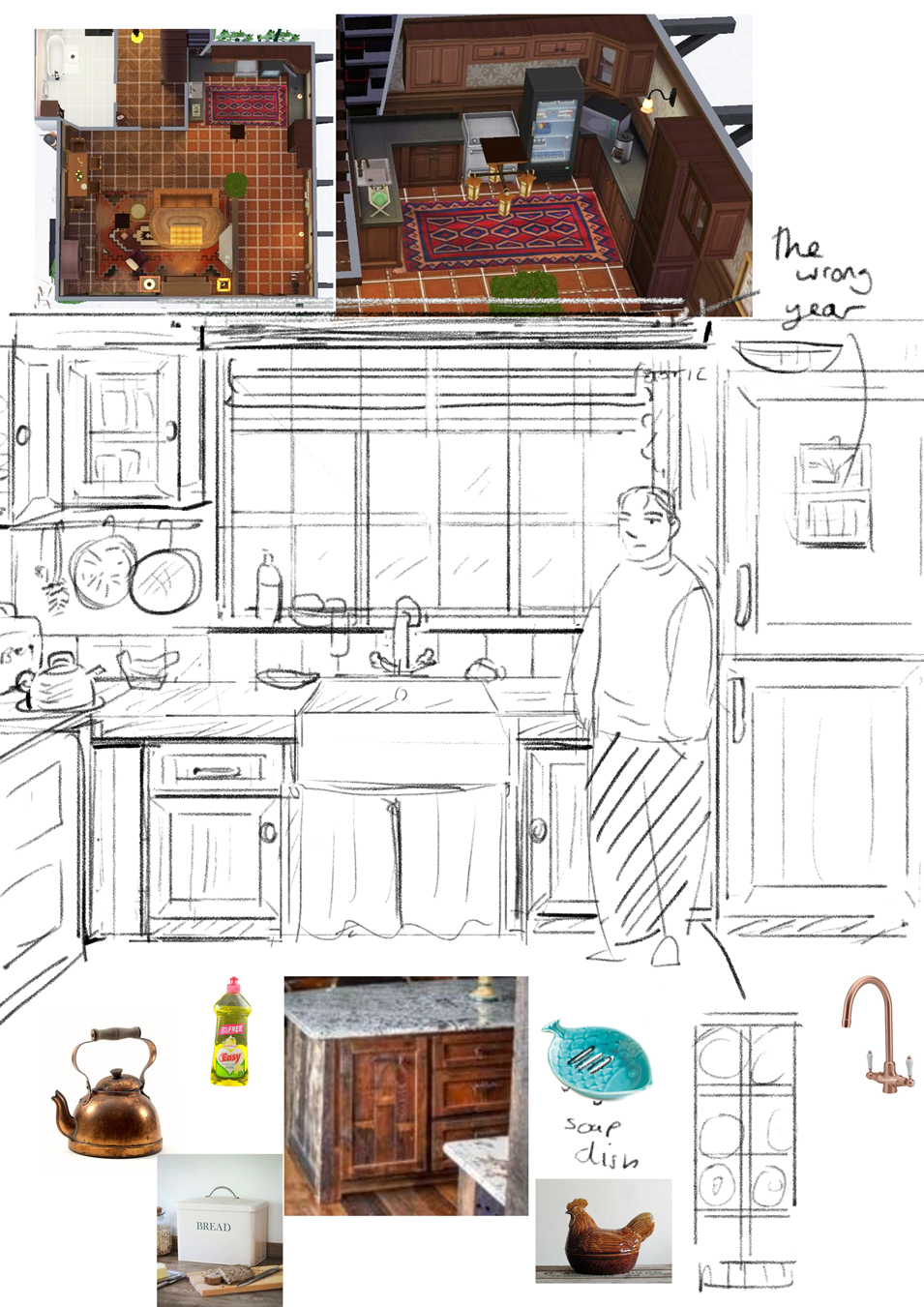
I think I'm going to settle on the nib style of the second to last page, with the forest! As much as I love the brushier ink, it really bothers me how much detail I lose and how unpredictable it is (see the half finished kitchen inks haha) I like the fineness of the nib, and also it's a lot less strain to use because theres very limited pressure! (though whether I'll make up the strain with excessive hatching is yet to be seen)
It's taken absolutely forever to find something I even slightly like, you can see how many shading attempts are there, and I definitely had A LOT more smaller experiments with screentones etc. I feel like it looks so...non cohesive? To have the flat grey just there, or to have softer effects mixed with the hard lines? It's probably just me, but I had a style I wanted to hit, and I really wasn't getting it! I think the hatching helps blend it better.
(I'm using Kyle Websters old nib, and old brush for the other experiments)
Files