Home
Home

 Artists
 Search
 Recent
 Random
 Posts
Posts
 DMs
DMs
 Tags
Tags
 Random
 Importer
 Import
 FAQ
FAQ
 Account
 Register
 Favorites
 Login
Login

マトリクス図アンケート Matrix Diagram Questionnaire (Pixiv Fanbox)
Content
今後の絵の方針に関するアンケートを取りたいと思います
非常にめんどくさいアンケートですので、
特に気にしてない方用の回答もありますが、
世の中
意見は、言わないと通りません
世の中
声の大きな少数派の意見が通るなんてことはよくあります
何事も、言わなければ始まりません
できるだけ多くの方にご回答いただけたらなと思います。
ご協力のほどよろしくお願いいたします
〇参考
【判明】意見が割れる「アニメ調」とは

■おさらい の記事の一番下でも書きましたね。 AIを始めた先輩と話をしていて、先輩は「上のラクス様のほうがアニメ調でいいね」 作者としては「下のラクス様のほうが断然アニメ調なんですが。。。」 と これはアニメを見てきている世代の差か、好みの差ですね、たぶん その先輩と話をしてみたんです。 そしたらいろいろ...
〇マトリクス図
サイズが大きすぎたんでGoogleドライブで共有してます。
右上のリンクからプレビューもできますが、多分ダウンロードしたほうがいいかなと
一枚当たりの画質は変わらないまま10*10の100枚くっつけてます
プレビューにすると移動するたびに読み込みが走ります
一枚一枚の崩壊は許してください。。。orz
これ出すのに1枚3分*100=5時間かかってるんです。
むしろ100枚あればこれだけ崩壊するっていう現実ですね
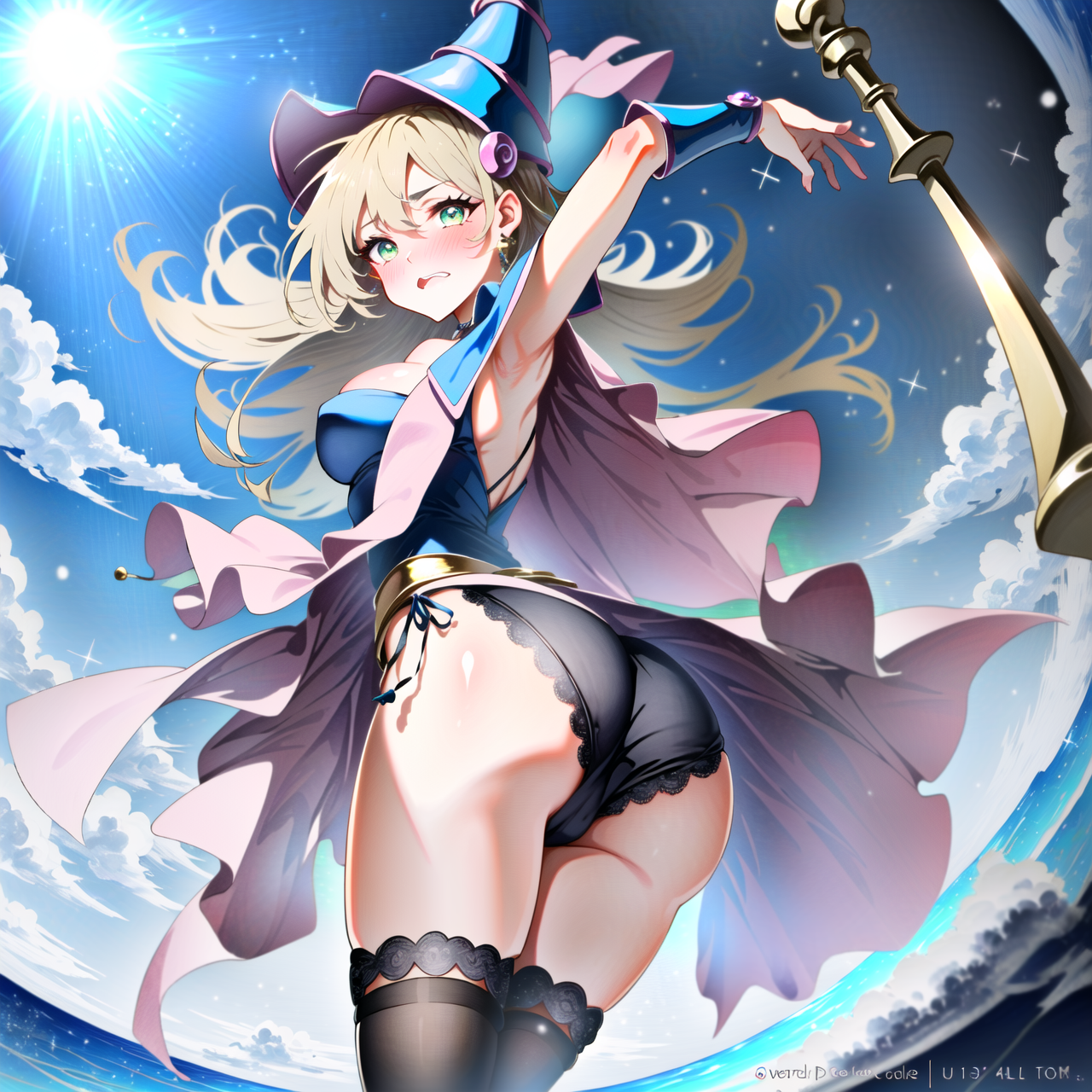
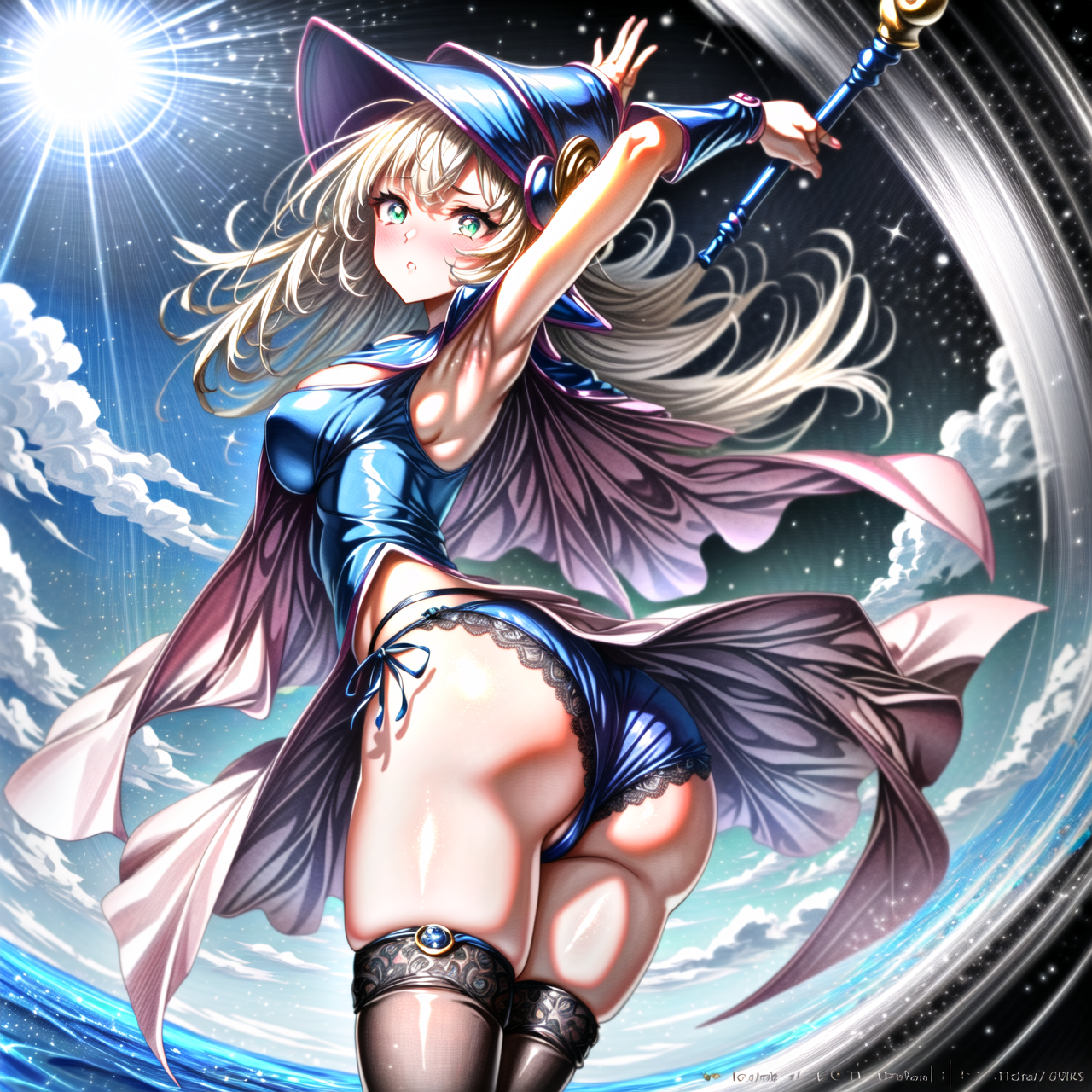
右に行けば行くほど、線の書き込みを増やして
下に行けば行くほど、光沢を増すようにしてあります
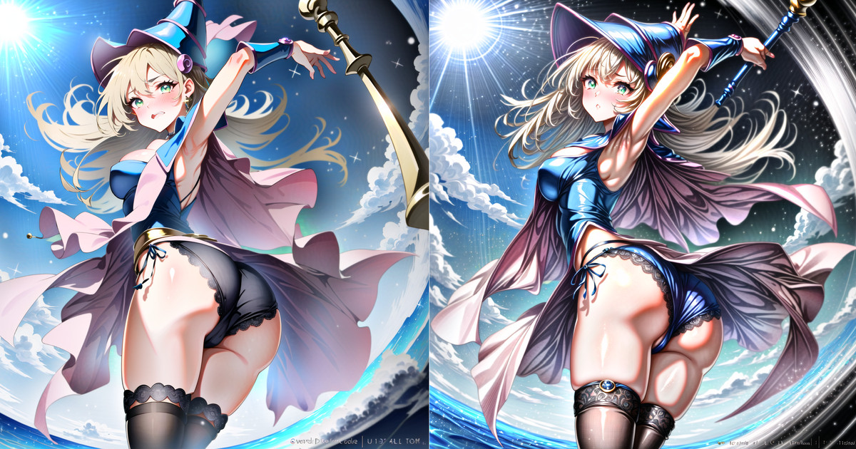
真ん中位を1個1個見るのはしんどいと思うので、とりあえず四隅を見ると違いが判ると思います
〇両極端な二枚(いずれもやりすぎ)
いずれも極振りしてます
値は -1 ~ +1 なので限界いっぱいです
〇一番 線の書き込みが少なく、光沢も一番ないもの(一番左上)がこれ
〇一番 線の書き込みも多く、光沢も出してるの(一番右下)がこれ
〇アンケートの前に
きついようですが最初に言っておきます
もう、好みの領域です
どちらにも「好きな方」がいること、ご理解ください。
真っ当なメッセージをくれる方もいますが、行き過ぎたメッセージをくれる方がちらほらいます。 ※コメント欄ではありません
私に対する意見は受け入れますが、ほかの支援者様への意見は許容できません
※例:なんでこんな絵(どちらとは言いませんが)がいいの?理解できない等
最後に
この値は参考値です。
キャラが替われば当然値も変わります。
目指す方向(右下なのか右上なのか、左上なのか左下なのか等)を決めるものです
------------------------------------------
I would like to take a survey regarding future painting policies.
This is a very annoying survey,
Some answers are for those who don't particularly care about it,
In this world, if you don't voice your opinion, it won't be heard.
It often happens that the opinions of the loudest minority get through.
We hope that as many people as possible will respond to the survey.
Thank you in advance for your cooperation.
〇matrix diagram
The size was too large, so I'm sharing it on Google Drive.
You can preview it from the link, but I thought it would probably be better to download it.
I've attached 100 sheets of 10*10 without changing the image quality per sheet.
If you preview it, it will run loading every time you move it.
Please forgive the disintegration of each image. Orz
It took me 3 minutes*100=5 hours to produce this.
The reality is that if you have 100 sheets, this is how much it will collapse.
The further to the right, the more lines are written.
The lower you go, the shinier it gets.
I think it's hard to look at the center of each one, so I think you can tell the difference by looking at the four corners for the time being.
〇Two extreme pieces (both are overdone).
Both of them are overdone.
The value is -1 to +1, which is the full limit.
The one with the fewest lines and the least gloss (top left)
This is the one with the most lines and the most gloss (bottom right)
〇Before the survey
I know it sounds harsh, but let me be the first to say it.
It's already in the realm of preference.
There are "lovers" on both sides.
Some people give us straight messages, but there are a few here and there who give us messages that go too far. *This is not a comment section.
I accept opinions about me, but I do not tolerate opinions about other supporters!
For example: Why do you like this picture (not saying which one)? I don't understand, etc.
Files