Home
Home

 Artists
 Search
 Recent
 Random
 Posts
Posts
 DMs
DMs
 Tags
Tags
 Random
 Importer
 Import
 FAQ
FAQ
 Account
 Register
 Favorites
 Login
Login

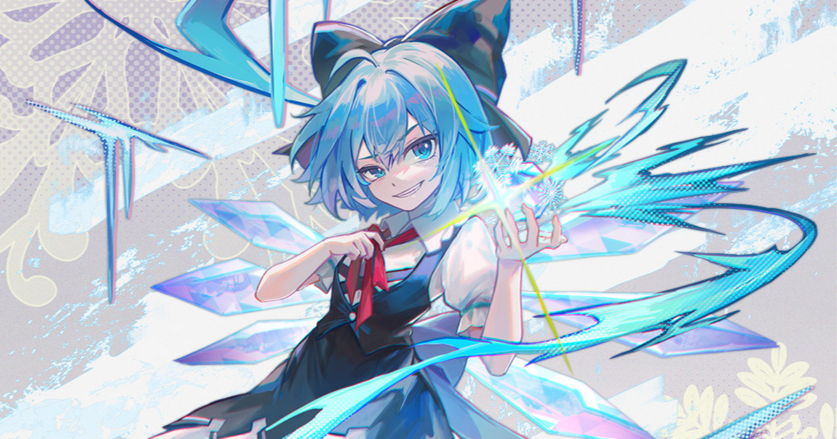
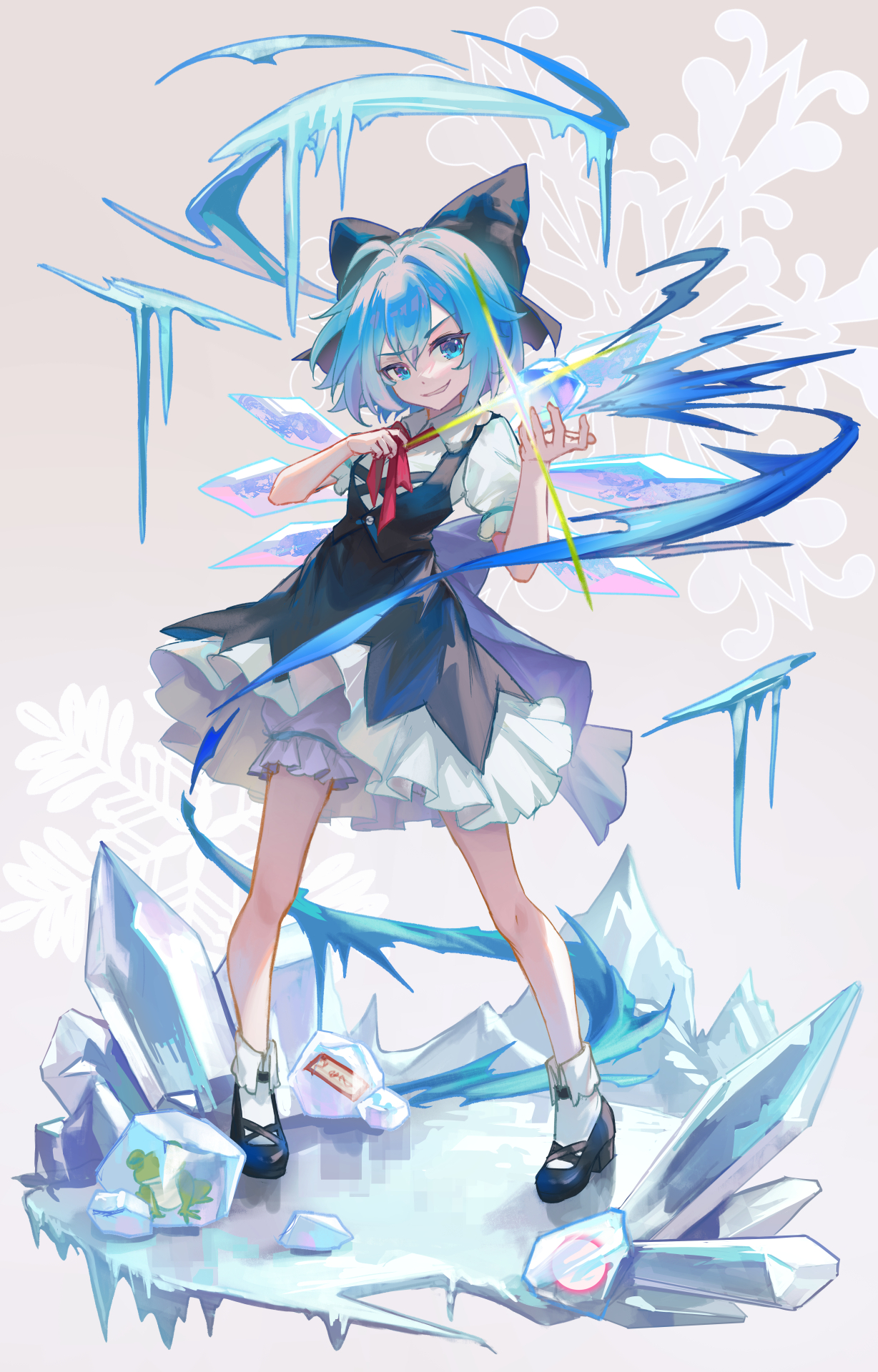
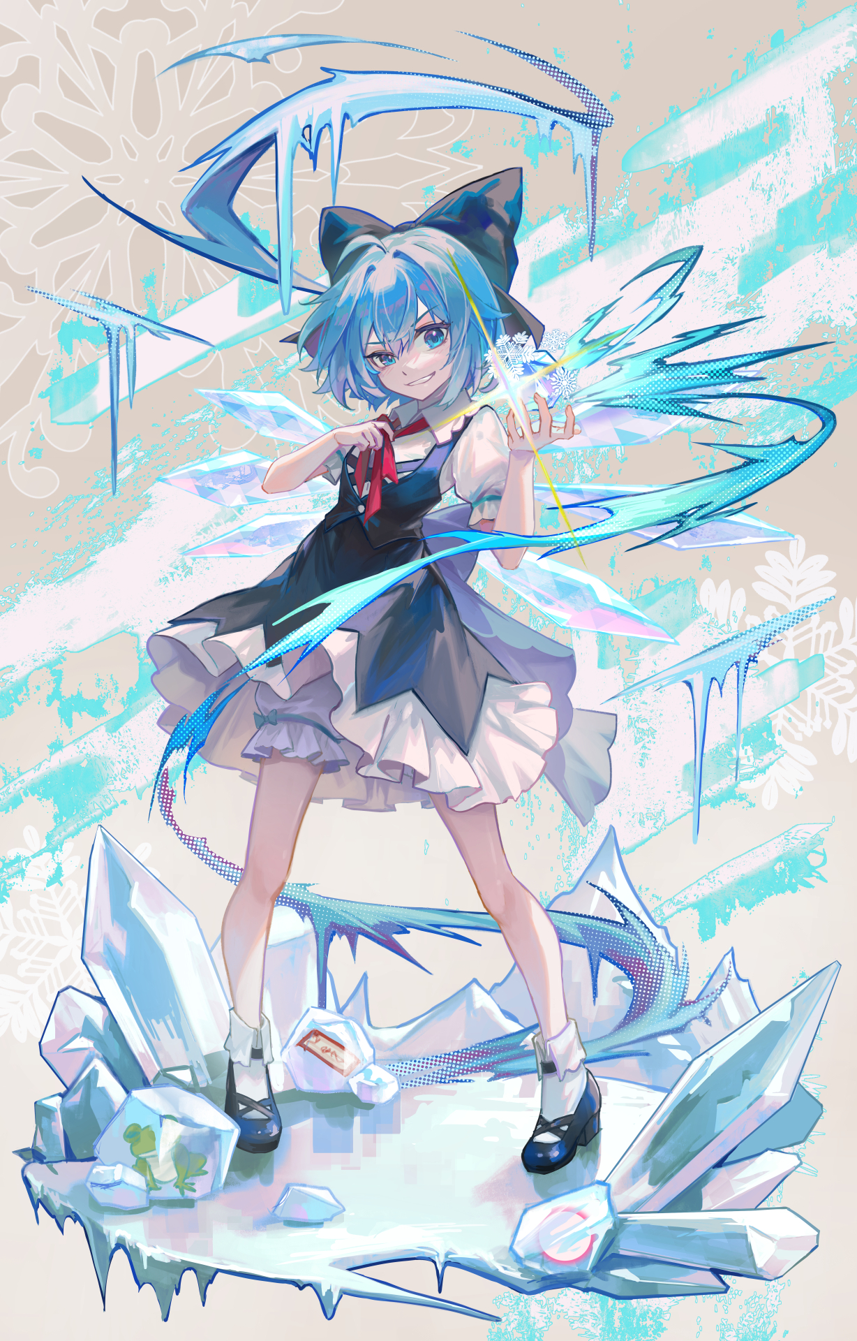
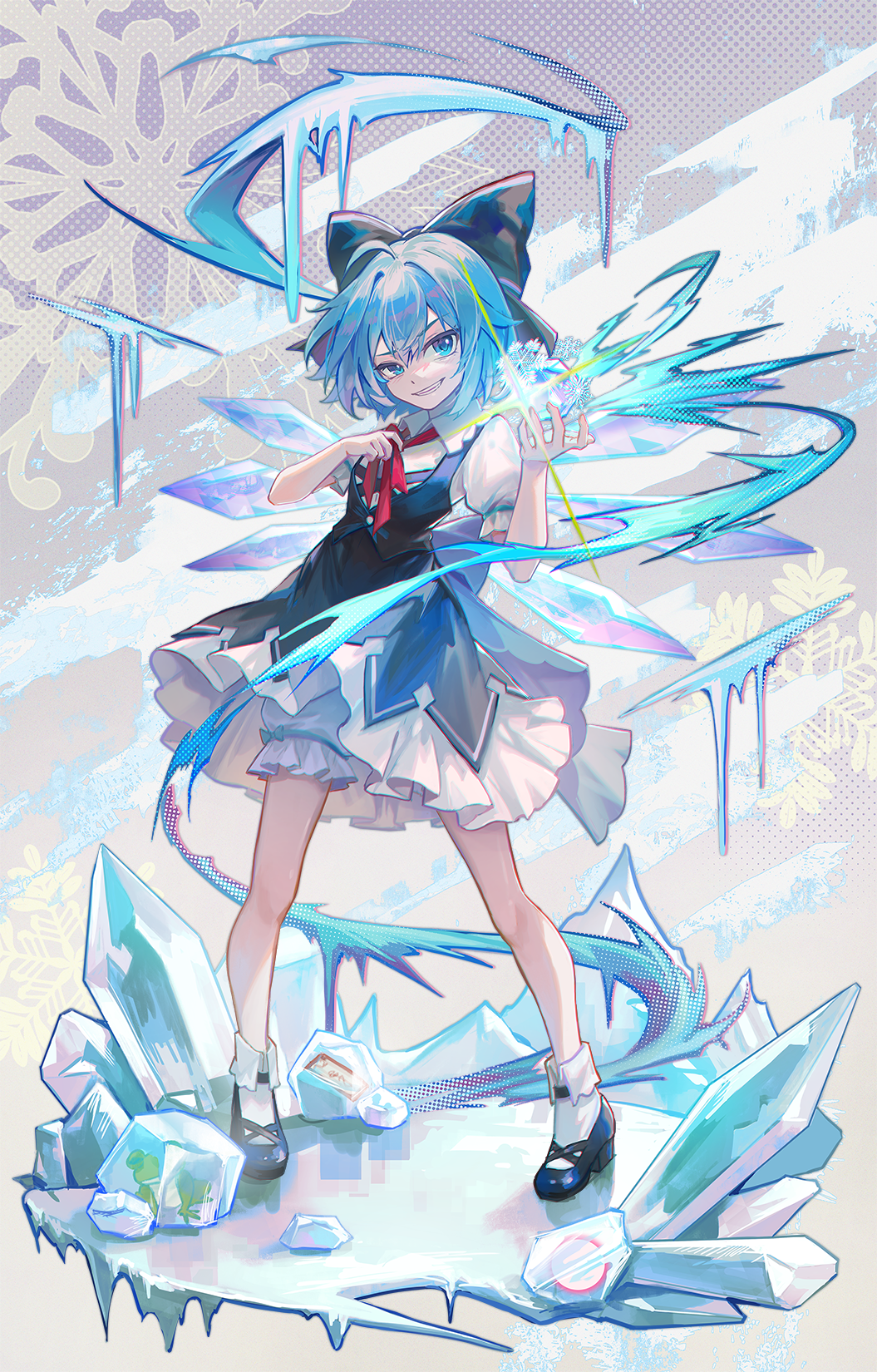
チルノ(PSD and Process) (Pixiv Fanbox)
Published:
2022-12-02 09:05:12
Edited:
2023-01-16 12:42:30
Imported:
2023-03
Videos
-
cirno.mp4
Downloads
Content
描写:ClipStudioPaint
加工:photoshop
タイムラプス↓
こういった、同系色が多いイラストの場合は色に幅を持たせることを意識しています。
全てに青系の色を使ってしまうと絵がまとまりすぎてしまう(=単調)ので、所々に近似色の紫~ピンク系の色を使いました。
青系の色でも、彩度・明度の低い藍色やビビッドカラーな水色を使うなどして色にメリハリを出しています。
For illustrations like this, in which there are many similar colors, I'm conscious of giving the colors a wide range.
If I used blue for everything, the picture would be too orderly (= monotonous), so I used approximate purple to pink colors in some places.
Even in blue, I used indigo with low saturation and lightness, and vivid light blue to give the illustrations a sense of liveliness.
何か至らない点があればコメントにてお伝えください。
その他要望や感想、質問等もお気軽にコメントへどうぞ!
If you have any requests, impressions, or questions, please feel free to comment!
Files