Home
Home

 Artists
 Search
 Recent
 Random
 Posts
Posts
 DMs
DMs
 Tags
Tags
 Random
 Importer
 Import
 FAQ
FAQ
 Account
 Register
 Favorites
 Login
Login

アンケートです!! It's a survey! (Pixiv Fanbox)
Published:
2020-05-13 11:29:39
Imported:
2021-07
Content
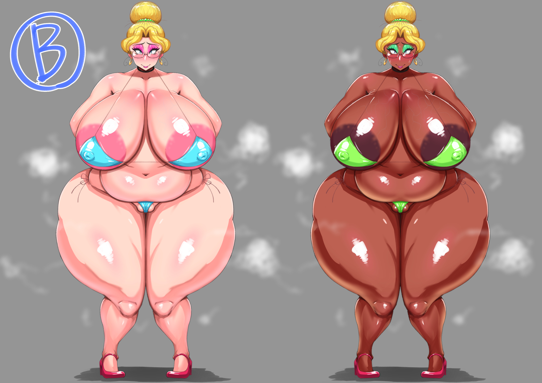
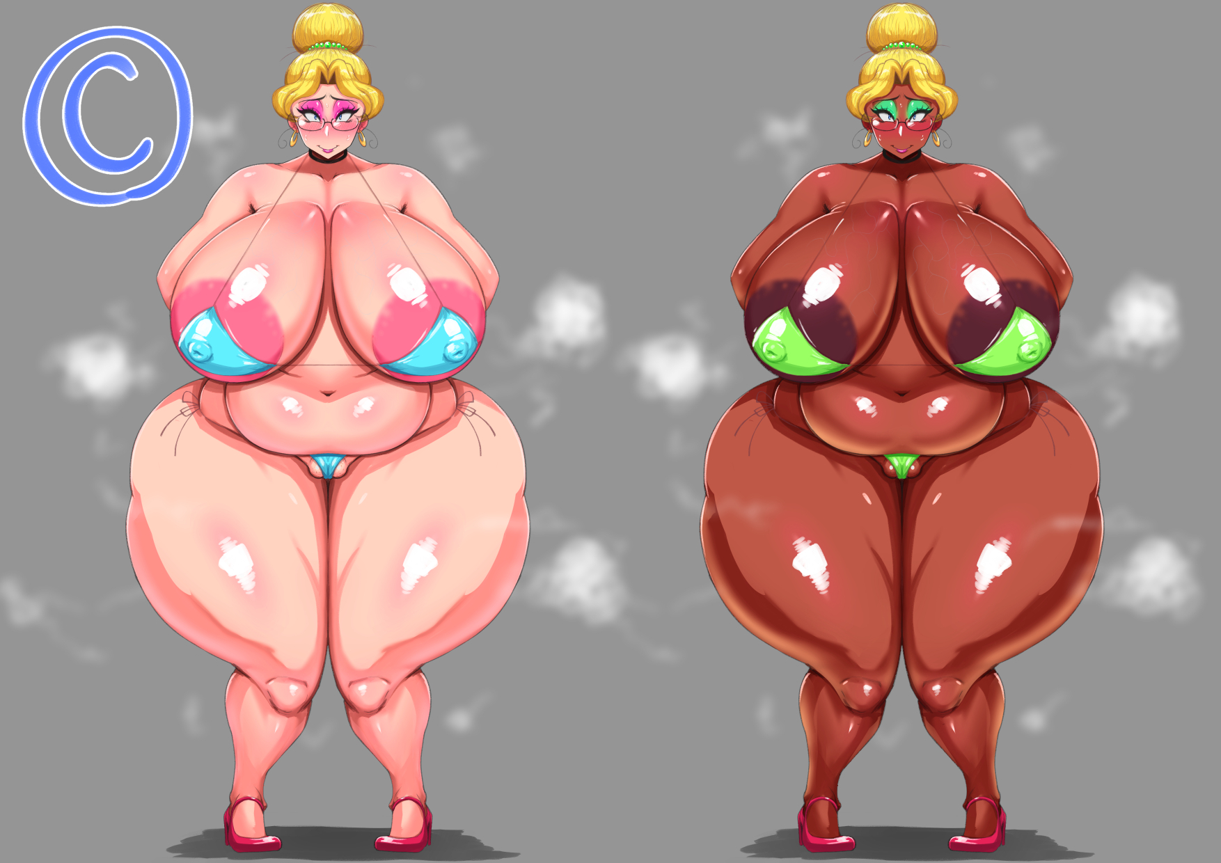
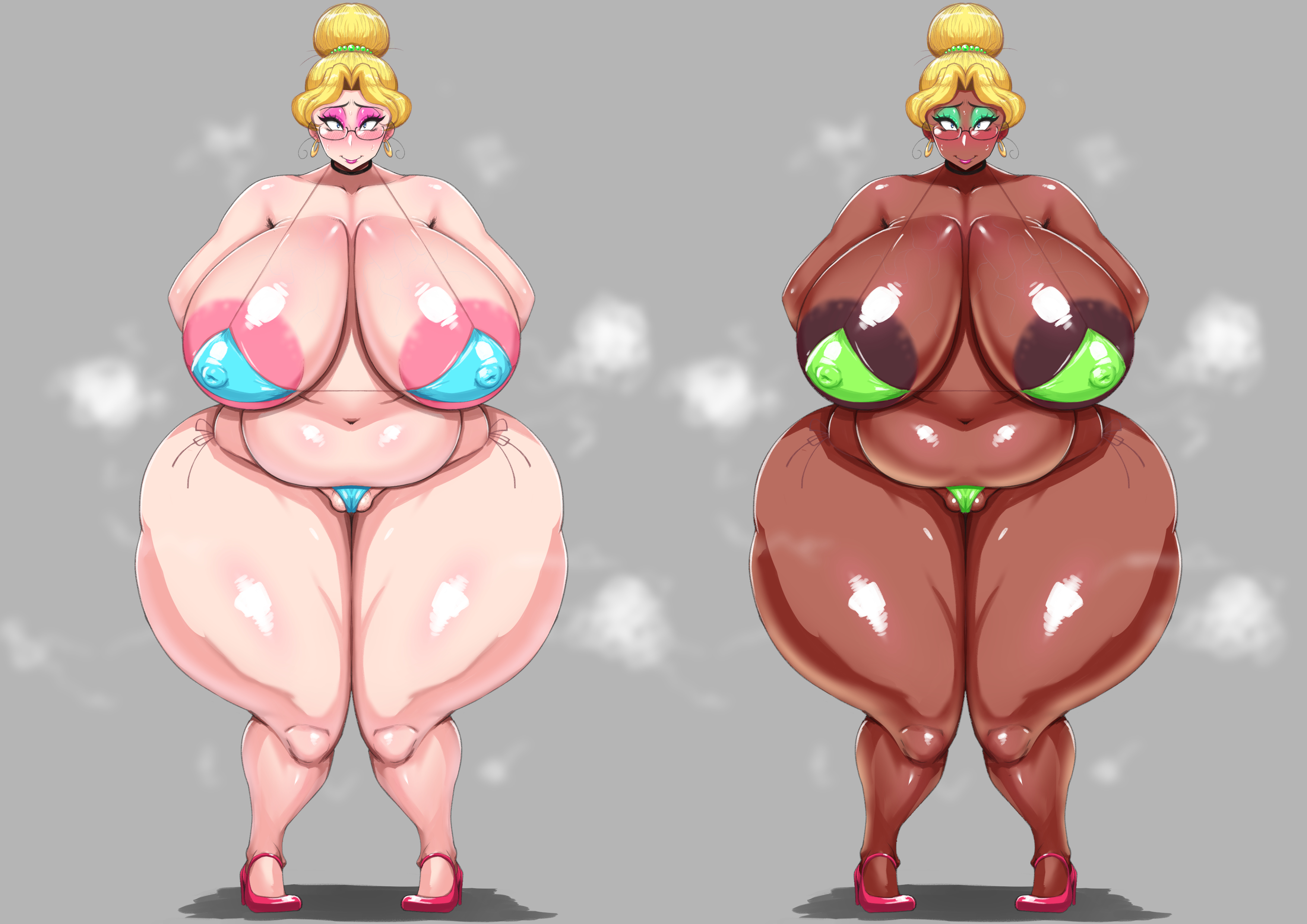
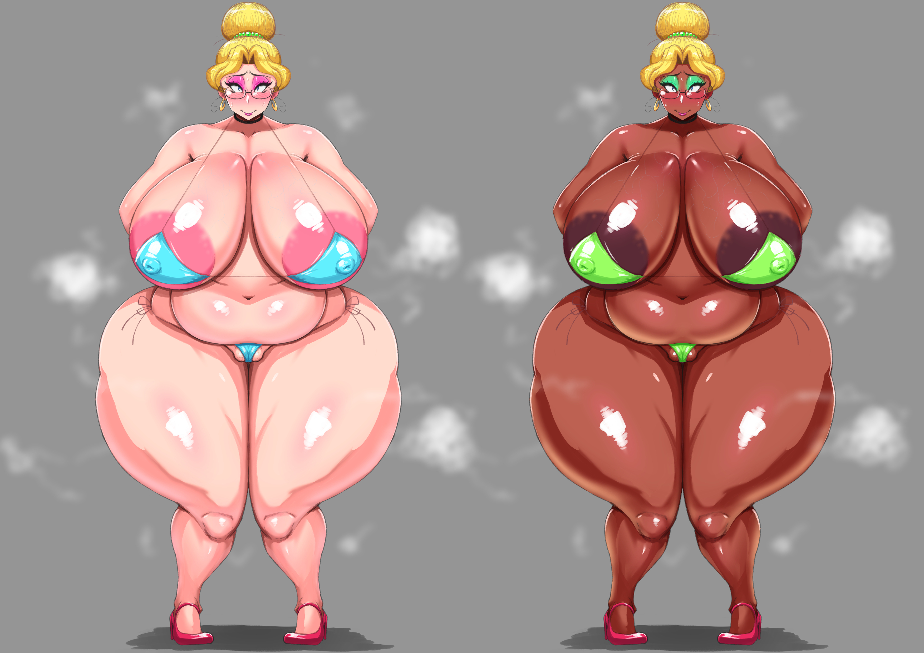
普段はPC環境で絵を描いているのですが、スマホ(iPhone)で自分の作品見るとPCと比べて色味を薄く感じます。
皆様の閲覧環境や見え方が気になったので、アンケートでご意見を頂きたいと思います。
下記のA、B、Cどのイラストが一番気に入ったかコメントして頂けると助かります。
また、どんな閲覧環境か(PC、iPhone、etc…)も答えて頂ければ嬉しいです!!
今後の参考とさせていただきます!
I usually draw in a PC environment, but when I look at my work on a smartphone (iPhone), I feel the color is lighter than on a PC.
I'm curious about your viewing environment and how the colors look, so I'd like to hear your opinion in the questionnaire.
It would be helpful if you could comment which illustrations A, B and C below are your favorite.
Also, I would be happy if you could answer what kind of browsing environment (PC, iPhone, etc.) !!
It will be used for future reference!
Files