Home
Home

 Artists
 Search
 Recent
 Random
 Posts
Posts
 DMs
DMs
 Tags
Tags
 Random
 Importer
 Import
 FAQ
FAQ
 Account
 Register
 Favorites
 Login
Login

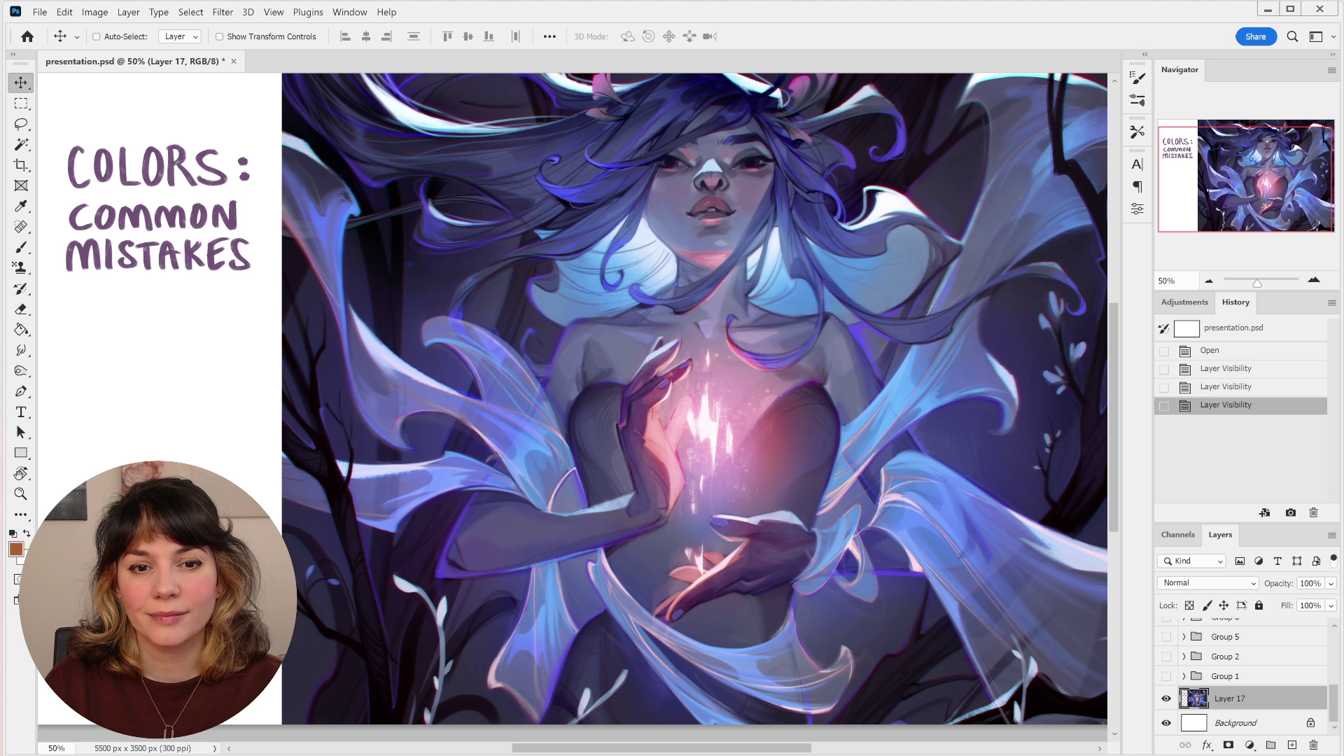
TUTORIAL // colors: common mistakes - subtitled (Patreon)
Published:
2024-02-16 17:46:16
Imported:
Flagged
Downloads
Content
The subtitles came in way faster than expected!! Here's the subtitled version of my tutorial on common mistakes when choosing colors. Be sure to read the description of the first video post for more information about the tutorial, as well as a cheat sheet that summarizes a lot of the info from the video. Hope you enjoy it ❤
Files