Home
Home

 Artists
 Search
 Recent
 Random
 Posts
Posts
 DMs
DMs
 Tags
Tags
 Random
 Importer
 Import
 FAQ
FAQ
 Account
 Register
 Favorites
 Login
Login

Progress on the development of Malevolent Planet - 18th August 2020 (Patreon)
Content
With the release date announcement out of the way, I can elaborate on my attempts to make the Quests system as intuitive as it can be and other stuff I've been working on. I had 2 possible approaches to making the Quest system intuitive for the player.
The first one, which seemed easier to me at the time, was a menu with your active quests whose stages' texts would include a short description of where you're supposed to go to advance the quest. The second one, which seemed way more difficult at the time, was always highlighting the relevant locations for quests with something like orange. Below is how I went about it:
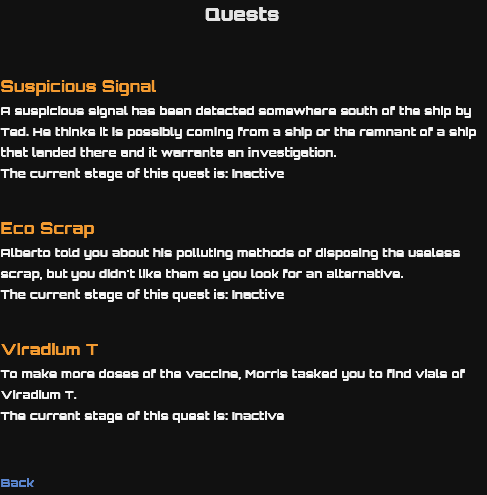
- Started working on the first approach, by making an easily accessible menu that shows you the titles, descriptions, and current stages of your current quests. Once I finished it, I started stylizing it a bit to make every quest distinct and for now I left it as you can see it in the second image. Now, with that done, I was not entirely happy about leaving everything on this note. A menu that shows you your active quests is definitely nice, but it is not a replacement for an UI that shows you the relevant quest areas to the current stages of the active quests.
- With my mind set, I started doing some research to see what I can do to highlight the relevant quest areas. Using what I learnt, I took it step by step and I reached something that I think you'll be happy with. Every location on the imagemap is a separate element and I figured out how to change the attributes of the elements by setting a condition on them. For Ted's Quest (Suspicious Signal), if the Current Stage is 0, the Pilot Room will always have that orange tint on it and if you hover your cursor over it there will be a short text telling you when to go to this location (the Pilot Room in this scenario) in order to advance the quest. The great thing about this is that nothing is static, as in if the current stage of Ted's Quest doesn't pinpoint to the Pilot Room, it will not have that always-on orange tint anymore and will have the purple tint when you hover over it as any other location.
- Leading me to this bulletpoint. We now have a menu where you can see your active quests and we also have an UI that eliminates any confusion in regards to where you should go. I will still add to every current stage a short sentence pinpointing the location and the time, but you won't strictly need that anymore. (first gif shows everything)
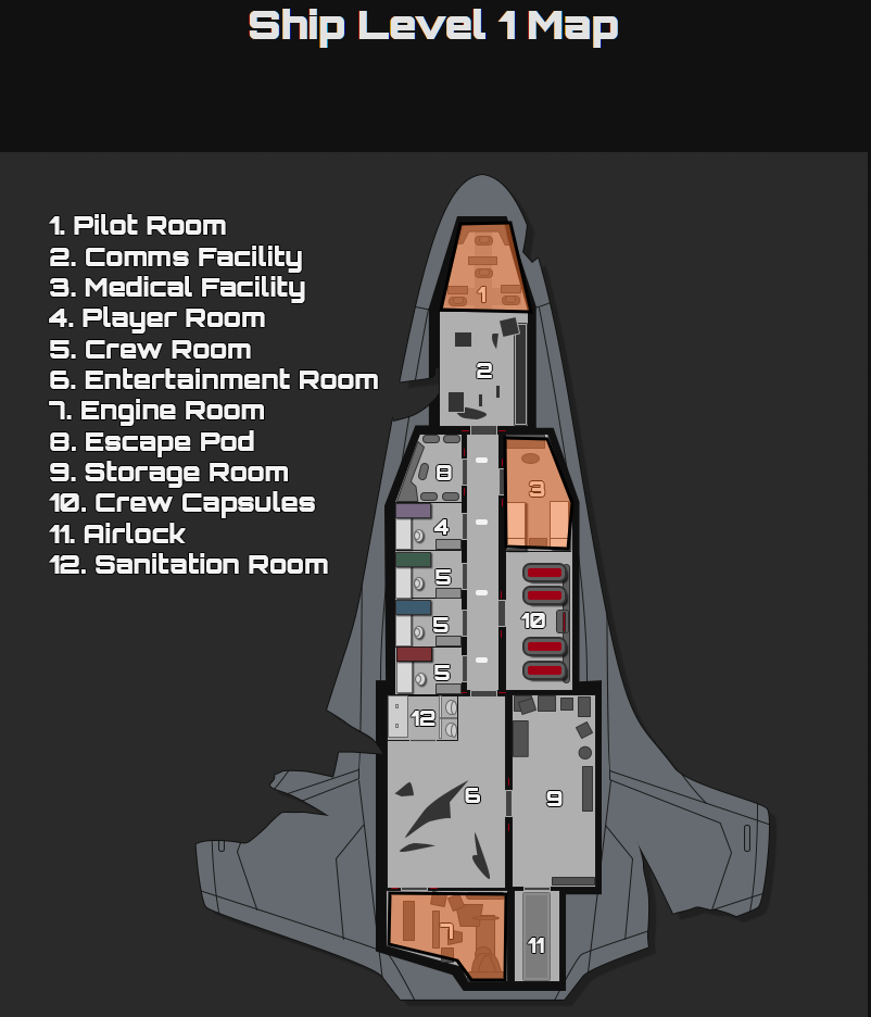
- On an unrelated note, I've also added the Sanitation Room on the Ship Level 1 Map and I will tie the Event System to it to give it a low chance of triggering the event I've written. Later, I'll add a repeatable continuation to this event because going through it multiple times with each time being the same doesn't make much sense for repeatability.
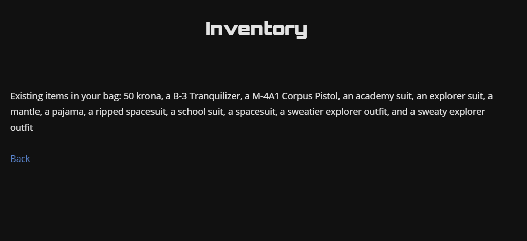
- We also have an inventory menu where you will see the items currently found in your backpack/inventory. (fourth image)
- Drew 3 Likurieris portraits and a lot more, but I will just show them in the game because this post already has plenty of images.
In conclusion, we now have the means to make reaching the written/drawn content I'm working on way more intuitive than it used to be, coupled with the combat system that allows for more interactive fiction. I am taking a short time to refresh myself creativity-wise to prepare myself to finish writing the quests and to curate the dialogues in a timely manner to reach the announced release date. (26-29 August)
Files