Home
Home

 Artists
 Search
 Recent
 Random
 Posts
Posts
 DMs
DMs
 Tags
Tags
 Random
 Importer
 Import
 FAQ
FAQ
 Account
 Register
 Favorites
 Login
Login

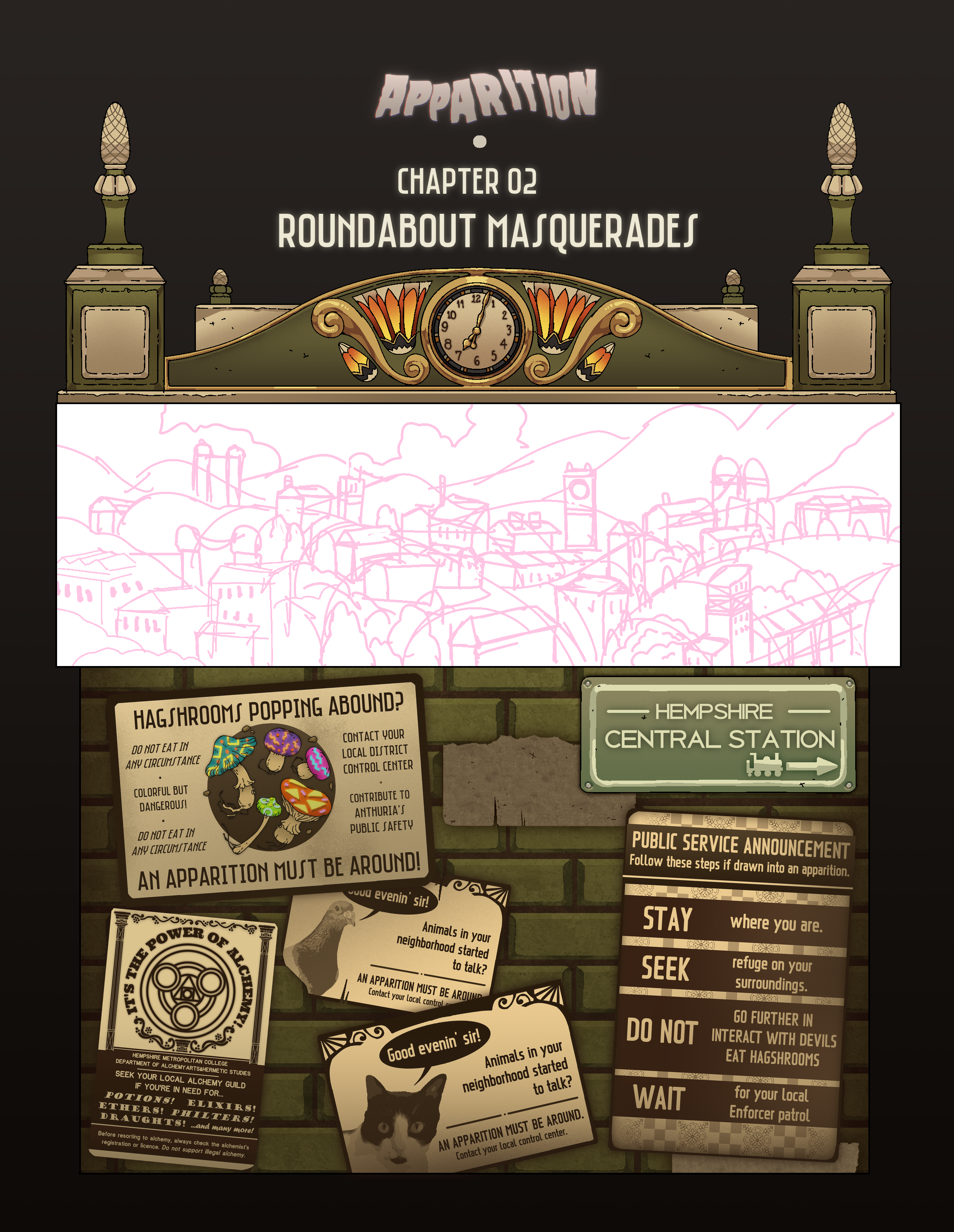
Pages process - CH02 PG01-05 (Patreon)
Content
This first batch of pages for the second chapter demanded a lot of work!! I wanted to flesh out the characters and world a bit more, so I threw them in cute and mundane situations for this world. Thing is, everything has to be made from the ground up so yeah, I had to roll up my sleeves!!
Actually the first two pages have a lot of detail, I ended up doing them in a bigger size than the others. It was here that I also entered a little crisis on how I handle scale and my lineart, and I got to admit I'm still struggling with that.
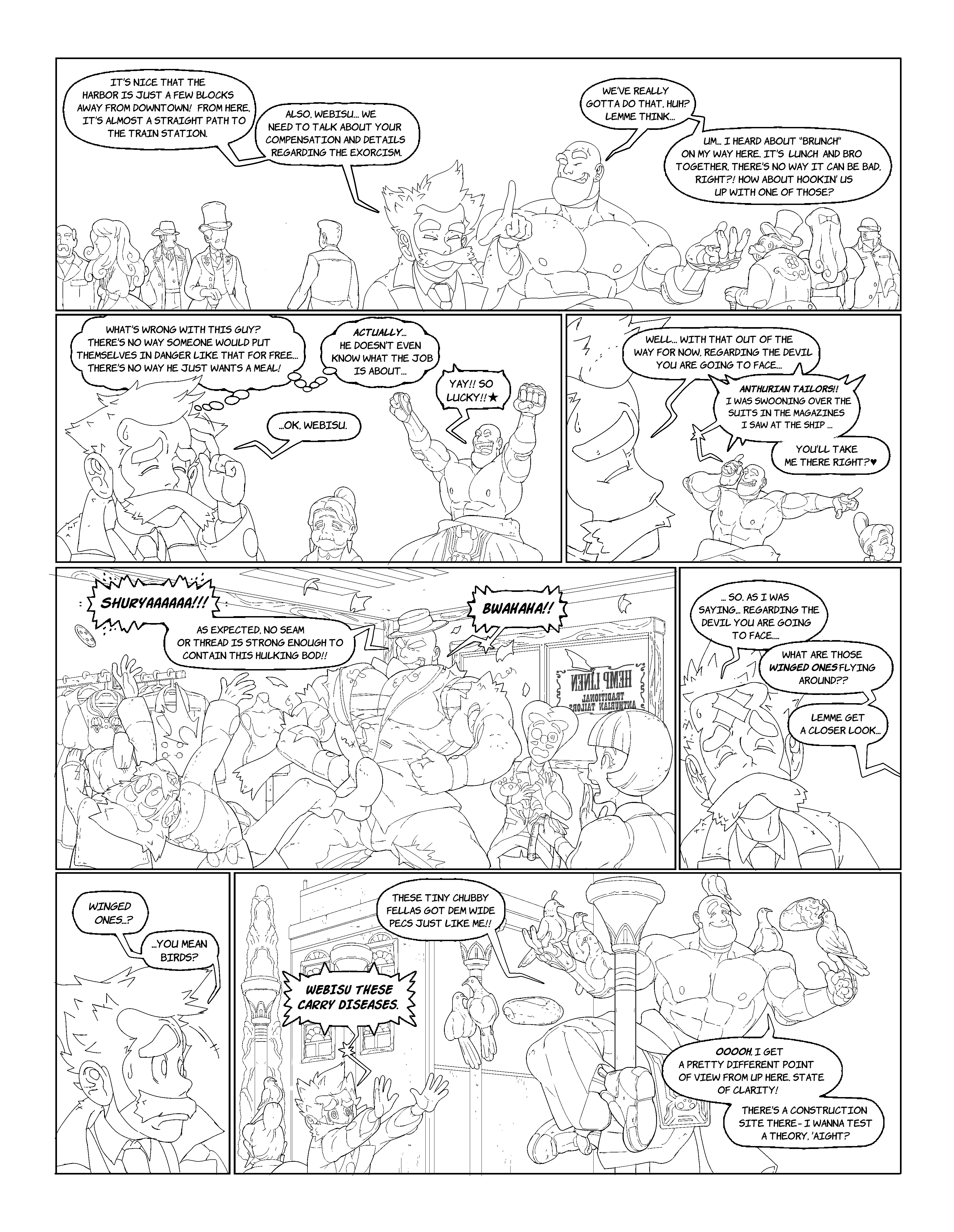
Another cool thing was that I got to keep experimenting with photobashing, 3D and pattern working. Let's see more about that, right!
Things that I do that are often left unnoticed - in the first page the tailor shop they're in actually has this detail in the glass façade! I swear I have to focus the energy on details to more productive things I think.... but I can't help myself!

Also I really don't know why but... as I was drawing the characters walking around town, I reeeeally wanted to put a tramway here!!! Maybe because I'm brazilian and these were the fad at the turn of the century, but I can see the traces left by them in a lot of places I've been. Tramways are cute OKIE
I grabbed a 3D model for one over sketchup and started thinking on how I'd tackle the scene!

Notice the pattern on the floor?! Unfortunately they ended up not that conspicuous as I wished buuuut... I made them myself, I wish I have the opportunity to actually use them in the future!! I've made some brick patterns that I can use as a floor and as a wall, but this one specifically works better as a floor pattern.

This was the angle I set down! see how the pattern kinda got a bit lost in this angle speficially.... but that's life, gonna take it in consideration the next time!

Aaaaand as I like to actually render and color the resources I use, here's the final image that I used before rendering it!

I made this lil thing too to slap on the tramway.... tramways are cute OK

As we are talking about rendering resources... I've found another opportunity here!
I initially tried to lay down a structure for the Hempshire Central Station to work on it. The thing is though. It would appear for ONE PANEL only.... I really think that the effort to create a station from zero, with all its architectonic and perspective considerations could be applied better somewhere else, somewhere where that was necessary. Then I thought, hey I'll tryi photobashing this time!!!
After looking up central stations, I found this cute one!

Then I removed all the colors as to work on it better, and I think resolution will mess up with it a bit, but in the second one I applied a pixelation filter to merge it a bit better with my style.


And here's how it looks in the finished version! I always want to make it as different as I can from the original. Also I can't help it but say that working with stained glass is always fun!!

Here are some assets I did for the overall aesthetics inside the station! I admit I could make them look a bit better. Gonna leave that for the next settings!


For things like the board saying more about the lines, I have to be more mindful on how I set things in the composition - I feel it isn't in the focus I wanted it to have in the final page.

Another experience for photobashing, again with the pixelating effects.


Here's how it looks in the finished page!

Files