Home
Home

 Artists
 Search
 Recent
 Random
 Posts
Posts
 DMs
DMs
 Tags
Tags
 Random
 Importer
 Import
 FAQ
FAQ
 Account
 Register
 Favorites
 Login
Login

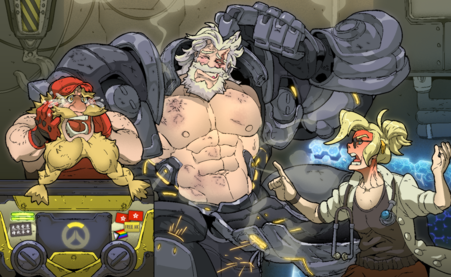
June Pin-up - Reinhardt (Patreon)
Content
Time for our pin-up!! :D
I always wanted to tackle how Reinhardt looks inside his power suit.... and I found out a way to do it in a fun way with this piece! I hope you enjoy the process!
> I have noticed that I don't spend that much time with thumbnails for pieces, only when I'm really undecided on what I want to do. I found it best to leave iterations for things I don't know how I want them to look - even though I really need to make thumbnailing more of an habit! Notice that I nailed down the important things I wanted for this piece: Reinhardt being a massive klutz, Torbjörn freaking out, Mercy getting pissed as fuck and the vague machinery on the BG.

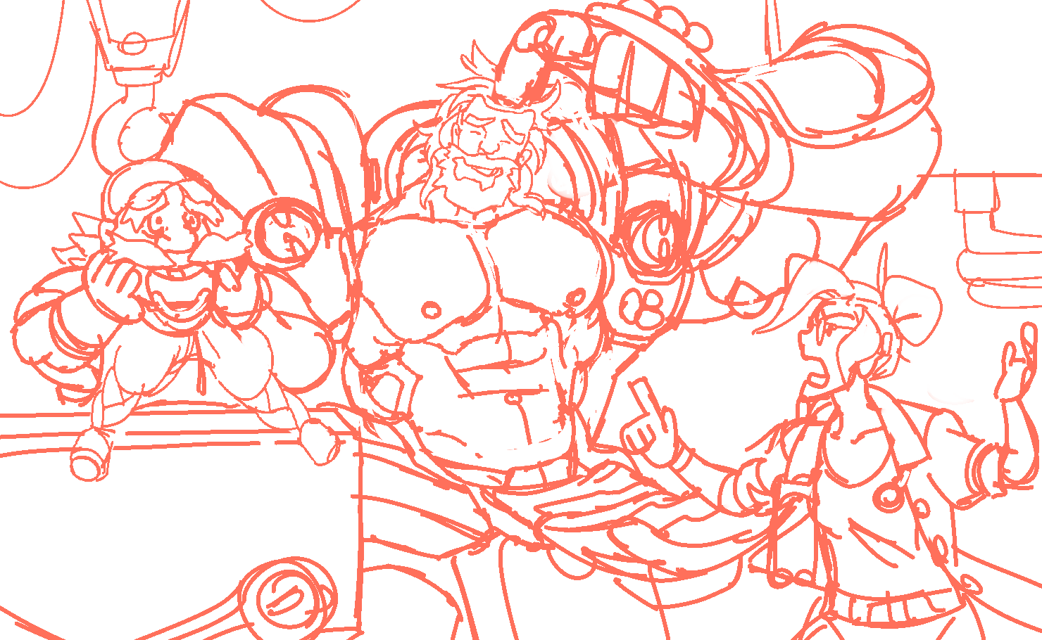
> Structure for the bodies! I decided to leave the power suit for last.

> Armor pass! I noticed Reinhardt was a bit too big (even though he is quite the big lad) and I shrunk him down a bit. This is nice because the size of the power suit is put in evidence - look how the hands are big compared to the body!

> Laying down clothes and hair!

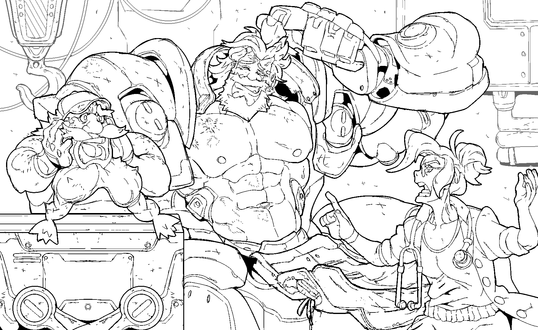
> now with everything cleaned up! chop chop chop!

> Time for lineart!! Started with the "less important" parts of the composition by finishing Mercy and Torb first.

> And for Rein... I decided to make it the same as when I was tackling the sketch - first I do his body, then I'll do his armor. The floating torso is kinda creepy isn't it????

> GOSH I have to admit, I had fun with this armor.............. I really turned my fuck-it on regarding the very specific and countless details of the usual OW designs, it's really not my thing and I stylized along the way. I was happy to make what would be a perfectionist hell in a cool exercise! That's what I always want when tackling the pin-ups and my pieces in general.

> BG lines!!! Here in more light color to help me visualize the planes

> When I finished the lineart I thought: better stop for the day! Usually I tackle the pin-up pieces across 2 days of work so I'm not bummed out and the piece has all my focus.
I started watching some Changeman episodes but midway I couldn't stop thinking about what colors to use.... it was late already but I wanted to experiment a bit with the colors I was going to pick. Enjoy the mouse drawing as I was crashed on my bed LOL


I thought about the Overwatch logo colors and decided I wanted to play a bit with gray and yellow in this composition - which are actually aligned with Pantone's colors this year! It helps all character are blondies LOL

> Did this one just to separate the planes in my head....

> and with the colors I experimented the other day, I made the color sketch!

> Rendered the background first!! Ended up adding a broken barrier in the background to emphasize Rein's state. At this stage, I was pretty safe I'd work mostly with greys and yellows but blue started seeping in...? Well, I just let it flow!

> Flats!! This time I didn't suffer that much because the color blocks here are pretty delimited.

> Put some more blue in the background - specially on the barrier's side, and rendered it a bit more. I'm a sucker for barriers!!!

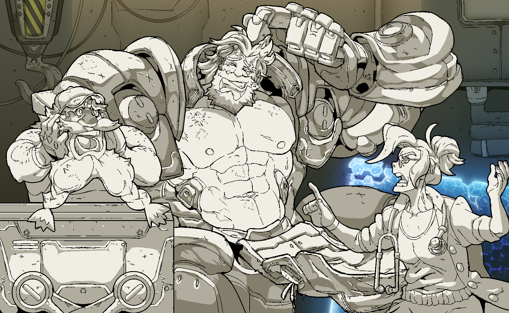
> Did the primary shadows! Again, I did the characters first, and then the armor. I actually started with the armor (you can see the hands and head parts) but I decided not to do so as to not overwhelm myself by starting with the most complicated thing. Preserve yourself!!!


> Secondary shadows!! You know, I noticed I kinda over-render everything!! And from what I've been studying, contrast is really important not just in colors and shapes, but in details as well.
As Rein is the focus of the piece, He's the one I'll finish the most detail, while the other two will have secondary attention. Wanted to see if this bring attention to where I want - a problem that surfaces when you put the same effort in all of the picture!!

> From there I finished it! I have some fun considerations this time....

> First is Torb's expression!! I got it wrong the first time - it was more of a despair filled scream than a comical "OH NO!!" concerned scream. It's pretty jarring LOL but I found out a way to work it out by removing the contrast of the dramatic lighting from below and putting a river of tears and a slight blush to his big sniffer.

>Other thing I noticed... was that the gray I picked at first for the armor kinda blend in a bit too well with the background... which is a bad thing when I want to show it! So I ended up experimenting with colors and it was pretty wild - I found some really cool results that I want to share! Ultimately I picked a blueish gray to contrast with all the yellow and to work with the blue already present in the barrier side of the composition.


And that concludes our monthly pin-up post! I'll be opening the voting for the next character on the 1st, I'm looking forward to your participation on it!
Thanks for supporting me while I'm working in my current project. You really make the difference!!
Files